🔥 Today Only: Save 30% on Premium — Offer Ends Soon! - Upgrade Now!
Multiple Graphs

Band 5+: The line graph shows how much money overseas visitors spent in the UK from 1980 - 2010 and the pie charts show the reasons for their visits in 1980 and 2010. Summarise the information by selecting and reporting the main features and make comparisons where relevant.

Image for topic: The line graph shows how much money overseas visitors spent in the UK from 1980 - 2010 and the pie charts show the reasons for their visits in 1980 and 2010. Summarise the information by selecting and reporting the main features and make comparisons where relevant.
Our system will evaluate the answer based on this AI-generated description.
The image contains two graphs related to spending by overseas visitors in the UK and reasons for visit in two different years, 1980 and 2010. The first graph, titled "Money spent in the UK by overseas visitors," shows the money spent in millions from 1980 to 2010. The spending starts at around 6,500 million in 1980, reaches approximately 7,500 million in 1985, dips slightly in 1990, jumps to 10,500 million in 1995, fluctuates between 10,000 and 10,500 million from 2000 to 2005, and peaks at around 12,000 million in 2010. The second graph, titled "Reasons for visit," presents pie charts for 1980 and 2010. In 1980, the reasons for visit are distributed as follows: Holidays 41.1%, Business 20.7%, Visiting Friends or Relatives 18.7%, and Other 19.5%. In 2010, the distribution changes to: Holidays 30.1%, Business 22.8%, Visiting Friends or Relatives 28.2%, and Other 19.9%.
Given the complexity of the image, the above description may not be entirely accurate.
Note: Both the topic and the answer were created by one of our users.

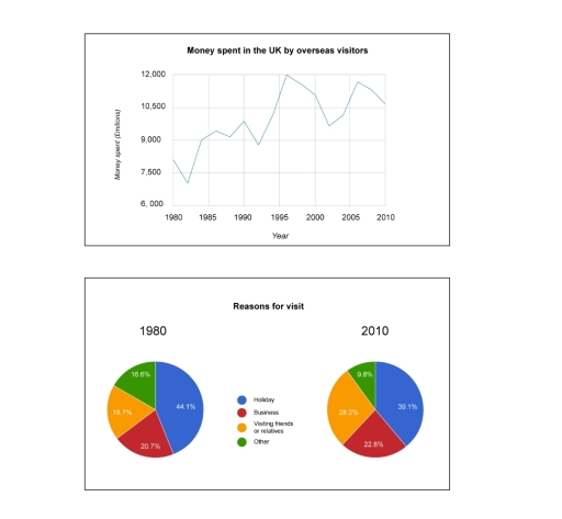
The line graph shows the amount of money the UK foreign visitors spent over a 30-year period unite measured in millions pound sterling and the pie charts show the percentage of reasons for visits divided into four categories holiday,business,visiting friends and relatives and other between two years.

Overall, the line graph shows an increase in the amount spent between 1980 and 2010. However, we can clearly see in the pie chart that the proportions of spending have mildly changed.

In the line graph the amount spent in 1980 was little over 7,500 million pounds sterling.While it kept fluctuating over the years it increased gradually reaching its highest point in 1996 at 12,000 million pound sterling and by 2010 it had a mild drop to 10,500 million pound sterling.

While the pie chart shows in 1980 the majority of causes it visit was for holiday at 44.1% and business at 20 .7%, Visiting friends and relatives and other accounts for only the third of courses to visit at 18.7% and 16.6% respectively, This has however slightly changed in 2010 although holiday is still the number one reason to visit percentage has decreased by about 5% as well as other causes to visit . other categories has increased.

Word Count: 206

Answers On The Same Topic:

The line graph shows how much money overseas visitors spent in the UK from 1980 – 2010 and the pie charts show the reasons for their visits in 1980 and 2010. Summarise the information by selecting and reporting the main features and make comparisons where relevant.

The line graph delineates the amount of money spent by overseas visitors in the UK from 1980 to 2010, and the pie chart presents the purpose of their visits from 1980 to 2010. Overall, although the amount of money spent fluctuated, the total expenditure by visitors increased over the period, and their reasons for visiting […]

The line graph shows how much money overseas visitors spent in the UK from 1980 – 2010 and the pie charts show the reasons for their visits in 1980 and 2010. Summarise the information by selecting and reporting the main features and make comparisons where relevant.

Th image consists of two charts: a line graph and a pie chart, which illistrate the expenditure, whom spent by overseas visitors, while the pie charts depicts the reasons for their visits, over the decade of 1980 and 2010, particularly in UK. Overall, in UK the expenditure rate was remarkably increased with period of time, […]

The line graph shows how much money overseas visitors spent in the UK from 1980 – 2010 and the pie charts show the reasons for their visits in 1980 and 2010. Summarise the information by selecting and reporting the main features and make comparisons where relevant.

The line graph shows information on the amount of money spent in the UK by foreign visitors between 1980 and 2010, whereas the pie chart describes the purpose of their visit. Overall, the annual quantity of money used by overseas visitors is approximately 2000 million pounds higher in 2010 than the amount recorded in 1980, […]

The line graph shows how much money overseas visitors spent in the UK from 1980 – 2010 and the pie charts show the reasons for their visits in 1980 and 2010. Summarise the information by selecting and reporting the main features and make comparisons where relevant.

The line graph illustrates changes in internal visitors’ spending in the UK over a 30 years period from 1980 to 2010, while the pie charts present the distribution of different purposes of visiting the UK. Overall, overseas visitors’ spending increased notably after 3 decades although fluctuations were obsereved throughout the period. Additionally, holiday remained the […]

The line graph shows how much money overseas visitors spent in the UK from 1980 – 2010 and the pie charts show the reasons for their visits in 1980 and 2010. Summarise the information by selecting and reporting the main features and make comparisons where relevant.

The line graph indicates the amount of expenditure foreign visitors paid in the UK between 1980 and 2010, while the pie charts illustrate the distinct purposes for their arrivals at the same years. Overall, it is noticeable that there was more and more money spent in the UK by foreign visitors, while the percentage of […]

See All

Other Topics:

the bar charts below show the information about the population in a particular town in the UK from 1951 to 2011. summarise the information by selecting and reporting the main features, and make compariaon where relevant

The first bar chart compares the changes in total population in the particular town in the UK from 1951 to 2011, while the second bar chart shows the proportion of the five age groups. Overall, the figures for total population went up, with the percentage of 0-14 age group, 15-29 age group, and 65+ age […]

The bar chart below shows the percentage of people in five age groups in one city who exercised regularly in 2025. Summarise the information by selecting and reporting the main features, and make comparisons where relevant.

The graph illustrates the percentage of individuals doing workout regularly in five age groups, consisting of 18 to 25, 26 o 35, 36 to 45, and 56 to 65 years old, in 2025 Overall, the youngest group shows the highest proportion of people who exercise regularly, while the oldest group records the lowest percentage. The […]

the bar charts below show the information about the population in a particular town in the UK from 1951 to 2011. summarise the information by selecting and reporting the main features, and make compariaon where relevant

The first bar chart compares the changes in total population in the particular town in the UK from 1951 to 2011, while the second bar chart shows the proportion of the five age groups. Overall, the figures for total population went up, with the percentage of 0-14 age group, 15-29 age group, and 65+ age […]

The charts below show the percentage of secondary school students at a school in the UK taking different subjects in 1995 and this year

The pie charts provide information about the percentage of secondary school students in the UK taking different subjects in 1995 and now, including Geography, RS, Drama, Business, History and Art. Overall, IT replaced RS and Drama and became one of the most popular subjects. While all other subjects experienced changes in their proportions, Business was […]

The charts below show the main reasons for study among students of different age groups and the amount of support they received from employers.

The given Die chart illustrates the uses of enerit in an average australian household and greenhouse gas emissions result from energy used. From an overall perspective, heating dominate all categreriespeed. Sin energy use. Although, water heating shows some stagety largest propertion in gas emissions. Other appliances alsow grow their percent in gas emissions. Truning into […]

The chart and table below give information about tourists at a particular holiday resort in Australia. Summarize the information by selecting and reporting the main features, and make comparisons where relevant.

The pie chart indicate the percentage of tourists who come from, each region while the table shows information about their duration of stay, preferences on type of accommodation,and activities at a specific resort in Australia. Overall, the majority of tourists are from Europe and the ones stay the longest compared to the rest, whereas Asians […]

See All
We have detected unusual activity on your device.
Please verify your identity to continue.
Note: This verification step won't sign you in. If you have a premium account, please log in to access the service as usual.
Google/Gmail Verification
Or verify using Email/Code
We've sent a verification code to:
youremail@gmail.com (Not your email?)
Enter it below to complete the verification process.
Ensure your email address is correct, your inbox is not full, and you check your spam folder. If no email arrives, consider using an alternative email.
You will need a Premium plan to perform your action!
Note: If you already have a premium account, please log in to access our services as usual.

Plans & Pricing

Our mission is to make quality education accessible for everyone.
However, to keep our hardworking team running and this service alive, we genuinely need your support!
By opting for a premium plan, not only do you sustain us in achieving the mission, but you also unlock advanced features to enrich your learning experience.

Free

For learners who aren't pressed for time

What's included on Free
100+ Cambridge IELTS Tests
Instant IELTS Writing Task 1 & 2 Evaluation (2 times/month)
Instant IELTS Speaking Part 1, 2, & 3 Evaluation (5 times/month)
Instant IELTS Writing Task 1 & 2 Essay Generator (2 times/month)
500+ Dictation & Shadowing Exercises
100+ Pronunciation Exercises
Flashcards
Other Advanced Tools

Premium

For those serious about advancing their English proficiency, and for IELTS candidates aspiring to boost their band score by 1-2 points (especially in writing & speaking) in just 30 days or less

What's included on Premium
Save Your IELTS Test Progress
Unlock All Courses & IELTS Tests
Unlimited AI Conversations
Unlimited AI Writing Enhancement Exercises
Unlimited IELTS Writing Task 1 & 2 Evaluation
Unlimited IELTS Speaking Part 1, 2, & 3 Evaluation
Checked Answers Will Not Be Published
Unlimited IELTS Writing Task 1 & 2 Essay Generator
Unlimited IELTS Speaking Part 1, 2, & 3 Sample Generator
Unlimited Usage Of Advanced Tools
Priority Support within 24h (12-month plan only)

Due to the nature of our service and the provided free trials, payments are non-refundable.
Nếu bạn là người Việt Nam và không có hoặc không muốn trả bằng credit/debit cards, bạn có thể thanh toán bằng phương thức chuyển khoản:


Chọn gói:
419,000₫ 277,000 ₫ cho gói 1 tháng (chỉ 9,233₫/ngày)
1,239,000₫ 597,000 ₫ cho gói 3 tháng (chỉ 6,633₫/ngày)
2,469,000₫ 1,027,000 ₫ cho gói 6 tháng (chỉ 5,706₫/ngày)
4,929,000₫ 1,417,000 ₫ cho gói 12 tháng (chỉ 3,936₫/ngày)


Sau khi chuyển khoản, vui lòng đợi trình duyệt tự động điều hướng bạn trở lại Engnovate và bạn sẽ ngay lập tức nhận được mã kích hoạt tài khoản premium.
Nếu có lỗi xảy ra, bạn có thể liên hệ với team thông qua một trong các phương thức: email đến helloengnovate@gmail.com hoặc nhắn tin qua facebook.com/engnovate.
Vì toàn bộ công cụ trên website đều có thể sử dụng thử miễn phí, Engnovate không hỗ trợ hoàn tiền.