🔥 Today Only: Save 30% on Premium — Offer Ends Soon! - Upgrade Now!
Bar Chart

Band 5+: The bar chart below shows estimated world illiteracy rates by region and by gender for the last year. Summarise the information by selecting and reporting the main features, and make comparisons where relevant. You should write at least 150 words

Image for topic: The bar chart below shows estimated world illiteracy rates by region and by gender for the last year. Summarise the information by selecting and reporting the main features, and make comparisons where relevant. You should write at least 150 words
Our system will evaluate the answer based on this AI-generated description.
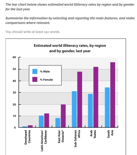
The image is a bar chart depicting estimated world illiteracy rates by region and gender for the last year. The vertical axis represents the percentage of illiteracy, with markers at 10% intervals up to 60%. The horizontal axis displays regions: Developed Countries, Latin America, Sub-Saharan Africa, Arab States, South Asia, and South East Asia. Each region has two bars side by side, representing male and female illiteracy percentages. Developed Countries shows around 1% male and less than 1% female illiteracy. Latin America indicates just under 10% for males and just over 10% for females. Sub-Saharan Africa displays around 30% male and over 40% female illiteracy. Arab States present just over 20% for males and approximately 40% for females. South Asia has roughly 30% male and just over 50% female illiteracy. South East Asia reveals around 10% male and below 20% female illiteracy.
Given the complexity of the image, the above description may not be entirely accurate.
Note: Both the topic and the answer were created by one of our users.

The bar chart represents how many people are not capable to read and write. It is divided in women and men and illustrated per region.

Overall, it can be noted that the highest illiteracy rates are in the Arab States, South Asia and Sub-Saharan Africa. Especially, compared to the developing countries, Latin America and East Asia the percentage of women and men who are illiterate is significantly higher. For example, the number of illiterate men in the East Asia is more than doubled in the Arab States. However, there are no enormous differences in the percentage of illiterate people in the regions with the highest illiteracy rates.

Furthermore, it is noticeable, that in every region more females than males have the ability to read and write. There is a remarkable difference, especially in South Asia, Arab States, Sub-Saharan Africa and East Asia between the two genders. On the other hand in Latin America it can be seen that approximately the same amount of women and men are illiterate.

Word Count: 168

Answers On The Same Topic:

The bar chart below shows estimated world illiteracy rates by region and by gender for the last year. Summarise the information by selecting and reporting the main features, and make comparisons where relevant. You should write at least 150 words

The bar chart compares the percentage of males and females who were illiteracy across six regions in last year. Overall, women’s illiteracy percentage overweighted men in all regions. Additionally, The highest percentage of illiteracy in both men and women in Sub-Saharan Africa, Acrab States and South Asia. Those regions, illiterarcy of men had simliar rate. […]

The bar chart below shows estimated world illiteracy rates by region and by gender for the last year. Summarise the information by selecting and reporting the main features, and make comparisons where relevant. You should write at least 150 words

The bar chart gives information about the illiteracy of male and females around the world from the previous year. Overall, South Asia and Arab states have the highest number of female who can’t read while developed countries have the lower number of female. Male can read compared to females. The report is from last year […]

The bar chart below shows estimated world illiteracy rates by region and by gender for the last year. Summarise the information by selecting and reporting the main features, and make comparisons where relevant. You should write at least 150 words

The bar chart presents the estimated global illiteracy rates segmented by region and gender for the last year. A key takeaway is that across all regions, women demonstrate higher illiteracy rates than their male counterparts. Notably, South Asia emerges as the most affected region, where over 50% of females and nearly 33% of males are […]

The bar chart below shows estimated world illiteracy rates by region and by gender for the last year. Summarise the information by selecting and reporting the main features, and make comparisons where relevant. You should write at least 150 words

The provided chart compares the estimated proportions of people who are unable to read and write across six world regions, with figures presented separately for men and women in the previous year. Overall, women consistently recorded higher illiteracy rates than men in all regions. The highest proportions of illiterate individuals were found in South Asia, […]

The bar chart below shows estimated world illiteracy rates by region and by gender for the last year. Summarise the information by selecting and reporting the main features, and make comparisons where relevant. You should write at least 150 words

The bar chart illustrates the estimated percentages of illiterate people worldwide, categorized by region and gender, for the most recent year. Overall, illiteracy rates vary considerably among regions, with women consistently showing higher rates of illiteracy than men. South Asia and the Arab States record the highest proportions of people unable to read or write, […]

See All

Other Topics:

The chart below shows the number of visitors to tourist attractions in a European city in 1981, 1991 and 2001.

The bar chart provides a comparative overview of how many people visited sights in a certain European city in 1981, 1991 and 2001. Overall, it can be seen that the Central Amusement Park was the most popular tourist attraction throughought the period studied, whereas the Central Zoo had the smallest number of visitors. The Central […]

The bar chart below shows the number of international tourists (in millions) visiting five cities in 2010 and 2020. Summarise the information by selecting and reporting the main features, and make comparisons where relevant.

This bar chart provides the number of international tourists visiting Paris, Bangkok, Dubai, Istanbul and Tokyo in 2010 and 2020. The figures are given in millions. Overall, tourist arrivals increased in every city over the ten years period, with Bangkok showing by far the highest rise. Paris had the highest tourists in 2010, but in […]

The chart below gives information about the growth of urban population in certain parts of the world including the prediction the future. of

The graph below demonstrates data about rise of population in big cities in specific parts of the world with prediction that can be in perspective. Overall, latin america will have the biggest number of people, while others will be approximately same numbers. Firstly, in 1950 arfica and asia showed least number of popularion ratio, both […]

The chart below shows the percentage of people who ate five portions of fruit and vegetables per day in the UK from 2001 to 2008.

The bar graph illustrates the proportion of individuals who ate the five portions of fruits and vegetables in the country United kingdom between 2001 and 2008. Overall, In 2001 to 2006 the ratio of women sharply rose approximately 20% to 32%. In 2001 to 2007. The ratio of individual men boosted from approximately 18% to […]

The chart below shows the sales figures for children's toys in 2012 and 2016 in six different countries. Summarise the information by selecting and reporting the main features, and make comparisons where relevant.

The graph illustrates the comparison of children’s toy sales in 2012 and 2016 between six countries. Most noticeable growth in sales is from India with a whopping growth of 2 billion US dollar in sales. The UK has sustained a very strong number of sales and growth over the years, with the USA as the […]

The chart below shows the total amount of money (in billion) of household expenditure in the USA. divided into three categories, fom 2000 to 2007.

The chart illustrates the total valuation of household expenditures in the USA in billions across three categories: groceries, electricity, and internet. From 2000 to 2007, households spent the most on groceries, followed by electricity and internet. In 2000, over 70 billion US dollars was spent on groceries. For the next few years, this number grew […]

See All
We have detected unusual activity on your device.
Please verify your identity to continue.
Note: This verification step won't sign you in. If you have a premium account, please log in to access the service as usual.
Google/Gmail Verification
Or verify using Email/Code
We've sent a verification code to:
youremail@gmail.com (Not your email?)
Enter it below to complete the verification process.
Ensure your email address is correct, your inbox is not full, and you check your spam folder. If no email arrives, consider using an alternative email.
You will need a Premium plan to perform your action!
Note: If you already have a premium account, please log in to access our services as usual.

Plans & Pricing

Our mission is to make quality education accessible for everyone.
However, to keep our hardworking team running and this service alive, we genuinely need your support!
By opting for a premium plan, not only do you sustain us in achieving the mission, but you also unlock advanced features to enrich your learning experience.

Free

For learners who aren't pressed for time

What's included on Free
100+ Cambridge IELTS Tests
Instant IELTS Writing Task 1 & 2 Evaluation (2 times/month)
Instant IELTS Speaking Part 1, 2, & 3 Evaluation (2 times/month)
Instant IELTS Writing Task 1 & 2 Essay Generator (2 times/month)
500+ Dictation & Shadowing Exercises
100+ Pronunciation Exercises
Flashcards
Other Advanced Tools

Premium

For those serious about advancing their English proficiency, and for IELTS candidates aspiring to boost their band score by 1-2 points (especially in writing & speaking) in just 30 days or less

What's included on Premium
Save Your IELTS Test Progress & Analyze Mistakes By Question Type
Save Your Own Flashcard Sets & Use Them On Any Device
Unlock All Courses, IELTS Tests, Section & Part Practice
Unlimited AI Conversations
Unlimited AI Writing Enhancement Exercises
Unlimited IELTS Writing Task 1 & 2 Evaluation
Unlimited IELTS Speaking Part 1, 2, & 3 Evaluation
Checked Answers Will Not Be Published
Unlimited IELTS Writing Task 1 & 2 Essay Generator
Unlimited IELTS Speaking Part 1, 2, & 3 Sample Generator
Unlimited Usage Of Advanced Tools & AI Features
Priority Support within 24h (12-month plan only)

Due to the nature of our service and the provided free trials, payments are non-refundable.