🔥 Today Only: Save 30% on Premium — Offer Ends Soon! - Upgrade Now!
Line Graph

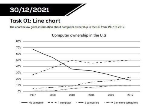
Band 5+: The chart below gives information about computer ownership in the US from 1997 to 2012.

Image for topic: The chart below gives information about computer ownership in the US from 1997 to 2012.
Our system will evaluate the answer based on this AI-generated description.
The image displays a line chart on computer ownership in the US from 1997 to 2012: No computer ownership started at 60% in 1997, declining to about 45% in 2000, further decreasing to just over 30% in 2003, dropping to roughly 25% in 2006, falling beneath 20% in 2009, and reaching around 10% in 2012. Ownership of 1 computer started at 25% in 1997, increased to near 40% in 2000, peaking above 50% in 2003, then dropping back to around 40% in 2006, stabilizing around 35% in 2009, and slightly decreasing to just under 30% in 2012. Ownership of 2 computers began at 10% in 1997, rose to about 15% in 2000, continued increasing to near 20% in 2003, maintained a similar level in 2006, rose slightly again in 2009, and peaked just below 30% in 2012. Ownership of 3 or more computers started at below 10% in 1997, minimally increased in 2000, gradually rose to about 10% in 2003, increased marginally to around 15% in 2006, rose to just below 20% in 2009, and further increased to approximately 25% in 2012.
Given the complexity of the image, the above description may not be entirely accurate.
Note: Both the topic and the answer were created by one of our users.

The line graph illustrates the percentage of computer ownership in the US between 1997 and 2012.

Overall, the proportion of households without a computer fell gradually over the period, whereas single-computer ownership experienced a dramatic increase and became the most common category by the end. Meanwhile, multiple-computer ownership rose only minimally throughout the period.

Focusing on highest trends, the zero-computer ownership started at near 69% in 1997. However, a figure decreased dramatically year by year at around 18% by the end of the period. As for the single-computer households, it was accounted around 28% in 1997, after that, this share increased noticeably to 50% and it peaked in 2003. By 2006, the percentage of single-computer ownership a slight decline to about 45%, before it increased to again 50% in 2012.

By contrast, the two-computer households and the multi-computer households began at around 5% and almost 1%, after which, both ownership increased apparently to over 22% and 10% throughout the period. baholachi

Word Count: 161

Answers On The Same Topic:

The chart below gives information about computer ownership in the US from 1997 to 2012.

The line graph gives information demonstates of how many people owning in the US between 1997 and 2012. Overall, the percentage of people who owned 1 2 and 3 or more computers increased while people who did not own computer decreased. In addition, most of them owned 1 computer at the give time. In 1997, […]

The chart below gives information about computer ownership in the US from 1997 to 2012.

The line chart illustrates changes in the percentage of computer ownership in the US over a 15-year period from 1997 to 2012. Overall, there was a clear upward trend in the proportion of Americans owning one or more computers, while the percentage of households without a computer declined significantly. Additionally, throughout the period, having just […]

The chart below gives information about computer ownership in the US from 1997 to 2012.

The line graph shows information about computer ownership in the US from 1997 to 2012. Overall, the number of people without a computer went down, while the number of people with computers went up. One computer became the highest group by the end of the period. In 1997, about 65% of people did not have […]

The chart below gives information about computer ownership in the US from 1997 to 2012.

The graph illsutrates data on owning computers in the US between 1997 and 2012. Overall, while without computers remained dominat at the beggining of the period, a figure that then declined significantly over the period. Several computer owneships opposed to without computer ownerships. At the beginning of the year, it had a lowest figure, but […]

See All

Other Topics:

Task 1: The graph below compares SAT math results according to gender from 1992 to 2000 in a particular school.

The line graph compares the average SAT math scores achieved by female and male students between 1992 to 2000. Overall, while the figure for male students almost always increased, the average scores by female students experienced a significant rise through years. In addition, male’s average scores was higher than that in female over the period. […]

The line graph below shows the changes in Vietnam's GDP growth from 2011 to 2025. Summarise the information by selecting and reporting the main features, and make comparisons where relevant.

The given line chart depicts the cycle of economic growth, measured in billion USD and estimated by GDP in Vietnam from 2011 to 2025. Overall, the economic landscape generally represents a pronounced signal of growth over the period, with the exception of the period between 2020 and 2021. The GDP witnessed a sudden sharp decline […]

The line graph shows distance covered in a 100-kilometer race between a tortoise and a hare.

The line graph illustrates the distance achieved over time in a 100-kilometer race between tortoise and a hare. Overall, the graph shows that a tortoise lead over a hare while the competition. In the begining a hare was very fast and covered 60 km distance from 0 to 4 hours. After that, the velocity of […]

The line graph shows distance covered in a 100-kilometer race between a tortoise and a hare.

The line graph illustrates the distance achieved over time in a 100-kilometer race between tortoise and a hare. Overall, the graph shows that a tortoise lead over a hare while the competition. In the begining a hare was very fast and covered 60 km distance from 0 to 4 hours. After that, the velocity of […]

The Graph shows information about the number of marriages in the UK from 1951 to 2001

The line graph illustrates the account of marraiages status in the united kingdom from 1951 to 2001.measured by thousands,there has three catagories: All marriages, Remarriages and First marriages. Overall,it can be seen that in 1981 was the maximum number of marriages and Remarriage. whereas in 2001 was the lowest number of marriage and Remarriage. Approximately, […]

The line graph shows the percentage of people in the UK with access to different types of recreational activities from 1996 to 2006.

The graph illustrates percentage of access to different types of recreational activities within the people in the UK. Overall, all types of activities experienced growth over the given period. Although, going to gym showed the most significant leap. Regarding 3 out of 4 recreational ativities: watching TV, listening to music and reading books experienced similar […]

See All
We have detected unusual activity on your device.
Please verify your identity to continue.
Note: This verification step won't sign you in. If you have a premium account, please log in to access the service as usual.
Google/Gmail Verification
Or verify using Email/Code
We've sent a verification code to:
youremail@gmail.com (Not your email?)
Enter it below to complete the verification process.
Ensure your email address is correct, your inbox is not full, and you check your spam folder. If no email arrives, consider using an alternative email.
You will need a Premium plan to perform your action!
Note: If you already have a premium account, please log in to access our services as usual.

Plans & Pricing

Our mission is to make quality education accessible for everyone.
However, to keep our hardworking team running and this service alive, we genuinely need your support!
By opting for a premium plan, not only do you sustain us in achieving the mission, but you also unlock advanced features to enrich your learning experience.

Free

For learners who aren't pressed for time

What's included on Free
100+ Cambridge IELTS Tests
Instant IELTS Writing Task 1 & 2 Evaluation (2 times/month)
Instant IELTS Speaking Part 1, 2, & 3 Evaluation (2 times/month)
Instant IELTS Writing Task 1 & 2 Essay Generator (2 times/month)
500+ Dictation & Shadowing Exercises
100+ Pronunciation Exercises
Flashcards
Other Advanced Tools

Premium

For those serious about advancing their English proficiency, and for IELTS candidates aspiring to boost their band score by 1-2 points (especially in writing & speaking) in just 30 days or less

What's included on Premium
Save Your IELTS Test Progress & Analyze Mistakes By Question Type
Save Your Own Flashcard Sets & Use Them On Any Device
Unlock All Courses, IELTS Tests, Section & Part Practice
Unlimited AI Conversations
Unlimited AI Writing Enhancement Exercises
Unlimited IELTS Writing Task 1 & 2 Evaluation
Unlimited IELTS Speaking Part 1, 2, & 3 Evaluation
Checked Answers Will Not Be Published
Unlimited IELTS Writing Task 1 & 2 Essay Generator
Unlimited IELTS Speaking Part 1, 2, & 3 Sample Generator
Unlimited Usage Of Advanced Tools & AI Features
Priority Support within 24h (12-month plan only)

Due to the nature of our service and the provided free trials, payments are non-refundable.