🔥 Today Only: Save 30% on Premium — Offer Ends Soon! - Upgrade Now!
Multiple Graphs

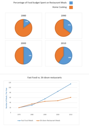
Band 5+: The charts below show the percentage of food budget the average Australian family spent on restaurant meals in different years. The graph shows the number of meals eaten in fast food restaurants and sit-down restaurants.

Image for topic: The charts below show the percentage of food budget the average Australian family spent on restaurant meals in different years. The graph shows the number of meals eaten in fast food restaurants and sit-down restaurants.
Our system will evaluate the answer based on this AI-generated description.
The image includes two main sections: pie charts and a line graph. The first set of four pie charts is titled "Percentage of Food Budget Spent on Restaurant Meals." For 1980, 85% is Home Cooking, 15% is Restaurant Meals; for 1990, 65% is Home Cooking, 35% is Restaurant Meals; for 2000, 50% is Home Cooking, 50% is Restaurant Meals; for 2010, 40% is Home Cooking, 60% is Restaurant Meals. The second section, a line graph, is titled "Fast Food vs. Sit-down Restaurants" and shows the number of meals per year. In 1970, Fast Food Meals are at approximately 20 and Sit-down Meals near 30. In 1980, Fast Food Meals reach about 50 and Sit-down Meals approximately 35. In 1990, Fast Food Meals hit 80 while Sit-down Meals are around 40. By 2000, Fast Food Meals soar to 90 and Sit-down Meals reach 50. In 2010, Fast Food Meals hit 120 whereas Sit-down Meals are around 60.
Given the complexity of the image, the above description may not be entirely accurate.
Note: Both the topic and the answer were created by one of our users.

The pie graph and the line graph illustrate the Austrian budget for food that were cooked whether at the restaurant or at home, and the number of meals were eaten in two different types of restaurants, respectively, from 1970 to 2010.

Overall, Australian taste was changing to restaurant meals over the period. Additionally, there was a growth in the number of meals were ordered from fast food as well as sit-down restaurant.

Based on the pie graph, the budget for outdoor meals climbed remarkably by exactly 45% during this period; however, the percentage of money that was spent on home cooked foods was dropped to 40%. At 2000, the Austrian budget to eat at cafeteria was as same as their financial plan to home made nutriment.

According to line graph, even though the number of meals which were eaten annually at fast food restaurant was as same as the sit-down restaurant at 1970, fast food restaurant took the first place by a significant gap, about 60 meals, at the end of the interval. Only at 1980, the number of healthy meals at exceed fast foods by about 5 meals.

Word Count: 189

Other Topics:

The graph and chart below give information about migration to the UK. The graph below shows how long immigrants in the year 2000-2008 intended to stay in the UK. And the pie-chart shows reasons for migration in 2008. Summarize the information by selecting and reporting the main features and make comparisons where relevant. Write at least 150 words.

The line graph and pie chart provides data about displacement to the United Kingdom from 2000 to 2008. The graph illustrates the estimated length of stay of foreign residents, while the chart demonstrates the factors behind migration to the UK in 2008. Overall, the number of migrants that palling to stay dramatically increased in two […]

The charts below show the reasons of students to study a particular in a UK university in the year 1987 and 2007. Summarise the information by selecting and reporting the main features, and make comparison where relevant.

The two maps illustrate that different factors of the students that affect to study in a particular university in UK in 1987 and 2007. Overall, relevant degree courses were the main driver for pursuing higher education in that university over the period with other determinants traili000ng distantly behinf in-terms of proportions. Additionally, now students prioritized […]

The pie chart and the line graph shows the workforce and the unemployment in Australia from 1996 to 2003. Summarize the information by selecting and reporting the main features and make comparison where relevant. (Mixed Charts)

The line graph and pie chart shows Australian workforce and uneployment from 1996 to 2003. The units are measured in percentage of the group. Overall, it is clear that unemployment fall significantly in Australia and pie chart shows there three group of people who works in Australia. In detail, pie chart have three groups of […]

The table below shows CO2 emissions for different forms of transport in the European Union. The Pie Chart shows the percentage of European Union funds being spent on different forms of transport. Write a report for a university lecturer describing the information shown below.

The first diagram shows an estimation of the grams of CO2 emissions per passenger kilometre depending on the commute. While the second chart indicates how much the European Union has financed transportation for six years. To start with, the highest CO2 emissions are produced through air transportation. Air pollution produces more than three quarters of […]

the charts below show the proportion of holidaymakers using four different types of accommodation in 3 diffent years

The pie charts illustrate the change in accommodation preferences of holidaygoers in the years 1988, 1998, and 2008. Overall, people opted to spend holidays with their families the most over the 30-year period. Additionally, while family staying and camping saw a reduction in preference, people increased their interest in hotels and rented apartments for their […]

WRITING TASK 1 Que. The table below shows CO2 emissions for different forms of transport in the European Union. The Pie Chart shows the percentage of European Union funds being spent on different forms of transport. Summarize the information by selecting and reporting the main features, and make comparisons where relevant. You should write at least 150 words.

The bar chart depicts the emission of CO2 from different forms of transport in the European Union, while the pie chart illustrates the percentage of funds spend on different transport by European Union. Looking from an overall perspective, it is readily apparent that the higher emission of CO2 is from air, while least emission is […]

See All
We have detected unusual activity on your device.
Please verify your identity to continue.
Note: This verification step won't sign you in. If you have a premium account, please log in to access the service as usual.
Google/Gmail Verification
Or verify using Email/Code
We've sent a verification code to:
youremail@gmail.com (Not your email?)
Enter it below to complete the verification process.
Ensure your email address is correct, your inbox is not full, and you check your spam folder. If no email arrives, consider using an alternative email.
You will need a Premium plan to perform your action!
Note: If you already have a premium account, please log in to access our services as usual.

Plans & Pricing

Our mission is to make quality education accessible for everyone.
However, to keep our hardworking team running and this service alive, we genuinely need your support!
By opting for a premium plan, not only do you sustain us in achieving the mission, but you also unlock advanced features to enrich your learning experience.

Free

For learners who aren't pressed for time

What's included on Free
100+ Cambridge IELTS Tests
Instant IELTS Writing Task 1 & 2 Evaluation (2 times/month)
Instant IELTS Speaking Part 1, 2, & 3 Evaluation (5 times/month)
Instant IELTS Writing Task 1 & 2 Essay Generator (2 times/month)
500+ Dictation & Shadowing Exercises
100+ Pronunciation Exercises
Flashcards
Other Advanced Tools

Premium

For those serious about advancing their English proficiency, and for IELTS candidates aspiring to boost their band score by 1-2 points (especially in writing & speaking) in just 30 days or less

What's included on Premium
Save Your IELTS Test Progress
Unlock All Courses & IELTS Tests
Unlimited AI Conversations
Unlimited AI Writing Enhancement Exercises
Unlimited IELTS Writing Task 1 & 2 Evaluation
Unlimited IELTS Speaking Part 1, 2, & 3 Evaluation
Checked Answers Will Not Be Published
Unlimited IELTS Writing Task 1 & 2 Essay Generator
Unlimited IELTS Speaking Part 1, 2, & 3 Sample Generator
Unlimited Usage Of Advanced Tools
Priority Support within 24h (12-month plan only)

Due to the nature of our service and the provided free trials, payments are non-refundable.
Nếu bạn là người Việt Nam và không có hoặc không muốn trả bằng credit/debit cards, bạn có thể thanh toán bằng phương thức chuyển khoản:


Chọn gói:
419,000₫ 277,000 ₫ cho gói 1 tháng (chỉ 9,233₫/ngày)
1,239,000₫ 597,000 ₫ cho gói 3 tháng (chỉ 6,633₫/ngày)
2,469,000₫ 1,027,000 ₫ cho gói 6 tháng (chỉ 5,706₫/ngày)
4,929,000₫ 1,417,000 ₫ cho gói 12 tháng (chỉ 3,936₫/ngày)


Sau khi chuyển khoản, vui lòng đợi trình duyệt tự động điều hướng bạn trở lại Engnovate và bạn sẽ ngay lập tức nhận được mã kích hoạt tài khoản premium.
Nếu có lỗi xảy ra, bạn có thể liên hệ với team thông qua một trong các phương thức: email đến helloengnovate@gmail.com hoặc nhắn tin qua facebook.com/engnovate.
Vì toàn bộ công cụ trên website đều có thể sử dụng thử miễn phí, Engnovate không hỗ trợ hoàn tiền.