Our system will evaluate the answer based on this AI-generated description.
The image depicts a line graph showing financial data over a period from the financial year ending June 30, 2012, to 2022. It presents four categories: Rates revenue, User charges, Borrowings, and Grants and subsidies. Rates revenue starts around $500 million in 2012 and appears to steadily increase annually to slightly below $2,500 million in 2022. User charges initially are approx. $650 million in 2012, growing relatively steadily to reach about $1,800 million in 2022. Borrowings begin about $750 million in 2012, fluctuate around this figure until about 2019, then appear to rise sharply, peaking near $1,500 million around 2020 before declining slightly to about $1,300 million by 2022. Grants and subsidies start at about $200 million in 2012, peak at around $800 million in 2018 and 2019, then fall to approximately $500 million by 2022. Each line in the graph shifts distinctly, reflecting different trajectories and peaks over these ten years.
Given the complexity of the image, the above description may not be entirely accurate.
Skyrocket your IELTS band score by 1-2 points in under a month with our premium plan!
Note: Both the topic and the answer were created by one of our users.
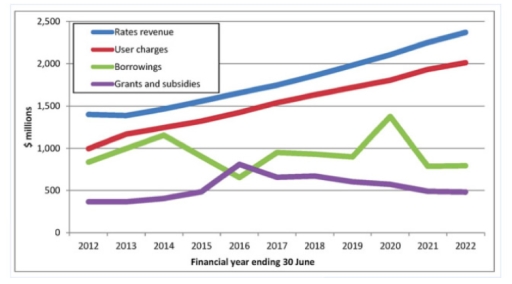
The line graph illustrates four financial sources for information technology companies in South America from 2012 to 2022.
Overall, at the beginning of the period, the rates revenue took the leading position, although at the end of the period, it was still at the highest point.
From 2012 to 2022, user charges showed a considerable increase without any decline, while the number of borrowings followed a fluctuation over the same period. In 2012, the quantity of borrowings went through a period of dramatic increase to nearly 900 million, before reducing gradually to about 600 million in 2016. After that, in 2020, it experienced a considerable rise to nearly 1,400 million dollars, after witnessing a period of stability to nearly 900 million in 2018. By 2021, there was a rapid decline in the number of borrowings to nearly 700 million, before it leveled out to about 600 million at the end of the year.
In the years between 2012 and 2022, the grants and subsidies showed minimal fluctuation, while the rates revenue demonstrated a dramatic growth over the whole period. At the beginning of the year, there was a slight increase in grants and subsidies to nearly 600 million, before witnessing a gradual increase. From 2016 to 2022, it went down slightly to nearly 500 million.
Word Count: 215