🔥 Today Only: Save 30% on Premium — Offer Ends Soon! - Upgrade Now!
Line Graph

Band 7+: The graph below shows the average monthly amount spent by households on four categories of food between 2005 and 2025.

Image for topic: The graph below shows the average monthly amount spent by households on four categories of food between 2005 and 2025.
Our system will evaluate the answer based on this AI-generated description.
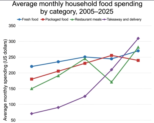
The image features a line graph titled "Average monthly household food spending by category, 2005–2025" with the vertical axis labeled "Average monthly spending (US dollars)" marked in increments of 50 from 50 to 350. Across five unlabeled horizontal points spanning the years 2005 to 2025, four categories are plotted: Fresh food, Packaged food, Restaurant meals, and Takeaway and delivery. At point 1 (2005), Fresh food is at approximately 221, Packaged food is at 180, Restaurant meals is at 150, and Takeaway and delivery is at 70. At point 2 (2010), Fresh food is at 235, Packaged food is at 205, Restaurant meals is at 191, and Takeaway and delivery is at 90. At point 3 (2015), Fresh food is at 250, Restaurant meals is at 245, Packaged food is at 230, and Takeaway and delivery is at 125. At point 4 (2020), Packaged food is at 255, Fresh food is at 245, Takeaway and delivery is at 210, and Restaurant meals is at 171. At point 5 (2025), Takeaway and delivery is at 310, Restaurant meals is at 282, Fresh food is at 270, and Packaged food is at 240.
Given the complexity of the image, the above description may not be entirely accurate.
Note: Both the topic and the answer were created by one of our users.

The line graph compares average monthly household food spending by four different categories from 2005 to 2025. The figures are given in dollars.

Overall, monthly spending on fresh food was the highest category, whereas takeaway and delivery was the lowest at the beginning of the period. Another noticeable feature is that all figures was recorded an upward trend.

At the beginning of the period, the figure for fresh food stood at approximately 225$, followed by packaged food at around 180$. The former then increased gradually to 250$ in 2015 before falling to 245$ in 2020, reaching a peak of 270$ in 2025. Over the same period, packaged food peaked at 255$ in 2020 and then fell to 240$.

Regarding the remaining categories, average monthly spending on restaurant meals started at 150$. Its figure then rose steadily to around 245$ and dropped to 170$ from 2015 to 2020 before reaching 275$ in the final year. An opposite pattern was seen in takeaway and delivery, It rose sharply from about 70$ to 310$, overtaking the other categories to become the highest at the end of the period.

Word Count: 185

Answers On The Same Topic:

The graph below shows the average monthly amount spent by households on four categories of food between 2005 and 2025.

The line graph compares average monthly household food spending by four different categories from 2005 to 2025. The figures are given in dollars. Overall, monthly spending on fresh food was the highest category, whereas takeaway and delivery was the lowest at the beginning of the period. Another noticeable feature is that all figures recorded an […]

See All

Other Topics:

The graph below shows the percentage of 18-25 years olds in universities in four different countries. Summarise the information by selecting and reporting the main feartures and make comparisons where relevant.

The line graph illustrates the proportion of university-going students across four Asian countries – Singapore, Malaysia, the Philippines, and Thailand – over a 50-year timeframe between 1961 and 2011. Overall, higher education enrollment rates experienced an upward trajectory across all four nations over the five-decade period. Although Thailand initially recorded the highest percentage of students, […]

The graph below shows the percentage of 18-25 years olds in universities in four different countries. Summarise the information by selecting and reporting the main feartures and make comparisons where relevant.

The line graph here depicts the percentage of university going students in four different countries- Singapore, Malaysia, Philippine and Thailand. Overall, the percentage has gradually increased over this period of 50 years, this shows a positive mindset among people about pursuing higher level education. Malaysia, having around 2.5% in 1961 and then experiencing a sudden […]

The line graph below illustrates average monthly carbon dioxide (CO2) emissions in three different countries (Country A, Country B, and Country C) from January to December 2025. Summarise the information by selecting and reporting the main features, and make comparisons where relevant.

The graph shows the amount of carbon dioxide emission measured in kilotons across A, B, and C countries in a year. Overall, country B has the highest peak point and country C has lowest peak in July. However it ends with a slightly different number from the beginning of the period. More over country A […]

The line graph below illustrates average monthly carbon dioxide (CO2) emissions in three different countries (Country A, Country B, and Country C) from January to December 2025.

The given line graph illustrates the amount of CO2 emissions produced by three countries in each month of 2025, measured in kilotons. Overall, Country A emissions increased significantly until July before declining towards the end of the year. On the other hand, Country C showed the opposite trend, while Country B remained relatively stable throughout […]

See All
We have detected unusual activity on your device.
Please verify your identity to continue.
Note: This verification step won't sign you in. If you have a premium account, please log in to access the service as usual.
Google/Gmail Verification
Or verify using Email/Code
We've sent a verification code to:
youremail@gmail.com (Not your email?)
Enter it below to complete the verification process.
Ensure your email address is correct, your inbox is not full, and you check your spam folder. If no email arrives, consider using an alternative email.
You will need a Premium plan to perform your action!
Note: If you already have a premium account, please log in to access our services as usual.

Plans & Pricing

Our mission is to make quality education accessible for everyone.
However, to keep our hardworking team running and this service alive, we genuinely need your support!
By opting for a premium plan, not only do you sustain us in achieving the mission, but you also unlock advanced features to enrich your learning experience.

Free

For learners who aren't pressed for time

What's included on Free
100+ Cambridge IELTS Tests
Instant IELTS Writing Task 1 & 2 Evaluation (2 times/month)
Instant IELTS Speaking Part 1, 2, & 3 Evaluation (2 times/month)
Instant IELTS Writing Task 1 & 2 Essay Generator (2 times/month)
500+ Dictation & Shadowing Exercises
100+ Pronunciation Exercises
Flashcards
Other Advanced Tools

Premium

For those serious about advancing their English proficiency, and for IELTS candidates aspiring to boost their band score by 1-2 points (especially in writing & speaking) in just 30 days or less

What's included on Premium
Save Your IELTS Test Progress & Analyze Mistakes By Question Type
Save Your Own Flashcard Sets & Use Them On Any Device
Unlock All Courses, IELTS Tests, Section & Part Practice
Unlimited AI Conversations
Unlimited AI Writing Enhancement Exercises
Unlimited IELTS Writing Task 1 & 2 Evaluation
Unlimited IELTS Speaking Part 1, 2, & 3 Evaluation
Checked Answers Will Not Be Published
Unlimited IELTS Writing Task 1 & 2 Essay Generator
Unlimited IELTS Speaking Part 1, 2, & 3 Sample Generator
Unlimited Usage Of Advanced Tools & AI Features
Priority Support within 24h (12-month plan only)

Due to the nature of our service and the provided free trials, payments are non-refundable.