🔥 Today Only: Save 30% on Premium — Offer Ends Soon! - Upgrade Now!
Bar Chart

Band 7+: The graph below shows the percentage change in places where students lived over five decades. Summarise the information by selecting and reporting the main features, and make comparisons where relevant

Image for topic: The graph below shows the percentage change in places where students lived over five decades. Summarise the information by selecting and reporting the main features, and make comparisons where relevant
Our system will evaluate the answer based on this AI-generated description.
The image depicts a bar chart illustrating student accommodation preferences in percentage from the 1960s to the 2000s. In the 1960s "At home with own family" stands at 68%, "Students hall of residence" at 22%, "Paying guest with a host family" is 8%, "Room in a shared house or flat with other students" is approximately 2%. The 1970s show "At home with own family" decreasing slightly to around 63%, "Students hall of residence" drops to 17%, "Paying guest with a host family" marginally increases to 9%, and "Room in a shared house or flat with other students" rises to around 11%. During the 1980s, a significant shift occurs with "At home with own family" plummeting to 48%, "Students hall of residence" increases to 26%, while "Paying guest with a host family" decreases slightly to 7%, and "Room in a shared house or flat with other students" surges to nearly 19%. In the 1990s, "At home with own family" continues to decrease to 43%, "Students hall of residence" sees a slight drop to 24%, "Paying guest with a host family" remains stable at 7%, and "Room in a shared house or flat with other students" increases to approximately 26%. In the 2000s, "At home with own family" slightly rises around 45%, "Students hall of residence" increases to 27%, "Paying guest with a host family" again remains stable at 7%, and "Room in a shared house or flat with other students" sees a small increase to just above 26%.
Given the complexity of the image, the above description may not be entirely accurate.
Note: Both the topic and the answer were created by one of our users.

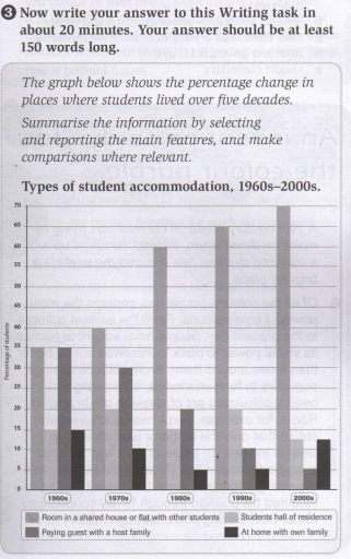
The bar graph illustrates the proportional differences between 4 types of student accommodations over a five-decade period from the 1960s to the 2000s.

Overall, in the 1960s, sharing houses with host families and with other peers were the most popular choices. Over the period, the former increased and reached the top in the 2000s, while the opposite was true with the latter category. Meanwhile, living in students’ apartments and staying with family experienced a slight decrease in the 2000s.

In the 1960s, staying with other students and with host families accounted for the highest percentage, both at 35%. However, the two categories experienced opposite trends. Whereas home-staying with other peers rose significantly and reached a peak of 70%, the portion of the other type dramatically declined to only 5% in the 2000s.

During the same period, living in the hall of residence fluctuated slightly before falling to 13% in the 2000s. Also, the ratio of students staying at their own houses mildly decreased from 15% to 12% in the 2000s.

Word Count: 170

Answers On The Same Topic:

The graph below shows the percentage change in places where students lived over five decades. Summarise the information by selecting and reporting the main features, and make comparisons where relevant

The graph illustrates changes in student accommodation preferences from the 1960s to the 2000s, showing the percentage of students in four types of living arrangements. The most striking trend is the sharp rise in students choosing to live as paying guests with host families. This figure almost doubled, from 40% in the 1960s to 75% […]

The graph below shows the percentage change in places where students lived over five decades. Summarise the information by selecting and reporting the main features, and make comparisons where relevant

The given bar bar chart illustrates the number of changes in some different types of accommodation chosen by students over a period of five decades. As can be seen, the majority of learners are more likely to live in a shared house or flat with other friends, as opposed to a downward tendency of three […]

The graph below shows the percentage change in places where students lived over five decades. Summarise the information by selecting and reporting the main features, and make comparisons where relevant

The graph a percentage changes in different types of accomodation between 1960 and 2000. Overall, the percentage of living in room or flat with other students grew every decade while the percenrage of other places where students lived decreased by 2000. In the middle of 19th century, living with other students was at the same […]

The graph below shows the percentage change in places where students lived over five decades. Summarise the information by selecting and reporting the main features, and make comparisons where relevant

The bar chart compares the proportion of students’ housing preferences between 1960s and 2000s. Overall, most categories experienced a steady decrease in popularity, with the only notable exception being shared houses with other students, which rose dramaticcaly. While both staying at home and living in the hall of residence showed minor fluctuations, the proportion of […]

The graph below shows the percentage change in places where students lived over five decades. Summarise the information by selecting and reporting the main features, and make comparisons where relevant

The graph illustrates the trends in students’ accommodation preferences over a span of five decades. Overall, the proportion of students opting to live in shared houses or flats with peers saw a significant rise, while the percentage of those staying as paying guests with host families declined considerably. Meanwhile, the figures for students living in […]

See All

Other Topics:

The following chart illustrates the results of a British survey taken in 2005 related to Housing preferences of UK people.

The bar chart illustrades the housing preferences of people in three UK cities: Liverpool, London and Manchester which based on a survey from 2009 Overall, most of people in Liverpool chose apartment while London and Manchester residents liked semi detached and detached house. Apartments were the preferred option in Liverpool, chosen by approximately 58%. It […]

The bar chart below shows the number of students who studied six different subjects at a university in 2025. Summarise the information by selecting and reporting the main features, and make comparisons where relevant.

The bar chart provides information about the number of students who studied six different subjects at a university in 2025. Overall, Engineering was by far the most popular subject, with History recording the lowest number of students. Medicine and Business were also relatively popular, while Arts and History had considerably fewer students than the other […]

The chart below gives information about Someland's main export in 2005, 2015 and future projection for 2025

The bar graph illustrates the clear data about the important export products and facilities of Someland in two different years, 2005 and 2015, and future projections for 2025. Overall, it is clear that dairy products and international tourism were much more profitable throughout the 20 years. In contrast, meat products decreased gradually over these years. […]

The chart below shows the average years that individuals in different age groups (25-34, 35-44) can stay in one job in Europe and the USA between 1985 and 2005

The bar chart illustrates how many years people in two age categories (25-34 and 35-44) stayed in one job in Europe and the USA from 1985 to 2005. Overall, it is clearly seen that older workers in both regions stayed in their jobs longer than younger ones throughout the entire period. Moreover, people in Europe […]

The following chart illustrates the results of a British survey taken in 2005 related to Housing preferences of UK people.

The bar graph demonstrates the preferences of people living in three major cities of the United Kingdom: Liverpool, London and Manchester with regard to four different types of accommodation, including apartments, terraced houses, detached houses, and semi-detached houses. Overall, apartments were the favorite type of accommodation in Liverpool, and semi-detached houses were the most popular […]

the chart below giver information how families spent their weekly income in between 1968 and 2018

The bar chart illustrates information about how families expend their weekly budget between the years 1968 and 2018. Overall, it’s clear that the highest percentage was in food (1968), wheras the lowest propotion was noticable in personal goals (2018). It’s significant to mentor that in the household goals was similar percentage in same years . […]

See All
We have detected unusual activity on your device.
Please verify your identity to continue.
Note: This verification step won't sign you in. If you have a premium account, please log in to access the service as usual.
Google/Gmail Verification
Or verify using Email/Code
We've sent a verification code to:
youremail@gmail.com (Not your email?)
Enter it below to complete the verification process.
Ensure your email address is correct, your inbox is not full, and you check your spam folder. If no email arrives, consider using an alternative email.
You will need a Premium plan to perform your action!
Note: If you already have a premium account, please log in to access our services as usual.

Plans & Pricing

Our mission is to make quality education accessible for everyone.
However, to keep our hardworking team running and this service alive, we genuinely need your support!
By opting for a premium plan, not only do you sustain us in achieving the mission, but you also unlock advanced features to enrich your learning experience.

Free

For learners who aren't pressed for time

What's included on Free
100+ Cambridge IELTS Tests
Instant IELTS Writing Task 1 & 2 Evaluation (2 times/month)
Instant IELTS Speaking Part 1, 2, & 3 Evaluation (2 times/month)
Instant IELTS Writing Task 1 & 2 Essay Generator (2 times/month)
500+ Dictation & Shadowing Exercises
100+ Pronunciation Exercises
Flashcards
Other Advanced Tools

Premium

For those serious about advancing their English proficiency, and for IELTS candidates aspiring to boost their band score by 1-2 points (especially in writing & speaking) in just 30 days or less

What's included on Premium
Save Your IELTS Test Progress & Analyze Mistakes By Question Type
Save Your Own Flashcard Sets & Use Them On Any Device
Unlock All Courses, IELTS Tests, Section & Part Practice
Unlimited AI Conversations
Unlimited AI Writing Enhancement Exercises
Unlimited IELTS Writing Task 1 & 2 Evaluation
Unlimited IELTS Speaking Part 1, 2, & 3 Evaluation
Checked Answers Will Not Be Published
Unlimited IELTS Writing Task 1 & 2 Essay Generator
Unlimited IELTS Speaking Part 1, 2, & 3 Sample Generator
Unlimited Usage Of Advanced Tools & AI Features
Priority Support within 24h (12-month plan only)

Due to the nature of our service and the provided free trials, payments are non-refundable.