🔥 Today Only: Save 30% on Premium — Offer Ends Soon! - Upgrade Now!
Line Graph

Band 7+: The graph below shows the population figures of different types of turtles in India between 1980 and 2012. Summarise the information by selecting and reporting the main features, and make comparisons where relevant. Write at least 150 words.

Image for topic: The graph below shows the population figures of different types of turtles in India between 1980 and 2012. Summarise the information by selecting and reporting the main features, and make comparisons where relevant. Write at least 150 words.
Our system will evaluate the answer based on this AI-generated description.
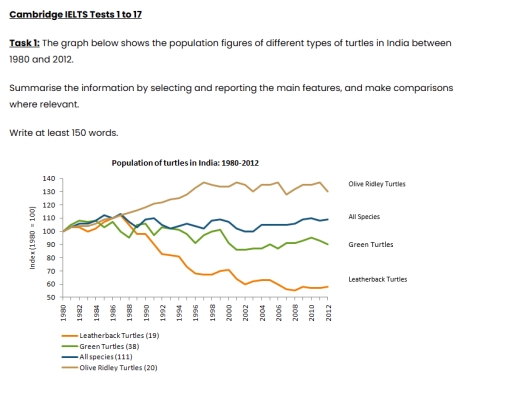
The image contains a line graph titled "Population of turtles in India: 1980-2012", which tracks four categories using an index where 1980 equals 100. Olive Ridley Turtles (initial count 20): starts at 100, then by year: 1982(~102), 1984(~105), 1986(~112), 1988(~115), 1990(~120), 1992(~125), 1994(~130), 1996(~138), 1998(~135), 2000(~138), 2002(~132), 2004(~135), 2006(~128), 2008(~134), 2010(~135), ending 2012(~132). All Species (111): starts at 100, then: 1982(~108), 1984(~110), 1986(~112), 1988(~105), 1990(~110), 1992(~102), 1994(~103), 1996(~102), 1998(~109), 2000(~105), 2002(100), 2004(~99), 2006(~104), 2008(~105), 2010(~105), ending 2012(~102). Green Turtles (38): starts at 100, then: 1982(~102), 1984(~105), 1986(~109), 1988(~95), 1990(~108), 1992(~98), 1994(~99), 1996(~91), 1998(100), 2000(~95), 2002(~87), 2004(~88), 2006(~87), 2008(~90), 2010(~95), ending 2012(~90). Leatherback Turtles (19): starts at 100, then: 1982(~105), 1984(~109), 1986(~112), 1988(98), 1990(99), 1992(83), 1994(81), 1996(~68), 1998(~67), 2000(~72), 2002(~60), 2004(~63), 2006(~58), 2008(~56), 2010(~58), ending 2012(~58).
Given the complexity of the image, the above description may not be entirely accurate.
Note: Both the topic and the answer were created by one of our users.

This line graph illustrates the population figures of three types of turtles and compares them with eachother and all species of turtles in india between the years of 1980 and 2012.

Overall, the Olive Ridley turtles grew to have the biggest population. The Green turtles stayed more or less at the same population with minor fluctuations over the years. The overall species also stayed fairly consistent. The Leatherback turtle’s population dropped dramatically in these 32 years.

The Olive Ridley turtle’s population grew steadily from 1980 to around 1997, after which it more or less levelled out, with minor ups and downs. it started at a popluation index of 100, like every other turtle species, in 1980 and ended up at slightly above 120 in 2012. The Green turtles and all the species showed fluctuations over the years but didn’t drop or rise too much overall. The Green turtles ended up at approximately 90 and all the species at a bit above 100 by 2012.

The leatherback turtles, while starting with a promising rise till 1986, saw a dramatic decline since then. By 2012, the Leatherback turtle population reached about 55, a little more than half of where it started.

Word Count: 199

Answers On The Same Topic:

The graph below shows the population figures of different types of turtles in India between 1980 and 2012. Summarise the information by selecting and reporting the main features, and make comparisons where relevant. Write at least 150 words.

The line chart illustrates India’s living number of different types of turtles from 1980 to 2012. Taken as a whole, the data indicate that all types of turtles were initially converged. However, the Oliver Ridley Turtles experienced an upward tendency, in contrast to Leatherback Turles, whose population went into free-fall. Other types erraticaly fluctuated, but […]

See All

Other Topics:

WRITING TASK 1 You should spend about 20 minutes on this task. The line graph below shows the percentage of households with internet access in three different countries between 2005 and 2015. Summarize the information by selecting and reporting the main features, and make comparisons where relevant. Write at least 150 words.

The line graph compares the percentage of households where the internet access was present accross three different countries in the given period of time. Overall, the highest percentage of households which had the internet access was from USA, while the proportion of households with internet access in Japan was the lowest. In terms of internet […]

The chart provides research on the number of times Australian adolescents ate fast food annually in twenty-five years, from 1975 to 2000.

The line graph illustrates the number of times in fast food consumptions by Australian teenagers between 1975 and 2000. Overall, it is clear to see from the chart that the consumption numbers of pizza and hamburgers increased significantly, while the numbers of fish decreased over the period. The data on hamburgers and pizza demonstrate a […]

The graph below shows the percentage of workers from five different European countries that were absent for a day or more due to illness from 1991 to 2001.

The graph illustrates the propotion of of workers from; Netherlands, France , Sweden, United Kingdom and Germany that were absent for a day or more due to illness from 1991 to 2000. Overall, Netherlands showed and increasing trend whereas Germany showcased a decreasing trend over the years. To begin with, Netherlands showed a dramatic rise […]

The graph below shows the average number of hours per week that teenagers in one country spent on four leisure activities between 2000 and 2020. Summarise the information by selecting and reporting the main features, and make comparisons where relevant.

The given graph depicts information about the average amount of time per week that teenagers in one country spend on four free-time activities between 2000 and 2020. Overall, four activities are illustrated in the graph: social media, television, reading and sport. The most remarkable features are the rapid growth of the figure for “Social media” […]

You should spend about 20 minutes on this task. The graph below gives information on the numbers of participants fordifferent activities at one social centre in Melbourne, Australia for the period2000 to 2020. Summarise the information by selecting and reporting the main featuresand make comparisons where relevant. Write at least 150 words.

The line graph illustrate the different numbers of attendees for different activities in Melbourne, Australia over the time period of twenty years from 2000 to 2020. Overall it is evident that most of the attendees took part in film club and highest figures recorded for these members are approximately 65 whereas intially, the lowest figures […]

See All
We have detected unusual activity on your device.
Please verify your identity to continue.
Note: This verification step won't sign you in. If you have a premium account, please log in to access the service as usual.
Google/Gmail Verification
Or verify using Email/Code
We've sent a verification code to:
youremail@gmail.com (Not your email?)
Enter it below to complete the verification process.
Ensure your email address is correct, your inbox is not full, and you check your spam folder. If no email arrives, consider using an alternative email.
You will need a Premium plan to perform your action!
Note: If you already have a premium account, please log in to access our services as usual.

Plans & Pricing

Our mission is to make quality education accessible for everyone.
However, to keep our hardworking team running and this service alive, we genuinely need your support!
By opting for a premium plan, not only do you sustain us in achieving the mission, but you also unlock advanced features to enrich your learning experience.

Free

For learners who aren't pressed for time

What's included on Free
100+ Cambridge IELTS Tests
Instant IELTS Writing Task 1 & 2 Evaluation (2 times/month)
Instant IELTS Speaking Part 1, 2, & 3 Evaluation (2 times/month)
Instant IELTS Writing Task 1 & 2 Essay Generator (2 times/month)
500+ Dictation & Shadowing Exercises
100+ Pronunciation Exercises
Flashcards
Other Advanced Tools

Premium

For those serious about advancing their English proficiency, and for IELTS candidates aspiring to boost their band score by 1-2 points (especially in writing & speaking) in just 30 days or less

What's included on Premium
Save Your IELTS Test Progress & Analyze Mistakes By Question Type
Save Your Own Flashcard Sets & Use Them On Any Device
Unlock All Courses, IELTS Tests, Section & Part Practice
Unlimited AI Conversations
Unlimited AI Writing Enhancement Exercises
Unlimited IELTS Writing Task 1 & 2 Evaluation
Unlimited IELTS Speaking Part 1, 2, & 3 Evaluation
Checked Answers Will Not Be Published
Unlimited IELTS Writing Task 1 & 2 Essay Generator
Unlimited IELTS Speaking Part 1, 2, & 3 Sample Generator
Unlimited Usage Of Advanced Tools & AI Features
Priority Support within 24h (12-month plan only)

Due to the nature of our service and the provided free trials, payments are non-refundable.