🔥 Today Only: Save 30% on Premium — Offer Ends Soon! - Upgrade Now!
Line Graph

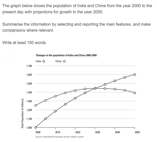
Band 4+: the graph below shows the population of India and china from the year 2000 to the present day with projects for growth to the year 2050

Image for topic: the graph below shows the population of India and china from the year 2000 to the present day with projects for growth to the year 2050
Our system will evaluate the answer based on this AI-generated description.
The image depicts a line graph titled "Changes in the population of India and China 2000-2050", contrasting the populations of India and China from 2000 with forecasts up to 2050. The x-axis indicates years at 10-year intervals from 2000 to 2050, whereas the y-axis measures population in millions from 1,000 to 1,700 in increments of 100. India’s population starts at approximately 1,050 million in 2000, climbing gradually to about 1,200 million by 2010, then to around 1,350 million by 2020, and is projected to reach about 1,500 million by 2030, close to 1,600 million by 2040, and roughly 1,700 million by 2050. China’s population begins at about 1,250 million in 2000, increases slightly to around 1,350 million by 2010, remains near this level by 2020, is forecasted to start a downward trend to approximately 1,320 million by 2030, about 1,280 million by 2040, and approximately about 1,250 million by 2050. The graph clearly projects India's ascending trajectory surpassing China around 2030, where China’s population peaks and then declines.
Given the complexity of the image, the above description may not be entirely accurate.
Note: Both the topic and the answer were created by one of our users.

The pictorial representation of the line graph illustartes the number of population in neighbouring countries , India and China from the year 2000 to the current date with incline for growth to the year 2050.Overall, a definetive trend towards higher population in India compared to China is an evident , though India has lower rate in the begining years , while China outnumber the India . However , Both the country intersects at a point in 2030 , straight after china experienced overall downfall , while India steadily rises and persisted untill 2050.

Looking at the detail, India started in 2000 at 1000 population, these continues with substanial incline from 2010 with rate of 1200 till it crossovers china with equal number of population of approximatley 1450 in year 2030 . However china countinues with same ratio in 2035.

On contrary , china started with powerful numbers almost around 1250 in 2000, these rosed to 1300 roughly in 2005 . Despite of these china accountes decline in ending years nearly from 1310 to 1290 in 2045 and 2050 respectively .

Word Count: 180

Answers On The Same Topic:

the graph below shows the population of India and china from the year 2000 to the present day with projects for growth to the year 2050

The line graph displays the number of people living in China and India since the year 2000 and predicts future trends. Overall, it is evident that the Chinese population was relatively bigger in the past but is expected to fall in the future. India’s, on the other hand, is continuously growing and is expected to […]

the graph below shows the population of India and china from the year 2000 to the present day with projects for growth to the year 2050

The chart illustrates the population of India and China between 2000 to present day with predictions for the trend in population in the year 2050. India experienced a linear growth in population throughout the review period. In the year 2000, 1 billion people called India home. The figures rose to 1.2 billion in 2010, a […]

the graph below shows the population of India and china from the year 2000 to the present day with projects for growth to the year 2050

The line graph below demonstrates the number of people living in China and India from 2000 up to 2025, including predictions until 2050. Overall, the population of the two given countries showed a steady increase over the period provided. At the start of the timeline, the population of China was noticeably higher than the number […]

the graph below shows the population of India and china from the year 2000 to the present day with projects for growth to the year 2050

The line graph compares the total number of citizens in billions of two countries from the year 2000 to current day with a prediction for growth until year 2050. Overall, India starts off with least change change in population. meanwhile, China ends with lowest change in population.. In more detail, Total Population of India starts […]

See All

Other Topics:

Number of books borrowed from four villages from four village libraries

The line graph illustrates how much books were taken from four different rural areas’ libraries from June to September. Overall, Ryeslip is the most interesting village in the beginning of the time period. West Eaton and Church Mount start in the same amount, while ending together. Sutton Wood fluctuated, and the peak amount accounted for […]

The line graph below gives informatiom about the number of visitors to three London museums between June and September 2013.

The line graph illustrates the quantity of holidaymakers who visited three types of museums: the British Museum, the Science Museum, and the Natural History Museum throughout four months in London in 2013. Overall, over the given period, the number of visitors to the British Museum and Science Museum showed an upward trend, while the amount […]

The line graph below gives informatiom about the number of visitors to three London museums between June and September 2013.

The line graph illustrates the quantity of holiday makers visited three types of Museum, British Museum, Science Museum and Natural History museum throughout four month in London in 2013. Overall, over the giver period, the number of visitors in British Museum and Science Museum showed a upward trend, while the amount for the Natural History […]

the chart below shows full-time employment of population ratios by age and gender

The given chart delineates full-time employment of population ratios by age and gender between the year 1980 to 2001. Overall, the male employment rate remained fairly higher than that for female, albeit it decreased over the period while the rate of employment for women marked an upward trajectory throughout the given time. In 1980, nearly […]

The graph below shows the average monthly percentage change in the prices of three metals over a twelve-month period in 2014. Summarise the information by selecting and reporting the main features, and make comparisons where relevant.

The line graph provides information about price’s changes of copper, nickel and zinc. Overall, the most striking feature is that all of three lines go down in the first half of the year and show rising in the second one. Turning to the details, Nickel decreases rapidly at the beginning of the period, but in […]

The graph below shows the average monthly change in the prices of three metals during 2014 Summarise the information by selecting and reporting the main features, and make comparisons.

The provided line graph illustrates the average monthly percentage changes in the prices of three metals – copper, nickel, and zinc – throughout the year 2014. Overall, all three metals experienced a downward trend in their monthly price changes during the half of the year, reaching their lowest point in June, before recovering towards the […]

See All
We have detected unusual activity on your device.
Please verify your identity to continue.
Note: This verification step won't sign you in. If you have a premium account, please log in to access the service as usual.
Google/Gmail Verification
Or verify using Email/Code
We've sent a verification code to:
youremail@gmail.com (Not your email?)
Enter it below to complete the verification process.
Ensure your email address is correct, your inbox is not full, and you check your spam folder. If no email arrives, consider using an alternative email.
You will need a Premium plan to perform your action!
Note: If you already have a premium account, please log in to access our services as usual.

Plans & Pricing

Our mission is to make quality education accessible for everyone.
However, to keep our hardworking team running and this service alive, we genuinely need your support!
By opting for a premium plan, not only do you sustain us in achieving the mission, but you also unlock advanced features to enrich your learning experience.

Free

For learners who aren't pressed for time

What's included on Free
100+ Cambridge IELTS Tests
Instant IELTS Writing Task 1 & 2 Evaluation (2 times/month)
Instant IELTS Speaking Part 1, 2, & 3 Evaluation (2 times/month)
Instant IELTS Writing Task 1 & 2 Essay Generator (2 times/month)
500+ Dictation & Shadowing Exercises
100+ Pronunciation Exercises
Flashcards
Other Advanced Tools

Premium

For those serious about advancing their English proficiency, and for IELTS candidates aspiring to boost their band score by 1-2 points (especially in writing & speaking) in just 30 days or less

What's included on Premium
Save Your IELTS Test Progress & Analyze Mistakes By Question Type
Save Your Own Flashcard Sets & Use Them On Any Device
Unlock All Courses, IELTS Tests, Section & Part Practice
Unlimited AI Conversations
Unlimited AI Writing Enhancement Exercises
Unlimited IELTS Writing Task 1 & 2 Evaluation
Unlimited IELTS Speaking Part 1, 2, & 3 Evaluation
Checked Answers Will Not Be Published
Unlimited IELTS Writing Task 1 & 2 Essay Generator
Unlimited IELTS Speaking Part 1, 2, & 3 Sample Generator
Unlimited Usage Of Advanced Tools & AI Features
Priority Support within 24h (12-month plan only)

Due to the nature of our service and the provided free trials, payments are non-refundable.