🔥 Today Only: Save 30% on Premium — Offer Ends Soon! - Upgrade Now!
Multiple Graphs

Band 4+: The graphs below provide information on global population figures and figures for urban populations in different world regions. Summarise the information by selecting and reporting the main features, and make comparisons where relevant

Image for topic: The graphs below provide information on global population figures and figures for urban populations in different world regions. Summarise the information by selecting and reporting the main features, and make comparisons where relevant
Our system will evaluate the answer based on this AI-generated description.
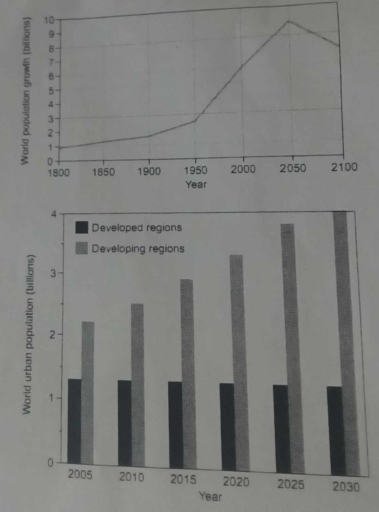
The image contains two graphs. The first graph, a line graph, displays the world population from 1800 to 2100 in billions, with points marked at 1800 (approximately 1 billion), 1900 (approximately 1.6 billion), 1950 (approximately 2.5 billion), 2000 (approximately 6 billion), 2050 (around 9 billion), and 2100 (a decline to about 7 billion). The second graph, a bar graph, shows the world urban population in billions, split into developed and developing regions from 2005 to 2030, with values for developed regions in 2005 (approximately 0.9 billion), 2010 (approximately 1 billion), 2015 (approximately 1.1 billion), 2020 (approximately 1.2 billion), 2025 (approximately 1.3 billion), 2030 (approximately 1.4 billion); and for developing regions in 2005 (approximately 1.8 billion), 2010 (approximately 2.2 billion), 2015 (approximately 2.6 billion), 2020 (approximately 3 billion), 2025 (approximately 3.4 billion), 2030 (approximately 3.8 billion).
Given the complexity of the image, the above description may not be entirely accurate.
Note: Both the topic and the answer were created by one of our users.

The bar chart provide key information for urban population among different areas around the world . The units are measured in million of people.

Overall, it is clear from the graph that from 2035 to 2040, the number of million people have a significant increase.in addition, the chart show a notable increase in developing areas approximately in 21 years, whereas developed areas the chart shows a consistent pattern of growth in people.

According to what is shown developing regions 2015 to 2020, the number of millions of people were more than than 2000. Meanwhile ,during 2025, developing regions have reached to 3000 approximately .

In terms of the population developed regions, the majority of million people show an equivalent number among the years. Compared to developing reigons which have a considerable increase in million of people since 2015 by 2500,while during 2025 the number of popultion have reached to 4000.

Word Count: 150

Answers On The Same Topic:

The graphs below provide information on global population figures and figures for urban populations in different world regions. Summarise the information by selecting and reporting the main features, and make comparisons where relevant

The line graph demonstrates the world population growth from 1800 until projection of year 2100, while the bar chart gives information about world urban residents in both developed and developing regions from 2005 until expectation of 2030. Both figures measured in billions. Overall, it is clear that although the urban citizens number increasing significantly over […]

The graphs below provide information on global population figures and figures for urban populations in different world regions. Summarise the information by selecting and reporting the main features, and make comparisons where relevant

The line graph illustrates data on global population and bar graph provided information for urban populations in different world areas. Overall, it clear that value of world population growth’ fluctuated, while population in developed regions remains same and in developing countries shows upward trend. To start with, in the beginning of the period world population […]

The graphs below provide information on global population figures and figures for urban populations in different world regions. Summarise the information by selecting and reporting the main features, and make comparisons where relevant

The line graph shows the population size across three centuries, from the 19th to the 21st. Meanwhile, the bar chart compares the population in two different regions of the globe (developed and developing regions) from 2015 to 2040. Overall, it is evident that the world population experienced a significant increase over the period, with a […]

The graphs below provide information on global population figures and figures for urban populations in different world regions. Summarise the information by selecting and reporting the main features, and make comparisons where relevant

The line graph shows how much population there was in three various centuries between 19th and 21st. Meanwhile, the bar chart compares the number of people in two different regions of globe (developed and developing regions) from 2015 to 2040. Overall, it is evident that the world population experienced a significant increase over the period, […]

See All

Other Topics:

The charts below show the results of surveys conducted among three target groups about different aspects of a public library.

The pie charts provide information on the outcomes of the survey carried out in a particular public library in 2006, showing the proportions of respondents by target groups and the the features of the library that received the most positive ratings. Overall, readers constituted the largest proportion of respondents, while that of citizens comprised the […]

The charts illustrate the proportion of place by birth of employment and the changes in unemployment level in Australia between 1993 and 2003 by sector.

The pie chart depicts the percentage of employees in Australia by birth place in 2003, while the line graph indicates the unemployment trends between people born in Australia, English speaking countries and Non-English speaking countries in a period of ten years, from 1993 to 2003. Overall, the job sector was dominated by the Australian borns […]

the charts below show the average money spent per customer on various types of equipment in a Canadian sports store. summarise the information by selecting and reporting the main features, and make comparison where relevant

These pie charts compare the mean amount of money spent by per customer on four distinct categories of sports gear at a Canadian retail outlet between 2000 and 2020. Overall, it is clear that football equipment consistently accounted for the largest share of customer spending in both years. Additionally, while expenditure on football and swimming […]

the bar charts below show the information about the population in a particular town in the UK from 1951 to 2011. summarise the information by selecting and reporting the main features, and make compariaon where relevant

The first bar chart compares the changes in total population in the particular town in the UK from 1951 to 2011, while the second bar chart shows the proportion of the five age groups. Overall, the figures for total population went up, with the percentage of 0-14 age group, 15-29 age group, and 65+ age […]

The bar chart below shows the percentage of people in five age groups in one city who exercised regularly in 2025. Summarise the information by selecting and reporting the main features, and make comparisons where relevant.

The graph illustrates the percentage of individuals doing workout regularly in five age groups, consisting of 18 to 25, 26 o 35, 36 to 45, and 56 to 65 years old, in 2025 Overall, the youngest group shows the highest proportion of people who exercise regularly, while the oldest group records the lowest percentage. The […]

the bar charts below show the information about the population in a particular town in the UK from 1951 to 2011. summarise the information by selecting and reporting the main features, and make compariaon where relevant

The first bar chart compares the changes in total population in the particular town in the UK from 1951 to 2011, while the second bar chart shows the proportion of the five age groups. Overall, the figures for total population went up, with the percentage of 0-14 age group, 15-29 age group, and 65+ age […]

See All
We have detected unusual activity on your device.
Please verify your identity to continue.
Note: This verification step won't sign you in. If you have a premium account, please log in to access the service as usual.
Google/Gmail Verification
Or verify using Email/Code
We've sent a verification code to:
youremail@gmail.com (Not your email?)
Enter it below to complete the verification process.
Ensure your email address is correct, your inbox is not full, and you check your spam folder. If no email arrives, consider using an alternative email.
You will need a Premium plan to perform your action!
Note: If you already have a premium account, please log in to access our services as usual.

Plans & Pricing

Our mission is to make quality education accessible for everyone.
However, to keep our hardworking team running and this service alive, we genuinely need your support!
By opting for a premium plan, not only do you sustain us in achieving the mission, but you also unlock advanced features to enrich your learning experience.

Free

For learners who aren't pressed for time

What's included on Free
100+ Cambridge IELTS Tests
Instant IELTS Writing Task 1 & 2 Evaluation (2 times/month)
Instant IELTS Speaking Part 1, 2, & 3 Evaluation (5 times/month)
Instant IELTS Writing Task 1 & 2 Essay Generator (2 times/month)
500+ Dictation & Shadowing Exercises
100+ Pronunciation Exercises
Flashcards
Other Advanced Tools

Premium

For those serious about advancing their English proficiency, and for IELTS candidates aspiring to boost their band score by 1-2 points (especially in writing & speaking) in just 30 days or less

What's included on Premium
Save Your IELTS Test Progress
Unlock All Courses & IELTS Tests
Unlimited AI Conversations
Unlimited AI Writing Enhancement Exercises
Unlimited IELTS Writing Task 1 & 2 Evaluation
Unlimited IELTS Speaking Part 1, 2, & 3 Evaluation
Checked Answers Will Not Be Published
Unlimited IELTS Writing Task 1 & 2 Essay Generator
Unlimited IELTS Speaking Part 1, 2, & 3 Sample Generator
Unlimited Usage Of Advanced Tools
Priority Support within 24h (12-month plan only)

Due to the nature of our service and the provided free trials, payments are non-refundable.
Nếu bạn là người Việt Nam và không có hoặc không muốn trả bằng credit/debit cards, bạn có thể thanh toán bằng phương thức chuyển khoản:


Chọn gói:
419,000₫ 277,000 ₫ cho gói 1 tháng (chỉ 9,233₫/ngày)
1,239,000₫ 597,000 ₫ cho gói 3 tháng (chỉ 6,633₫/ngày)
2,469,000₫ 1,027,000 ₫ cho gói 6 tháng (chỉ 5,706₫/ngày)
4,929,000₫ 1,417,000 ₫ cho gói 12 tháng (chỉ 3,936₫/ngày)


Sau khi chuyển khoản, vui lòng đợi trình duyệt tự động điều hướng bạn trở lại Engnovate và bạn sẽ ngay lập tức nhận được mã kích hoạt tài khoản premium.
Nếu có lỗi xảy ra, bạn có thể liên hệ với team thông qua một trong các phương thức: email đến helloengnovate@gmail.com hoặc nhắn tin qua facebook.com/engnovate.
Vì toàn bộ công cụ trên website đều có thể sử dụng thử miễn phí, Engnovate không hỗ trợ hoàn tiền.