Our system will evaluate the answer based on this AI-generated description.
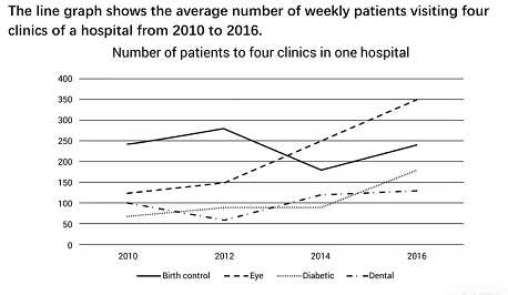
The image is a line graph with four lines representing the average number of weekly patients to four different clinics - Birth Control, Eye, Diabetic, and Dental - within one hospital from 2010 to 2016; the y-axis ranges from 0 to 400 in increments of 50, and the x-axis is marked at 2010, 2012, 2014, and 2016. The Birth Control clinic starts at approximately 50 patients in 2010, steadily increases to around 350 in 2014, and slightly drops to just below 350 in 2016. The Eye clinic starts at around 200 patients in 2010, remains consistent in 2012, drops to 150 in 2014, and then experiences a small increase to about 175 in 2016. The Diabetic clinic starts at approximately 175 patients in 2010, shows a slight increase to 200 in 2012, a decrease to around 125 in 2014, and a sharp increase to slightly below 350 in 2016. Lastly, the Dental clinic starts at roughly 150 patients in 2010, decreases slightly in 2012, increases to about 225 in 2014, and peaks at 300 in 2016.
Given the complexity of the image, the above description may not be entirely accurate.
Skyrocket your IELTS band score by 1-2 points in under a month with our premium plan!
Note: Both the topic and the answer were created by one of our users.
The line graph illustrates the number of patients visiting birth control, eye, diabetic and dental types of clinics between 2010 and 2016. Overall, it can be seen that during 6-year period the highest result was in eye clinics, while dental clinics were at least.
Eye clinics patients increased dramatically dental as well. Eye clinic’s patients stood at 125 in 2010, higher than diabetic and dental clinics. Then, it rose dramatically over the next 6 years. Dental clinic’s patients stood at 100 in 2010, then it was moderate rise.
Birth control stood at about 248. In 2014, it dropped at approximately 246. Diabetic sufferers stood at about 54. Between 2012 and 2014 it followed a similar pattern. In 2016, it rose slightly.
Word Count: 121
