🔥 Today Only: Save 30% on Premium — Offer Ends Soon! - Upgrade Now!
Line Graph

Band 8+: The line graph shows the global demand of different types of textile from 1980 to 2015.

Image for topic: The line graph shows the global demand of different types of textile from 1980 to 2015.
Our system will evaluate the answer based on this AI-generated description.
The image depicts a line graph showing total fiber demand in million tons from 1980 to 2015 for four types of fibers: Polyester, Cotton, Cellulosic, and Wool. Polyester starts at just above 10 million tons in 1980, increasing steadily to just below 20 million tons in 1995, followed by a steeper incline to nearly 80 million tons in 2015. Cotton begins at nearly 10 million tons in 1980, rising gradually to approximately 25 million tons in 2015. Cellulosic starts at 5 million tons in 1980, with modest growth to around 6 million tons in 1995, followed by a sharper rise to about 15 million tons in 2015. Wool displays the least growth, starting at roughly 3 million tons in 1980 and ending at around 4 million tons in 2015. The graph includes a horizontal axis marking years at five-year intervals and a vertical axis marking fiber demand from 0 to 80 million tons in increments of 10.
Given the complexity of the image, the above description may not be entirely accurate.
Note: Both the topic and the answer were created by one of our users.

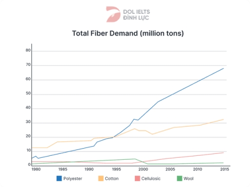
The line graph illustrates the global demand for fibers over a 35-year period from 1980 to 2015. Overall, it is evident from the graph that there was a notable increase in demand for polyester and cotton, whereas cellulosic and wool remained less popular during this timeframe.

In terms of polyester and cotton, at the beginning of the period, the demands for polyester and cotton were around 5 million and 15 million tons respectively. However, polyester overtook cotton around 1995 and significantly rose to nearly 70 million tons by 2015. Meanwhile, cotton demand also experienced a substantial increase to about 32 million tons by the end of the period.

On the other hand, cellulosic and wool saw different trends. Cellulosic fibers witnessed a slight increase from approximately 5 million to 10 million tons, whereas wool declined from about 5 million to 1 million tons. Both remained at relatively low levels throughout the entire period, staying below 10 million tons.

Word Count: 158

Answers On The Same Topic:

The line graph shows the global demand of different types of textile from 1980 to 2015.

The line graph illustrates data on the overall requirement of four different textiles between 1980 and 2015. Overall, the most popular fiber was polyester with a remarkable growth, while cellulosic and wool had the smallest numbers throughout the given period. To begin with the highest amounts, the demand for polyester was about 5 million tons […]

The line graph shows the global demand of different types of textile from 1980 to 2015.

The line chart depicts the worldwide requirement for multiple fabrics, including polyester, cotton, cellulosic and wool over the years between 1980 and 2015. Overall, while the popularity for polyester, cotton, and cellulosic gained an increase throughout the years, that of wool showed a decline. On the other hand, demand for polyester marked the highest at […]

The line graph shows the global demand of different types of textile from 1980 to 2015.

The given line chart depicts total fiber need of four materials including polyester, cotton, cellulosic and wool over the period between 1980 and 2015. From an overview, it is easy to see that cotton and polyester were upward trend, remaining type of fiber such as cellulosic and wool were downward trend. Especially that polyester increased […]

The line graph shows the global demand of different types of textile from 1980 to 2015.

The given line graph illustrates the demand for different types of textiles—namely polyester, cotton, cellulosic, and wool—between 1980 and 2015. Overall, the demand for most textiles increased over the period, with polyester showing the most significant growth. While cotton was the most used material at the beginning, polyester overtook it by the end. In contrast, […]

The line graph shows the global demand of different types of textile from 1980 to 2015.

The line graph delineates the global demand trends for four distinct textile fibers from 1980 to 2015. In summary, the analysis reveals a general upward trajectory in the demand for all textile fibers scrutinized, with the exception of wool, which exhibited minimal growth. Notably, polyester demand exhibited the most pronounced increase, establishing its dominance in […]

See All

Other Topics:

Writing task 1 The graph below shows the unemployment levels in Ireland and the number of people leaving the country between 1988 and 2008. Summarise the information by selecting and reporting the main features, and make comparisons where relevant.

The given line graph illustrates the ratio of unemployment and people ( in thousands) relocating to other country from Ireland in three decades ( 1988 – 2008) . Overall, the unemploument levels and people moving to other countries, both has decreased over the time with significant decrease of people relocating. In 1988, the 60% of […]

The graph shows data about the annual earnings of three bakeries in Calgary, 2000-2010.

The graph compares the yearly revenue of three bakeries in Calgary from 2000 to 2010. Overall, Mari Bakeshop experienced a marked decline over the period, while Amandine Bakery remained relatively stable initially before surging in the second half of the decade. Meanwhile, Bolo Cakery showed a steady upward trend throughout. In 2000, Mari Bakeshop earned […]

The chart below shows the changes that took place in three different areas of crime in Newport city centre from 2003-2012. Summarise the information by selecting and reporting the main features, and make comparisons where relevant.

The line graph compares changes in three types of crime in Newport city centre between 2003 and 2012. Overall, burglary and car theft showed a downward trend over the period, while robbery remained relatively stable. In addition, burglary was the most common type of crime throughout the period. On the one hand, the number of […]

The graph below shows the popularity of 2 shoe brand over a 10 year period. Summarise the information by selecting and reporting the main features, and make comparisons where relevant.

The line graph gives information about the popularity levels of two different shoe brands from 1990 to 2000, measured with points. Overall, it can be seen that both brands’ scores were fluctuating during the mentioned period. While BTrack has managed to increase its points significantly by 2000, L-tron could not keep up with the same […]

The line graph shows the trends in smartphone adoption among different age groups in Moscow between 2008 and 2019. Summarise the information by selecting and reporting the main features, and make comparisons where relevant.

The chart illustrates the changes in smartphone possession among 4 age groups, measured in percentages, in Moscow from 2008 to 2019. Overall, all figures experienced a upward trend, while 19-29 years old people were the most smartphone users for the most of the period. Nobody adopted a smartphone from other age groups until 2011. In […]

You should spend about 20 minutes on this task. The graph below shows the percentage of money spent on advertising in five types of media in France from 2010 and projected spending to 2040. Summarise the information by selecting and reporting the main features, and make comparisons where relevant. You should write at least 150 words. Writing Task 1

The line graph illustrates the proportion of advertising expenditure allocated to five types of media in France in 2010, together with projections up to 2040. Overall, internet and television are expected to dominate advertising spending by 2040, while traditional media such as newspapers, magazines, and radio will experience a significant decline. Television is forecast to […]

See All
We have detected unusual activity on your device.
Please verify your identity to continue.
Note: This verification step won't sign you in. If you have a premium account, please log in to access the service as usual.
Google/Gmail Verification
Or verify using Email/Code
We've sent a verification code to:
youremail@gmail.com (Not your email?)
Enter it below to complete the verification process.
Ensure your email address is correct, your inbox is not full, and you check your spam folder. If no email arrives, consider using an alternative email.
You will need a Premium plan to perform your action!
Note: If you already have a premium account, please log in to access our services as usual.

Plans & Pricing

Our mission is to make quality education accessible for everyone.
However, to keep our hardworking team running and this service alive, we genuinely need your support!
By opting for a premium plan, not only do you sustain us in achieving the mission, but you also unlock advanced features to enrich your learning experience.

Free

For learners who aren't pressed for time

What's included on Free
100+ Cambridge IELTS Tests
Instant IELTS Writing Task 1 & 2 Evaluation (2 times/month)
Instant IELTS Speaking Part 1, 2, & 3 Evaluation (5 times/month)
Instant IELTS Writing Task 1 & 2 Essay Generator (2 times/month)
500+ Dictation & Shadowing Exercises
100+ Pronunciation Exercises
Flashcards
Other Advanced Tools

Premium

For those serious about advancing their English proficiency, and for IELTS candidates aspiring to boost their band score by 1-2 points (especially in writing & speaking) in just 30 days or less

What's included on Premium
Save Your IELTS Test Progress
Unlock All Courses & IELTS Tests
Unlimited AI Conversations
Unlimited AI Writing Enhancement Exercises
Unlimited IELTS Writing Task 1 & 2 Evaluation
Unlimited IELTS Speaking Part 1, 2, & 3 Evaluation
Checked Answers Will Not Be Published
Unlimited IELTS Writing Task 1 & 2 Essay Generator
Unlimited IELTS Speaking Part 1, 2, & 3 Sample Generator
Unlimited Usage Of Advanced Tools
Priority Support within 24h (12-month plan only)

Due to the nature of our service and the provided free trials, payments are non-refundable.
Nếu bạn là người Việt Nam và không có hoặc không muốn trả bằng credit/debit cards, bạn có thể thanh toán bằng phương thức chuyển khoản:


Chọn gói:
419,000₫ 277,000 ₫ cho gói 1 tháng (chỉ 9,233₫/ngày)
1,239,000₫ 597,000 ₫ cho gói 3 tháng (chỉ 6,633₫/ngày)
2,469,000₫ 1,027,000 ₫ cho gói 6 tháng (chỉ 5,706₫/ngày)
4,929,000₫ 1,417,000 ₫ cho gói 12 tháng (chỉ 3,936₫/ngày)


Sau khi chuyển khoản, vui lòng đợi trình duyệt tự động điều hướng bạn trở lại Engnovate và bạn sẽ ngay lập tức nhận được mã kích hoạt tài khoản premium.
Nếu có lỗi xảy ra, bạn có thể liên hệ với team thông qua một trong các phương thức: email đến helloengnovate@gmail.com hoặc nhắn tin qua facebook.com/engnovate.
Vì toàn bộ công cụ trên website đều có thể sử dụng thử miễn phí, Engnovate không hỗ trợ hoàn tiền.