🔥 Today Only: Save 30% on Premium — Offer Ends Soon! - Upgrade Now!
Bar Chart

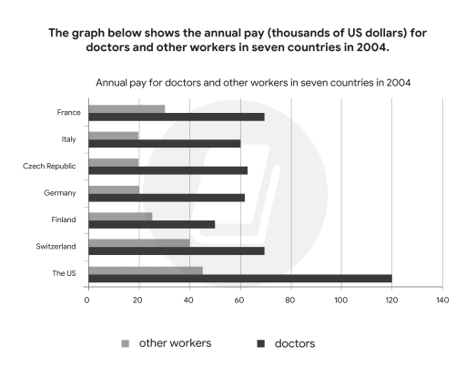
Band 7+: The chart below shows the annual pay (thousands of US dollars) for doctors and other workers in seven countries in 2004. Summarise the information by selecting and reporting the main features, and make comparisons where relevant.

Image for topic: The chart below shows the annual pay (thousands of US dollars) for doctors and other workers in seven countries in 2004. Summarise the information by selecting and reporting the main features, and make comparisons where relevant.
Our system will evaluate the answer based on this AI-generated description.
The image contains a bar graph showing the annual pay for doctors and other workers in seven countries in 2004, measured in thousands of US dollars. The countries represented are France, Italy, Czech Republic, Germany, Finland, Switzerland, and the US. In France, other workers earn just above 20, while doctors earn around 60. In Italy, other workers earn just below 20, while doctors earn around 60. The Czech Republic has other workers earning around 10, and doctors earning just above 40. Germany shows other workers earning around 20, while doctors earn over 40. Finland has other workers earning around 20, and doctors earning over 60. Switzerland displays other workers earning over 40, and doctors earning over 120. The US has other workers earning around 40, and doctors earning over 100. Two shades of bars represent the data, with lighter bars indicating other workers and darker bars indicating doctors. The x-axis is labeled from 0 to 140. The title of the graph is "Annual pay for doctors and other workers in seven countries in 2004".
Given the complexity of the image, the above description may not be entirely accurate.
Note: Both the topic and the answer were created by one of our users.

The chart depicts the data regarding the income (in thousands of US dollars) of doctors and other employees in seven different nations in 2004.

Overall, the chart highlights the significant differences among the examined figures. However, the most notable aspects involve the US statistics, which are the highest in both types of annual pay. In addition, the salary for doctors in all seven countries was much higher than that of other workers.

To begin with the figures for the US, Switzerland, and France, it is evident that the annual pay for doctors in the US ranked first at $120,000, followed by Switzerland and France, which were relatively similar, at around $70,000. Moreover, the income of other employees in the US also recorded the highest, at about $43,000, while those of Switzerland and France were $40,000 and $30,000, respectively.

Moving to the annual pay for doctors and other workers in Italy, the Czech Republic, Germany, and Finland, it is obvious that the data on Italy, the Czech Republic, and Germany were equal to each other, with around $60,000 for doctors and $20,000 for other workers, while those of Finland were quite different. Despite having a lower salary for doctors at approximately $50,000, Finland paid higher for other workers at around $23,000, compared to the three former countries.

Word Count: 216

Answers On The Same Topic:

The chart below shows the annual pay (thousands of US dollars) for doctors and other workers in seven countries in 2004. Summarise the information by selecting and reporting the main features, and make comparisons where relevant.

The graph shows the yearly pay for medical practitioners and other workers in the US and six European countries in 2004. Overall, in all countries pay for doctors more than other jobs, and the US pay highest salary for both doctors and other workers. Doctor’s lowest salary in Finland and other workers’ in Germany. The […]

The chart below shows the annual pay (thousands of US dollars) for doctors and other workers in seven countries in 2004. Summarise the information by selecting and reporting the main features, and make comparisons where relevant.

The bar chart illustrates how the occupational earnings for doctors and other workers varied across seven nations in 2004. Overall, physicians consistently commanded higher salaries than other professionals in all countries surveyed. The United States topped the list for both doctors and other workers in terms of annual income. Doctors’ annual salaries exhibited a wide […]

The chart below shows the annual pay (thousands of US dollars) for doctors and other workers in seven countries in 2004. Summarise the information by selecting and reporting the main features, and make comparisons where relevant.

The bar chart below gives information about the salary of doctors and other workers received per year from 7 distinct countries in the year of 2004. In general, The US holds the biggest pay for doctors, in contrast to Italy, Czech Republic, Germany all of which hit a low of payment for other workers. Noticeably, […]

The chart below shows the annual pay (thousands of US dollars) for doctors and other workers in seven countries in 2004. Summarise the information by selecting and reporting the main features, and make comparisons where relevant.

The chart given illustrates the annual salary earned by doctors and other careers in seven different nations in the year 2004. Overall, it is clear that the annual wage for doctors was much higher than for other occupations. Moreover, the biggest amount of money paid for doctors and other jobs was recorded in the US. […]

The chart below shows the annual pay (thousands of US dollars) for doctors and other workers in seven countries in 2004. Summarise the information by selecting and reporting the main features, and make comparisons where relevant.

he bar chart gives information about the yearly salaries of doctors compared to other professions across various countries in 2004. Overall, the US was the top payer for both doctors and other workers, while salaries in Italy, the Czech Republic, and Germany were relatively similar. Additionally, doctors received significantly higher annual pay than people doing […]

See All

Other Topics:

Percentae of People who ate five portions of fruit and vegetables

The given chart illustrates the proportion people in Uk who ate five portion of fruits and vegetables per day between 2001 and 2008. Overall,the percentage of women is the highest from the other consumers, In contrast the children is the lowest consumer. In the Begining three years the proportion of men is levelled of upto […]

The bar chart shows the number of visits to a community website in the first and second years of use Number of visits to a community website: First and second years of use

The bar chart illustrates how many visits a community website RECEIVE in the first and second years of use. Overall, website traffic was significantly higher in the second year, with the peak number of visits occurring in June and July. In January, the number of visits between the two years shows the most significant gap, […]

The chart illustrates the percentage of male and female executives in six different types of profession across the UK in 2007. Summarise the information by selecting and reporting the main features, and make comparisons where necessary. Write at least 150 words.

The bar graph shows the percentage of woman and man executives in six different field among the UK in 2007. Overall, while the highest rate which is 90 % is construction profession, the lowest rate which 10% is teaching in male. On the contrary, while women are most represented in the field of teaching which […]

The chart below shows the average price per kilo of clothing imported into the European Union from seven major countries of origin in 1997 and 2003. Summarise the information by selecting and reporting the main features, and make comparisons where relevant. Write at least 150 words.

The bar chart compares the prices of imported clothing per kilometre into the European Union from Argentina, Brazil, Japan, China, India and Bangladesh in 1993 and 2003. Overall, the prices was the highest in Argentina and Brazil in both years .In contrast, Bangladesh experienced the lowest price. Prices in Japan fell slightly and Brazil’s remained […]

The chart below shows the percentage of people who are ate five portions of fruit and vegetables per day in the UK from 2001 to 2008.

The bar chart illustrates the percentage of men, women and children who consumed five portions of fruit and vegetables per day in the UK over an eight-year period from 2001 to 2008. Overall, women had the highest percentage throughout the period, while children had the lowest. The percentage of people who consumed five portions generally […]

The chart below shows the amount of greenhouse gas emissions produced by different sectors in the UK in 2010 and 2020. Summarise the information by selecting and reporting the main features and make comparisons where relevant.

The provided bar chart depicts the quantities of emitted gas measured in Million tonnes CO2 by energy supply , transport, buisness , residential and agriculture sectors in uk in 2010 and 2020. Overall , Almost all the sections recorded a slight decrease in gas emission wheras agriculture maintained the same level during the given period. […]

See All
We have detected unusual activity on your device.
Please verify your identity to continue.
Note: This verification step won't sign you in. If you have a premium account, please log in to access the service as usual.
Google/Gmail Verification
Or verify using Email/Code
We've sent a verification code to:
youremail@gmail.com (Not your email?)
Enter it below to complete the verification process.
Ensure your email address is correct, your inbox is not full, and you check your spam folder. If no email arrives, consider using an alternative email.
You will need a Premium plan to perform your action!
Note: If you already have a premium account, please log in to access our services as usual.

Plans & Pricing

Our mission is to make quality education accessible for everyone.
However, to keep our hardworking team running and this service alive, we genuinely need your support!
By opting for a premium plan, not only do you sustain us in achieving the mission, but you also unlock advanced features to enrich your learning experience.

Free

For learners who aren't pressed for time

What's included on Free
100+ Cambridge IELTS Tests
Instant IELTS Writing Task 1 & 2 Evaluation (2 times/month)
Instant IELTS Speaking Part 1, 2, & 3 Evaluation (2 times/month)
Instant IELTS Writing Task 1 & 2 Essay Generator (2 times/month)
500+ Dictation & Shadowing Exercises
100+ Pronunciation Exercises
Flashcards
Other Advanced Tools

Premium

For those serious about advancing their English proficiency, and for IELTS candidates aspiring to boost their band score by 1-2 points (especially in writing & speaking) in just 30 days or less

What's included on Premium
Save Your IELTS Test Progress & Analyze Mistakes By Question Type
Save Your Own Flashcard Sets & Use Them On Any Device
Unlock All Courses, IELTS Tests, Section & Part Practice
Unlimited AI Conversations
Unlimited AI Writing Enhancement Exercises
Unlimited IELTS Writing Task 1 & 2 Evaluation
Unlimited IELTS Speaking Part 1, 2, & 3 Evaluation
Checked Answers Will Not Be Published
Unlimited IELTS Writing Task 1 & 2 Essay Generator
Unlimited IELTS Speaking Part 1, 2, & 3 Sample Generator
Unlimited Usage Of Advanced Tools & AI Features
Priority Support within 24h (12-month plan only)

Due to the nature of our service and the provided free trials, payments are non-refundable.