🔥 Today Only: Save 30% on Premium — Offer Ends Soon! - Upgrade Now!
Bar Chart

Band 4+: The chart below shows the number of households in the US by their annual income in 2007, 2022 and 2015. Summarise the information by selecting and reporting the main features and make comparisons where relevant.

Image for topic: The chart below shows the number of households in the US by their annual income in 2007, 2022 and 2015. Summarise the information by selecting and reporting the main features and make comparisons where relevant.
Our system will evaluate the answer based on this AI-generated description.
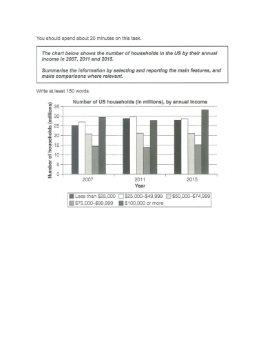
The image is a bar chart showing the number of US households (in millions) by annual income in 2007, 2011, and 2015. There are four income categories: Less than $25,000; $25,000-$49,999; $50,000-$74,999; $75,000-$99,999; $100,000 or more. In 2007, households earning less than $25,000 were approximately 22 million, $25,000-$49,999 were around 28 million, $50,000-$74,999 were about 26 million, $75,000-$99,999 were close to 16 million, and $100,000 or more were roughly 19 million. In 2011, less than $25,000 increased slightly above 22 million, $25,000-$49,999 remained around 28 million, $50,000-$74,999 dropped below 26 million, $75,000-$99,999 decreased to about 15 million, and $100,000 or more rose slightly above 19 million. In 2015, less than $25,000 decreased to about 21 million, $25,000-$49,999 reduced slightly below 28 million, $50,000-$74,999 increased above 25 million, $75,000-$99,999 rose to just below 16 million, and $100,000 or more grew to approximately 23 million.
Given the complexity of the image, the above description may not be entirely accurate.
Note: Both the topic and the answer were created by one of our users.

The given bar chart illustrates the number of household of US by their yearly income.

Overall, the number of household income with $100000 or more increased throughout the given period. However, the number of households with annual income of $75000 to $99999 shows a little bit of fluctuation. Meanwhile the number of households with income of $50000 to $74999 remained constant.

In 2007 the number of households with income of less than $25000 was 25 million.However, the number of households with income of $25000 to $49999 was over 25 million and was increased to 30 million in 2011 respectively. The number of households with income of $100000 or more was close to 30 million.

Meanwhile, the number of household with income of $50000 to $74999 remained the same in the given time period at bit over 20 million. Although the number of household with annual income of $75000 to $99999 showed a little bit fluctuation. However in 2015 the number of house with 0000 was over 30 million and the households with income of less than $25000 and with $25000 to $49999 was 26 million and 28 million accordingly.

Word Count: 189

Answers On The Same Topic:

The chart below shows the number of households in the US by their annual income in 2007, 2022 and 2015. Summarise the information by selecting and reporting the main features and make comparisons where relevant.

The bar chart compares the number of households in five different categories in the US by their annual income in 2007,2011 and 2015 . It is clear that the highest number of US households by yearly income in 100000 and more. By contrast, the lowest proportion of expenditure on 75000-99999$ throughout the period. In terms […]

The chart below shows the number of households in the US by their annual income in 2007, 2022 and 2015. Summarise the information by selecting and reporting the main features and make comparisons where relevant.

The bar chart compares the number of households in five different categories in the US by their annual income in 2007 , 2011 and 2015 . It is clear that the highest number of US households by yearly income in 100000 and more. By contrast, the lowest proportion of expenditure on 75000-99999$ throughout the period. […]

The chart below shows the number of households in the US by their annual income in 2007, 2022 and 2015. Summarise the information by selecting and reporting the main features and make comparisons where relevant.

The provided statistical chart illustrates the population of households residing in the United States, divided with respect to their yearly income in different time frames. Overall, the main participants of the competition have been those with salaries of below $25,000, between $25,000 and $49,999, and $100,000 or more, having stayed as the most populated classes […]

The chart below shows the number of households in the US by their annual income in 2007, 2022 and 2015. Summarise the information by selecting and reporting the main features and make comparisons where relevant.

The data provides a bar chart that compares US households by their annual income in three different years, from 2007, 2011, to 2015. Overall, the comparison of data in 2007, 2011, and 2015 shows no drastic change in proportion between the five groups of US households categorised by their annual income. The category of US […]

See All

Other Topics:

The chart below shows the main reasons why people choose to make or break friendship connections on a popular social media site. Summarise the information by selecting and reporting the main features, and make comparisons where relevant.

The bar chart compares the main factors that lead people to add or remove friends on a popular social networking site. Overall, personal connections from everyday life dominate the reasons for making friends online, while negative behaviour is the primary cause of unfriending. In terms of adding friends, knowing someone in real life is by […]

Task 1: The bar chart below shows the percentage of share of total world production by Asia, Europe and other parts of the world from the years 1840 to 2000.

The provided bar graph compares the proportion of share of total world production in Asia, Europe and other parts of the world between 1840 and 2000. Overall, what stands out is that with the exception of the rest of the world experienced an upward trend, albeit to varying extents and fluctuations, while Asia and Europe […]

The chart below shows the main reasons why people choose to make or break friendship connections on a popular social media site. Summarise the information by selecting and reporting the main features, and make comparisons where relevant.

The bar chart compares the main factors that lead people to add or remove friends on a popular social networking site. Overall, personal connections from everyday life dominate the reasons for making friends online, while negative behaviour is the primary cause of unfriending. In terms of adding friends, knowing someone in real life is by […]

The graph shows the percentage of males aged 16-25 in a particular country who prefer watching sports to males who prefer participating in sports. Summarise the information by selecting and reporting the main features and make comparisons where relevant.

The bar chart compares the percentages of males aged 16-25 in a particular country who preferred watching six different sports with those who actually participated in them. Overall, watching sports was more popular than participating in most cases. Football and horse riding attracted the highest proportions of viewers, whereas fishing was the only sport in […]

The bar chart below provides information about energy generation from fossil fuels, nuclear and renewables in 2024. Summarise the information by selecting and reporting the main features, and make comparisons where relevant.

The graph shows sources of electricity generation in the year 2024 by different countries which are represented on the Y-axis while on the X-axis we have the % production of electricity. Africa has the highest presentation of fossil fuels represented at 75% while south America has the least percentage at 22 %. Asia comes second […]

The bar chart below shows the percentage of New Zealander men and women who did regular physical activity in 2010 across different age groups. Summarise the information by selecting and reporting the main features, and make comparisons where relevant.

The bar chart demonstrates a comparison of New Zealander individuals who were regularly active across age groups for 2010. Overall, males showed a downward trend in activity level from age range 34 to 63, Whereas females revealed an upward trend across the same ages. In 2010, figures for men and women in 64-and-over age group […]

See All
We have detected unusual activity on your device.
Please verify your identity to continue.
Note: This verification step won't sign you in. If you have a premium account, please log in to access the service as usual.
Google/Gmail Verification
Or verify using Email/Code
We've sent a verification code to:
youremail@gmail.com (Not your email?)
Enter it below to complete the verification process.
Ensure your email address is correct, your inbox is not full, and you check your spam folder. If no email arrives, consider using an alternative email.
You will need a Premium plan to perform your action!
Note: If you already have a premium account, please log in to access our services as usual.

Plans & Pricing

Our mission is to make quality education accessible for everyone.
However, to keep our hardworking team running and this service alive, we genuinely need your support!
By opting for a premium plan, not only do you sustain us in achieving the mission, but you also unlock advanced features to enrich your learning experience.

Free

For learners who aren't pressed for time

What's included on Free
100+ Cambridge IELTS Tests
Instant IELTS Writing Task 1 & 2 Evaluation (2 times/month)
Instant IELTS Speaking Part 1, 2, & 3 Evaluation (2 times/month)
Instant IELTS Writing Task 1 & 2 Essay Generator (2 times/month)
500+ Dictation & Shadowing Exercises
100+ Pronunciation Exercises
Flashcards
Other Advanced Tools

Premium

For those serious about advancing their English proficiency, and for IELTS candidates aspiring to boost their band score by 1-2 points (especially in writing & speaking) in just 30 days or less

What's included on Premium
Save Your IELTS Test Progress & Analyze Mistakes By Question Type
Save Your Own Flashcard Sets & Use Them On Any Device
Unlock All Courses, IELTS Tests, Section & Part Practice
Unlimited AI Conversations
Unlimited AI Writing Enhancement Exercises
Unlimited IELTS Writing Task 1 & 2 Evaluation
Unlimited IELTS Speaking Part 1, 2, & 3 Evaluation
Checked Answers Will Not Be Published
Unlimited IELTS Writing Task 1 & 2 Essay Generator
Unlimited IELTS Speaking Part 1, 2, & 3 Sample Generator
Unlimited Usage Of Advanced Tools & AI Features
Priority Support within 24h (12-month plan only)

Due to the nature of our service and the provided free trials, payments are non-refundable.