🔥 Today Only: Save 30% on Premium — Offer Ends Soon! - Upgrade Now!
Bar Chart

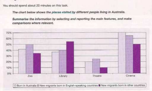
Band 5+: The chart below shows the places visited by different places living in Australia.

Image for topic: The chart below shows the places visited by different places living in Australia.
Our system will evaluate the answer based on this AI-generated description.
The image shows a bar graph with four categories: Zoo, Library, Theatre, and Cinema, with three different groups represented: Born in Australia, New migrants born in English-speaking countries, and New migrants born in other countries. For the Zoo category, Born in Australia group is around 28%, New migrants born in English-speaking countries is around 25%, and New migrants born in other countries is around 20%. For the Library category, Born in Australia group is around 45%, New migrants born in English-speaking countries is around 40%, and New migrants born in other countries is around 35%. For the Theatre category, Born in Australia group is around 25%, New migrants born in English-speaking countries is around 15%, and New migrants born in other countries is around 10%. For the Cinema category, Born in Australia group is around 65%, New migrants born in English-speaking countries is around 48%, and New migrants born in other countries is around 55%. The graph shows that the Born in Australia group consistently has a higher percentage in all categories.
Given the complexity of the image, the above description may not be entirely accurate.
Note: Both the topic and the answer were created by one of our users.

The bar chart depicts 4 places which visited by variety people who live in Australia. overall cinema had enormous visitors who were born in Australia and new migrants in English countries, while theater had the lowest visitors rather than other places.

According to the chart 50% of new migrants in English countries visited of zoo while the people who were born in Australia was 10% lower than new migrants in English countries in the percentage of migrants are in the other countries was between 30% and 40%, moreover the percent of visitors of library whom born in Australia and migrants warning English countries had the lowest difference, however the number of visit head many gaps between zoo and library but the cinema had the most visit by people who born in Australia and migrants in English countries.

Theatre was a place which had lowest visit with 20 per cent people who born in Australia and new migrants born in other countries with 10 per cent lower than Australian people.

Word Count: 169

Answers On The Same Topic:

The chart below shows the places visited by different places living in Australia.

The chart depicts the destinations visited by various groups of people living in Australia. Overall, it is clear that cinema was mostly visited and preferred among most groups, whereas theatre turned out to be less desirable. Regarding the most popular entertainment options, the Library saw the highest rates of attendance for new migrants born in […]

The chart below shows the places visited by different places living in Australia.

The given bar chart illustrates location attended by various residents in Australia. Overall, it seems that the most frequented place was cinema by new migrants born in English speaking countries, with 70% of the sanctification, while the lowest indicator was theater was 10% visits by new migrants born in other countries. First new immigrants born […]

The chart below shows the places visited by different places living in Australia.

The bar chart compares the proportions of people living in Australia, categorized into three groups, who visited four recreational places: the zoo, the library, the theatre and the cinema. Overall, it is clear that the cinema was the most popular place among all groups. In contrast, the theatre was visited by the smallest proportion of […]

The chart below shows the places visited by different places living in Australia.

The chart illustrates the percentage of different people visiting four places in Australia. Overall, all places showed varying rates of visits, with Cinema accounting for the highest percentage. Notably, while people from Australia attended Cinema more than anyone, new migrants from another countries recorded the least amount of visits in theatre. On the one hand, […]

The chart below shows the places visited by different places living in Australia.

The bar graph illustrates the proportions of people in Australia who visited cultural or leisure venues during their free time in 2010, grouped by birthplace. Overall, cinemas were the most popular facilities among both Australian-born native Australians and new migrants, while theatres were the least well-attended. In most venues, native-born Australians recorded higher attendance rates […]

See All

Other Topics:

The bar chart shows the information of the number of volunteers and paid workers in 4 different roles in the sport sector of an australian town in 2015

The chart gives information on the number of paid workers and volunteers in four different roles in the sports sector in Australia in 2015. Overall, the number of volunteers were higher in all different roles, while the number of paid workers were almost the same. Volunteers and paid workers were more in coaching compared to […]

The bar chart below shows the number of male and female fans of five K-Pop bands in Mongolia in 2024.

The bar chart illustrates the number of boy and girl fans of BTS, BLACKPINK, EXO, SEVENTEEN AND TWICE bands in Mongolia in the year in 2024. Overall, Blackpink had the highest number of female fan. EXO has the lowest girl supporter. While, Seventeen has the largest fan club of boy then twice has the smallest […]

The chart below shows the percentage of boys and girls in one country who played various sports in 2010

The bar chart compares the proportion of joiners in two genders across six different types of sport in a certain country in 2010. Overall, the total rate of male participants outnumbered that of females. Specifically, boys dominated in football, tennis, basketball and cricket while the opposite was true for swimming and netball. In addition, swimming […]

The graph below shows the result of a survey of young people in four European countries on the most effective solution of global warming. Summarize information making comparisons where relevant.

The bar chart illustrates the prevention of climate change where they survey on youth in four european countries, portugal,spain italy,netherlands. Overall, the best solution of all the european country to tackle global warming was lifestyle changes on younger people. While, the least effective way was none of these in the all countries. Government policies are […]

The bar chart shows information about the favorite subjects of students from two middle schools, school A and school B

The bar chart compares the number of students from two different middle schools who chose their favourite subjects. Overall, the vast majority of School A students opt for sport, resulting in a massive gap between the two schools. Additionally, science is also more favoured subject by School A students, while the remaining subjects are more […]

The graph below shows how the prices of apples and oranges changed between 2010 and 2014 in Australia.

The bar-chart provides information about how the value of apples and oranges per pound varied four-years period starting from 2010 and ending in 2014 in Australia. Overall cost of apples and oranges decreased in 2010, 2011 and 2012, whereas it increased in 2013 and 2014. Notably, the value of fruits in 2014 ranked first throughout […]

See All
We have detected unusual activity on your device.
Please verify your identity to continue.
Note: This verification step won't sign you in. If you have a premium account, please log in to access the service as usual.
Google/Gmail Verification
Or verify using Email/Code
We've sent a verification code to:
youremail@gmail.com (Not your email?)
Enter it below to complete the verification process.
Ensure your email address is correct, your inbox is not full, and you check your spam folder. If no email arrives, consider using an alternative email.
You will need a Premium plan to perform your action!
Note: If you already have a premium account, please log in to access our services as usual.

Plans & Pricing

Our mission is to make quality education accessible for everyone.
However, to keep our hardworking team running and this service alive, we genuinely need your support!
By opting for a premium plan, not only do you sustain us in achieving the mission, but you also unlock advanced features to enrich your learning experience.

Free

For learners who aren't pressed for time

What's included on Free
100+ Cambridge IELTS Tests
Instant IELTS Writing Task 1 & 2 Evaluation (2 times/month)
Instant IELTS Speaking Part 1, 2, & 3 Evaluation (2 times/month)
Instant IELTS Writing Task 1 & 2 Essay Generator (2 times/month)
500+ Dictation & Shadowing Exercises
100+ Pronunciation Exercises
Flashcards
Other Advanced Tools

Premium

For those serious about advancing their English proficiency, and for IELTS candidates aspiring to boost their band score by 1-2 points (especially in writing & speaking) in just 30 days or less

What's included on Premium
Save Your IELTS Test Progress & Analyze Mistakes By Question Type
Save Your Own Flashcard Sets & Use Them On Any Device
Unlock All Courses, IELTS Tests, Section & Part Practice
Unlimited AI Conversations
Unlimited AI Writing Enhancement Exercises
Unlimited IELTS Writing Task 1 & 2 Evaluation
Unlimited IELTS Speaking Part 1, 2, & 3 Evaluation
Checked Answers Will Not Be Published
Unlimited IELTS Writing Task 1 & 2 Essay Generator
Unlimited IELTS Speaking Part 1, 2, & 3 Sample Generator
Unlimited Usage Of Advanced Tools & AI Features
Priority Support within 24h (12-month plan only)

Due to the nature of our service and the provided free trials, payments are non-refundable.