🔥 Today Only: Save 30% on Premium — Offer Ends Soon! - Upgrade Now!
Multiple Graphs

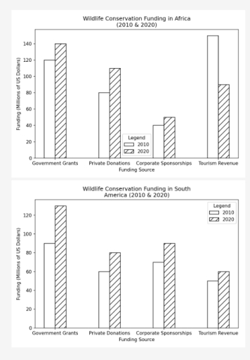
Band 6+: The charts below show the main sources of funding for wildlife conservation in Africa and South America for the years 2010 and 2020. Summarise the information by selecting and reporting the main features, and make comparisons where relevant.

Image for topic: The charts below show the main sources of funding for wildlife conservation in Africa and South America for the years 2010 and 2020. Summarise the information by selecting and reporting the main features, and make comparisons where relevant.
Our system will evaluate the answer based on this AI-generated description.
The image features two bar charts detailing wildlife conservation funding in millions of US dollars across four sources in 2010 and 2020, with x-axes labeled 'Funding Source' ('Government Grants', 'Private Donations', 'Corporate Sponsorships', 'Tourism Revenue') and y-axes labeled 'Funding (Millions of US Dollars)' with a legend for 2010 and 2020. The top chart, titled 'Wildlife Conservation Funding in Africa (2010 & 2020)' with y-axis ticks from 0 to 140 in increments of 20, lists values for 2010 and 2020 respectively as: Government Grants at 120 and 140; Private Donations at 80 and 110; Corporate Sponsorships at 40 and 50; and Tourism Revenue at 150 and 90. The bottom chart, titled 'Wildlife Conservation Funding in South America (2010 & 2020)' with y-axis ticks from 0 to 120 in increments of 20, lists values for 2010 and 2020 respectively as: Government Grants at 90 and 130; Private Donations at 60 and 80; Corporate Sponsorships at 70 and 90; and Tourism Revenue at 50 and 60.
Given the complexity of the image, the above description may not be entirely accurate.
Note: Both the topic and the answer were created by one of our users.

The bar charts illustrate the primary sources of funds for wild life conservation; government grants, private donations , corporate sponsorships, and tourism, both in Africa and South Africa in 2010 and 2020.

Overall, in Africa and South Africa, the government grants were the main sources of wildlife conservation funds. Tourism revenues generated big funds in Africa than in South Africa. However the private donations and corporate sponsorship had moderate contributions to the two countries, while corporate sponsorship is the lowest in Africa.

In Africa, the primary source was government grant and tourism. The government grants started at 120 million USD and rose to 140 million USD while tourism began at 140 million USD and dropped to 90 million. Private donation was at 80 million USD and later increased to 119 million USD, whereas corporate sponsorships commenced at 40 million USD and experienced a slight increase to 50 million USD.

In South Africa, there was an increase trend in funds generated in both years. Government grant contributed the highest at 95 million USD and progressed to 140 million USD . This is followed by corporate sponsorship at 70 million USD and 90 million USD . Private donation had 50 million USD and rose to 60 million USD.

Word Count: 206

Answers On The Same Topic:

The charts below show the main sources of funding for wildlife conservation in Africa and South America for the years 2010 and 2020. Summarise the information by selecting and reporting the main features, and make comparisons where relevant.

The barcharts display primary funding sources for wildlife conservation in Africa and South America in two different years, particularly, 2010 and 2020. Overall, the fundings from different sources have risen in the span of 10 years in both Africa and South America, with Tourism Revenue in Africa being an exception. In Africa, government grands in […]

The charts below show the main sources of funding for wildlife conservation in Africa and South America for the years 2010 and 2020. Summarise the information by selecting and reporting the main features, and make comparisons where relevant.

The given bar chart provides information about the expenditure spent for the conservation of wildlife in Africa and South America for the years 2010 and 2020. Overall, the funds provided by government grants remained the highest in both regions, while corporate sponsorship remained the lowest in Africa, and tourism revenue held the lowest position in […]

The charts below show the main sources of funding for wildlife conservation in Africa and South America for the years 2010 and 2020. Summarise the information by selecting and reporting the main features, and make comparisons where relevant.

The graphs illustrate the major sources of wildlife conservation funding in Africa and South America in 2010 and 2020. The sources mentioned in the chart are: government grants, private donations, corporate sponsorships, and tourism revenue. In Africa, government grants were a major source of funds in 2010(120) and it had a marginal gain in 2020, […]

The charts below show the main sources of funding for wildlife conservation in Africa and South America for the years 2010 and 2020. Summarise the information by selecting and reporting the main features, and make comparisons where relevant.

The bar charts compare the key sources of funding that financially aided the conservation of wildlife in African and South American regions in 2010 and 2020. Overall, Government Grants was the major source that funded Asian and African wildlife in both years, except being the second highest in 2021 for Africa. Notably, Coporative Sponserships were […]

See All

Other Topics:

The table and chart below show the time spent on leisure and household activities in Britain.

The given table illustrates the time spent on leisure, while the bar chart provides information about household activities in Britain. Overall, it is clear that the figures for spending time of men in TV, video, radio was highest, while the figures for women in sports was lowest in the table. In addition, Female spend their […]

The charts below show the land area lost (thousand km2) per one-metre rise in sea level and the population (in millions) affected per one-metre rise in sea level in the predicted future. Summarise the information by selecting and reporting the main features, and make comparisons where relevant.

The bar chart illustrates the amount of land area lost (thousand km2),and the pie chart shows the population (in millions) that will be affected per one-metre rise in sea level in the predicted future. Overall, in the bar chart, Asia will lose the largest area among all the regions, while Oceania’s area will decline the […]

The pie chart below shows the types of waste collected from households in one city in 2020. The bar chart shows the percentage of each type of waste that was recycled in 2000 and 2020. Summarise the information by selecting and reporting the main features, and make comparisons where relevant.

The pie chart illustrates the different types of household waste collected in one city in 2020, while the bar chart compares the percentages of waste recycled in 2000 and 2020. Overall, food waste accounted for the largest proportion of household waste, whereas metals made up the smallest proportion. Regarding recycling, glass had the highest rate […]

The charts below show the physical activity levels of adult men and women in one country from 2018 to 2019, and the activities they participated in. Summarise the information in both charts by selecting and reporting the main features, and make comparisons where relevant.

These charts illustrate a trend of people engaged in sports and their chosen activities in one country from 2018 to 2019. There were more people who exercised more than 150 minutes a week. Besides the choice of activities was not really different. The first bar chart shows that men were quite more interested in exercising […]

The charts below show the information about a US bus company between 1999 and 2003. Summarise the information by selecting and reporting the main features, and make comparisons where relevant.

The two bar charts demonstrate some statistics about a US bus company during the period from 1999 to 2003, including each year’s number of passenger complaints and a comparison of actual and target punctuality rates for buses’ arrival. Overall, actual and target rates of bus punctuality were both highest in 1999. The rate of actual […]

The charts below show the density of people in 2003, and the change of population from 2003 to 2005. Summarise the information by selecting and reporting the main features, and make comparisons where relevant.

The bar chart gives information about the figure of people in 2003 and the change of population between 2003 and 2005. Overall, Japan was by far the most crowded country among the surveyed countries in 2003, which stood in contrast to Sweden, where the population was the least dense country. In addition, Australia showed the […]

See All
We have detected unusual activity on your device.
Please verify your identity to continue.
Note: This verification step won't sign you in. If you have a premium account, please log in to access the service as usual.
Google/Gmail Verification
Or verify using Email/Code
We've sent a verification code to:
youremail@gmail.com (Not your email?)
Enter it below to complete the verification process.
Ensure your email address is correct, your inbox is not full, and you check your spam folder. If no email arrives, consider using an alternative email.
You will need a Premium plan to perform your action!
Note: If you already have a premium account, please log in to access our services as usual.

Plans & Pricing

Our mission is to make quality education accessible for everyone.
However, to keep our hardworking team running and this service alive, we genuinely need your support!
By opting for a premium plan, not only do you sustain us in achieving the mission, but you also unlock advanced features to enrich your learning experience.

Free

For learners who aren't pressed for time

What's included on Free
100+ Cambridge IELTS Tests
Instant IELTS Writing Task 1 & 2 Evaluation (2 times/month)
Instant IELTS Speaking Part 1, 2, & 3 Evaluation (2 times/month)
Instant IELTS Writing Task 1 & 2 Essay Generator (2 times/month)
500+ Dictation & Shadowing Exercises
100+ Pronunciation Exercises
Flashcards
Other Advanced Tools

Premium

For those serious about advancing their English proficiency, and for IELTS candidates aspiring to boost their band score by 1-2 points (especially in writing & speaking) in just 30 days or less

What's included on Premium
Save Your IELTS Test Progress & Analyze Mistakes By Question Type
Save Your Own Flashcard Sets & Use Them On Any Device
Unlock All Courses, IELTS Tests, Section & Part Practice
Unlimited AI Conversations
Unlimited AI Writing Enhancement Exercises
Unlimited IELTS Writing Task 1 & 2 Evaluation
Unlimited IELTS Speaking Part 1, 2, & 3 Evaluation
Checked Answers Will Not Be Published
Unlimited IELTS Writing Task 1 & 2 Essay Generator
Unlimited IELTS Speaking Part 1, 2, & 3 Sample Generator
Unlimited Usage Of Advanced Tools & AI Features
Priority Support within 24h (12-month plan only)

Due to the nature of our service and the provided free trials, payments are non-refundable.