🔥 Today Only: Save 30% on Premium — Offer Ends Soon! - Upgrade Now!
Multiple Graphs

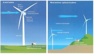
Band 7+: the diagram below shows the design for a wind turbine and its location

Image for topic: the diagram below shows the design for a wind turbine and its location
Our system will evaluate the answer based on this AI-generated description.
The image contains two diagrams, the left diagram, titled "A wind turbine," features a wind turbine with labeled parts including rotor diameter (40-90m), hub height (50-80m), and generator (1.5-5MW). Below the turbine, there is a small building labeled electrical systems. The turbine is set on flat terrain with a single tree and vehicle close by. An arrow indicating wind goes through the rotor. The right diagram, title "Wind turbines: optimum locations," presents the same wind turbine with labeled rotor diameter (40-90m), hub height (50-80m), and generator (1.5-5MW). This turbine is placed on a hilly terrain with variable heights indicated (20-80m), a coastline depicted on the right, and a house and tree on the lower left side. An arrow indicating wind is pointing towards the rotor, originating from the higher elevations of the hill.
Given the complexity of the image, the above description may not be entirely accurate.
Note: Both the topic and the answer were created by one of our users.

The diagrams clarify where wind turbines should be situated and what they look like.

According to the diagrams, there are three possible locations for a turbine. A large industrial turbine would be built high up on a hillside where the wind is strongest, and these turbines can produce 1.5 megawatts of power. On the other hand, smaller turbines that produce 100 kilowatts of power for domestic use can be found on rooftops. The third possible position is in the sea. Here, there is less impact on the countryside, but winds can still be very strong.

While the locations may be different, the turbines themselves all have the same special shape. They consist of a tall tower made of strong steel and on top of this there are three blades made of fibreglass or wood. The turbines are controlled by a computer which can alter the direction and angle of the blades accompanying to the information it receives from a sensor.

Clearly, most wind turbines are genuinely large, and all turbines need to be exposed to a lot of wind.

Word Count: 179

Answers On The Same Topic:

the diagram below shows the design for a wind turbine and its location

The pictures illustrate the design of a wind turbine and the different locations where it can be installed. Overall, all types of wind turbines require wind power to generate electricity. Additionally, the tallest turbine includes a computer system that adjusts the direction and angle of the blades for maximum efficiency. A wind turbine consists of […]

the diagram below shows the design for a wind turbine and its location

The diagrams illustrate the structure and function of a wind turbine as well as the most suitable locations for installing such turbines. Overall, a wind turbine converts the kinetic energy of the wind into electricity through a generator controlled by a computer system. The second diagram shows that wind turbines should ideally be placed in […]

the diagram below shows the design for a wind turbine and its location

The provided diagrams depict the design of a wind turbine alongside its potential locations for optimal electricity generation. In summary, the illustrations highlight two distinct setups for the wind turbine, each corresponding to various terrains that influence energy production efficiency. The wind turbine, characterized by a rotor diameter ranging between 40 to 90 meters and […]

the diagram below shows the design for a wind turbine and its location

The diagrams illustrate an air turbine and its potential locations for generating electricity. Initially, the body of the machine features a tall steel tower designed to withstand the ground’s pressure. Atop the tower is a generator capable of producing 1.5 megawatts of energy. Additionally, the turbine has blades made of fiberglass or wood, which are […]

See All

Other Topics:

The first chart shows the average housing prices in two cities in one country in 2010 and 2015, with projections for 2025. The second chart shows the percentage of people aged 30-35 who owned a home in 2010 and 2015. Summarize the information by selecting and reporting the main features, and make comparisons where relevant.

The provided bar chart illustrates average housing prices in City A and City B in one country in 2010, 2015, and 2025 years. Second pie chart shows the proportion of house owners aged 30-35 in 2010 and 2015. Overall, the prices for housing had gradually increased over the given period, while renters outweighed owners in […]

The table and charts detailed below give information about the police budget in 2017 and 2018 in on area of Britain. The table illustrates where the money come from and the charts show how it was distributed.

The table and pie charts illustrate the sources of police budget and how it was spent in one area of Britain over the one-years period between 2017 and 2018. Overall, from the table it can be clearly seen that the budget grew over time and most of the funds came from the national government. The […]

The chart shows how many men and women went to the cinema to watch different types of films in the year 2018. The pie chart gives information about the age of cinemagoers.

The bar chart contains information about the amount of attendance at the cinema by men and women to watch various kinds of movies in 2018. The pie diagram illustrates the age of the audience. Overall, it is clear that action was the ubiquitous type of films among men, whereas historical drama was at the top […]

The chart shows how many men and women went to the cinema to watch different types of films in the year 2018. The pie chart gives information about the age of cinemagoers.

The bar chart contains information about the amount of attendance at the cinema by men and women to watch various kinds of movies in 2018. The pie diagram illustrates the age of the audience. Overall, it is clear that action was the ubiquitous type of films among men, whereas historical drama was at the top […]

The table and graph below give information about Internet searches in the US between 2004 and 2010.

The table illustrates the total number of searches in the US from 2004 to 2010, while the line graph depicts the percentage of searches using five different search engines over the same period. Overall, the total number of online searches increased significantly during the period. Google recorded a considerable growth, while the other engines exhibited […]

the Pie Charts illustrate the percentage distribution of specific commodities across 4 countries and it's consumption in different regions of the world.write an essay summarising the information by selecting and reporting the main features and make comparisons higher relevant

The given pie chart depicts information about the percentage distribution of a specific commodity’s production across four countries and its consumption in different regions of the world. Overall, what stands out from the chart is that the percentage of consumption in Europe has the highest percentage, while the proportion of production in South Africa has […]

See All
We have detected unusual activity on your device.
Please verify your identity to continue.
Note: This verification step won't sign you in. If you have a premium account, please log in to access the service as usual.
Google/Gmail Verification
Or verify using Email/Code
We've sent a verification code to:
youremail@gmail.com (Not your email?)
Enter it below to complete the verification process.
Ensure your email address is correct, your inbox is not full, and you check your spam folder. If no email arrives, consider using an alternative email.
You will need a Premium plan to perform your action!
Note: If you already have a premium account, please log in to access our services as usual.

Plans & Pricing

Our mission is to make quality education accessible for everyone.
However, to keep our hardworking team running and this service alive, we genuinely need your support!
By opting for a premium plan, not only do you sustain us in achieving the mission, but you also unlock advanced features to enrich your learning experience.

Free

For learners who aren't pressed for time

What's included on Free
100+ Cambridge IELTS Tests
Instant IELTS Writing Task 1 & 2 Evaluation (2 times/month)
Instant IELTS Speaking Part 1, 2, & 3 Evaluation (2 times/month)
Instant IELTS Writing Task 1 & 2 Essay Generator (2 times/month)
500+ Dictation & Shadowing Exercises
100+ Pronunciation Exercises
Flashcards
Other Advanced Tools

Premium

For those serious about advancing their English proficiency, and for IELTS candidates aspiring to boost their band score by 1-2 points (especially in writing & speaking) in just 30 days or less

What's included on Premium
Save Your IELTS Test Progress & Analyze Mistakes By Question Type
Save Your Own Flashcard Sets & Use Them On Any Device
Unlock All Courses, IELTS Tests, Section & Part Practice
Unlimited AI Conversations
Unlimited AI Writing Enhancement Exercises
Unlimited IELTS Writing Task 1 & 2 Evaluation
Unlimited IELTS Speaking Part 1, 2, & 3 Evaluation
Checked Answers Will Not Be Published
Unlimited IELTS Writing Task 1 & 2 Essay Generator
Unlimited IELTS Speaking Part 1, 2, & 3 Sample Generator
Unlimited Usage Of Advanced Tools & AI Features
Priority Support within 24h (12-month plan only)

Due to the nature of our service and the provided free trials, payments are non-refundable.