🔥 Today Only: Save 30% on Premium — Offer Ends Soon! - Upgrade Now!
Multiple Graphs

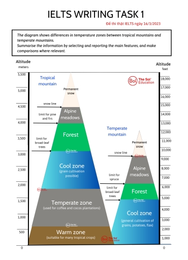
Band 6+: The diagram shows differences in temperature zones between tropical mountains and temperate mountains.

Image for topic: The diagram shows differences in temperature zones between tropical mountains and temperate mountains.
Our system will evaluate the answer based on this AI-generated description.
The image displays the temperature zones between tropical mountains and temperate mountains, divided into Warm, Cool, Temperate, Forest, Alpine meadows, and Tropical mountains. Altitude in meters and feet is given. Warm zone: suitable for mainly tropical crops (1000-1500 meters/3000-5000 feet), Cool zone: used for coffee and cocoa plantations (1500-2500 meters/5000-8000 feet), Temperate zone: used for coffee and cocoa plantations (2500-3000 meters/8000-10000 feet), Forest: limit for pine trees (2500-3500 meters/8000-11500 feet), Cool zone: general cultivation of grains, potatoes, flax (3000-4000 meters/10000-13000 feet), Alpine meadows (3500-4500 meters/11500-14500 feet), Temperate mountain: Alpine meadows (3500-4500 meters/11500-14500 feet), Tropical mountain: Alpine meadows (4000-5500 meters/13000-17000 feet), Forest: limit for broad-leaf trees (3500-4500 meters/11500-14500 feet), Alpine meadows: limit for pine trees (4500 meters/14500 feet), Alpine meadows: permanent snow line (4500-5000 meters/14500-16000 feet), Tropical mountain: permanent snow line (5000 meters/16000 feet), Temperate mountain: permanent snow line (5000 meters/16000 feet).
Given the complexity of the image, the above description may not be entirely accurate.
Note: Both the topic and the answer were created by one of our users.

The diagram compares tropical mountain with temperate mountain in terms of their vegetation.

Overall, tropical mountain maintains more diverse zones than temperate mountain, with the vegetation growing at higher altitudes than in temperate region.

The snow line in tropical mountain starts out at 4300 meters, whereas the snow line in temperate region is at a lower level of around 2700 meters. Above this line is permanent snow and the alpine meadows lie below it in both regions. The lower limit of forest area in the tropical region is around 3200 meters while the upper limit coincides with the limit for pines and firs, at 4000 meters. In contrast, the forest zone for temperate mountain stands at much lower altitudes, ranging around 1400 meters for lower bound and 1700 meters for upper bound.

Regarding the zones below forest area, while the temperate mountain only has one zone known as the “cool zone” for grain production from sea-level to 1400 meters, the tropical region consists of three different zones: cool zone for grain production, temperature zone for coffee and coco plantation and warm zone for the production of tropical crops.

Word Count: 188

Answers On The Same Topic:

The diagram shows differences in temperature zones between tropical mountains and temperate mountains.

The diagram illustrates how temperature zones differ by altitude between tropical and temperate mountains. Overall, the tropical mountains span a significantly broader vertical range, and contain more distinct ecological zones. Meanwhile, the permanent snow line is positioned at a much higher altitude in the tropics. In the tropical regions, the warm zone stretches from sea […]

The diagram shows differences in temperature zones between tropical mountains and temperate mountains.

The diagram illustrated the difference between tropical mountain and temperature mountain which is a place for planting different species along with its altitude. There are six groups in tropical mountain and four groups in temperate mountain. To beign with the tropical mountain, there has a warm zone which is suitable for many tropical crops such […]

The diagram shows differences in temperature zones between tropical mountains and temperate mountains.

The diagram compares different altitude zones of vegetation and temperature on tropical and temperate mountains, based on changes in climate and land use at various elevations. Overall, the tropical mountain has a wider range of distinct zones and supports vegetation at much higher altitudes. In contrast, the temperate mountain has fewer zones, and the limits […]

The diagram shows differences in temperature zones between tropical mountains and temperate mountains.

The given diagram represents comparison in temperature zones between tropical mountains and temperate mountains. Overall, vegetation in tropical moutains are more diverse than that of temperate mountains. Tropical mountains are higher altitude than temperate mountains. There is a snow line at about 2800 meters (10000 feets) on temperate mountains, which are shorter than that of […]

The diagram shows differences in temperature zones between tropical mountains and temperate mountains.

The diagram gives information about and how temperature zones and tropical mountains and temperate mountains different about temperature zones. Overall, it is clear that tropical mountain has more various temperature zones than temperate mountain. The cultivation of each mountain have a big difference. Regarding lower altitude (below 3,000 meters), the cool zone in tropical mountain, […]

See All

Other Topics:

The pie charts below show the comparison of different kinds of energy production of France and Germany in 2020. Summarise the information by selecting and reporting the main features, and make comparisons where relevant.

The pie charts compare the percentage of energy production from six different sources in France and Germany in 2020. Overall, it is clear that the proportion of energy production from gas accounted for the highest share in France, while solar was the primary source in Germany in 2020. In addition, other energy was the least […]

The pie charts below show the devices people in the 18 to 25 age group use to watch television in a European country in two different years

The pie charts illustrate the devices used by people aged 18 to 25 for watching television in a European country in two different years. Overall, it is clear that while the figures for mobile phone, tablet and flat-screen TV experienced an upward trend, there was a fall in the percentage of people who used laptop, […]

The line graph shows how much money overseas visitors spent in the UK from 1980 - 2010 and the pie charts show the reasons for their visits in 1980 and 2010. Summarise the information by selecting and reporting the main features and make comparisons where relevant. Write at least 150 words.

The chart illustrate the location of dance classes and diferrent age group attending the classes . Overall,it seems to be that private studios seen as good population of dance lover whereas ballet dance are more preffered by both age groups . After analyzing the information it is crystal clear that,loaction of danceare more preffered by […]

The bar charts give information about the salaries and university fees of students from three universities in two spheres - Law and Business. Summarize information by selecting and reporting the main features and make comparisons where relevant

The bar charts compare salaries and expenses of students studying Law and Business in three different universities in Australia. Overall, it is clearly visible that the figure of Law students’ expenses in institution A is the highest among all features, whereas salary of individuals studying Business in university A is the lowest. Interestingly, wages of […]

The line graph and pie charts below show the percentage of the population aged between 18 and 34 years old in a country from 1978 to 2011 and the percentage of this age group of people living in different regions in 1978 and 2011. Summarise the information by selecting and reporting the main features, and make comparisons where relevant. Write at least 150 words.

The line graph shows the percentage of a country’s population aged between 18 and 34 from 1978 to 2011, while the pie charts illustrate where people in this age group lived in 1978 and 2011. Overall, the proportion of 18-34-year-olds increased slightly until 1992, reaching a peak of around 37%, before declining steadily to its […]

The line graph and pie charts below show the percentage of the population aged between 18 and 34 years old in a country from 1978 to 2011 and the percentage of this age group of people living in different regions in 1978 and 2011. Summarise the information by selecting and reporting the main features, and make comparisons where relevant. Write at least 150 words.

The line graph illustrates the proportion of a country’s population aged between 18 and 34 from 1978 to 2011, while the pie charts show the distribution of this age group across cities, towns and rural areas in 1978 and 2011. Overall, the percentage of people aged 18-34 increased slightly until 1992, after which it declined […]

See All
We have detected unusual activity on your device.
Please verify your identity to continue.
Note: This verification step won't sign you in. If you have a premium account, please log in to access the service as usual.
Google/Gmail Verification
Or verify using Email/Code
We've sent a verification code to:
youremail@gmail.com (Not your email?)
Enter it below to complete the verification process.
Ensure your email address is correct, your inbox is not full, and you check your spam folder. If no email arrives, consider using an alternative email.
You will need a Premium plan to perform your action!
Note: If you already have a premium account, please log in to access our services as usual.

Plans & Pricing

Our mission is to make quality education accessible for everyone.
However, to keep our hardworking team running and this service alive, we genuinely need your support!
By opting for a premium plan, not only do you sustain us in achieving the mission, but you also unlock advanced features to enrich your learning experience.

Free

For learners who aren't pressed for time

What's included on Free
100+ Cambridge IELTS Tests
Instant IELTS Writing Task 1 & 2 Evaluation (2 times/month)
Instant IELTS Speaking Part 1, 2, & 3 Evaluation (2 times/month)
Instant IELTS Writing Task 1 & 2 Essay Generator (2 times/month)
500+ Dictation & Shadowing Exercises
100+ Pronunciation Exercises
Flashcards
Other Advanced Tools

Premium

For those serious about advancing their English proficiency, and for IELTS candidates aspiring to boost their band score by 1-2 points (especially in writing & speaking) in just 30 days or less

What's included on Premium
Save Your IELTS Test Progress & Analyze Mistakes By Question Type
Save Your Own Flashcard Sets & Use Them On Any Device
Unlock All Courses, IELTS Tests, Section & Part Practice
Unlimited AI Conversations
Unlimited AI Writing Enhancement Exercises
Unlimited IELTS Writing Task 1 & 2 Evaluation
Unlimited IELTS Speaking Part 1, 2, & 3 Evaluation
Checked Answers Will Not Be Published
Unlimited IELTS Writing Task 1 & 2 Essay Generator
Unlimited IELTS Speaking Part 1, 2, & 3 Sample Generator
Unlimited Usage Of Advanced Tools & AI Features
Priority Support within 24h (12-month plan only)

Due to the nature of our service and the provided free trials, payments are non-refundable.