🔥 Today Only: Save 30% on Premium — Offer Ends Soon! - Upgrade Now!
Multiple Graphs

Band 7+: The graph and table below show the average monthly temperatures and the average number of hours of sunshine per year in three major cities Summarise the information by selecting and reporting the main features and make comparisons where relevant.

Image for topic: The graph and table below show the average monthly temperatures and the average number of hours of sunshine per year in three major cities Summarise the information by selecting and reporting the main features and make comparisons where relevant.
Our system will evaluate the answer based on this AI-generated description.
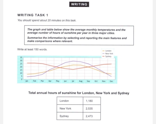
The image depicts a graph and a table; the graph illustrates average monthly temperatures over a year across three cities: London, New York, and Sydney, with temperatures in Celsius on the y-axis ranging from 0 to 30, matching months January to December on the x-axis; a line represents each city. Specific approximate monthly temperatures for London are: January 5°C, February 5°C, March 8°C, April 11°C, May 15°C, June 18°C, July 20°C, August 20°C, September 17°C, October 13°C, November 10°C, December 7°C. For New York: January 3°C, February 4°C, March 8°C, April 14°C, May 19°C, June 24°C, July 27°C, August 26°C, September 22°C, October 16°C, November 10°C, December 5°C. For Sydney: January 25°C, February 25°C, March 23°C, April 20°C, May 17°C, June 14°C, July 13°C, August 15°C, September 17°C, October 19°C, November 22°C, December 24°C. The table presents total annual hours of sunshine, with London at 1,180 hours, New York at 2,535 hours, and Sydney at 2,473 hours.
Given the complexity of the image, the above description may not be entirely accurate.
Note: Both the topic and the answer were created by one of our users.

The line graph and table compare the average temperature for each month and annual sunshine hours in three big cities.

Overall, In London and New York the average temperature in summer is higher than in other seasons while in Sydney in July it reaches its lowest point. Nevertheless, the city with the least number of sunshine hours is London.

Looking at the details of the line graph, New York is the city with the highest average summer temperature, reaching 29 degrees, and the lowest average winter temperature, reaching four degrees. The shape of the London graph is similar to the New York graph but it is smoother, in this way the London average temperature in summer hits a high of 23 degrees and in winter it drops to its lowest point of eight degrees. In Sydney, unlike the other two cities, the lowest average temperature is reached in summer and is 16 degrees, while between November and March the average temperature peaks at 25-26 degrees.

Turning to the table, the number of annual sunshine hours in New York and Sydney are fairly similar and they are 2,535 and 2,473, respectively. London receives far less sunshine than the other two cities, with an average of only 1,180 sunshine hours.

Word Count: 208

Answers On The Same Topic:

The graph and table below show the average monthly temperatures and the average number of hours of sunshine per year in three major cities Summarise the information by selecting and reporting the main features and make comparisons where relevant.

The line graph illustrates monthly temperature variations, while the table provides information on the total number of sunny hours in three cities (London, New York, and Sydney) throughout the year. Overall, New York and London show a practically similar trend, with the highest temperatures in summer and the lowest in winter. Conversely, Sydney had the […]

The graph and table below show the average monthly temperatures and the average number of hours of sunshine per year in three major cities Summarise the information by selecting and reporting the main features and make comparisons where relevant.

The charts illustrate mean temperatures and the total number of hours of sunlight falling in three megapolises over a 12-month period. Overall, while London and New York share similar weather patterns, becoming cold in December and January, Sydney remains mainly warm throughout the review period. However, interestingly, New York has the longest hours of sunshine […]

The graph and table below show the average monthly temperatures and the average number of hours of sunshine per year in three major cities Summarise the information by selecting and reporting the main features and make comparisons where relevant.

The given datas give information about average monthly temperatures and average number of hours of sunshine per year in London, New York, and Sydney. Overall, it is very clear that New York has the highest degress of temperature and total annual hours of sunshine. In addition, London has no significant changes of temperature and has […]

The graph and table below show the average monthly temperatures and the average number of hours of sunshine per year in three major cities Summarise the information by selecting and reporting the main features and make comparisons where relevant.

The diagram illustrates the average monthly temperatures across three major cities – Sydney, London, and New York – whereas the second graph demonstrates the mean sunshine hours in the same cities. Overall, Sydney is recorded with the highest monthly temperatures, while London and New York’s temperatures have experienced major fluctuations throughout the period. New York […]

See All

Other Topics:

The graphs below illustrate trends in population in Southern Pacific Ocean countries from 1950, with projections up to 2040.

The line graphs illustrate changes in the populations of countries in the South Pacific between 1950 and the present, with projections extending to 2040. Overall, it can be clearly seen that the total population has grown and is expected to increase because of the growth of both urban and rural populations. In addition, people under […]

The charts below show information about the number of people using different modes of transport to commute to work in a European city in 2000 and 2020. The table shows the average time (in minutes) that commuters spent travelling to work by each mode of transport in 2020. Summarise the information by selecting and reporting the main features, and make comparisons where relevant.

The bar chart depicts the data regarding modes of transport across five distinct categories, namely car, public transport, bicycle, walking, and others, in a European city in 2000 and 2020, whereas the table illustrates the mean time spent by travellers to reach work by each mode of transport. Time is measured in minutes. Overall, car […]

The charts below show information on crime in the UK for 2002. Write a report for a university lecturer describing the information below.

The line graph compares the proportion of the UK’s crime rates ranging from zero to sixty-four years old in 2002, with the pie chart providing the breakdown of types of crime in four categories, namely violent, property, drug, and public order. Overall, the 16-24 age group has the highest crime rate, and the lowest is […]

The graph and pie chart below give information on in-house training courses in a large financial company. Summarise the information by selecting and reporting the main features, and make comparisons where relevant.

The pie chart illustrates hours of training spent on different types of courses. Meanwhile, the bar graph demonstrates attitudes of employees toward training. Overall, hours spent on technical courses are equal to the other three combined. Moreover, most employees view trainings as benefits with different reasons. First of all, the technical course would make up […]

The percentage of persons arrested in the five years ending 1994 and the most recent reasons for arrest.

The pie charts illustrate the percentage of people arrested by gender from 1990 to 1994, while the bar chart compares the proportion of the six most recent reasons for arrest. Overall, more men were arrested than women; moreover, public drinking was the main reason for arrest for both genders, while no answer was the least […]

See All
We have detected unusual activity on your device.
Please verify your identity to continue.
Note: This verification step won't sign you in. If you have a premium account, please log in to access the service as usual.
Google/Gmail Verification
Or verify using Email/Code
We've sent a verification code to:
youremail@gmail.com (Not your email?)
Enter it below to complete the verification process.
Ensure your email address is correct, your inbox is not full, and you check your spam folder. If no email arrives, consider using an alternative email.
You will need a Premium plan to perform your action!
Note: If you already have a premium account, please log in to access our services as usual.

Plans & Pricing

Our mission is to make quality education accessible for everyone.
However, to keep our hardworking team running and this service alive, we genuinely need your support!
By opting for a premium plan, not only do you sustain us in achieving the mission, but you also unlock advanced features to enrich your learning experience.

Free

For learners who aren't pressed for time

What's included on Free
100+ Cambridge IELTS Tests
Instant IELTS Writing Task 1 & 2 Evaluation (2 times/month)
Instant IELTS Speaking Part 1, 2, & 3 Evaluation (2 times/month)
Instant IELTS Writing Task 1 & 2 Essay Generator (2 times/month)
500+ Dictation & Shadowing Exercises
100+ Pronunciation Exercises
Flashcards
Other Advanced Tools

Premium

For those serious about advancing their English proficiency, and for IELTS candidates aspiring to boost their band score by 1-2 points (especially in writing & speaking) in just 30 days or less

What's included on Premium
Save Your IELTS Test Progress & Analyze Mistakes By Question Type
Save Your Own Flashcard Sets & Use Them On Any Device
Unlock All Courses, IELTS Tests, Section & Part Practice
Unlimited AI Conversations
Unlimited AI Writing Enhancement Exercises
Unlimited IELTS Writing Task 1 & 2 Evaluation
Unlimited IELTS Speaking Part 1, 2, & 3 Evaluation
Checked Answers Will Not Be Published
Unlimited IELTS Writing Task 1 & 2 Essay Generator
Unlimited IELTS Speaking Part 1, 2, & 3 Sample Generator
Unlimited Usage Of Advanced Tools & AI Features
Priority Support within 24h (12-month plan only)

Due to the nature of our service and the provided free trials, payments are non-refundable.