🔥 Today Only: Save 30% on Premium — Offer Ends Soon! - Upgrade Now!
Bar Chart

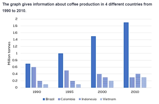
Band 5+: The graph below gives information about coffee production in 4 different countries from 1990 to 2010.Summarize the important features and make comparisons where relevant.

Image for topic: The graph below gives information about coffee production in 4 different countries from 1990 to 2010.Summarize the important features and make comparisons where relevant.
Our system will evaluate the answer based on this AI-generated description.
The image is a bar graph depicting coffee production in million tonnes for four countries - Brazil, Colombia, Indonesia, and Vietnam - over four time periods: 1990, 1995, 2000, and 2010. In 1990, Brazil produced 1.2 million tonnes, Colombia produced 0.6 million tonnes, Indonesia produced 0.2 million tonnes, and Vietnam produced 0.1 million tonnes. In 1995, Brazil increased to 1.4 million tonnes, Colombia decreased slightly to 0.5 million tonnes, Indonesia increased to 0.5 million tonnes, and Vietnam increased to 0.2 million tonnes. In 2000, Brazil decreased to 1.0 million tonnes, Colombia remained at 0.5 million tonnes, Indonesia increased to 0.6 million tonnes, and Vietnam saw a significant increase to 0.8 million tonnes. In 2010, Brazil jumped to 1.8 million tonnes, Colombia decreased to 0.4 million tonnes, Indonesia remained at 0.6 million tonnes, and Vietnam saw a substantial increase to 1.6 million tonnes. Brazil consistently had the highest production, while Vietnam saw the most dramatic increase from 1990 to 2010.
Given the complexity of the image, the above description may not be entirely accurate.
Note: Both the topic and the answer were created by one of our users.

The bar chart illustrates the coffee’s production in 4 dissimilar nations over the period 30 years, starting from 1990.

Overall, it is clear that Colombia aside, the number of coffee production increased over the timeframe shown. In addition, Brazil was the country that held the top spot throughout the period.

In 1990, Brazil started with the manufacturing coffee approximately 0,7 million tonnes, which ranked first compare to others. Thereafter, the figure for coffee production in Brazil experienced a dramatic increase from roughly 0,7 million tonnes to 1,9 million tonnes while the opposite was true in Colombia. Moreover, the amounts of coffee production in Colombia decreased gradually by 0,3 million tonnes.

In the case of Indonesia and Vietnam, which had the similarity trend. Additionally, Coluombia and Vietnam remained a plateau in the first 5 years, albeit standing at much lower positions 0,2 million tonnes and 0,1 million tonnes after which there was a slight increase in the coffee prodution numbers in Indonesia and Vietnam from 0,2 million tonnes and from 0,1 million tonnes to 0,3 million tonnes, respectively

Word Count: 177

Answers On The Same Topic:

The graph below gives information about coffee production in 4 different countries from 1990 to 2010.Summarize the important features and make comparisons where relevant.

The bar chart shows the amount of coffee produced in four countries from 1990 to 2010. Overall, all countries increased their coffee production, with Brazil experiencing the most pronounced growth, except for Colombia, where coffee production declined steadily over time. Notably, Brazil was the clear frontrunner in all years studied by a significant margin, while […]

The graph below gives information about coffee production in 4 different countries from 1990 to 2010.Summarize the important features and make comparisons where relevant.

The bar chart below illustrates information aboufe coffee production in 4 different countries from 1990 to 2010. Overall,the data shows that Brazil was the highest in coffee production ,VietNam was the lowest category overtime.In addtion,almost country had upward trends except for Colombia. The coffee output produced in Brazil was the highest at 0,7 million tones,Brazil […]

The graph below gives information about coffee production in 4 different countries from 1990 to 2010.Summarize the important features and make comparisons where relevant.

The bar chart compares the information of coffee production in 4 different nations between 1990 to 2010. Overall,Brasil saw a significant increase over the period,whereas Colombia experienced a decline.Notably,Vietnam saw a slightly increase while Indonesia saw a fluctuating trend throughout the period. To begin with, during the early years of the period, Brasil showed a […]

The graph below gives information about coffee production in 4 different countries from 1990 to 2010.Summarize the important features and make comparisons where relevant.

The bar chart provided illustrates the amount of coffee output in four various nations between 1990 and 2010. Overall, coffee output witnessed an increasing trend over the span, with the exception of Colombia. It is noticeable that Brazil consistently had the highest amount of coffee, whereas Vietnam’s output was the lowest. Looking first at the […]

The graph below gives information about coffee production in 4 different countries from 1990 to 2010.Summarize the important features and make comparisons where relevant.

The bar chart shows the amount of coffee produced in four countries from 1990 to 2010. Overall, most countries increased their coffee production, except for Colombia, where coffee production declined steadily over time. Notably, Brazil was the clear frontrunner in all years studied by a significant margin, while other countries had relatively comparable figures for […]

See All

Other Topics:

The chart below shows percentages of people choosingdifferent ways to reduce greenhouse gases in fourdifferent countries in 2005.Summarize the information byselecting and reporting the main features, and makecomparisons where relevant. Write at least 150 words.

The bar chart illustrates the percentages of people in Portugal, Poland, Estonia and Holland who chose four different methods of reducing greenhouse gas emissions in 2005. Overall, government regulations were the most commonly selected method in Portugal, while lifestyle changes were equally popular in Portugal and Poland. Advanced technology was the leading choice in Holland, […]

The graph below shows the favourite sport of people from the USA between 1985 and 2015.

The bar chart illustrates, the amount of waste disposed via landfill, burning and dumping at sea from 2005 and 2008, measured in tonnes. Overall, three methods fluctuated between 2005 and 2008. Landfill experienced significantly changes over the period, while burning and dumping at sea showed relatively resembling changes. All of the methods ended the year […]

The chart below shows how often people ate in fast food restaurants in the United States between 2004 and 2014.

The chart informs the frequency fo people eating fast food in restaurants in the United States from 2004 until 2014. Overall, most of people consumed fast food once or twice a week and once a week. Once or twice a month and once a week become the most frequency for people eating the fast food. […]

The graph below shows the Change in Consumption of Energy attained from different sources, in different sectors, from 2018 to 2019. Summarise the information by selecting and reporting the main features, and make comparisons where relevant.

The bar chart illustrates changes in energy consumption, measured in thousand tonnes of oil equivalent (ktoe), from six different energy sources across three sectors – agriculture, commercial and public administration – between 2018 and 2019. Overall, the commercial sector experienced the most substantial change, mainly because of a dramatic reduction in electricity consumption. In contrast, […]

The bar graph below represents data about the clubs joined by people of two different age groups at a leisure centre in a small city.

The bar graph compares the numbers of people aged 25-35 and 55-65 who joined six different types of clubs at a leisure centre in a small city. Overall, the younger age group had higher participation in most clubs, particularly arts and crafts and cycling. In contrast, gardening was considerably more popular among older people. There […]

the chart below shows the changes in three different areas of crime in Manchester city centre from 2003 and 2012.

The line graph illustrates the variation in three types of crime in Manchester city centre between 2003 and 2012. Overall, burglary initially recorded the highest crime figure; then it decreased dramatically and remained at its lowest level over the period. Meanwhile, at the beginning of the period, car theft reported the second-highest number; later it […]

See All
We have detected unusual activity on your device.
Please verify your identity to continue.
Note: This verification step won't sign you in. If you have a premium account, please log in to access the service as usual.
Google/Gmail Verification
Or verify using Email/Code
We've sent a verification code to:
youremail@gmail.com (Not your email?)
Enter it below to complete the verification process.
Ensure your email address is correct, your inbox is not full, and you check your spam folder. If no email arrives, consider using an alternative email.
You will need a Premium plan to perform your action!
Note: If you already have a premium account, please log in to access our services as usual.

Plans & Pricing

Our mission is to make quality education accessible for everyone.
However, to keep our hardworking team running and this service alive, we genuinely need your support!
By opting for a premium plan, not only do you sustain us in achieving the mission, but you also unlock advanced features to enrich your learning experience.

Free

For learners who aren't pressed for time

What's included on Free
100+ Cambridge IELTS Tests
Instant IELTS Writing Task 1 & 2 Evaluation (2 times/month)
Instant IELTS Speaking Part 1, 2, & 3 Evaluation (2 times/month)
Instant IELTS Writing Task 1 & 2 Essay Generator (2 times/month)
500+ Dictation & Shadowing Exercises
100+ Pronunciation Exercises
Flashcards
Other Advanced Tools

Premium

For those serious about advancing their English proficiency, and for IELTS candidates aspiring to boost their band score by 1-2 points (especially in writing & speaking) in just 30 days or less

What's included on Premium
Save Your IELTS Test Progress & Analyze Mistakes By Question Type
Save Your Own Flashcard Sets & Use Them On Any Device
Unlock All Courses, IELTS Tests, Section & Part Practice
Unlimited AI Conversations
Unlimited AI Writing Enhancement Exercises
Unlimited IELTS Writing Task 1 & 2 Evaluation
Unlimited IELTS Speaking Part 1, 2, & 3 Evaluation
Checked Answers Will Not Be Published
Unlimited IELTS Writing Task 1 & 2 Essay Generator
Unlimited IELTS Speaking Part 1, 2, & 3 Sample Generator
Unlimited Usage Of Advanced Tools & AI Features
Priority Support within 24h (12-month plan only)

Due to the nature of our service and the provided free trials, payments are non-refundable.