🔥 Today Only: Save 30% on Premium — Offer Ends Soon! - Upgrade Now!
Bar Chart

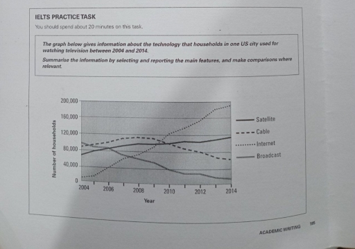
Band 4+: The graph below gives information about the technology that households in one US city used for watching television between 2004 and 2014

Image for topic: The graph below gives information about the technology that households in one US city used for watching television between 2004 and 2014
Our system will evaluate the answer based on this AI-generated description.
The image contains a line graph depicting the number of households, in thousands, using satellite, cable, internet, or broadcast technology for watching television in a US city from 2004-2014. Satellite usage started at just over 40,000 households in 2004, steadily increased to peak at just below 120,000 in 2008, and declined to below 100,000 by 2014. Cable began as the most popular method with over 120,000 households in 2004, fluctuated slightly, but maintained a general decline to just above 60,000 by 2014. Internet usage showed a gradual incline from about 20,000 households in 2004 to just below 80,000 in 2014. Broadcast technology started at just under 60,000 households in 2004, experienced a decline until 2010, and increased to nearly 70,000 by 2014. Cable was consistently the most used technology until 2010 when it was surpassed by satellite; however, by 2014, satellite again fell below cable usage. Broadcast remained the least used technology from 2004-2008, after which internet usage dropped below it until 2010.
Given the complexity of the image, the above description may not be entirely accurate.
Note: Both the topic and the answer were created by one of our users.

The graph illustrates data about the technology to watch television at homes of a city of US in between the years 2004 and 2014.

Overall,the use of internet rises over the period but consuption of broadcast fall gradually over the period. While the use of satellite fluctuate termendously but a minor decrease of cable is also be noticed.

Firstly,in the starting year 2004 the use of internet is almost zero and reached 40,000 in the year 2006. By the next 2 years it increased and reached to its triple amount approximately 120,000.In the upcoming year 2012 it reached upto 160,000.In the final year it tend to go its peak just below 200,000.On the other hand the consuption of cable usage in yje first year is just higher than 80,000 and just below the digit 120,000.But in the year 2008 it started decreasing and reached almost 60,000 in final year.

On the other hand, their is a little fluctuation in satellite users. In the starting year the number of users are almost 70,000 over the period in the final year 2014 the persntage rose upto just below 120,000. Their a great fall of podcast user which is observed. In the starting year 2004 almost 90,000 ehich decreased very badly and reached upto just 10,000.

Word Count: 213

Answers On The Same Topic:

The graph below gives information about the technology that households in one US city used for watching television between 2004 and 2014

The graph presented talks about the technology that households in one US city used for watching television between 2004 and 2014. The graph projected provides various number of informations regarding the topic. Information discussed in the graph may be useful and beneficial for the government. Overall, all households experienced a significant increase and decrease in […]

The graph below gives information about the technology that households in one US city used for watching television between 2004 and 2014

The line visualises data about various connections utilllised by the residents of a certain city in the US to watch television over a period from 2004 to 2014. Overall, the number of internet connections increased exponentially over this period while broadcasting services have declined. However, the figures for satellite connections observed an upward trend as […]

The graph below gives information about the technology that households in one US city used for watching television between 2004 and 2014

The line graph provides data on four kinds of ways ( satellite, cable, internet ,and broadcast) that families used for watching television in one city from 2004 to 2014 . Overall , the number of watching television by on internet was the most popular while the number of users was the least large by the […]

The graph below gives information about the technology that households in one US city used for watching television between 2004 and 2014

The line graph represents information about the consumption of four different types of technologies – satellite, cable, internet, and broadcast – by U.S. families from 2004 to 2014. Overall, internet usage experienced significant growth during this period, while cable, broadcast, and satellite services saw a decline. In 2004, broadcast was the most widely used technology, […]

See All

Other Topics:

The graph below shows the sales of 5 types of items in four different seasons in a US department store in 2011.

The line graph compares the sales of five different types of items – women’s clothes, men’s clothes, sports equipment, cosmetics, and jewellery – in four seasons ( Winter, Spring, Summer, and Autumn) in a US department store in 2011. Overall, women’s clothes stand out as the highest sold item among others, while men’s clothes were […]

The bar graph below shows the number of new houses constructed in a certain city from between 1999 and 2002. Summarise the information by selecting and reporting the main features, and make comparisons where relevant.

The bar chart illustrates changes in the number of new houses constructed in a certain city between 1999 and 2002. The figures are given in numbers of houses. Overall, detached houses and terrace houses showed an upward trend, whereas semi-detached houses and flats declined over the period. It is also noticeable that detached houses recorded […]

The charts below show the percentage of male and female students of different age groups who studied in Australia for full-time and part-time education in 2006. Summarize the information by selecting and reporting the main features, and make comparisons where relevant.

The bar charts compare the proportion of students of both genders in different age brackets who studied full-time and part-time in Australia in 2006. Overall, while part-time education was more prevalent among students aged 24 and under, those over 25 primarily opted for full-time education. Moreover, the figure for female attendance was generally higher than […]

The bar chart below compares the main modes of transport used by people to travel to work in London in 2000 and 2020. Summarise the information by selecting and reporting the main features, and make comparisons where relevant.

The bar chart compares the primary methods of transportation utilized by commuters to travel to work in London across the years 2000 and 2020. Overall, while driving a car remained the most dominant mode of travel throughout the period, its share declined. Conversely, public transport and cycling experienced upward trends, whereas walking rates remained entirely […]

You should spend about 20 minutes on this task. The chart below shows the annual pay (thousands of US dollars) for doctors and other workers in seven countries in 2004. Summarize the information by selecting and reporting the main features, and make comparisons where relevant.

The data represents yearly salary in thousands of USD, which is paid to doctors and workers from different job fields in the USA and other 6 countries in Europe in 2004. Overall, the US provides people with the highest income for both doctors and other workers compared to Europe. Doctors in avarage earn 120 000 […]

The graph shows the number of students enrolled on different course types in China.

The given chart illustrates the number of people taking four different courses, such as online learning, literacy courses, as well as postgraduate and undergraduate programs in China between 2008 and 2012.Overall, the vast majority of courses saw an upward trend, with the exception of literacy courses. In addition, there was a significant gap in the […]

See All
We have detected unusual activity on your device.
Please verify your identity to continue.
Note: This verification step won't sign you in. If you have a premium account, please log in to access the service as usual.
Google/Gmail Verification
Or verify using Email/Code
We've sent a verification code to:
youremail@gmail.com (Not your email?)
Enter it below to complete the verification process.
Ensure your email address is correct, your inbox is not full, and you check your spam folder. If no email arrives, consider using an alternative email.
You will need a Premium plan to perform your action!
Note: If you already have a premium account, please log in to access our services as usual.

Plans & Pricing

Our mission is to make quality education accessible for everyone.
However, to keep our hardworking team running and this service alive, we genuinely need your support!
By opting for a premium plan, not only do you sustain us in achieving the mission, but you also unlock advanced features to enrich your learning experience.

Free

For learners who aren't pressed for time

What's included on Free
100+ Cambridge IELTS Tests
Instant IELTS Writing Task 1 & 2 Evaluation (2 times/month)
Instant IELTS Speaking Part 1, 2, & 3 Evaluation (2 times/month)
Instant IELTS Writing Task 1 & 2 Essay Generator (2 times/month)
500+ Dictation & Shadowing Exercises
100+ Pronunciation Exercises
Flashcards
Other Advanced Tools

Premium

For those serious about advancing their English proficiency, and for IELTS candidates aspiring to boost their band score by 1-2 points (especially in writing & speaking) in just 30 days or less

What's included on Premium
Save Your IELTS Test Progress & Analyze Mistakes By Question Type
Save Your Own Flashcard Sets & Use Them On Any Device
Unlock All Courses, IELTS Tests, Section & Part Practice
Unlimited AI Conversations
Unlimited AI Writing Enhancement Exercises
Unlimited IELTS Writing Task 1 & 2 Evaluation
Unlimited IELTS Speaking Part 1, 2, & 3 Evaluation
Checked Answers Will Not Be Published
Unlimited IELTS Writing Task 1 & 2 Essay Generator
Unlimited IELTS Speaking Part 1, 2, & 3 Sample Generator
Unlimited Usage Of Advanced Tools & AI Features
Priority Support within 24h (12-month plan only)

Due to the nature of our service and the provided free trials, payments are non-refundable.