🔥 Today Only: Save 30% on Premium — Offer Ends Soon! - Upgrade Now!
Table

Band 5+: The graph below shows the percentage of people who travelled by bus in the UK from 2009 to 2011. Summarise the information by selecting and reporting the main features and make comparisons where relevant.

Image for topic: The graph below shows the percentage of people who travelled by bus in the UK from 2009 to 2011. Summarise the information by selecting and reporting the main features and make comparisons where relevant.
Our system will evaluate the answer based on this AI-generated description.
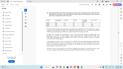
The image displays a table and narrative data regarding the percentage of people who traveled by bus in the UK from 2009 to 2011 for various purposes including shopping, social events, work, visiting friends, and day tours. In 2009, 65% of bus passengers traveled for shopping, 8% for social purposes, 12% for work, 8% for visiting friends, and 7% for day tours. In 2010, the percentages were 62% for shopping, 9% for social events, 13% for work, 8% for visiting friends, and 8% for day tours. In 2011, the percentages shifted to 60% for shopping, 10% for social, 15% for work, 7% for visiting friends, and 8% for day tours. The narrative explains that shopping was the most common purpose in all years, but saw a decrease from 65% in 2009 to 60% in 2011, while travel for work increased from 12% to 15% over the same period. Social travel and day tours also saw slight increases, whereas visiting friends remained relatively stable.
Given the complexity of the image, the above description may not be entirely accurate.
Note: Both the topic and the answer were created by one of our users.

The table chart depicts the information for the ratio of individuals who travelled via bus in UK between 2009 to 2011 for different activities like shopping, study, work, visiting friends and day tour.

Overall, it is clear that highest percentage of individuals uses bus for shopping in all years meanwhile lowest uses it for study and work.

After analyzing the table chart, it can be clearly seen that, there were 65% of people who used bus in 2009 for shopping which was dropped down by 9% in 2010 and 14% in 2011. Moreover, 4% of humans used bus for study which rose up by 5% in 2010 and remained same in 2011. However, only 7% of individuals commute to work by bus in all years collectively.

Furthermore, table chart collects that, for visiting friends same ratio of people(19%) uses bus for travelling to visit theor friends in 2009 and 2010, while 23% uses it in 2011. In addition, 7% and 12% people uses bus for day tour in 2009 and 2010 respectively and remained same as 2010 in 2011.

Word Count: 179

Answers On The Same Topic:

The graph below shows the percentage of people who travelled by bus in the UK from 2009 to 2011. Summarise the information by selecting and reporting the main features and make comparisons where relevant.

The given table demonstrates the proportion of people who prefer to use bus for going from one place to another in UK during the years 2009 to 2011. Overall, it can be clearly seen that Shopping is only place were people prefer to use bus services the most whereas usage of bus is been decreased […]

See All

Other Topics:

Describe the information shown below in your own words. What implications do the indicators have for the countries.

the table show social and economic for four countries namely canada, jepang, peru and zaire in 1994. the information includes annual income per person, life expectancy at birth, daily calorie supply, and adult literacy rate. overall, canada and japan had much higher figures for most indicators than peru and zaire. japan had the highest annual […]

The charts below show the percentage of energy produced from different sources in the UK in 1990 and 2020. Energy Source 1990 2020 Coal 38% 12% Natural Gas 22% 28% Nuclear Power 15% 20% Renewable Energy 8% 30% Oil 10% 7% Other Sources 7% 3%

The table chart illustrates the ratio of energy produced from different sources in the country Uk in year 1990 and 2020. Overall, In the first year the higher value is coal and the lowest value is other sources. Firstly, Coal is 38% in the year 1990 and in the next year thay is 12%. The […]

WRITING TASK 1 You should spend about 20 minutes on this task. The first table below shows changes in the total population of New York City from 1800 to 2000. The second and third tables show changes in the population of the five districts of the city (Manhattan, Brooklyn, Bronx, Queens, Staten Island) over the same period. Summarise the information by selecting and reporting the main features, and make comparisons where relevant. Write at least 150 words

The tables illustrate population change in New York city in overall and its five districts, Manhattan, Brooklyn, Bronx, Queens and Staten Island over a period of two hundred years. It is clear that Manhattan was the most populated district in the years 1800 and 1900, hosting more than 50% of citizens. However, other four districts […]

The table shows consumer expenses on distinct items—tobacco, footwear, and education—in five different countries in 2002.

the table presents customers spending on tobbaco and food , clothing and shoes , leisure and educational activities in several nations in 2022. Overall, it is evident that tobacco accounted for the largest proportion of consumer expenditure in most of the countries, whereas education represented a comparatively smaller share. Footwear expenditure, meanwhile, occupied an intermediate […]

the table below shows the percentage of household and electronic goods in New Zealand in 2002 and 2020. summerize the information and make comparisons

The table compares the ownership percentages of seven different household and electronic devices in New Zealand in two specific years: 2002 and 2020. Overall, ownership of almost all listed electronic items increased over the 18-year period. Cell phones and digital cameras witnessed the most dramatic growth, while video recorders were the sole product to experience […]

The table shows the percentage of women in the workforce and management across five countries. Summarise the information by selecting and reporting the main features, and make comparisons where relevant.

The table shows the percentage of women in the workforce and management across five countries. Overall, Australia and the United States had the highest proportion of women in management. The proportion of women in workforce was highest in Japan. However, Sri Lanka and Egypt reported the lowest percentage of women in management. Out of five […]

See All
We have detected unusual activity on your device.
Please verify your identity to continue.
Note: This verification step won't sign you in. If you have a premium account, please log in to access the service as usual.
Google/Gmail Verification
Or verify using Email/Code
We've sent a verification code to:
youremail@gmail.com (Not your email?)
Enter it below to complete the verification process.
Ensure your email address is correct, your inbox is not full, and you check your spam folder. If no email arrives, consider using an alternative email.
You will need a Premium plan to perform your action!
Note: If you already have a premium account, please log in to access our services as usual.

Plans & Pricing

Our mission is to make quality education accessible for everyone.
However, to keep our hardworking team running and this service alive, we genuinely need your support!
By opting for a premium plan, not only do you sustain us in achieving the mission, but you also unlock advanced features to enrich your learning experience.

Free

For learners who aren't pressed for time

What's included on Free
100+ Cambridge IELTS Tests
Instant IELTS Writing Task 1 & 2 Evaluation (2 times/month)
Instant IELTS Speaking Part 1, 2, & 3 Evaluation (2 times/month)
Instant IELTS Writing Task 1 & 2 Essay Generator (2 times/month)
500+ Dictation & Shadowing Exercises
100+ Pronunciation Exercises
Flashcards
Other Advanced Tools

Premium

For those serious about advancing their English proficiency, and for IELTS candidates aspiring to boost their band score by 1-2 points (especially in writing & speaking) in just 30 days or less

What's included on Premium
Save Your IELTS Test Progress & Analyze Mistakes By Question Type
Save Your Own Flashcard Sets & Use Them On Any Device
Unlock All Courses, IELTS Tests, Section & Part Practice
Unlimited AI Conversations
Unlimited AI Writing Enhancement Exercises
Unlimited IELTS Writing Task 1 & 2 Evaluation
Unlimited IELTS Speaking Part 1, 2, & 3 Evaluation
Checked Answers Will Not Be Published
Unlimited IELTS Writing Task 1 & 2 Essay Generator
Unlimited IELTS Speaking Part 1, 2, & 3 Sample Generator
Unlimited Usage Of Advanced Tools & AI Features
Priority Support within 24h (12-month plan only)

Due to the nature of our service and the provided free trials, payments are non-refundable.