Our system will evaluate the answer based on this AI-generated description.
The image displays a line graph with five categories tracking percentage values from 1970 to 2010: Food starts at 35% in 1970, followed by 30% in 1980, 25% in 1990, 20% in 2000, and roughly 15% in 2010; Leisure starts just above 0% in 1970, rises to approximately 5% in 1980, leaps around 10% in 1990, climbs to around 15% in 2000, and stabilizes close to 22% in 2010; Clothing starts just under 20% in 1970, drops to about 15% in 1980, decreases to nearly 12% in 1990, touches 10% in 2000, and ends just above 5% in 2010; Transport maintains at about 10% in 1970, sees a minor decline under 10% by 1980, dips further to almost 8% in 1990, stays constant towards 10% through 2000, and remains just under 10% in 2010; Health starts below 5% in 1970, follows a steady incline reaching slightly above 5% in 1980, aligns closely with Clothing's drop, nearly 8% in 2000 and remains around 9% in 2010.
Given the complexity of the image, the above description may not be entirely accurate.
Skyrocket your IELTS band score by 1-2 points in under a month with our premium plan!
Note: Both the topic and the answer were created by one of our users.
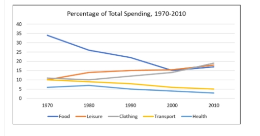
The graph illustrate how the spending of five different things changed btween 1970 and 2010 in city of Australia.
Overall, it can be see that spending on leisure and clothing showed a slight increased, whereas others showed decline. Further, spending on food shown a dramatic changed.
Looking at the data sets that increased in more detals it is clear that the persentage of mony on leisure was about 34% in 1970. By 1980, this numbere had increased to approximately 14% and remain stable before 2010. Smilarly, the percentage of spasdig on clothing was almost 11 peraent over the period start and it hit the pick in 2010 aroud 20 percent.
Turning to the remaining data sets that decresed in more details it is evident that 34% was spend on food and there was a dramatic decline to 15% in 2000, then it shown a slight incresed to 19 percent in 2010. Which was the highest number over the period shown. Now transport and health which shown smilar trend, faling from 10 and 6 percent to 5 and 3 percent in 1970 and 2010, respectively. Therefor, spending on health a lowest proportion over the period.
Word Count: 194
