🔥 Today Only: Save 30% on Premium — Offer Ends Soon! - Upgrade Now!
Line Graph

Band 4+: The graph below shows the population of particular coutry by age group starting in 1960 and including a forecast to 2040

Image for topic: The graph below shows the population of particular coutry by age group starting in 1960 and including a forecast to 2040
Our system will evaluate the answer based on this AI-generated description.
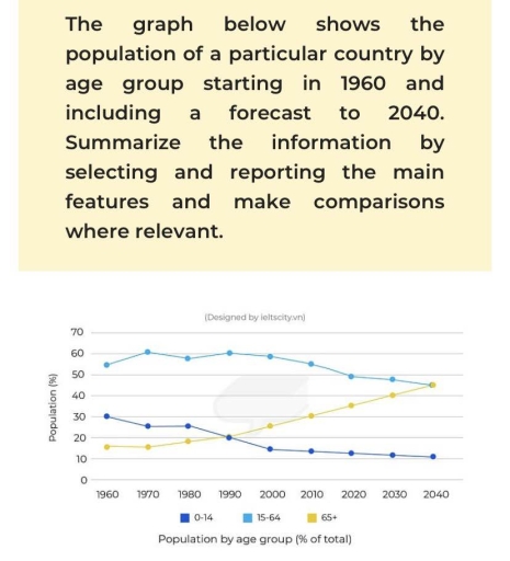
The image presents a line graph depicting population percentages across three age groups over multiple decades from 1960 to 2040. In 1960, age group 0-14 constitutes 40%, 15-64 comprises 60%, and 65+ is 5%. By 1970, age group 0-14 is at 37%, 15-64 holds at 61%, and 65+ reaches 7%. In 1980, group 0-14 marks 33%, 15-64 achieves 62%, and 65+ stands at 10%. By 1990, 0-14 has declined to 30%, age 15-64 remains stable at 63%, and 65+ increases to 13%. In 2000, age 0-14 is noted at 28%, 15-64 at 63%, and 65+ at 15%. By 2010, group 0-14 registers 27%, age 15-64 drops to 60%, and 65+ rises to 18%. In 2020, 0-14 decreases slightly to 25%, 15-64 is at 59%, and 65+ shows a growth to 20%. By 2030, predictions for age 0-14 are 23%, 15-64 at 57%, and 65+ at 23%. In 2040, projections indicate age 0-14 at 22%, 15-64 at 55%, and 65+ increases to 25%.
Given the complexity of the image, the above description may not be entirely accurate.
Note: Both the topic and the answer were created by one of our users.

The graph depicts the population of a nation in three age groups from 0 up to 65 years old between 1960 and including a forecast to 2040.

Overall, the young from 0 to 14 years old a decline among 80 years, while the older groups who are over 65 years old experiencing a significant increased. The age group from 15 to 64 also decreased slightly equal to the oldest group in the end of the forecast in 2040

Firstly, the proportion of people who are in the oldest groups around 18% in 1960, and continue soared over the 80 years. In 2040, the percentage of these people is predicted to reach at the peak of the graph, around 47%.

Secondly, there are two age groups from 0 to 14 and from 15 to 64 reached the most population in 1960, around 30% and 55% respectively. However, there is a dramatic decline in the young group which is decreased to 10% in 2040. The number of people from 15 to 64 dropped equal to the oldest people group, around 47%

Word Count: 179

Answers On The Same Topic:

The graph below shows the population of particular coutry by age group starting in 1960 and including a forecast to 2040

The graph illustrates the population of a particular country by age group starting in 1960 and including a forecast to 2040. initially, we seen that 80 decades data is given. we begin with 1960,population of above 65 years was less than population of age group between 15 to 64. However, till the age of 14 […]

The graph below shows the population of particular coutry by age group starting in 1960 and including a forecast to 2040

The supplied graph illustrates the population of one country throughout the years from 1960 and involved a forecast to 2040. Overall, the number of children and middle-aged people gradually declined, on the contrary the population of pensioners accounted for consistent growth. The population percentage shows that the number of children among the years of 0-14 […]

The graph below shows the population of particular coutry by age group starting in 1960 and including a forecast to 2040

The given line chart delineates the percentage of population among different age brackets in a specific nation from 1960 to 2020, with the predictions for 2030 and 2040. Upon initial inspection, it is apparent that the prediction witnessed a growing trend in the proportion of people aged over 65 years old, whereas the opposite was […]

The graph below shows the population of particular coutry by age group starting in 1960 and including a forecast to 2040

The line chart illustrates the proportion of population by age group from 1960 and 2040 in a particular country. Overall, both the age group of 0-14 and 15-64 show a steady decline throughout the period, while individuals ageing 65 and above demonstrate a significant increase. The middle age group, ranging from fifteen to sixty four, […]

See All

Other Topics:

The graph shows how much money was spent on foreign investment in real estate for four Asian countries from 2014 to 2024.

The line graph illustrates the amount of earnings being spent on foreign investment in housing for four various Asian nations between 2014 and 2024. A glance at the graph reveals that Japanese’s investment upsurged whereas Chinese’s investment plumped throughout the provided timeframe. As regards the Singaporians, their investment decreased gradually while Korean’s fluctuated over the […]

The line graph shows the number of overseas visitors to three different areas in a European country between 1987 and 2007. Summarise the information by selecting and reporting the main features, and make comparisons where relevant.

The data illustrates overseas visitors to three several areas in a European country from 1987 to 2007. Overall, proportion of people who visited to the coasts and lakes increased substantially, but with some flactuations, over the period, . The mountains visitors also rose, although the increase was considerably less pronounced. At the first half of […]

The line graph shows the number of overseas visitors to three different areas in a European country between 1987 and 2007. Summarise the information by selecting and reporting the main features, and make comparisons where relevant.

The given line graph compares the changes in the number of tourists visiting European country areas in a 20-year period starting from 1987. Overall, all three visiting lands gained popularity over the time, ending with the coast dominance, followed by the lakes and the mountains. While the figure for the coast and the lakes had […]

The line graph show the average number of weekly patients visiting four clinics of a hospital from 2010 to 2016. Summarise the information by selecting and reporting the main features, and make comparisons where relevant. Write at least 150 words.

The line graph illustrates the average weekly number of patients visiting four different clinics at a hospital between 2010 and 2016. Overall, the eye clinic experienced by far the most substantial growth and became the busiest clinic by 2016. In contrast, the birth-control clinic fluctuated considerably, although its figure returned to its initial level at […]

The line graph show the average number of weekly patients visiting four clinics of a hospital from 2010 to 2016. Summarise the information by selecting and reporting the main features, and make comparisons where relevant. Write at least 150 words.

The line graph illustrates the average number of patients visiting four clinics at a hospital each week between 2010 and 2016. Overall, the eye clinic experienced by far the most substantial growth and became the hospital’s busiest clinic by 2016. By contrast, the birth-control clinic fluctuated considerably, although it ended at approximately the same level […]

The graph below show the percentage of people in one country who accessed the news from four resources from 1995 , with projections to 2025 Summarise the information by selecting and reporting the main features and make comparison where relevant

The line graph illustrates changes in the proportion of citizens in a particular nation who accessed the news through four media platforms from 1995 to the present, with future projections up to 2025. Overall, the period is characterized by a dramatic shift in news consumption habits. The Internet experienced an exponential rise and is expected […]

See All
We have detected unusual activity on your device.
Please verify your identity to continue.
Note: This verification step won't sign you in. If you have a premium account, please log in to access the service as usual.
Google/Gmail Verification
Or verify using Email/Code
We've sent a verification code to:
youremail@gmail.com (Not your email?)
Enter it below to complete the verification process.
Ensure your email address is correct, your inbox is not full, and you check your spam folder. If no email arrives, consider using an alternative email.
You will need a Premium plan to perform your action!
Note: If you already have a premium account, please log in to access our services as usual.

Plans & Pricing

Our mission is to make quality education accessible for everyone.
However, to keep our hardworking team running and this service alive, we genuinely need your support!
By opting for a premium plan, not only do you sustain us in achieving the mission, but you also unlock advanced features to enrich your learning experience.

Free

For learners who aren't pressed for time

What's included on Free
100+ Cambridge IELTS Tests
Instant IELTS Writing Task 1 & 2 Evaluation (2 times/month)
Instant IELTS Speaking Part 1, 2, & 3 Evaluation (2 times/month)
Instant IELTS Writing Task 1 & 2 Essay Generator (2 times/month)
500+ Dictation & Shadowing Exercises
100+ Pronunciation Exercises
Flashcards
Other Advanced Tools

Premium

For those serious about advancing their English proficiency, and for IELTS candidates aspiring to boost their band score by 1-2 points (especially in writing & speaking) in just 30 days or less

What's included on Premium
Save Your IELTS Test Progress & Analyze Mistakes By Question Type
Save Your Own Flashcard Sets & Use Them On Any Device
Unlock All Courses, IELTS Tests, Section & Part Practice
Unlimited AI Conversations
Unlimited AI Writing Enhancement Exercises
Unlimited IELTS Writing Task 1 & 2 Evaluation
Unlimited IELTS Speaking Part 1, 2, & 3 Evaluation
Checked Answers Will Not Be Published
Unlimited IELTS Writing Task 1 & 2 Essay Generator
Unlimited IELTS Speaking Part 1, 2, & 3 Sample Generator
Unlimited Usage Of Advanced Tools & AI Features
Priority Support within 24h (12-month plan only)

Due to the nature of our service and the provided free trials, payments are non-refundable.