🔥 Today Only: Save 30% on Premium — Offer Ends Soon! - Upgrade Now!
Line Graph

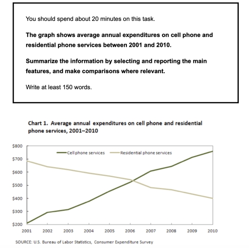
Band 5+: The graph shows average annual expenditures on cell phone and residential phone services between 2001 and 2010.

Image for topic: The graph shows average annual expenditures on cell phone and residential phone services between 2001 and 2010.
Our system will evaluate the answer based on this AI-generated description.
The image displays a line graph titled "Chart 1. Average annual expenditures on cell phone and residential phone services, 2001–2010," with two lines representing cell phone services and residential phone services. The y-axis ranges from $200 to $800 in increments of $100, and the x-axis lists years from 2001 to 2010. In 2001, the cell phone services line begins at approximately $210, while the residential phone services line starts at around $670. Over the 10-year period, the cell phone services line exhibits a steady upward trend, culminating at approximately $760 in 2010. Conversely, the residential phone services line experiences a gradual decline, falling to about $350 by 2010. The graph indicates a crossover point between the two lines around the year 2006, where expenditures on cell phone services surpass those on residential phone services for the first time. The exact numerical data points for each line at every year mark are not provided. The source of the data is cited as the U.S. Bureau of Labor Statistics, Consumer Expenditure Survey.
Given the complexity of the image, the above description may not be entirely accurate.
Note: Both the topic and the answer were created by one of our users.

this given line graph illustrate information about the average annual expenditure on cell phones and residential phone service between 2001 to 2010

It is crystal clear that income spend on residential services was noticed at peak in 2001, where as an amount spent on cells was at lowest level in 2001

To begin with in the year 2001, people expenditure on cell phones was noticed at dollar 200. Moreover from the year 2002 to 2006, it followed in increasing trend from dollar 300 to dollar 500 from the year 2001 to 2008 expenditure on cell phone was recorded between Dollar 600 to 700 amount spent by individual from 2009 to 2010 was under dollar 750

Further more in the beginning of 20th century, people spent dollar 700 on a residential phone services from the year 2002 to 2005 expenditure on residential phone services followed decreasing trend, whereas Hindi year 2006 expenditure on both moon was intersect each other in the year 2007 amount spent on residential phone was noticed that dollar 550 in the year 2008, 2009, 2010. The expenditure on residential phone services was noticed as a $.0500 $ 450 and 400 respectively.

Word Count: 194

Answers On The Same Topic:

The graph shows average annual expenditures on cell phone and residential phone services between 2001 and 2010.

the line graph shows the annual average expenditures of Americans user on cell phone and residential phone services yearly over a 10-year period. overall,spending on cell phone services are very merely increased while on landline services sharply decreased and both services met at same level of records in 2006. In 2001, spending on mobile phone […]

The graph shows average annual expenditures on cell phone and residential phone services between 2001 and 2010.

The line graph illustrates the average cost that American customers spent on mobile and landline phone services annually over a 10-year period. Overall, spending on residential phone services dramatically declined, while popularity of mobile services increased sharply throughout a decade. Also, both of services met at the same record in 2006. In 2001, spending on […]

The graph shows average annual expenditures on cell phone and residential phone services between 2001 and 2010.

The line graph tells that how much cost did american costumers spent on sellphone and landline in ten years. It tells that cell phone services increased while landline services seems to be declined but in 2006 both of the services were at same record acording to other remaing years. If we see in 2001 the […]

The graph shows average annual expenditures on cell phone and residential phone services between 2001 and 2010.

The graphs illustrate average annual spendings on cell phone and residential phone services over a nine-year period from 2001 and 2010. Overall, the mean cell phone annual expenditures showed increased each year from 2001 until 2010 and reached a peak spendings in 2010. However, compare to the residential phone service, it decreased over almost a […]

The graph shows average annual expenditures on cell phone and residential phone services between 2001 and 2010.

The graphs illustrate average annual spendings on cell phone and residential phone services over a nine-year period from 2001 and 2010. Overall, the mean cell phone annual expenditures showed increased each year from 2001 until 2010 and reached a peak spendings in 2010. However, compare to the residential phone service, it decreased over almost a […]

See All

Other Topics:

The graph shows data about the annual earnings of three bakeries in calagry ,2000-2010. Summarize the information by selecting and reporting main features and make comparison where relevant.

The graph illustrates the annual earnings of three bakeries over the span of 10 years from 2000 to 2010. Overall, Mari Backeshop emrged as highest earning bakery throughout the period.In contrast, Amandine Bakery was highest earning bakery at the start of the period but dewindled over the time, while Bolo Cakery showed gradual increase in […]

The line graph shows the number of people using five kinds of public facilities in a town in France at different times during the year 2022. Summarise the information by selecting and reporting the main features and make comparisons where relevant.

The line graph presents information about the number of people using five types of public facilities:library,museum,park,public pool and youth centre in a town in France at different month during the year 2022. Overall,the graph data clearly shows that,the park was unpredictable through the given period and reached the peak of share.In contrast,library stayed constant all […]

The graph below shows changes in the percentage of households with cars in one European country between 1961 and 2001.

The line graph compares the no-car, 1-car, and 2+-car categories in terms of the percentage of owners in European households over a 40-year period, between 1961 and 2001. Overall, ownership of 2+ cars and 1 car exhibited an upward trajectory, whereas the reverse was true for the no-car category. Notably, ownership of 2+ cars witnessed […]

The graph below gives information about total oil use of 4 main consumers from 2009 to 2030

The given line chart illustrate information about oil consumed by main four consumers in year 2009 and 2030 in millions barrel per day. Overall, we can clearly seen that the usa were more oil in 2009 and will be remain highest in year 2030. whereas others remain low comapred as oters. on one hand, oil […]

The graph below gives information about the number of jobs in four sectors economy in the US between 1960 and 2020.

in this report, i will illustrate the multi line graph. This graph, shows the numbers of miilions job in four different sectors from 1960 to 2020 in the US. Firstly, millions of job in manufacturing sector is highly in 1960 from the other sectors, which is slightly increasing in 1980 then continous decreasing in 2020 […]

The chart below shows the percentage of households with different kinds of technology in the UK from 1997 to 2001. Summarise the information by selecting and reporting the main features, and make comparisons where relevant.

The line chart compares the proportion of people who used different types of technology in the UK over the period shown. Overall, the figures for most countries saw an upward trend, with the CD player demonstrated the highest proportion, regardless of the year. Of particual note, the telephone showed a significant increase in usage, while […]

See All
We have detected unusual activity on your device.
Please verify your identity to continue.
Note: This verification step won't sign you in. If you have a premium account, please log in to access the service as usual.
Google/Gmail Verification
Or verify using Email/Code
We've sent a verification code to:
youremail@gmail.com (Not your email?)
Enter it below to complete the verification process.
Ensure your email address is correct, your inbox is not full, and you check your spam folder. If no email arrives, consider using an alternative email.
You will need a Premium plan to perform your action!
Note: If you already have a premium account, please log in to access our services as usual.

Plans & Pricing

Our mission is to make quality education accessible for everyone.
However, to keep our hardworking team running and this service alive, we genuinely need your support!
By opting for a premium plan, not only do you sustain us in achieving the mission, but you also unlock advanced features to enrich your learning experience.

Free

For learners who aren't pressed for time

What's included on Free
100+ Cambridge IELTS Tests
Instant IELTS Writing Task 1 & 2 Evaluation (2 times/month)
Instant IELTS Speaking Part 1, 2, & 3 Evaluation (2 times/month)
Instant IELTS Writing Task 1 & 2 Essay Generator (2 times/month)
500+ Dictation & Shadowing Exercises
100+ Pronunciation Exercises
Flashcards
Other Advanced Tools

Premium

For those serious about advancing their English proficiency, and for IELTS candidates aspiring to boost their band score by 1-2 points (especially in writing & speaking) in just 30 days or less

What's included on Premium
Save Your IELTS Test Progress & Analyze Mistakes By Question Type
Save Your Own Flashcard Sets & Use Them On Any Device
Unlock All Courses, IELTS Tests, Section & Part Practice
Unlimited AI Conversations
Unlimited AI Writing Enhancement Exercises
Unlimited IELTS Writing Task 1 & 2 Evaluation
Unlimited IELTS Speaking Part 1, 2, & 3 Evaluation
Checked Answers Will Not Be Published
Unlimited IELTS Writing Task 1 & 2 Essay Generator
Unlimited IELTS Speaking Part 1, 2, & 3 Sample Generator
Unlimited Usage Of Advanced Tools & AI Features
Priority Support within 24h (12-month plan only)

Due to the nature of our service and the provided free trials, payments are non-refundable.