🔥 Today Only: Save 30% on Premium — Offer Ends Soon! - Upgrade Now!
Multiple Graphs

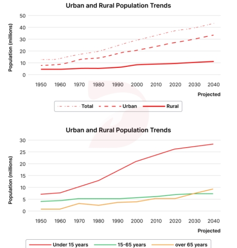
Band 5+: The graphs below illustrate trends in population in Southern Pacific Ocean countries from 1950, with projections up to 2040.

Image for topic: The graphs below illustrate trends in population in Southern Pacific Ocean countries from 1950, with projections up to 2040.
Our system will evaluate the answer based on this AI-generated description.
The image presents two graphs. The first graph details three datasets from 1950 to 2040 (projected): Total population beginning under 10 million in 1950, surpassing 20 million around 1990, 30 million near 2020, reaching approximately 42 million by 2040; Urban population starting below 5 million in 1950, crossing 10 million in 1990, nearing 20 million in 2020, reaching about 30 million by 2040; Rural population maintains near 10 million from 1950, peaking slightly above 10 million in 2000, slightly declining to end around 10 million by 2040. The second graph represents age group trends from 1950 to 2040 (projected): Population under 15 years starting around 10 million, decreasing slightly towards 9 million by 2040; Population aged 15-65 years rising from about 10 million in 1950 to approximately 25 million by 2040, representing the highest plotted category; Population over 65 years begins under 2 million in 1950, grows to above 5 million by 2040.
Given the complexity of the image, the above description may not be entirely accurate.
Note: Both the topic and the answer were created by one of our users.

The line graph shows Southern Pacific Ocean countries population trends from 1950 along with it’s projections upto 2040.

Overall, there was a increase in the total amount of population, whichs was the result of climbing in the amount of populations from urban and rural. The number of demographics in age structure mostly 15-65 years

The rural population trend was stagnant over the years, expect in 2000. In 2000, there was a slight increase in the numbers, approximately 5 millions. Thus, it’s expected that it will remain stagnant in coming years as well. However, population trends in Urban areas are increasing rapidly, which will also increase the number of total population trends. It’s predicted that by 2040, the total population will reach up to 40 millions, where Urban areas population trends will be about 35 millions.

There was a significant rise in the number of people under 15, after 1960. And after 1980, the numbers rising at a alarming speed, which means by 2040, more than half of population will be youngsters. The numbers of people around 15-65 years old, remained stagnant, with only a little growth over the years. And people who are above 65 years, their numbers keeps fluctuating, although it’s predicted that the number will increase in future.

Word Count: 210

Answers On The Same Topic:

The graphs below illustrate trends in population in Southern Pacific Ocean countries from 1950, with projections up to 2040.

The line graphs shows growth in population in southern pacific ocean countries between 1950 and 2020 with prediction up to 2040. Overall, both graphs experienced an upward trend, where urban areas accounted for bigger number and individuals under 15 surpassed people aged 15-65 in terms of population. In 1950, urban and rural areas started with […]

The graphs below illustrate trends in population in Southern Pacific Ocean countries from 1950, with projections up to 2040.

The two lines compare the population of urban and rural area with the trends of age groups from 1950 and be predicted in 2024 in Southern Pacific Ocean. Overall, the number of people in urban and rural area witnessed an upward trajectory, with projection to reacgh their peaks in 2040. Meanwhile, the population focuses on […]

The graphs below illustrate trends in population in Southern Pacific Ocean countries from 1950, with projections up to 2040.

The first line graph compares the trend in population in Southern Pacific Ocean countries from 1950 as well as giving projection for the year of 2040. Meanwhile, the second chart illustrates the trend in age in the same period. Overall, if all projections materialize , both given line charts will show an upward trend in […]

The graphs below illustrate trends in population in Southern Pacific Ocean countries from 1950, with projections up to 2040.

Overall, there has been an increase in the population of the Southern Pacific Ocean countries, primarily due to the growth in the urban population and the youngest demographic, which also formed the largest segments in terms of region and age, respectively. Regarding the total population, including both urban and rural residents, it has all increased. […]

The graphs below illustrate trends in population in Southern Pacific Ocean countries from 1950, with projections up to 2040.

The provided line charts delineate tendencies in population of countries in the Southern Pacific Ocean, measured in millions, from 1950 with predictions up to 2040. Overall, there was a gradual increase in population trends in both urban and rural areas, similarly with the tendency of the survey about the age of population in both regions. […]

See All

Other Topics:

the pie graphs below show the result of a survey of children's activity

THE TWO PIE CHARTS ILLUSTRATE OUTCOME OF A SURVEY OF A CHILDREN’S CULTURAL AND LEISURE ACTIVITIES , WITH THE FIRST CHART SHOWING THE ACTIVITIES PREFERRED BY BOYS AND THE SECOND PRESENTING THOSE PARTICIPATED IN BY GIRLS . OVERALL , BOYS AND GIRLS SHOWED DIFFERENT INTERESTS FOR CULTURAL AND LEISURE ACTIVITIES , WITH SOME ACTIVITIES BEING […]

It is also claimed that women have achieved greater freedom and have access to the same opportunities as men. The pia chart below show some employment patterns in a developed country.

The pie chart shows the proportion of women workers in different fields and compared those figures to males’ proportions. Overall, women who working in other manual jobs approximately recorded a figure as men, while men recorded nearly double the rate of women who work in managerial and profficional jobs. In contrast, the proportion of women […]

The charts below show the results of a survey of adult education. The first chartshows the reasons why adults decide to study. The pie chart shows how peoplethink the costs of adult education should be shared.Write a report for a university lecturer, describing the information shown below.

The charts below illustrate the results of a poll of adult education. The graph shows why adults are interested in studying, while the pie chart demonstrates how individuals think the costs of adult education should be distributed. Overall, according to the graph, interest in a subject and gaining qualifications are the most popular and common […]

The charts below show the results of a survey of adult education. The first chartshows the reasons why adults decide to study. The pie chart shows how peoplethink the costs of adult education should be shared.Write a report for a university lecturer, describing the information shown below.

The charts below illustrate the result of a poll of adult education. The graph shows why adults are interested in studying, while the pie chart demonstrates how individuals consider the adult education costs should be distributed. Overall, according to the graph, interest in a subject and gaining qualifications are the most popular and common reasons […]

the pie chart below shows the comparison of different kinds of energy production in France in two years. summarize the information by selecting and reporting the main features, and make comparisons where relevant

The pie charts illustrate the proportion of five different categories of energy production of France in two distinct years. Overall, gas and coal shared the largest proportion in the both years. All kind of energy production increased over the years, except the petrol it fell in 2005. To begin with, the gas and coal had […]

You should spend about 20 minutes on this task. The pie chart shows the percentage of women in poverty and the bar chart shows poverty rates by sex and age. They are from the United States in 2008. Summarise the information by selecting and reporting the main features and make comparisons where relevant. Write at least 150 words.

The initial pie chart illustrates the proportion of women in poverty, and the table gives information about poverty rates by sex and age from United State in 2008. Overall, it is clear that, single women with no children shared the largest of among all family composition,while married women with no dependent children experienced the opposite […]

See All
We have detected unusual activity on your device.
Please verify your identity to continue.
Note: This verification step won't sign you in. If you have a premium account, please log in to access the service as usual.
Google/Gmail Verification
Or verify using Email/Code
We've sent a verification code to:
youremail@gmail.com (Not your email?)
Enter it below to complete the verification process.
Ensure your email address is correct, your inbox is not full, and you check your spam folder. If no email arrives, consider using an alternative email.
You will need a Premium plan to perform your action!
Note: If you already have a premium account, please log in to access our services as usual.

Plans & Pricing

Our mission is to make quality education accessible for everyone.
However, to keep our hardworking team running and this service alive, we genuinely need your support!
By opting for a premium plan, not only do you sustain us in achieving the mission, but you also unlock advanced features to enrich your learning experience.

Free

For learners who aren't pressed for time

What's included on Free
100+ Cambridge IELTS Tests
Instant IELTS Writing Task 1 & 2 Evaluation (2 times/month)
Instant IELTS Speaking Part 1, 2, & 3 Evaluation (2 times/month)
Instant IELTS Writing Task 1 & 2 Essay Generator (2 times/month)
500+ Dictation & Shadowing Exercises
100+ Pronunciation Exercises
Flashcards
Other Advanced Tools

Premium

For those serious about advancing their English proficiency, and for IELTS candidates aspiring to boost their band score by 1-2 points (especially in writing & speaking) in just 30 days or less

What's included on Premium
Save Your IELTS Test Progress & Analyze Mistakes By Question Type
Save Your Own Flashcard Sets & Use Them On Any Device
Unlock All Courses, IELTS Tests, Section & Part Practice
Unlimited AI Conversations
Unlimited AI Writing Enhancement Exercises
Unlimited IELTS Writing Task 1 & 2 Evaluation
Unlimited IELTS Speaking Part 1, 2, & 3 Evaluation
Checked Answers Will Not Be Published
Unlimited IELTS Writing Task 1 & 2 Essay Generator
Unlimited IELTS Speaking Part 1, 2, & 3 Sample Generator
Unlimited Usage Of Advanced Tools & AI Features
Priority Support within 24h (12-month plan only)

Due to the nature of our service and the provided free trials, payments are non-refundable.