🔥 Today Only: Save 30% on Premium — Offer Ends Soon! - Upgrade Now!
Line Graph

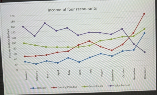
Band 7+: The line graph below provides information about the incomes of four restaurants in a city in 2010. Summarise the information by selecting and reporting the main features, and make comparisons where relevant.

Image for topic: The line graph below provides information about the incomes of four restaurants in a city in 2010. Summarise the information by selecting and reporting the main features, and make comparisons where relevant.
Our system will evaluate the answer based on this AI-generated description.
The image shows the monthly income for four restaurants over one year: Delicacy starts at $40k, rises to $50k in February, $60k in March, $70k in April and May, $80k in June and July, $90k in August, $100k in September and October, $110k in November, peaking at $120k in December; Evening Paradise begins at $140k in January, drops to $130k in February and March, then ascends to $150k in April, remains steady from May to June, reaches $160k in July, continues to $150k in August, drops to $130k in September and October, remains consistent at $140k in November, concluding at $160k in December; Grand Fiesta opens at $160k in January, drops to $120k in February, bounces to $170k in March, proceeds to $140k in April, climbs to $150k in May and June, levels at $140k in July and August, arrives at $130k in September, increases to $150k in October, dips to $140k in November, ends at $170k in December; Spicy Fortune starts at $80k in January, maintains this in February and March, goes to $110k in April, maintains it in May, $120k in June, and $130k in July, back to $120k in August, holds at $140k in September, climbs to $160k in October, holds at $150k in November, and reaches $190k in December.
Given the complexity of the image, the above description may not be entirely accurate.
Note: Both the topic and the answer were created by one of our users.

This line graph illustrates the income of four different restaurants located in a city in the year of 2010. It consists of the following restaurants: Delicacy, Evening Paradise, Grand Fiesta, and Spicy Fortune. Units are shown in thousands of dollars.

Overall, the income of all three restaurants increased, while for Spicy Fortune it declined. However, Spicy Fortune used to have the most profitable business out of all as this restaurant’s income was on the very peak in January, but it plunged by the end of the year.

Delicacy and Evening Paradise started at just under 60. Delicacy’s income was fluctuating between 20 and 40 thousand dollars, until it soared by the end of the year, reaching 100. Evening Paradise had steady income of 50 until May, when it started to rise and in September, after its decrease, the income started to surge, reaching the peak of 190.

On the other hand, Grand Fiesta managed to rise its income from 100 to 140, avoiding drops. Spicy Fortune started at 160, experiencing dramatic plunges. This restaurant eventually ended up reaching the lowest peak of 50.

Word Count: 183

Answers On The Same Topic:

The line graph below provides information about the incomes of four restaurants in a city in 2010. Summarise the information by selecting and reporting the main features, and make comparisons where relevant.

The line graph gives information about the incomes of four restaurants in a city from January to December 2010. Overall, it can be seen that during this period, restaurant “Spicy Fortune” considered to be the most successful one and had the highest income throughout the whole year. But by the end of the period the […]

The line graph below provides information about the incomes of four restaurants in a city in 2010. Summarise the information by selecting and reporting the main features, and make comparisons where relevant.

The line graph illustrates the revenue data of four restaurants namley, delicacy, evening paradise, grand fiesta and spicy fortune in a city in the year 2010. Overall, restaurant named spicy fortune was the highest record on most of the months. In contrast, delicacy restaurant recorded by far the lowest figures interms of income. Spicy fortune […]

See All

Other Topics:

the line chart shows the number of people who used different communication services in the world

The line graph illustrates changes in telecommunication services between 1998 and 2008. Overall, cellular phone service experienced the most significant increase, while landline service remained relatively stable. Internet service also showed a considerable upward trend, whereas fixed broadband and mobile broadband increased slightly towards the end of the period. Looking first at internet service, the […]

The line graph shows the number of students who used the school library and sports centre between 2019 and 2023. Summarise the information by selecting and reporting the main features, and make comparisons where relevant.

The provided line graph compares the number of students using school facilities, including the library and the sports center, over a four-year period between 2019 and 2023. Overall, it is clear that both school services witnessed an upward trend over the given period. Another striking detail is that while the library was initially more popular, […]

The graph below shows the number of students enrolled in two different schools. Summarize the information by selecting and reporting the main features, and make comparisons where relevant.

The chart illustrates how many students enrolled in Riverside School and Litchfield School from 2011 to 2015. Overall, the two schools moved in completely opposite directions. Litchfield grew sharply to become the clear leader, while Riverside tended to decrease considerably after peaking early, leading to the two schools ending the period further apart than when […]

The graph below shows the average house prices in three countries between the years 1997 and 2014.

The line chart compares the average property values in three countries from 1997 to 2014. Overall, all nations experienced similar upward trends over the 17-year period. Country A maintained the highest figures for most of the time, whereas Country C recorded the smallest numbers. Firstly, Country A recorded a dramatic rise in property cost, increasing […]

The line graph shows the average number of people attending top-level football matches in three European countries from 1980 to 2004. Summarise the information by selecting and reporting the main features and make comparisons where relevant. Write at least 150 words

The line graph compares the average attendance per top-level football match in three European countries from 1980 and 2004. Overall, the percentage of attendance per top-level football match in three European countries, Although England experienced the highest overall figure by the end of the period, while Italy, despite starting from by far highest proportion, saw […]

Write the description according to the instructions. The line graph shows the number of visitors to four tourist destinations on an island between 1980 and 2015.

The line graph illustrates how many visitors in different areas of an island from 1980 to 2015. Overall, the majority of people tent to favour visiting aquariums since its numbers always reaching the highest compared to other places. At the begining of the period, the figure stood at 8 millions of visitors by 1980, then […]

See All
We have detected unusual activity on your device.
Please verify your identity to continue.
Note: This verification step won't sign you in. If you have a premium account, please log in to access the service as usual.
Google/Gmail Verification
Or verify using Email/Code
We've sent a verification code to:
youremail@gmail.com (Not your email?)
Enter it below to complete the verification process.
Ensure your email address is correct, your inbox is not full, and you check your spam folder. If no email arrives, consider using an alternative email.
You will need a Premium plan to perform your action!
Note: If you already have a premium account, please log in to access our services as usual.

Plans & Pricing

Our mission is to make quality education accessible for everyone.
However, to keep our hardworking team running and this service alive, we genuinely need your support!
By opting for a premium plan, not only do you sustain us in achieving the mission, but you also unlock advanced features to enrich your learning experience.

Free

For learners who aren't pressed for time

What's included on Free
100+ Cambridge IELTS Tests
Instant IELTS Writing Task 1 & 2 Evaluation (2 times/month)
Instant IELTS Speaking Part 1, 2, & 3 Evaluation (2 times/month)
Instant IELTS Writing Task 1 & 2 Essay Generator (2 times/month)
500+ Dictation & Shadowing Exercises
100+ Pronunciation Exercises
Flashcards
Other Advanced Tools

Premium

For those serious about advancing their English proficiency, and for IELTS candidates aspiring to boost their band score by 1-2 points (especially in writing & speaking) in just 30 days or less

What's included on Premium
Save Your IELTS Test Progress & Analyze Mistakes By Question Type
Save Your Own Flashcard Sets & Use Them On Any Device
Unlock All Courses, IELTS Tests, Section & Part Practice
Unlimited AI Conversations
Unlimited AI Writing Enhancement Exercises
Unlimited IELTS Writing Task 1 & 2 Evaluation
Unlimited IELTS Speaking Part 1, 2, & 3 Evaluation
Checked Answers Will Not Be Published
Unlimited IELTS Writing Task 1 & 2 Essay Generator
Unlimited IELTS Speaking Part 1, 2, & 3 Sample Generator
Unlimited Usage Of Advanced Tools & AI Features
Priority Support within 24h (12-month plan only)

Due to the nature of our service and the provided free trials, payments are non-refundable.