🔥 Today Only: Save 30% on Premium — Offer Ends Soon! - Upgrade Now!
Line Graph

Band 5+: The line graph shows TV news viewing figures over a one-year period.

Image for topic: The line graph shows TV news viewing figures over a one-year period.
Our system will evaluate the answer based on this AI-generated description.
The image displays a line graph titled "Channel one news viewing figures" with four lines representing different times: 1 pm, 6 pm, 9:30 pm, and 11 pm, tracking monthly TV news viewing figures in millions of viewers per day from January to December. The 1 pm news shows viewership starts around 3.2 million in January, peaks at nearly 4.5 million in April, and drops to about 2.8 million by December. The 6 pm news begins at approximately 4.8 million, remains relatively stable, peaking slightly above this figure around May, and ends around 4.2 million. The 9:30 pm slot starts at roughly 2.7 million, rises to a peak of around 4.2 million in May, then drops sharply to about 2.5 million by December. The 11 pm news, introduced on 1st May, starts at about 1 million, peaks at around 1.5 million in June, and drops to under 1 million by December. The graph shows seasonality in viewership patterns and a marked increase for all times around May with varying degrees of decline toward the year-end.
Given the complexity of the image, the above description may not be entirely accurate.
Note: Both the topic and the answer were created by one of our users.

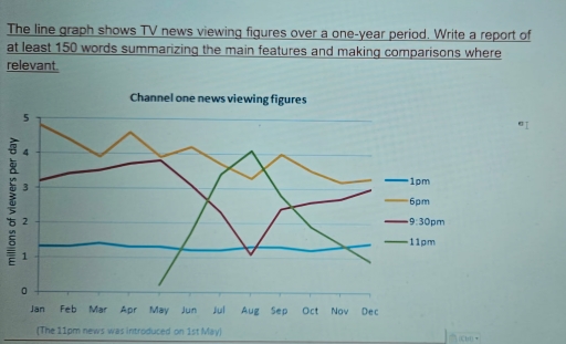
The given line graph illustrates the number of viewers per day in million of a TV news channel over a period of one year.

Overall, the number of viewers were most during the evening time which was around 6pm through out the year whereas very few millions of people watched the channel during the mid day around one 1pm.

Obeserving the line graph,around 5 million people used to watch the news channel during evening time on january which was the peak time over the year.Over the period of time, it showed fluctuations and the number of viewers decreased to around 3 million around December.The number of people who watched the channel at 1pm reamined steady throughout the year which was around 1 million.

Similarly, around 3 million people used to watch the show around 9:30 pm in january which slighty rose to 4 million during may.After that time period, it experienced a large dip to around 1 million in august.After August, it rocketed to around 2.5 million and reached around 3 million coming to December.The 11pm show on the channel experienced the views starting from May which rose significantly to 4 million arounf August and had a sudden dip after August and reached 1 million in December.

Word Count: 207

Answers On The Same Topic:

The line graph shows TV news viewing figures over a one-year period.

The data illustrates number of viewers of a TV news each month with each line representing different time of the day. Viewers are measured in millions. Overall, the 11pm news introduced on May skyrocketed to a peak until it gradually decreased, whereas the 9:30 news experienced a significant drop at the similar month. The other […]

The line graph shows TV news viewing figures over a one-year period.

The line graph illustrates TV news viewing figures over a one-year period. Overall, it is evident that from the start of the year the most frequent time of viewing news was at 6 p.m. However, none of the viewer never watched TV news at 11 p.m. until first May. In January, the most TV news […]

The line graph shows TV news viewing figures over a one-year period.

The line graph illustrates TV news viewing figures on Channel One at four different times other the day a one-year period. Overall, the 6 pm and 9:30 pm news programmes attracted significantly larger audiences than the 1 pm and 11 pm bulletins. While viewing figures for most time slots fluctuated throught the year, the 11 […]

The line graph shows TV news viewing figures over a one-year period.

The line graph shows TV news viewing figures over a one-year period. The line graph illustrates the number of viewing figures on channel one on various times of the day annualy. Overall, it is evident that, the 6pm show had the highest viewership at the start, while the 1 PM show remained stable throughout the […]

See All

Other Topics:

The line graph gives information about the number of Iranian, Greek and Turkish students who enrolled at Sheffield University between 2005 and 2009. Summarize the information by selecting and reporting the main features, and make comparision where relevant.

The line graph illustrates the number of international students from three countries, Iran, Greece and Turkey, who registered at Sheffield University between 2005 and 2009. Overall, it is clear that the number of Greek students decreased significantly throughout the period, while the figures for Iranian and Turkish students increased substantially. In 2005, Greece had the […]

The graph below shows the percentage of people in a European country, by age group, who believed that wearing traditional attire was an important part of their cultural identity between 1990 and 2020.

The line graph illustrates the percentage of people lived in Europe, by five age groups who had a belief that wearing traditional attire had a significant meaning of their cultural identification between 1990 and 2020. Overall, age grops that are older showed higher percentage but gradually declined decade by decade. As for the younger generation […]

The chart below shows the changes in car ownership in Great Britain between 1961 and 2001.

The line graph illustrates the changes in the proportion of households owning cars in Great Britain over a 40-year period from 1961 to 2001. Overall, it is clear that car ownership in Great Britain increased significantly over the period. The percentage of households without a car experienced a sharp decline, while the figures for families […]

The diagram below gives information about the number of parcels delivered by two major mail services companies from 1920 to 2000. Summarise the information by selecting and reporting the main features, and make comparisons where relevant.

The diagram illustrates data about the number of parcels delivered by two major mail service companies between 1920 and 2000. Overall, while Federal Express (FedEx) underwent a period of volatility, TNT mail services experienced an upward trend throughout the period. In addition, the highest number of parcels delivered by both FedEx and TNT was observed […]

The line graph below gives information on cinema attendance in the UK. Summarize the information by selecting and reporting the main features, and make comparisons where relevant. Write at least 150 words.

The provided line chart illustrates the great Britain reports for percentage of people are attending cinema age-by- age Between 1984 to 2003 . Following all Data are increasingly significant over the time . From 1984 to 1988 age fifteen to twenty – four are 18% grown at that time and after that Between 2000 to […]

The chart below shows the percentage of households with different kinds of technology in the UK from 1997 to 2001. Summarise the information by selecting and reporting the main features, and make comparisons where relevant.

The graph compares the percentage of UK households that had access to various types of technology, namely CD player, telephone, computer, and internet as well as DVD player over the period from 1997 to 2001. Overall, it can be seen that all types of compared technology experienced an overall increase. CD player dominated over the […]

See All
We have detected unusual activity on your device.
Please verify your identity to continue.
Note: This verification step won't sign you in. If you have a premium account, please log in to access the service as usual.
Google/Gmail Verification
Or verify using Email/Code
We've sent a verification code to:
youremail@gmail.com (Not your email?)
Enter it below to complete the verification process.
Ensure your email address is correct, your inbox is not full, and you check your spam folder. If no email arrives, consider using an alternative email.
You will need a Premium plan to perform your action!
Note: If you already have a premium account, please log in to access our services as usual.

Plans & Pricing

Our mission is to make quality education accessible for everyone.
However, to keep our hardworking team running and this service alive, we genuinely need your support!
By opting for a premium plan, not only do you sustain us in achieving the mission, but you also unlock advanced features to enrich your learning experience.

Free

For learners who aren't pressed for time

What's included on Free
100+ Cambridge IELTS Tests
Instant IELTS Writing Task 1 & 2 Evaluation (2 times/month)
Instant IELTS Speaking Part 1, 2, & 3 Evaluation (2 times/month)
Instant IELTS Writing Task 1 & 2 Essay Generator (2 times/month)
500+ Dictation & Shadowing Exercises
100+ Pronunciation Exercises
Flashcards
Other Advanced Tools

Premium

For those serious about advancing their English proficiency, and for IELTS candidates aspiring to boost their band score by 1-2 points (especially in writing & speaking) in just 30 days or less

What's included on Premium
Save Your IELTS Test Progress & Analyze Mistakes By Question Type
Save Your Own Flashcard Sets & Use Them On Any Device
Unlock All Courses, IELTS Tests, Section & Part Practice
Unlimited AI Conversations
Unlimited AI Writing Enhancement Exercises
Unlimited IELTS Writing Task 1 & 2 Evaluation
Unlimited IELTS Speaking Part 1, 2, & 3 Evaluation
Checked Answers Will Not Be Published
Unlimited IELTS Writing Task 1 & 2 Essay Generator
Unlimited IELTS Speaking Part 1, 2, & 3 Sample Generator
Unlimited Usage Of Advanced Tools & AI Features
Priority Support within 24h (12-month plan only)

Due to the nature of our service and the provided free trials, payments are non-refundable.