🔥 Today Only: Save 30% on Premium — Offer Ends Soon! - Upgrade Now!
Line Graph

Band 6+: The graph below compares the number of visits to two new music sites on the web. Summarise the information by selecting and reporting the main features, and make comparisons where relevant.

Image for topic: The graph below compares the number of visits to two new music sites on the web. Summarise the information by selecting and reporting the main features, and make comparisons where relevant.
Our system will evaluate the answer based on this AI-generated description.
The image is a line graph titled "Visits to two new music sites on the web," with the x-axis labeled "Days" marking a time range from 1 to 15 and the y-axis labeled "'000s" reporting visits in thousands from 0 to 180. Two lines track visits to "Music Choice" and "Pop Parade" across the 15 days. Music Choice starts at around 120,000 visits on Day 1, fluctuates between approximately 40,000 and 80,000 visits from Day 2 to Day 9, spikes to about 140,000 on Day 10, drops to around 100,000 on Day 11, jumps to nearly 160,000 on Day 12, then declines to roughly 60,000 on Day 13 before recovering to 120,000 on Day 14 and finishing at just under 140,000 by Day 15. Pop Parade begins close to 80,000 visits on Day 1, experiences ups and downs reaching a low near 20,000 on Day 5 and highs around 100,000 on Days 7 and 10, sharply increases to above 160,000 visits on Day 11, plummets to approximately 80,000 on Day 12, climbs again past 160,000 by Day 13, and concludes the period with a decline to about 140,000 visits on Day 15.
Given the complexity of the image, the above description may not be entirely accurate.
Note: Both the topic and the answer were created by one of our users.

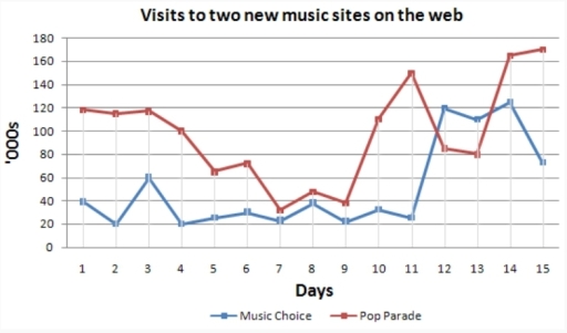
The line graph shows how many visits the two new music sites have over a period of 15 days.

All in all Pop Parade took the upper hand in the number of visits. However, on days 12 and 13 Music Choice overtook Pop Parade with a 40,000 difference in numbers.

Furthermore, Pop Parade reached its peak on day 15 (170,000). By contrast, Music Choice soared to 120,000 on day 14. Moreover, there was a fluctuation on days 1 to 7 for Music Choice but the overall trend was considered to be upward. From day 9 to 11 there was a slight increase, not that remarkable in numbers, but afterwards, on day 12 the number rocketed to approximately 120,000. Talking about Pop Parade, we can see that the trend was almost downward till day 5 reaching 63,000, then it dipped slightly to 37,000 on day 7. Despite such erratic changes, the number increased to 150,000 on day 11. It can also be seen that on days 7 to 9 both sites experienced the same fluctuation.

Word Count: 174

Answers On The Same Topic:

The graph below compares the number of visits to two new music sites on the web. Summarise the information by selecting and reporting the main features, and make comparisons where relevant.

The line graph illustrates the number of visits, measured in thousands, to two newly-launched music websites, namely Pop Parade and Music Choice, over a fifteen-day period. Overall, Pop Parade consistently attracted a larger audience at the beginning and end of the period, whereas Music Choice experienced lower figures initially but showed a notable surge towards […]

The graph below compares the number of visits to two new music sites on the web. Summarise the information by selecting and reporting the main features, and make comparisons where relevant.

The line graph provides us with information about amount of people which visit two music sites on the website on the internet(Music Choice and Pop Parade) over of 15 days period.Units are presented on thousands number of people. Overall,the both sites are fluctuated all time,but then they are grown of visits.Moreover Music Choice was higher […]

The graph below compares the number of visits to two new music sites on the web. Summarise the information by selecting and reporting the main features, and make comparisons where relevant.

The graph shows the number of visitors to two recently launched music sites on the internet: Music Choice and Pop Parade. Overall, both sites experienced noticeable fluctuations in visitor numbers during the whole period. While the Pop Parade saw ups and downs in visits, Music Choice remained stable at first and then saw a surge […]

The graph below compares the number of visits to two new music sites on the web. Summarise the information by selecting and reporting the main features, and make comparisons where relevant.

The line graph illustrates the rate of visits of two new music in both Music Choice and Pop Parade over 15 days from the first day to the fifteenth day. It can been seen that a downward trend and an upward trend were observed for Music Choice and Pop Parade respectively. Also, it was obvious […]

The graph below compares the number of visits to two new music sites on the web. Summarise the information by selecting and reporting the main features, and make comparisons where relevant.

The diagram compares the attendance of two new music sites on the web. Overall, the Pop Parade figures showed an upward trend and dominance above Music Choice, although there were two times when Music Choice outstripped Pop Parade. Firstly, Pop Parade visit numbers started at 120 on day one; between days 1 and 5, there […]

See All

Other Topics:

The graph below describes oil consumption of 4 countries from 2002 to 2015, in million barrels per day.

The given graph illustrates that the use of oil barrels in four countries per day between 2002 to 2015. The vertical axis depicts how many barrels have been utilized. Moverover, the horizontal axis represent each years between mentioned two years. There are various colors for each states. Such as, blue for country A, pink for […]

The charts shows the sales of five different kinds of jam from 2009 to 2014

The line graph illustrates the sales of five different types of jam between 2009 and 2014. Overall, it is clear that all figures showed a growth except plum. In addition, strawberry recorded the highest volume throughout the period, while grape depicted the least popular flavor in the initial year. However, plum recorded the lowest sales […]

The graph below shows tye percentage of Australian exports to 4 countries from 1990-2012.

The provided line chart represents the percentage of Australia exports to Japan, US, China, and India from 1990 to 2012. Overall, the percentage of China increased sharply in the graph, while there was no significant change in the rate of India. The percentage of Japan and US decreased slightly, and in the end the Japan […]

The graph below shows tye percentage of Australian exports to 4 countries from 1990-2012.

The graph below shows the percentage of Australian exports to 4 countries (Japan, US, China, and India) from 1990 to 2012. Overall, the percentage of China sharply increased than other countries, while the ratio of India was much lower than other countries in these years, while the some points, the ratio of India and China […]

You should spend about 20 minutes on this task. The graph below shows the percentage of money spent on advertising in five types of media in France from 2010 and projected spending to 2040. Summarise the information by selecting and reporting the main features, and make comparisons where relevant. You should write at least 150 words. Writing Task 1

The given bar graph illustrates the money spend on advertisement in the france on different types of media from 2010 and predicted spending to 2040. Overall, spending on internet incresed in given time period while television spending faced ups and downs while other three source of information faced downfall from 2010 to 2040. Initially, advertisement […]

You should spend about 20 minutes on this task. The graph below shows the percentage of money spent on advertising in five types of media in France from 2010 and projected spending to 2040. Summarise the information by selecting and reporting the main features, and make comparisons where relevant. You should write at least 150 words. Writing Task 1

The graph shown below illustrates the dynamics of the percentage of money spent on advertising in France from 2010 and protected spending to 2040. It is separated into five sectors – television, newspaper, magazines, radio and internet. According to the given data, we can conclude that the by 2040 the internet supposedly will have reached […]

See All
We have detected unusual activity on your device.
Please verify your identity to continue.
Note: This verification step won't sign you in. If you have a premium account, please log in to access the service as usual.
Google/Gmail Verification
Or verify using Email/Code
We've sent a verification code to:
youremail@gmail.com (Not your email?)
Enter it below to complete the verification process.
Ensure your email address is correct, your inbox is not full, and you check your spam folder. If no email arrives, consider using an alternative email.
You will need a Premium plan to perform your action!
Note: If you already have a premium account, please log in to access our services as usual.

Plans & Pricing

Our mission is to make quality education accessible for everyone.
However, to keep our hardworking team running and this service alive, we genuinely need your support!
By opting for a premium plan, not only do you sustain us in achieving the mission, but you also unlock advanced features to enrich your learning experience.

Free

For learners who aren't pressed for time

What's included on Free
100+ Cambridge IELTS Tests
Instant IELTS Writing Task 1 & 2 Evaluation (2 times/month)
Instant IELTS Speaking Part 1, 2, & 3 Evaluation (5 times/month)
Instant IELTS Writing Task 1 & 2 Essay Generator (2 times/month)
500+ Dictation & Shadowing Exercises
100+ Pronunciation Exercises
Flashcards
Other Advanced Tools

Premium

For those serious about advancing their English proficiency, and for IELTS candidates aspiring to boost their band score by 1-2 points (especially in writing & speaking) in just 30 days or less

What's included on Premium
Save Your IELTS Test Progress
Unlock All Courses & IELTS Tests
Unlimited AI Conversations
Unlimited AI Writing Enhancement Exercises
Unlimited IELTS Writing Task 1 & 2 Evaluation
Unlimited IELTS Speaking Part 1, 2, & 3 Evaluation
Checked Answers Will Not Be Published
Unlimited IELTS Writing Task 1 & 2 Essay Generator
Unlimited IELTS Speaking Part 1, 2, & 3 Sample Generator
Unlimited Usage Of Advanced Tools
Priority Support within 24h (12-month plan only)

Due to the nature of our service and the provided free trials, payments are non-refundable.
Nếu bạn là người Việt Nam và không có hoặc không muốn trả bằng credit/debit cards, bạn có thể thanh toán bằng phương thức chuyển khoản:


Chọn gói:
419,000₫ 277,000 ₫ cho gói 1 tháng (chỉ 9,233₫/ngày)
1,239,000₫ 597,000 ₫ cho gói 3 tháng (chỉ 6,633₫/ngày)
2,469,000₫ 1,027,000 ₫ cho gói 6 tháng (chỉ 5,706₫/ngày)
4,929,000₫ 1,417,000 ₫ cho gói 12 tháng (chỉ 3,936₫/ngày)


Sau khi chuyển khoản, vui lòng đợi trình duyệt tự động điều hướng bạn trở lại Engnovate và bạn sẽ ngay lập tức nhận được mã kích hoạt tài khoản premium.
Nếu có lỗi xảy ra, bạn có thể liên hệ với team thông qua một trong các phương thức: email đến helloengnovate@gmail.com hoặc nhắn tin qua facebook.com/engnovate.
Vì toàn bộ công cụ trên website đều có thể sử dụng thử miễn phí, Engnovate không hỗ trợ hoàn tiền.