🔥 Today Only: Save 30% on Premium — Offer Ends Soon! - Upgrade Now!
Multiple Graphs

Band 4+: proview an overview of the information by identifying and describing the key details, and include comparisons where appropriate

Image for topic: proview an overview of the information by identifying and describing the key details, and include comparisons where appropriate
Our system will evaluate the answer based on this AI-generated description.
The image presents a table and a line graph about US internet searches. The table, titled 'Total number of US searches', lists 4.5 billion for November 2004 and 16 billion for September 2010. The line graph, titled '% of searches using different search engines (US, 2004 - 2010)', displays the percentage of internet searches for five search engines, with the following approximate data points across twelve time intervals. For Google: 35% in Nov 04, 40% in Jul 05, 42% in Nov 05, 50% in Jul 06, 57% in Aug 07, 58% in Sept 07, 58% in Oct 07, 60% in Mar 08, 63% in Apr 09, 64% in May 09, 66% in Aug 10, and 67% in Sept 10. For Yahoo: 32% in Nov 04, 30% in Jul 05, 30% in Nov 05, 28% in Jul 06, 26% in Aug 07, 26% in Sept 07, 25% in Oct 07, 23% in Mar 08, 21% in Apr 09, 21% in May 09, 19% in Aug 10, and 18% in Sept 10. For Microsoft: 15% in Nov 04 through Nov 05, 14% in Jul 06, 12% in Aug 07, 11% in Sept 07, 10% in Oct 07, 10% in Mar 08, 9% in Apr 09, 9% in May 09, and 10% in Aug and Sept 10. For AOL: 10% in Nov 04, 9% in Jul 05, 8% in Nov 05, 6% in Jul 06, 5% from Aug to Oct 07, 4% in Mar 08, 3% in Apr and May 09, and 2% in Aug and Sept 10. For Ask Jeeves: 2% from Nov 04 to Nov 05, 3% from Jul 06 to Mar 08, and 4% from Apr 09 to Sept 10.
Given the complexity of the image, the above description may not be entirely accurate.
Note: Both the topic and the answer were created by one of our users.

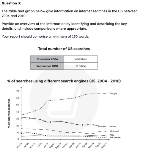
The table and graph illustrates information about internet searches in two various ways in the US between 2004 and 2010

Overall, it is clear that in november had the lowest share of reseaches,while this rate increased significantly in September.In contrast the rate of Google dominated in five search engines, whereas ask jeaves declined after 6 years with demonstrated the lowest share. In general most categories showed upward trends, although their rates of change were diffirent.

The first chart shows that in November to total number of US searches accounted 4.5 billion viewes. In contrast this searches increased dramatically in september with illustrated the largest share in US in this year.

Meanwhile, the rate of searches using various engines, Google demonstrated the largest share with represented 35 ratio, while this proportion increased sharply with accounted 60 percentage respectively. Another research we can saw in Yahoo and Microsoft with both 33 and 18 rate, whereas this trends substantially changed, similarly we saw Yahoo proportion declined dramatically to 22 percentage, while Microsoft immediatly showed gradually climbed and represented 20 rate of internet searches.

Word Count: 180

Answers On The Same Topic:

proview an overview of the information by identifying and describing the key details, and include comparisons where appropriate

The table and graph present the figures for internet searches and the proportion of searches using different search engines from 2004 to 2010. Overall, it is noticeable that the total number of US searches recorded in September 2010 (16 billion) was roughly 3.5 times the figure for US searches in November 2004 (4.5 billion). The […]

See All

Other Topics:

the pie charts below show the percentage of time working adults spent on different activities in a particular country in 1958 and 2008. summarize the information by selecting and reporting the main features and make comparisons where relevant.(150 words)

The chart gives information about the time working adults in percentage spent on various activities in a specific country in the yest 1958 and 2008. Back in 1958, working was the highest in percentage which is in 33%. Secondly, the sleeping was in 32%, relaxing at home is in the 8%, going out is 19%, […]

A bar chart shows the percentage of men and women in Great Britain who had driving licenses and another bar chart shows the percentage of men and women who were young drivers at the age of 17-20. Summarize the information by selecting and reporting the main features, and make comparisons where relevant.

The tables compares both of gender in terms of having driving license from 1976 to 2006, and the second chart illustrates the proportion of men and women who applied for it at the age of 17-20 between 1996 and 2006 in European country. Overall, the procentage of meal drive remained higher than women during the […]

The line graphs below illustrate population trends globally by percentage, from 1950 with a forecast to 2040. Summarize the information by selecting and report the main features and make comparisons where relevant.

The graphs depict global population proportions by region and age group, between 1950 and projected up to 2040. Generally, in the graph for area, while the rural area’s figure witnessed a noticeable downward trend, the percentage for urban area underwent a gradual growth. On the other hand, age group’s graph recorded an significant decline in […]

percentage of students attend to different courses of one education center

The pie charts compare the proportion of students at a adult education instituation who take many different courses offered in 1985 and this year. Overall, it is clear that the rate of students in fitness and dance have remain stable since 1985, while music appreciation class has no students in this year. It is also […]

The chats below show the percentage of time working adults spent on different activities in a particular country in 1958 and 2008.

The pie charts compare the distribution of the proportion of time working adults spent on different activities in a country over the period from 1958 to 2008. Overall, it is evident that working remained dominant in both years, although its proportion increased. Meanwhile, travelling to work experienced a noticebale change, whereas remaining categories underwent moderate […]

The pie charts give information about average percentages of sodium saturated fats and added typical meals consumed in the USA Summarise the information by selecting the main features, and make comparisons where relevant

The pie charts provide information about the average proportion of sodium, saturated fat and sugar in typical meals consumed in the USA. From an overall view, it is clear that a large percentage of sodium and saturated fat have mainly dinner meals, while snacks have a large proportion of sugar compare to other kind of […]

See All
We have detected unusual activity on your device.
Please verify your identity to continue.
Note: This verification step won't sign you in. If you have a premium account, please log in to access the service as usual.
Google/Gmail Verification
Or verify using Email/Code
We've sent a verification code to:
youremail@gmail.com (Not your email?)
Enter it below to complete the verification process.
Ensure your email address is correct, your inbox is not full, and you check your spam folder. If no email arrives, consider using an alternative email.
You will need a Premium plan to perform your action!
Note: If you already have a premium account, please log in to access our services as usual.

Plans & Pricing

Our mission is to make quality education accessible for everyone.
However, to keep our hardworking team running and this service alive, we genuinely need your support!
By opting for a premium plan, not only do you sustain us in achieving the mission, but you also unlock advanced features to enrich your learning experience.

Free

For learners who aren't pressed for time

What's included on Free
100+ Cambridge IELTS Tests
Instant IELTS Writing Task 1 & 2 Evaluation (2 times/month)
Instant IELTS Speaking Part 1, 2, & 3 Evaluation (5 times/month)
Instant IELTS Writing Task 1 & 2 Essay Generator (2 times/month)
500+ Dictation & Shadowing Exercises
100+ Pronunciation Exercises
Flashcards
Other Advanced Tools

Premium

For those serious about advancing their English proficiency, and for IELTS candidates aspiring to boost their band score by 1-2 points (especially in writing & speaking) in just 30 days or less

What's included on Premium
Save Your IELTS Test Progress
Unlock All Courses & IELTS Tests
Unlimited AI Conversations
Unlimited AI Writing Enhancement Exercises
Unlimited IELTS Writing Task 1 & 2 Evaluation
Unlimited IELTS Speaking Part 1, 2, & 3 Evaluation
Checked Answers Will Not Be Published
Unlimited IELTS Writing Task 1 & 2 Essay Generator
Unlimited IELTS Speaking Part 1, 2, & 3 Sample Generator
Unlimited Usage Of Advanced Tools
Priority Support within 24h (12-month plan only)

Due to the nature of our service and the provided free trials, payments are non-refundable.
Nếu bạn là người Việt Nam và không có hoặc không muốn trả bằng credit/debit cards, bạn có thể thanh toán bằng phương thức chuyển khoản:


Chọn gói:
419,000₫ 277,000 ₫ cho gói 1 tháng (chỉ 9,233₫/ngày)
1,239,000₫ 597,000 ₫ cho gói 3 tháng (chỉ 6,633₫/ngày)
2,469,000₫ 1,027,000 ₫ cho gói 6 tháng (chỉ 5,706₫/ngày)
4,929,000₫ 1,417,000 ₫ cho gói 12 tháng (chỉ 3,936₫/ngày)


Sau khi chuyển khoản, vui lòng đợi trình duyệt tự động điều hướng bạn trở lại Engnovate và bạn sẽ ngay lập tức nhận được mã kích hoạt tài khoản premium.
Nếu có lỗi xảy ra, bạn có thể liên hệ với team thông qua một trong các phương thức: email đến helloengnovate@gmail.com hoặc nhắn tin qua facebook.com/engnovate.
Vì toàn bộ công cụ trên website đều có thể sử dụng thử miễn phí, Engnovate không hỗ trợ hoàn tiền.