🔥 Today Only: Save 30% on Premium — Offer Ends Soon! - Upgrade Now!
Multiple Graphs

Band 6+: Global water use by sector and water consumption in two different countries

Image for topic: Global water use by sector and water consumption in two different countries
Our system will evaluate the answer based on this AI-generated description.
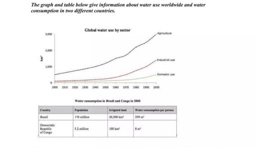
The image presents a line graph titled "Global water use by sector" and a table for "Water consumption in Brazil and Congo in 2000". The graph, with a y-axis in km³ and an x-axis from 1900 to 2000, shows water use for three sectors. Agriculture water use (km³) was approximately: 1900-500, 1910-600, 1920-700, 1930-800, 1940-1000, 1950-1200, 1960-1500, 1970-1800, 1980-2200, 1990-2600, 2000-3000. Industrial use (km³): 1900-50, 1910-60, 1920-80, 1930-100, 1940-150, 1950-200, 1960-400, 1970-600, 1980-800, 1990-1100, 2000-1400. Domestic use (km³): 1900-20, 1910-30, 1920-40, 1930-50, 1940-60, 1950-100, 1960-150, 1970-200, 1980-250, 1990-350, 2000-500. The table for the year 2000 shows for Brazil: a population of 176 million, 26,500 km² of irrigated land, and 359 m³ water consumption per person. For the Democratic Republic of Congo: a population of 5.2 million, 100 km² of irrigated land, and 8 m³ water consumption per person.
Given the complexity of the image, the above description may not be entirely accurate.
Note: Both the topic and the answer were created by one of our users.

The graphs represent findings about worldwide water usage and water consumption in two various countries: Brazil and Congo, in 2000.

Overall, it is clear that an agriculture sector was using significant proportions of water in contrast to other sectors. Likewise, Brazil was also consuming great amounts of water, while Congo showed only minor consumption of water in the same year.

To begin with, a domestic use wasn’t changing from 1920 to 1960, and remained the same figures for nearly 40 years. Its consumption was about 50 square kilometres. Although an industrial use showed almost the same results during the same duration, it began to rise crucially in 1960, and reached more than 1000 suqare kilometres in 2000.

Brazil in comparison to Congo had 176 millions of citizens, while Congo was composed of only 5.2 millions. Given this fact, water consumption was also much higher in Brazil rather than in Congo, and resulted in 26,500 square kilometres against 100 square kilometres respectively. While in Brazil every individual was using approximately 359 metres cubed of water on average, In Congo it only accounted to 8 metres cubed.

Word Count: 185

Answers On The Same Topic:

Global water use by sector and water consumption in two different countries

The given line graph illustrates changes in the consumption of water worldwide between 1900 and 2000, while the table compares population, irrigated land and per-capita water consumption in Brazil and the Democratic Republic of Congo in 2000. It is obvious that total worldwide water use experienced an upward trend over the period with agriculture consistently […]

Global water use by sector and water consumption in two different countries

The given line graph illustrates changes in the consumption of water worldwide between 1900 and 2000, while the table compares population, irrigated land and per-capita water consumption in Brazil and the Democratic Republic of Congo in 2000. It is obvious that total worldwide water use increased significantly over the period, with agriculture consistently being the […]

Global water use by sector and water consumption in two different countries

The line chart illustrates the proportion of water consumption internationally for three different sectors, namely agriculture, industry, and homes, while the table provides information about water usage in two countries, namely Brazil and Congo, in 2000. Overall, water consumption in all three sectors increased steadily throughout the period, with the most significant growth occurring in […]

Global water use by sector and water consumption in two different countries

The graph and the table represent findings about both use of water around the globe and its consumption in Brazil and Congo. Overall, it is evident that significant amounts of water were used in the agriculture sector. In contrast, the domestic sector experienced the lowest water use. In addition, Brazil outpaced Congo in water consumption, […]

See All

Other Topics:

The pie chart illustrates the percentages of industry sectors contribution to the economy of turkey in the year of 2000 and 2016

The pie charts illustrates the proportion of the contribution to the economy of Turkey by sector between 2000 and 2016. Overall, it can be seen that the economy in Turkey agriculture accounted was the highest percentage in the first year. In addition, healthcare and education was the same proportion in both years. Whereas, construction decreased […]

In June 1996, an experimental flu vaccine was trialed in a large country town on females only. Above are the graphs depicting the activities related. Summarize the information and compare where relevant, by selecting and reporting the key features. You should write at least 150 words.

The charts illustrate an experimental flu vaccine that was tried out in a large country town on females only. Overall, it can be seen that figure for females for death and flu rates were significantly higher than that of in males. Furthermore, female recipients over 65 were most at risk. Looking at the bar chart […]

The table below shows CO2 emissions for different forms of transport in the European Union. The Pie Chart shows the percentage of European Union funds being spent on different forms of transport. Write a report for a university lecturer describing the information shown below.

The bar graph compares the emission of CO2 gas for numerous forms of vehicles in the European Union. Overall, air contributes the highest CO2 emission per passenger per kilometer. Followed by passenger cars and buses. Whereas, the coaches emits a negligble amount of CO2 in the Europe. Almost 375 grams of CO2 is released per […]

the charts below give information on the ages of the populations of yemen and italy in 2000 and projections for 2050. summarize the information and make comparison.

The provided pie charts illustrate the age distribution of the populations in Yemen and Italy for the year 2000, alongside projections for 2050. Overall, Yemen is characterized by a predominantly youthful demographic, a trend that is anticipated to persist into 2050, whereas Italy exhibits a notably older population structure. Both nations, however, are projected to […]

The table and chart provide a breakdown of the total expenditure and the average of money spent by students per week while studying abroad in four countries

The given table and the chart illustrate the data of overall expenditure and the average spendings by schoolers in a week during the studies abroad from 4 countries. Overall, the maximum figure of total expenditure among countries is in country A, while spendings on living cost shows the highest amount of money spent on by […]

Writing Task 1 You should spend about 20 minutes on this task. The charts below show the protein and calorie intakes of people in different parts of the world.Summarise the information by selecting and reporting the main features, and make comparisons where relevant. You should write at least 150 words.

The following bar graph illustrates the protein and calorie intakes of individuals in various parts of countries india, east africa, latin america and north america of the world. Overall, the both other protein and animals protein are increased respectevily. The heighest number of protein in north america. whereas the lowest in india. consiquently, east africa […]

See All
We have detected unusual activity on your device.
Please verify your identity to continue.
Note: This verification step won't sign you in. If you have a premium account, please log in to access the service as usual.
Google/Gmail Verification
Or verify using Email/Code
We've sent a verification code to:
youremail@gmail.com (Not your email?)
Enter it below to complete the verification process.
Ensure your email address is correct, your inbox is not full, and you check your spam folder. If no email arrives, consider using an alternative email.
You will need a Premium plan to perform your action!
Note: If you already have a premium account, please log in to access our services as usual.

Plans & Pricing

Our mission is to make quality education accessible for everyone.
However, to keep our hardworking team running and this service alive, we genuinely need your support!
By opting for a premium plan, not only do you sustain us in achieving the mission, but you also unlock advanced features to enrich your learning experience.

Free

For learners who aren't pressed for time

What's included on Free
100+ Cambridge IELTS Tests
Instant IELTS Writing Task 1 & 2 Evaluation (2 times/month)
Instant IELTS Speaking Part 1, 2, & 3 Evaluation (2 times/month)
Instant IELTS Writing Task 1 & 2 Essay Generator (2 times/month)
500+ Dictation & Shadowing Exercises
100+ Pronunciation Exercises
Flashcards
Other Advanced Tools

Premium

For those serious about advancing their English proficiency, and for IELTS candidates aspiring to boost their band score by 1-2 points (especially in writing & speaking) in just 30 days or less

What's included on Premium
Save Your IELTS Test Progress & Analyze Mistakes By Question Type
Save Your Own Flashcard Sets & Use Them On Any Device
Unlock All Courses, IELTS Tests, Section & Part Practice
Unlimited AI Conversations
Unlimited AI Writing Enhancement Exercises
Unlimited IELTS Writing Task 1 & 2 Evaluation
Unlimited IELTS Speaking Part 1, 2, & 3 Evaluation
Checked Answers Will Not Be Published
Unlimited IELTS Writing Task 1 & 2 Essay Generator
Unlimited IELTS Speaking Part 1, 2, & 3 Sample Generator
Unlimited Usage Of Advanced Tools & AI Features
Priority Support within 24h (12-month plan only)

Due to the nature of our service and the provided free trials, payments are non-refundable.