🔥 Today Only: Save 30% on Premium — Offer Ends Soon! - Upgrade Now!
Multiple Graphs

Band 4+: proview an overview of the information by identifying and describing the key details, and include comparisons where appropriate

Image for topic: proview an overview of the information by identifying and describing the key details, and include comparisons where appropriate
Our system will evaluate the answer based on this AI-generated description.
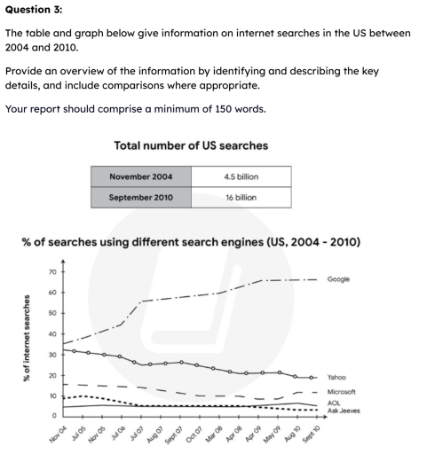
The image presents a table and a line graph about US internet searches. The table, titled 'Total number of US searches', lists 4.5 billion for November 2004 and 16 billion for September 2010. The line graph, titled '% of searches using different search engines (US, 2004 - 2010)', displays the percentage of internet searches for five search engines, with the following approximate data points across twelve time intervals. For Google: 35% in Nov 04, 40% in Jul 05, 42% in Nov 05, 50% in Jul 06, 57% in Aug 07, 58% in Sept 07, 58% in Oct 07, 60% in Mar 08, 63% in Apr 09, 64% in May 09, 66% in Aug 10, and 67% in Sept 10. For Yahoo: 32% in Nov 04, 30% in Jul 05, 30% in Nov 05, 28% in Jul 06, 26% in Aug 07, 26% in Sept 07, 25% in Oct 07, 23% in Mar 08, 21% in Apr 09, 21% in May 09, 19% in Aug 10, and 18% in Sept 10. For Microsoft: 15% in Nov 04 through Nov 05, 14% in Jul 06, 12% in Aug 07, 11% in Sept 07, 10% in Oct 07, 10% in Mar 08, 9% in Apr 09, 9% in May 09, and 10% in Aug and Sept 10. For AOL: 10% in Nov 04, 9% in Jul 05, 8% in Nov 05, 6% in Jul 06, 5% from Aug to Oct 07, 4% in Mar 08, 3% in Apr and May 09, and 2% in Aug and Sept 10. For Ask Jeeves: 2% from Nov 04 to Nov 05, 3% from Jul 06 to Mar 08, and 4% from Apr 09 to Sept 10.
Given the complexity of the image, the above description may not be entirely accurate.
Note: Both the topic and the answer were created by one of our users.

The table and graph illustrates information about internet searches in two various ways in the US between 2004 and 2010

Overall, it is clear that in november had the lowest share of reseaches,while this rate increased significantly in September.In contrast the rate of Google dominated in five search engines, whereas ask jeaves declined after 6 years with demonstrated the lowest share. In general most categories showed upward trends, although their rates of change were diffirent.

The first chart shows that in November to total number of US searches accounted 4.5 billion viewes. In contrast this searches increased dramatically in september with illustrated the largest share in US in this year.

Meanwhile, the rate of searches using various engines, Google demonstrated the largest share with represented 35 ratio, while this proportion increased sharply with accounted 60 percentage respectively. Another research we can saw in Yahoo and Microsoft with both 33 and 18 rate, whereas this trends substantially changed, similarly we saw Yahoo proportion declined dramatically to 22 percentage, while Microsoft immediatly showed gradually climbed and represented 20 rate of internet searches.

Word Count: 180

Answers On The Same Topic:

proview an overview of the information by identifying and describing the key details, and include comparisons where appropriate

The table and graph present the figures for internet searches and the proportion of searches using different search engines from 2004 to 2010. Overall, it is noticeable that the total number of US searches recorded in September 2010 (16 billion) was roughly 3.5 times the figure for US searches in November 2004 (4.5 billion). The […]

See All

Other Topics:

The line graph and the bar chart give the information and forecast about the vehicle numbers and CO2 emission in England and Wales between 2000 and 2020. Summarize the information by selecting and reporting the main features and make comparisons where relevant.

The line graph and bar chart illustrate information about the number of vehicles and CO₂ emissions in England and Wales from 2000 to 2020, including future predictions. Overall, the most striking feature of the figures is that the number of vehicles increased over the period. It is also noticeable that cars were responsible for a […]

The chart and table below show the life expectancy in 2008 and increase in life expectancy between 1983 and 2008.

The chart and table demonstrate four countries (Japan, Korea, America and Indonesia) regarding the life expectancy in 2008 and risen life expectancy over 25 years. Overall, Japan, experienced a peak in life expectancy from 1983 to 2008, while the Korea and U.S. witnessed a familiar in the past 25 years. It is shown that Indonesia […]

The pie graphs show greenhouse gas emissions worldwide in 2002 and the forecast for 2030. The column chart shows carbon dioxide emissions around the world. Summarise the information by selecting and reporting the main features, and make comparisons where relevant.

While the pie charts provide greenhouse gas emissions worldwide between 2002 and 2030, the column chart illustrates carbon dioxide emissions in five different group included industry, consumer, transportation, waste combustion and other sectors. Overall, while the data of greenhouse gas emissions in OECD and transition economies experienced a downward trend between 2002 and 2030, the […]

The chrats below show the main reasons for study among students of different age groups and the amount of support they received from employers

The two bar charts show why students of different ages study and the amount of support they get from their employers. Overall, younger students study mainly for their careers, while older students study for personal interest. Additionally, employer support decreases as students get older, except for the oldest groups. In the first chart, about 80% […]

The table below shows the number of students at a primary school and a secondary school in Malasysia in 2005. The charts show every survey results of what these students favourite sport was.

The table illustrates the number of students at a primary school and a secondary school in Malaysia in 2005, while the pie charts show the sports preferred by these students. Overall, the number of secondary school students is higher than that of primary school students. Meanwhile, tennis is the most popular sport among primary school […]

The charts below give information about the purposes of passengers flying from four different airports in the UK in 2016. Summarise the information by selecting and reporting the main features, and make comparisons where relevant.

The pie charts provide information regarding the flight’s purposes at four distinct airports in 2016. ;Overall, visiting friends or family and traveling holidays were by far the most popular reasons in comparison to others. In addition, the remaining purposes ( business and other) consisted of less significant shares. In 2006, around 54% of passengers at […]

See All
We have detected unusual activity on your device.
Please verify your identity to continue.
Note: This verification step won't sign you in. If you have a premium account, please log in to access the service as usual.
Google/Gmail Verification
Or verify using Email/Code
We've sent a verification code to:
youremail@gmail.com (Not your email?)
Enter it below to complete the verification process.
Ensure your email address is correct, your inbox is not full, and you check your spam folder. If no email arrives, consider using an alternative email.
You will need a Premium plan to perform your action!
Note: If you already have a premium account, please log in to access our services as usual.

Plans & Pricing

Our mission is to make quality education accessible for everyone.
However, to keep our hardworking team running and this service alive, we genuinely need your support!
By opting for a premium plan, not only do you sustain us in achieving the mission, but you also unlock advanced features to enrich your learning experience.

Free

For learners who aren't pressed for time

What's included on Free
100+ Cambridge IELTS Tests
Instant IELTS Writing Task 1 & 2 Evaluation (2 times/month)
Instant IELTS Speaking Part 1, 2, & 3 Evaluation (2 times/month)
Instant IELTS Writing Task 1 & 2 Essay Generator (2 times/month)
500+ Dictation & Shadowing Exercises
100+ Pronunciation Exercises
Flashcards
Other Advanced Tools

Premium

For those serious about advancing their English proficiency, and for IELTS candidates aspiring to boost their band score by 1-2 points (especially in writing & speaking) in just 30 days or less

What's included on Premium
Save Your IELTS Test Progress & Analyze Mistakes By Question Type
Save Your Own Flashcard Sets & Use Them On Any Device
Unlock All Courses, IELTS Tests, Section & Part Practice
Unlimited AI Conversations
Unlimited AI Writing Enhancement Exercises
Unlimited IELTS Writing Task 1 & 2 Evaluation
Unlimited IELTS Speaking Part 1, 2, & 3 Evaluation
Checked Answers Will Not Be Published
Unlimited IELTS Writing Task 1 & 2 Essay Generator
Unlimited IELTS Speaking Part 1, 2, & 3 Sample Generator
Unlimited Usage Of Advanced Tools & AI Features
Priority Support within 24h (12-month plan only)

Due to the nature of our service and the provided free trials, payments are non-refundable.