24 Hours Only: Get 39% OFF on Our Premium Plan - Check Out Now!
Line Graph

Band 5+: Task 1 You should spend about 20 minutes on this task. The graph shows the amount earned by graduates of different age groups in 2002. It includes those with a degree, those with a higher degree (postgraduate) and those with other qualifications. Summarize the information by selecting and reporting the main features, and make comparisons where relevant. Write at least 150 words. Weekly

Image for topic: Task 1 You should spend about 20 minutes on this task. The graph shows the amount earned by graduates of different age groups in 2002. It includes those with a degree, those with a higher degree (postgraduate) and those with other qualifications. Summarize the information by selecting and reporting the main features, and make comparisons where relevant. Write at least 150 words. Weekly
Our system will evaluate the answer based on this AI-generated description.
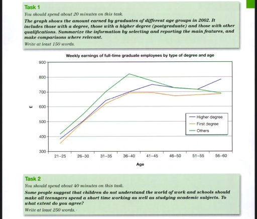
The image displays a line graph showcasing weekly earnings for full-time graduate employees categorized by type of degree and age in 2002. For 'Higher degree': age 21–25 earnings around £400, 26–30 earnings £600, peak at 31–35 with earnings approximately £800, 36–40 earnings about £750, 41–45 earnings around £700, 46–50 earnings about £650, 51–55 earnings marginally above £600, and 56–60 earnings just above £600. For 'First degree': age 21–25 earnings slightly below £400, 26–30 earnings approximately £550, 31–35 earnings at £700, 36–40 earnings slightly above £700, 41–45 and 46–50 earnings slightly below £700, 51–55 and 56–60 earnings around £600. For 'Others': age 21–25 earnings near £350, 26–30 earnings close to £500, 31–35 earnings around £600, 36–40 earnings slightly below £600, 41–45 earnings at £550, 46–50 earnings slightly below £550, 51–55 and 56–60 earnings around £500.
Given the complexity of the image, the above description may not be entirely accurate.
Note: Both the topic and the answer were created by one of our users.

The line graph illustrates the earnings of full-time graduate workers of different age group in 2002.

Overall , high income is observed through middle age group employees. Younger people are more likely to have low salary and they are less experienced. While older workers seems to have stable formed salary.

There was a steady rise between 21-25 and 41-45 years old workers and 56-60 whose salary reached its peak with approximately 800 pounds with higher degree. Also individuals with first degree got salary increase from below 400 pounds to 700 pounds.

The line graph showed that people who have higher degree get more money than those who have first degree especially to old age. But developing in other degrees will pay the highest price reaching above 800 pounds at 36-40 age.

Word Count: 131

Answers On The Same Topic:

Task 1 You should spend about 20 minutes on this task. The graph shows the amount earned by graduates of different age groups in 2002. It includes those with a degree, those with a higher degree (postgraduate) and those with other qualifications. Summarize the information by selecting and reporting the main features, and make comparisons where relevant. Write at least 150 words. Weekly

 The line graph demonstrates the amount of money earned by graduates employees of diverse age groups measured from 21-60, with intervals of four, and the amount of money valued in pound sterlings from 300 to 900, including 3 groups of degree ( postgraduate study) with just a degree and other qualifications proving certificates Overall […]

See All

Other Topics:

The graph below shows the number of tourists visiting a particular Carrabien island between 2010 and 2017.Summurise and make comparasions about graph.

the graph illustrates that the number of tourists visiting a particular caribbean island from 2O1O to 2O17 categorized by staying on cruise ships, islan and total visitor. Overall, it is clearly see that the amount of total visitor and who stay on cruise ships both were gradually increased. By contrast the amount of visitors who […]

Task 1 You should spend about 20 minutes on this task. The graph below gives information about computer possession by households in one European country between 1997 and 2011. Summarise the information by selecting and reporting the main features, and make comparisons where relevant Write at least 150 words.

The line graphs illustrate changes in the proportion of computer ownership across four different groups by households in the given European nation from 1997 to 2012. In general, it is noticeable that different trends were observed in the all given years. While no computer recorded the highest percentage of ownership in the beginning period, however, […]

: The graph below gives information about one company's unit sales of 5 different types of jam from 2009 to 2014

The line graph illustrates how many millions of jars of jam were sold by one company between 2009 and 2014. There are 5 sorts of jam: strawberry, raspberry, plum, cherry, and grape. Overall, the sales of strawberry jam had the highest figure. Notably, all other jams’ figures experienced considerable growth except for plum jam throughout […]

: The graph below gives information about one company's unit sales of 5 different types of jam from 2009 to 2014

The line graph illustrates how many millions of jars of jams were sold in one company between 2009 and 2014. There are 5 sorts of jam: strawberry, raspberry, plum, cherry and grape. Overall, the sales of strawberry jams had highest figure. Notably, all other jams’ figures experienced a considerable growth except for plum jam throughout […]

The line graph shows the past and projected finances for a local authority in New Zealand.

The given line graph demonstrated the past and projected finances for a local authority in New Zeland from 2012 to 2022. Overall, it can be seen that at the beginning of the period amounts spent for rates revenue was the highest cost and rapidly grown by the end of the period. While, budget for grants […]

The line chart below displays the carbon dioxide emissions in million metric tons for the top 4 contributing countries from 1990 to 2020. Summarise the information by selecting and reporting the main features and make comparisons where relevant.

The line chart shows us the number in metric tons of carbon dioxide emissions for the top four contributing countries from 1990 to 2020. Overall, the highest quantity of emissions belongs to China and the lowest to Russia. During the timeline given, the United States had approximately the same emissions contribution. While India had a […]

See All
We have detected unusual activity on your device.
Please verify your identity to continue.
Note: This verification step won't sign you in. If you have a premium account, please log in to access the service as usual.
Google/Gmail Verification
Or verify using Email/Code
We've sent a verification code to:
youremail@gmail.com (Not your email?)
Enter it below to complete the verification process.
Ensure your email address is correct, your inbox is not full, and you check your spam folder. If no email arrives, consider using an alternative email.
You will need a Premium plan to perform your action!
Note: If you already have a premium account, please log in to access our services as usual.

Plans & Pricing

Our mission is to make quality education accessible for everyone.
However, to keep our hardworking team running and this service alive, we genuinely need your support!
By opting for a premium plan, not only do you sustain us in achieving the mission, but you also unlock advanced features to enrich your learning experience.

Free

For learners who aren't pressed for time

What's included on Free
100+ Cambridge IELTS Tests
Instant IELTS Writing Task 1 & 2 Evaluation (2 times/month)
Instant IELTS Speaking Part 1, 2, & 3 Evaluation (5 times/month)
Instant IELTS Writing Task 1 & 2 Essay Generator (2 times/month)
500+ Dictation & Shadowing Exercises
100+ Pronunciation Exercises
Flashcards
Other Advanced Tools

Premium

For those serious about advancing their English proficiency, and for IELTS candidates aspiring to boost their band score by 1-2 points (especially in writing & speaking) in just 30 days or less

What's included on Premium
Save Your IELTS Test Progress
Unlock All Courses & IELTS Tests
Unlimited AI Conversations
Unlimited AI Writing Enhancement Exercises
Unlimited IELTS Writing Task 1 & 2 Evaluation
Unlimited IELTS Speaking Part 1, 2, & 3 Evaluation
Checked Answers Will Not Be Published
Unlimited IELTS Writing Task 1 & 2 Essay Generator
Unlimited IELTS Speaking Part 1, 2, & 3 Sample Generator
Unlimited Usage Of Advanced Tools

Due to the nature of our service and the provided free trials, payments are non-refundable.
Nếu bạn là người Việt Nam và không có hoặc không muốn trả bằng credit/debit cards, bạn có thể thanh toán bằng phương thức chuyển khoản:


Chọn gói:
279,000₫ 157,000 ₫ cho gói 1 tháng (chỉ 5,233₫/ngày)
819,000₫ 397,000 ₫ cho gói 3 tháng (chỉ 4,411₫/ngày)
1,649,000₫ 667,000 ₫ cho gói 6 tháng (chỉ 3,706₫/ngày)
3,299,000₫ 857,000 ₫ cho gói 12 tháng (chỉ 2,381₫/ngày)


Sau khi chuyển khoản, vui lòng đợi trình duyệt tự động điều hướng bạn trở lại Engnovate và bạn sẽ ngay lập tức nhận được mã kích hoạt tài khoản premium.
Nếu có lỗi xảy ra, bạn có thể liên hệ với team thông qua một trong các phương thức: email đến helloengnovate@gmail.com hoặc nhắn tin qua facebook.com/engnovate.
Vì toàn bộ công cụ trên website đều có thể sử dụng thử miễn phí, Engnovate không hỗ trợ hoàn tiền.