🔥 Today Only: Save 30% on Premium — Offer Ends Soon! - Upgrade Now!
Bar Chart

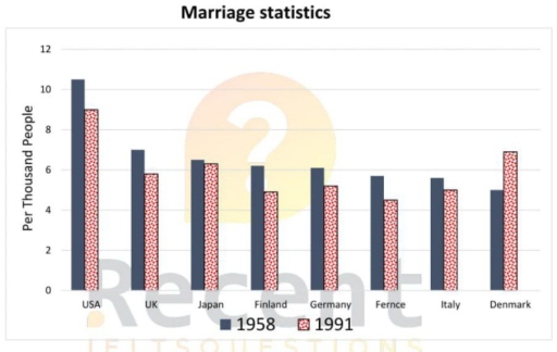
Band 4+: The bar chart below shows the Marriage statistics for eight countries in 1958 and 1991

Image for topic: The bar chart below shows the Marriage statistics for eight countries in 1958 and 1991
Our system will evaluate the answer based on this AI-generated description.
The image shows a bar graph titled "Marriage statistics" with data for the years 1958 and 1991. It compares the number of marriages per thousand people across eight countries. The USA has the highest rate in 1958 with approximately 11, dropping to about 9 in 1991. The UK starts at about 7.5 in 1958 and decreases to nearly 5.5 in 1991. Japan begins around 9 in 1958 and falls to just above 6 in 1991. Finland has a 1958 value near 7.5, reducing to roughly 5.5 in 1991. Germany starts at approximately 8.5 in 1958 and declines to about 6 in 1991. France initially has about 7.5, lowering to around 5 in 1991. Italy commences with nearly 7.5, falling to about 5.5 in 1991. Denmark has the lowest initial value at just above 7 in 1958 and drops to approximately 6 in 1991. Each bar has a pattern fill - dots for 1958 and diagonal lines for 1991.
Given the complexity of the image, the above description may not be entirely accurate.
Note: Both the topic and the answer were created by one of our users.

The bar chart illustrate the Marriage statistics for diverse eight countries between 1958 to 1991.

Overall,it is evident that category USA had the highest figures.Fernce and Italy remained unchanged.In contrast,there are categories experienced considerably lower numbers and a decline in percentage thousands people.The data also shows noticeable variations across the different categories.

In 1958,USA had the highest figures with a consistent total of 10% people.By contrast,Fernce and Italy reported a significantly lower number of 6% and remained stable in both years.Additionally, the UK had a relatively of 6,5% in 1958.While Japan started with 6,2% thousands people in 1958.Similary Finland and Germany maintained relatively stable figures of 6 thousands people in 1958.

Moreover,in 1991 USA saw a notable change with a decline of 8,5%.Additionally,the UK was accounted for overly 4,8%. Then Japan followed by slightly reduction in 1991 considerably.By contrast, Finland was rapid reduction of 4,5%. Japan also analogous similar of Finland. France was quickly variations with a decline of 4,2% in 1991.

Word Count: 162

Answers On The Same Topic:

The bar chart below shows the Marriage statistics for eight countries in 1958 and 1991

The bar chart illustrates the Marriage statistics for eight countries such as USA,UK,Japan,Finland,Germany,Frence,Italy, and Denmark in 1958 and 1991. Overall, it is observed that marriage rates declined in almost all countries by 1991. In addition the USA had the highest figures in both years, while Italy had the lowest. In 1958, the number of marriages […]

The bar chart below shows the Marriage statistics for eight countries in 1958 and 1991

The bar chart illustrates marriage statistics in eight countries in the years 1958 and 1991. Overall, it is clear that the proportion of marriages declined in all of the countries during this period, though the pace and scale of reduction varied. Despite the universal downward trend, some nations continued to record relatively high marriage figures […]

The bar chart below shows the Marriage statistics for eight countries in 1958 and 1991

The bar chart illustrates marriage statistics per thousand people for eight countries in 1958 and 1991 years. Overall, all of the countries except Denmark experienced declining, while Denmark underwent a dramatic rise. To begin with, in USA marriage statistics were higher overall, through it dropped slightly from around 10 to 9.UK stayed the nearly the […]

The bar chart below shows the Marriage statistics for eight countries in 1958 and 1991

The bar chart gives illustration of marriage statistics per thousand people for eight countries during the years 1958 and 1991. Overall, in both years USA held the highest numbers. To begin with, in USA marriage statistics was higher overall, through it dropped slightly from around 10 to 9. UK stayed the nearly the same, decreasing […]

See All

Other Topics:

The chart illustrates the distances travelled by passengers on 5 types of transport in the UK in 1990 and 2000. The data is presented in kilometers per person per week. Summarize the information by selecting and reporting the main features, and make comparisons where relevant.

The graph demonstrates the travelled distance on 5 categories of transport in the UK in 1990 and 2000. Overall, for the given period were noticed no substsntial changes. Bus occupies a leading position among various transport in both years, while motorbike remains less used transport in the UK. In 1990, air transport made up just […]

The bar chart illustrates the percentage of households in three different countries that owned various types of electronic devices in 2010 and 2020.

The given chart display the proportion of households owning three types electronic devices which includes Television, Computer, Phone in two different years 2010 and 2020. Overall, in 2020 every household possesses more electronic devices than than the year 2010. The major difference is in the ownership of mobiles followed by the computers and then there […]

The bar chart shows the number of visits to a community website in the first and second years of use. Summarise the information by selecting and reporting the main features, and make comparisons where relevant.

The bar chart compares the figures for visits to a community website over different months in its first and second years of operation. Overall, visit numbers in the second year were generally higher than those in the first year, with figures doubling on many occasions despite some fluctuations. Furthermore, the number of visits for both […]

The chart below shows the main reasons why agricultural land becomes less productive in three regions of the world. Summarise the information by selecting and reporting the main features, and make comparisons where relevant.

The bar chart shows by main reasons (over-grazing, deforestation, over-cultivation, and other factors) why agricultural land becomes less productive in three regions of the world, namely North America, Europe, and Oceania. Overall, in Oceania, over-grazing is the main reason, and had the highest percentage compared with other regions. In contrast, caused by over-cultivation in Oceania […]

The chart below shows the main reasons why agricultural land becomes less productive in three regions of the world. Summarise the information by selecting and reporting the main features, and make comparisons where relevant.

The bar chart shows by main reasons (Over-grazing, Deforestation, Over-cultivation, and Other factors) why agricultural land becomes less productive in three regions of the world, namely North America, Europe, and Oceania. Overall, in Oceania, over-grazing is the main reason, and had the highest percentage compared with other regions. In contrast, cause by over-cultivation in Ocenia […]

The chart below shows the amount of energy generated from winds in 4 countries from 1985 to 2000.

The bar graph demonstrates the quantity of energy in megawatts generated by wind in four different countries – India, Denmark, Germany and United States in the given period of 1980 and 2000. Overall, at the beginning the United States showed the highest rate of generated energy. Later, the Denmark grew considerably and became the largest […]

See All
We have detected unusual activity on your device.
Please verify your identity to continue.
Note: This verification step won't sign you in. If you have a premium account, please log in to access the service as usual.
Google/Gmail Verification
Or verify using Email/Code
We've sent a verification code to:
youremail@gmail.com (Not your email?)
Enter it below to complete the verification process.
Ensure your email address is correct, your inbox is not full, and you check your spam folder. If no email arrives, consider using an alternative email.
You will need a Premium plan to perform your action!
Note: If you already have a premium account, please log in to access our services as usual.

Plans & Pricing

Our mission is to make quality education accessible for everyone.
However, to keep our hardworking team running and this service alive, we genuinely need your support!
By opting for a premium plan, not only do you sustain us in achieving the mission, but you also unlock advanced features to enrich your learning experience.

Free

For learners who aren't pressed for time

What's included on Free
100+ Cambridge IELTS Tests
Instant IELTS Writing Task 1 & 2 Evaluation (2 times/month)
Instant IELTS Speaking Part 1, 2, & 3 Evaluation (2 times/month)
Instant IELTS Writing Task 1 & 2 Essay Generator (2 times/month)
500+ Dictation & Shadowing Exercises
100+ Pronunciation Exercises
Flashcards
Other Advanced Tools

Premium

For those serious about advancing their English proficiency, and for IELTS candidates aspiring to boost their band score by 1-2 points (especially in writing & speaking) in just 30 days or less

What's included on Premium
Save Your IELTS Test Progress & Analyze Mistakes By Question Type
Save Your Own Flashcard Sets & Use Them On Any Device
Unlock All Courses, IELTS Tests, Section & Part Practice
Unlimited AI Conversations
Unlimited AI Writing Enhancement Exercises
Unlimited IELTS Writing Task 1 & 2 Evaluation
Unlimited IELTS Speaking Part 1, 2, & 3 Evaluation
Checked Answers Will Not Be Published
Unlimited IELTS Writing Task 1 & 2 Essay Generator
Unlimited IELTS Speaking Part 1, 2, & 3 Sample Generator
Unlimited Usage Of Advanced Tools & AI Features
Priority Support within 24h (12-month plan only)

Due to the nature of our service and the provided free trials, payments are non-refundable.