🔥 Today Only: Save 30% on Premium — Offer Ends Soon! - Upgrade Now!
Multiple Graphs

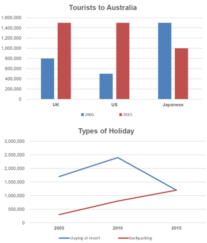
Band 5+: The bar chart below shows the number of tourists in three nations who travel to Australia in 2005 and 2015. The graph below shows the number of tourists who use two types for holiday.

Image for topic: The bar chart below shows the number of tourists in three nations who travel to Australia in 2005 and 2015. The graph below shows the number of tourists who use two types for holiday.
Our system will evaluate the answer based on this AI-generated description.
The image consists of two sections depicting two different graphs. The upper graph titled "Tourists to Australia" showcases the number of tourists from the UK, US, and Japan in two distinct years, 2005 and 2015. It shows UK tourists: approximately 1,200,000 in 2005 and about 1,100,000 in 2015; US tourists: roughly 600,000 in 2005 and nearly 1,400,000 in 2015; Japanese tourists: around 800,000 in 2005 and close to 600,000 in 2015. The lower graph titled "Types of Holiday" illustrates the number of tourists staying at a resort and those backpacking from 2005 to 2015. Resort stays reached their highest at approximately 2,500,000 in 2010, with the values around 1,750,000 in 2005 and close to 1,500,000 in 2015. Backpacking numbers started at about 2,000,000 in 2005, peaked at approximately 1,500,000 in 2010, and fell to around 1,000,000 in 2015.
Given the complexity of the image, the above description may not be entirely accurate.
Note: Both the topic and the answer were created by one of our users.

The first bar chart compares the visitors to Australia from the UK, the US and Japan in 2005 and 2015. The second chart demonstrates the holiday preference of them.

Overall, an increase was seen in the total number of tourists while a contrary trend was seen in Japanese tourists. During the period, travellers prefer to stay at resorts rather than enjoy backpacking.

In 2005, most of the visitors to Australia was from Japan, with a number of about 1.5 million. The figure for the UK and the US were 800 thousand and 500 thousand respectively. Surprisingly, the figures of tourists from the two country both increased dramatically to 1.5 million in 2015, while a drop of 500 thousand was seen in the that for Janpanese visitors.

As for the ways to enjoy the vacation, in 2005 about 1.7 million idividuals stayed at resort, while the figure for backpacking traveller was only abouy 300 thousand. Both types of holiday were increasingly welcome in 2010. However, 2015 witnessed the dramatic decrease in resort visitors, yet the backpacking holiday kept the upward trend.

Word Count: 180

Answers On The Same Topic:

The bar chart below shows the number of tourists in three nations who travel to Australia in 2005 and 2015. The graph below shows the number of tourists who use two types for holiday.

The charts illustrate the number of tourists visiting Australia from the UK, the US, and Japan in 1995 and 2005, alongside the various types of travel during that period. Overall, there was an increase in tourist numbers from the UK and the US, while the number of tourists from Japan saw a decline. In terms […]

The bar chart below shows the number of tourists in three nations who travel to Australia in 2005 and 2015. The graph below shows the number of tourists who use two types for holiday.

The charts show the number of tourists to Australia from the UK, the US, and Japan in 1995 and 2005, and the types of travel over the same period. Overall, tourist numbers from the UK and the US increased, while those from Japan declined. In terms of travel type, backpacking was more popular until 2000 […]

The bar chart below shows the number of tourists in three nations who travel to Australia in 2005 and 2015. The graph below shows the number of tourists who use two types for holiday.

The provided charts present detailed information regarding the influx of tourists to Australia from the United Kingdom, the United States, and Japan during two distinct years, 1995 and 2005, as well as the preferred types of holiday accommodations from 2005 to 2015. In general, the data reveals an overall increase in tourism from both the […]

The bar chart below shows the number of tourists in three nations who travel to Australia in 2005 and 2015. The graph below shows the number of tourists who use two types for holiday.

Presented are two charts illustrating the number of travelers in three nations and the kinds of transportation they used over one decade, from 2005 to 2015. Overall, while a wealth of visitors came to Japan more than to other countries in 2005, the opposite was true in 2015. Additionally, visitors preferred staying at resorts to […]

The bar chart below shows the number of tourists in three nations who travel to Australia in 2005 and 2015. The graph below shows the number of tourists who use two types for holiday.

The given bar chart illustrates the statistics of travelers to Australia among three different counties, namely the UK, the USA and Japan during the period between 1995 and 2000, while the line chart below represents the trend of two categories of traveling from 1995 to 2005. Overall, it is salient that the total number of […]

See All

Other Topics:

The diagrams below show changes of a cinema from 1980 until now. Summarize the information by selecting and reporting the main features, and make comparisons where relevant.

The diagrams illustrate the changes that have taken place in a cinema layout between 1980 and the present day. Overall, the cinema has undergone significant changes, characterized by the expansion of cinema halls and visitor amenities, while the only car park was totally removed. In 1998, the car park occupied the rear of the building, […]

The line graph and the bar chart give the information and forecast about the vehicle numbers and CO2 emission in England and Wales between 2000 and 2020. Summarize the information by selecting and reporting the main features and make comparisons where relevant.

The line graph illustrates the number of vehicles in millions in England and Wales between 2000 and 2020, while the bar chart shows the amount of CO2 emitted in tonnes from four types of vehicles in 2000, 2010, and 2020. Overall, there is a gradual increase in the number of vehicles throughout the period and […]

The pie charts below give information about the preferred housing and the quality of housing in Country A.Summarise the information by selecting and reporting the data and make comparisons where relevant.

The given pie charts displays the information regarding the housing and quality preffered in Country A. Overall,underoccupied home dominate in the matter of quality of housing in Country A.While, house is generally preferred mostly in Country A. Evaluating both the pie graphs,house preffering and quality of housing is categorised in several factors in Country A.Talking […]

The charts below give information on the ages of populations in Yemen and Italy in 2000 and projections for 2050. Summarise the information by selecting and reporting the main features, and make comparisons where relevant.

The pie chart illustrate the population distribution of two countries, Yemen and Italy, across three age groups; zero to fourteen years, fifteen to sixty years, and more than sixty years for the years 2000 and predictions for the year 2050. In general, it can be seen from the chart that for Yemen’s population, there will […]

The plans below show the layout of the ground floor of a school library in 2001 and how it changed as a result of renovations in 2009. Summarize the information by selecting and reporting the main features and make comparisons where relevant.

Two plans show the changes that library ground floor faced from 2001 to 2009. Overall, library has undergone significant changes, transitioning from one-function place into multifunctional location, adding more book sections and other specific zones for other needs such as children’s area and computer zone. In the center of the room, the number of study […]

The pie chart illustrates the percentages of industry sectors contribution to the economy of turkey in the year of 2000 and 2016

The pie charts illustrates the proportion of the contribution to the economy of Turkey by sector between 2000 and 2016. Overall, it can be seen that the economy in Turkey agriculture accounted was the highest percentage in the first year. In addition, healthcare and education was the same proportion in both years. Whereas, construction decreased […]

See All
We have detected unusual activity on your device.
Please verify your identity to continue.
Note: This verification step won't sign you in. If you have a premium account, please log in to access the service as usual.
Google/Gmail Verification
Or verify using Email/Code
We've sent a verification code to:
youremail@gmail.com (Not your email?)
Enter it below to complete the verification process.
Ensure your email address is correct, your inbox is not full, and you check your spam folder. If no email arrives, consider using an alternative email.
You will need a Premium plan to perform your action!
Note: If you already have a premium account, please log in to access our services as usual.

Plans & Pricing

Our mission is to make quality education accessible for everyone.
However, to keep our hardworking team running and this service alive, we genuinely need your support!
By opting for a premium plan, not only do you sustain us in achieving the mission, but you also unlock advanced features to enrich your learning experience.

Free

For learners who aren't pressed for time

What's included on Free
100+ Cambridge IELTS Tests
Instant IELTS Writing Task 1 & 2 Evaluation (2 times/month)
Instant IELTS Speaking Part 1, 2, & 3 Evaluation (2 times/month)
Instant IELTS Writing Task 1 & 2 Essay Generator (2 times/month)
500+ Dictation & Shadowing Exercises
100+ Pronunciation Exercises
Flashcards
Other Advanced Tools

Premium

For those serious about advancing their English proficiency, and for IELTS candidates aspiring to boost their band score by 1-2 points (especially in writing & speaking) in just 30 days or less

What's included on Premium
Save Your IELTS Test Progress & Analyze Mistakes By Question Type
Save Your Own Flashcard Sets & Use Them On Any Device
Unlock All Courses, IELTS Tests, Section & Part Practice
Unlimited AI Conversations
Unlimited AI Writing Enhancement Exercises
Unlimited IELTS Writing Task 1 & 2 Evaluation
Unlimited IELTS Speaking Part 1, 2, & 3 Evaluation
Checked Answers Will Not Be Published
Unlimited IELTS Writing Task 1 & 2 Essay Generator
Unlimited IELTS Speaking Part 1, 2, & 3 Sample Generator
Unlimited Usage Of Advanced Tools & AI Features
Priority Support within 24h (12-month plan only)

Due to the nature of our service and the provided free trials, payments are non-refundable.