🔥 Today Only: Save 30% on Premium — Offer Ends Soon! - Upgrade Now!
Bar Chart

Band 7+: The chart below gives information about global population percentages and distribution of wealth by region.

Image for topic: The chart below gives information about global population percentages and distribution of wealth by region.
Our system will evaluate the answer based on this AI-generated description.
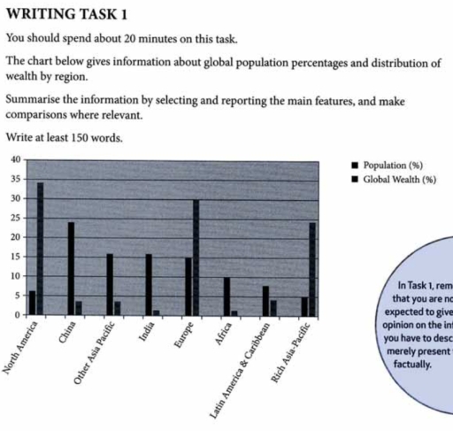
The image presents a vertical bar chart comparing global population percentages to global wealth percentages by region. North America has a population percentage around 5 and a wealth percentage just below 35. China has a population percentage above 20 and a wealth percentage around 25. Other Asia & Islands have a population percentage just above 5 and a wealth percentage just above 5. India has a population percentage above 15 and a wealth percentage around 5. Europe has a population percentage around 10 and a wealth percentage just above 30. Africa has a population percentage just below 15 and a wealth percentage around 5. Latin America & Caribbean have a population percentage around 10 and a wealth percentage around 5. Middle East has a population percentage just below 5 and a wealth percentage just above 5. Rich Asia-Pacific has a population percentage just above 5 and a wealth percentage just below 5. There is also a note in the bottom right corner that says, "In Task 1, remember that you are not expected to give reasons or explanations for the information in the graph; you have to describe what you can see, merely present factually."
Given the complexity of the image, the above description may not be entirely accurate.
Note: Both the topic and the answer were created by one of our users.

The graph below illustrates information about global population and wealth distribution percentages, which are represented by eight regions.

Overall, what stands out the most were regions with low population but high global wealth, such as North America, Europe, and the rich Asia-Pacific, while the rest of the regions had high populations in contrast to their low wealth distribution.

Even though North America was only approximately 6% of the global population, it boasted nearly 35% of global wealth. A similar situation can be seen in Europe, which has 15% of the worldwide population but 30% of the global population. The rich Asia-Pacific has only 5% of the world population but 25% of its wealth.

On the other hand, China, other regions of Asia Pacific, India, Africa, Latin America and Caribbean have far less total wealth compared to their share of the world population. The most striking was India, where they had 16% of the world population on only 1% of the global wealth. Similarly, in China, despite having the highest population percentage of 25%, their wealth barely reached 4%.

Word Count: 178

Answers On The Same Topic:

The chart below gives information about global population percentages and distribution of wealth by region.

The bar chart compares eight regions of the world by their population and wealth shares. In general, three areas have a positive population-to-wealth ratio, meaning people in these regions have more money distributed amongst them, while five other areas of the world have a larger percentage of the planet’s population but only a small proportion […]

The chart below gives information about global population percentages and distribution of wealth by region.

The bar chart illustrates how the proportion of the population and the allocation of wealth changed in eight areas. Overall, North America, Europe, and the rich Asia-Pacific show a higher percentage of wealth shares, whereas the remaining five regions are more likely to be populated without enough wealth. To begin with, regarding the three rich […]

The chart below gives information about global population percentages and distribution of wealth by region.

The bar chart illustrates how the proportion of the population and the allocation of wealth changed in eight areas. Overall, North America, Europe, and the rich Asia-Pacific show a higher percentage of wealth shares, whereas the remaining five regions are more likely to be populated without enough wealth. To begin with, regarding the three rich […]

The chart below gives information about global population percentages and distribution of wealth by region.

The bar chart provides a breakdown of population and distrubution of wealth percentage from 0 to 40 including the countries north america,china,india,europe,africa latin america and caribean,rich asia-pacefic and other asia pacefic. overall, the wealth distribution in the north america,europe and asia pacefic is highest but lowest distributed in africa and india.population is higher in percentage […]

The chart below gives information about global population percentages and distribution of wealth by region.

The diagram illustrates the proportions of population and global wealth across various regions. Overall, all the regions depicted, with the exception of North America, Europe, and Rich Asia-Pacific, have large populations but relatively low wealth. Notably, China has the highest percentage of the global population, while North America is home to the largest share of […]

See All

Other Topics:

The bar chart shows the percentage of students in Country X who participated in football, basketball, tennis, and swimming in 2010 and 2020.

The bar chart illuatrates the percentage of students in X country who participated in different sports from 2010 – 2020. Obseved that football was tie most greated proportion in 2010 and 2020 in the other hands tennis shows the lowest percentage over that years. Furthermore, students who participate in basketball were 40% compare to swimming […]

The bar chart below shows the percentage of Australian men and women in different age groups who did regular physical activity in 2010.Summarize the information by selecting and reporting the main features and make comparisons where relevant.Write at least 150 words.

The bar chart illustrates the proportion of Australian males and females across various age groups who engaged in regular physical activity in 2010. Overall, women generally exhibited higher participation rates than men in most age cohorts, with the most notable gap observed in the 45-54 age bracket. Conversely, men showed a clear advantage only among […]

The bar chart below shows the percentage of Australian men and women in different age groups who did regular physical activity in 2010.Summarize the information by selecting and reporting the main features and make comparisons where relevant.Write at least 150 words.

The given graph provide information about the percentage of Australian males and femalies in varies age groups who in regular physical activities in 2010. Overall, womans engaged in activities from 25 to 65 and over more than mans in similar ages,but mans particulary training more at 15 to 24 ages. Accorging to the bar chart […]

The chart below shows the main reasons for deforestation in three different regions of the world during two separate decades. Summarise the information by selecting and reporting the main features and make comparisons where relevant.

The bar chart illustrates the percentage of forest loss for five reasons (cattle ranching, commercial agriculture, logging, subsistence farming and other) in three different regions (South America, Southeast Asia and Central Africa.) Cattle ranching is considered a huge reason for forest loss in South America and the highest bar in the chart, Southeast Asia’s primary […]

the bar chart shows the number of cars per 1000 people in 5 European countries in 3 years and compares with the European average.

The number of vehicles per 1000 in 5 countries and the overall. Overall, Country five had the highest number of cars throughout the period, while Country 1 had the lowest number of cars all three years. Also, all countries’ figures fluctuated apart from Country 4 because it levelled off same level. Country five the had […]

The charts below show the amount of money spent on advertising in the UK and Australia across five different media types in 2010 and 2020. Summarise the information by selecting and reporting the main features, and make comparisons where relevant.

Two bar charts illustrate the money spent on five distict media types in the UK and Australia, for 2010 and 2020. Overall both countries showed same spending patterns, in 2010 television accounted for the greatest expenditure and in 2020 the biggest expense was internet advertisement for the countries. In 2010, advertising mediums in the UK […]

See All
We have detected unusual activity on your device.
Please verify your identity to continue.
Note: This verification step won't sign you in. If you have a premium account, please log in to access the service as usual.
Google/Gmail Verification
Or verify using Email/Code
We've sent a verification code to:
youremail@gmail.com (Not your email?)
Enter it below to complete the verification process.
Ensure your email address is correct, your inbox is not full, and you check your spam folder. If no email arrives, consider using an alternative email.
You will need a Premium plan to perform your action!
Note: If you already have a premium account, please log in to access our services as usual.

Plans & Pricing

Our mission is to make quality education accessible for everyone.
However, to keep our hardworking team running and this service alive, we genuinely need your support!
By opting for a premium plan, not only do you sustain us in achieving the mission, but you also unlock advanced features to enrich your learning experience.

Free

For learners who aren't pressed for time

What's included on Free
100+ Cambridge IELTS Tests
Instant IELTS Writing Task 1 & 2 Evaluation (2 times/month)
Instant IELTS Speaking Part 1, 2, & 3 Evaluation (2 times/month)
Instant IELTS Writing Task 1 & 2 Essay Generator (2 times/month)
500+ Dictation & Shadowing Exercises
100+ Pronunciation Exercises
Flashcards
Other Advanced Tools

Premium

For those serious about advancing their English proficiency, and for IELTS candidates aspiring to boost their band score by 1-2 points (especially in writing & speaking) in just 30 days or less

What's included on Premium
Save Your IELTS Test Progress & Analyze Mistakes By Question Type
Save Your Own Flashcard Sets & Use Them On Any Device
Unlock All Courses, IELTS Tests, Section & Part Practice
Unlimited AI Conversations
Unlimited AI Writing Enhancement Exercises
Unlimited IELTS Writing Task 1 & 2 Evaluation
Unlimited IELTS Speaking Part 1, 2, & 3 Evaluation
Checked Answers Will Not Be Published
Unlimited IELTS Writing Task 1 & 2 Essay Generator
Unlimited IELTS Speaking Part 1, 2, & 3 Sample Generator
Unlimited Usage Of Advanced Tools & AI Features
Priority Support within 24h (12-month plan only)

Due to the nature of our service and the provided free trials, payments are non-refundable.