Our system will evaluate the answer based on this AI-generated description.
The image presents a vertical bar chart comparing global population percentages to global wealth percentages by region. North America has a population percentage around 5 and a wealth percentage just below 35. China has a population percentage above 20 and a wealth percentage around 25. Other Asia & Islands have a population percentage just above 5 and a wealth percentage just above 5. India has a population percentage above 15 and a wealth percentage around 5. Europe has a population percentage around 10 and a wealth percentage just above 30. Africa has a population percentage just below 15 and a wealth percentage around 5. Latin America & Caribbean have a population percentage around 10 and a wealth percentage around 5. Middle East has a population percentage just below 5 and a wealth percentage just above 5. Rich Asia-Pacific has a population percentage just above 5 and a wealth percentage just below 5. There is also a note in the bottom right corner that says, "In Task 1, remember that you are not expected to give reasons or explanations for the information in the graph; you have to describe what you can see, merely present factually."
Given the complexity of the image, the above description may not be entirely accurate.
Skyrocket your IELTS band score by 1-2 points in under a month with our premium plan!
Note: Both the topic and the answer were created by one of our users.
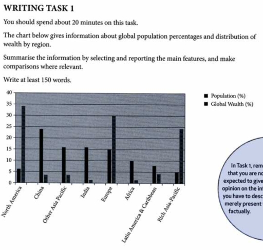
The bar chart illustrates how the proportion of the population and the allocation of wealth changed in eight areas.
Overall, North America, Europe, and the rich Asia-Pacific show a higher percentage of wealth shares, whereas the remaining five regions are more likely to be populated without enough wealth.
To begin with, regarding the three rich areas, North America is the wealthiest continent at almost 35%, which is about nine times higher than that of Latin America and the Caribbean at 4%, followed by Europe with 30% in second place. As the third richest region, Asia-Pacific accounts for around a quarter of the total proportion.
Next, in regards to the rest of the nations and areas, the most populated place is China at roughly 23%, which is more than twice that of Africa at 10%. Moreover, the figures for Europe, India, and Other Asia-Pacific countries range from 15% to 17%. Even though the two wealthy regions , North America and the rich Asia-Pacific, make up more than 20% of the shares, they are the least populated places of all.
Word Count: 178