🔥 Today Only: Save 30% on Premium — Offer Ends Soon! - Upgrade Now!
Bar Chart

Band 5+: the chart below shows the percentage of adults of different age groups in the uk who used the internet everyday from 2003 to 2006

Image for topic: the chart below shows the percentage of adults of different age groups in the uk who used the internet everyday from 2003 to 2006
Our system will evaluate the answer based on this AI-generated description.
The image depicts a bar graph showing the percentage of adults using the internet from 2003 to 2006, categorized by age group. For 16-24 age group, the percentages are around 110% for 2003, 115% for 2004, 105% for 2005, and 100% for 2006. For 25-44 age group, percentages are 80% for 2003, 85% for 2004, 80% for 2005, and 75% for 2006. For 45-54 age group, percentages are 70% for 2003, 65% for 2004, 60% for 2005, and 50% for 2006. For 55-64 age group, percentages are 40% for 2003, 45% for 2004, 40% for 2005, and 27% for 2006. For the 65+ age group, percentages are 20% for 2003, 25% for 2004, 20% for 2005, and 17% for 2006. The graph highlights a decline in internet usage across all age groups from 2003 to 2006, with the highest percentages observed in the 16-24 age group, followed by the 25-44, 45-54, 55-64, and the lowest in the 65+ age group.
Given the complexity of the image, the above description may not be entirely accurate.
Note: Both the topic and the answer were created by one of our users.

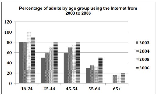
The bar graph illustrates the proportion of adults in different age groups using the Internet in their daily routine between 2003 and 2006 in Britain.

overall, adults, the 16 to 44 age group had a maximum time spent on web surfing, and use of the internet increased regardless of their age. The 65+ age group spends the least time on them.

The main users of the Internet are youngsters from the age group 16 to 24 years. In 2003 and 2006, they shared the same percentage, Which was 80%. In 2005, the figure increased significantly by 100%, After that, a slight down fall and reached 90 percent.

we can see from the chart, that the next two age groups have similar trends followed, and almost the same growth around 50 to 80 % the given year 2003 to 2006. The other two groups have minor fluctuations during the period, it was 30 to 50% in the age group 55-64 and in the 65+ aged all have under a quarter.

Word Count: 169

Answers On The Same Topic:

the chart below shows the percentage of adults of different age groups in the uk who used the internet everyday from 2003 to 2006

The bar chart illustrates the percentage of adults in the UK who used the Internet daily between 2003 and 2006, divided into six age groups. Overall, it is evident that younger age groups consistently had a higher proportion of daily internet users compared to older ones. The 16-24 age group had the highest usage across […]

the chart below shows the percentage of adults of different age groups in the uk who used the internet everyday from 2003 to 2006

The bar chart illustrates the percentage of internet users across different age groups in the UK in 2003 and 2006. The figures are presented in percentages. Overall, it is evident that the 16-24 age group consistently had the highest proportion of internet users, while those aged 65 and over had the lowest. Most other age […]

the chart below shows the percentage of adults of different age groups in the uk who used the internet everyday from 2003 to 2006

The bar chart illustrates data on the rates of Internet usage from 2003 to 2006 among five age cohorts in the UK. Overall, what stands out from the graph is that all age categories showed an upward trend during the given period, with the highest percentage of users among 16- to 24-year-olds, while the elderly […]

the chart below shows the percentage of adults of different age groups in the uk who used the internet everyday from 2003 to 2006

The bar chart illustrates the proportion of adult daily Internet users across five different age groups in the UK from 2003 to 2006. Overall, Internet usage increased significantly among all the age groups during this period, with the 25-44 age group showing the most substantial growth. While the 65 and older demographic consistently represented the […]

the chart below shows the percentage of adults of different age groups in the uk who used the internet everyday from 2003 to 2006

The bar chart compares the proportions of daily Internet users across five distinct age brackets in the UK between 2003 and 2006. Overall, the Internet became more prevalent across all of these age groups throughout the period surveyed. While the figure for elderly people over 65 established itself as the smallest Internet users group, the […]

See All

Other Topics:

The bar chart describes the sales of different goods in pounds ( £) in the UK over four seasons in 2015.

The bar charts give information on the amount of different goods sold in the UK throughout four seasons. Despite some fluctuation, there was an increase in the quantity of different clothing witnessing the most dramatic rise, whereas in summer and autumn the amount of commodities were sold lower than the other seasons. In addition, in […]

The following chart illustrates the results of a British survey taken in 2005 related to Housing preferences of UK people.

The given column graph illustrates the result of a british survey on flats,terraced houses,deteached houses and semi-detached houses taken in 2005.Overall, it is evident that the highest proportion of people like taken flat in London. It can be seen from the graph that most of the people taken flat in London from 58%. This figure […]

The charts below give information about workplace injuries in one country in 2018.

The bar chart compares how injuries occurred in four age cohorts across four different types of workplace in 2018. What stands out is that the proportions of injuries among those aged 50 and above was significantly high across all areas, particularly in education and health, and leisure and hospitality, where they topped the chart. Interestingly, […]

The bar chart below shows the production of the world’s oil in OPEC and non-OPEC countries. Write a short report for a university lecturer describing the information shown below.

The bar graph illustrate the number of oil barrel produced per day by OPEC and non-OPEC nations over 40 years period from 1980 to 2020. Overall, non-OPEC countries made up the marjority of the world’s oil production at the begining; however, their figures experienced a sharp decline over the period in question, similar to that […]

The bar chart gives information about the annual average spending on clothes per person in the USA in 1985, 1995 and 2005.

The bar chart illustrates th average amount of money spent on clothes in the USA in 1985, 1995 and 2005. Overall, women’s clothing accounted for the highest expenditure throughout the period, while spending on children’s clothes was much lower. In general, clothing expenditure increased over time, although spending on men’s clothes decreased slightly in 2005. […]

the graph below shows the amount of energy generated wind in four countries in the period 1980-2000

The bar chart illustrates the amount of energy generated by wind in four countries – India, Denmark, Germany and the United States – between 1985 and 2000, measured in megawatts. Overall, wind energy generation increased in all countries over the period, with the exception of the US, where the figure declined slightly at the end. […]

See All
We have detected unusual activity on your device.
Please verify your identity to continue.
Note: This verification step won't sign you in. If you have a premium account, please log in to access the service as usual.
Google/Gmail Verification
Or verify using Email/Code
We've sent a verification code to:
youremail@gmail.com (Not your email?)
Enter it below to complete the verification process.
Ensure your email address is correct, your inbox is not full, and you check your spam folder. If no email arrives, consider using an alternative email.
You will need a Premium plan to perform your action!
Note: If you already have a premium account, please log in to access our services as usual.

Plans & Pricing

Our mission is to make quality education accessible for everyone.
However, to keep our hardworking team running and this service alive, we genuinely need your support!
By opting for a premium plan, not only do you sustain us in achieving the mission, but you also unlock advanced features to enrich your learning experience.

Free

For learners who aren't pressed for time

What's included on Free
100+ Cambridge IELTS Tests
Instant IELTS Writing Task 1 & 2 Evaluation (2 times/month)
Instant IELTS Speaking Part 1, 2, & 3 Evaluation (5 times/month)
Instant IELTS Writing Task 1 & 2 Essay Generator (2 times/month)
500+ Dictation & Shadowing Exercises
100+ Pronunciation Exercises
Flashcards
Other Advanced Tools

Premium

For those serious about advancing their English proficiency, and for IELTS candidates aspiring to boost their band score by 1-2 points (especially in writing & speaking) in just 30 days or less

What's included on Premium
Save Your IELTS Test Progress
Unlock All Courses & IELTS Tests
Unlimited AI Conversations
Unlimited AI Writing Enhancement Exercises
Unlimited IELTS Writing Task 1 & 2 Evaluation
Unlimited IELTS Speaking Part 1, 2, & 3 Evaluation
Checked Answers Will Not Be Published
Unlimited IELTS Writing Task 1 & 2 Essay Generator
Unlimited IELTS Speaking Part 1, 2, & 3 Sample Generator
Unlimited Usage Of Advanced Tools
Priority Support within 24h (12-month plan only)

Due to the nature of our service and the provided free trials, payments are non-refundable.
Nếu bạn là người Việt Nam và không có hoặc không muốn trả bằng credit/debit cards, bạn có thể thanh toán bằng phương thức chuyển khoản:


Chọn gói:
419,000₫ 277,000 ₫ cho gói 1 tháng (chỉ 9,233₫/ngày)
1,239,000₫ 597,000 ₫ cho gói 3 tháng (chỉ 6,633₫/ngày)
2,469,000₫ 1,027,000 ₫ cho gói 6 tháng (chỉ 5,706₫/ngày)
4,929,000₫ 1,417,000 ₫ cho gói 12 tháng (chỉ 3,936₫/ngày)


Sau khi chuyển khoản, vui lòng đợi trình duyệt tự động điều hướng bạn trở lại Engnovate và bạn sẽ ngay lập tức nhận được mã kích hoạt tài khoản premium.
Nếu có lỗi xảy ra, bạn có thể liên hệ với team thông qua một trong các phương thức: email đến helloengnovate@gmail.com hoặc nhắn tin qua facebook.com/engnovate.
Vì toàn bộ công cụ trên website đều có thể sử dụng thử miễn phí, Engnovate không hỗ trợ hoàn tiền.