🔥 Today Only: Save 30% on Premium — Offer Ends Soon! - Upgrade Now!
Bar Chart

Band 7+: The chart show the result of a survey about the most important invention in the last 300 years. Summarize the information by selecting and reporting the main features, and make comparisions whare relevant .

Image for topic: The chart show the result of a survey about the most important invention in the last 300 years. Summarize the information by selecting and reporting the main features, and make comparisions whare relevant .
Our system will evaluate the answer based on this AI-generated description.
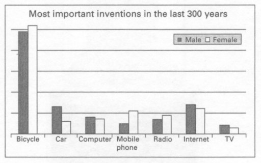
The image is a bar graph titled "Most important inventions in the last 300 years," comparing responses from male and female participants about seven different inventions. The inventions are Bicycle, Car, Computer, Mobile phone, Radio, Internet, TV; arranged on the x-axis. On the y-axis, there are horizontal lines representing percentages, marked at intervals of 5 from 0 to 35. For the Bicycle, Male is approximately 30%, and Female is near 5%. Car responses for Male are around 10%, and Female is about 5%. Computer Male responses are about 2.5%, and Female is roughly 1.5%. Male responses for Mobile phone are around 2.5%, and Female is about 5.5%. Radio has Male at approximately 1.5%, and Female is roughly 2%. Internet responses show Male at about 3.5% and Female at nearly 5%. TV has Male responses at approximately 2.5% and Female at about 2%. Male responses are represented by a darker shade bar, and Female responses by a lighter shade bar, each invention having two bars adjacent to each other for comparison.
Given the complexity of the image, the above description may not be entirely accurate.
Note: Both the topic and the answer were created by one of our users.

The bar chart provided illustrates the significance of various inventions over the past three centuries through a survey. Respondents were asked to rank seven categories bicycle, car, computer, mobile phone, radio, Internet, and TV.

The data reveals that the bicycle stands out as the most momentous invention among both genders which had 59 percent chosen by males and approximately 62 percent by females. The Internet emerges as the second most important creation with over 22 percent of males choosing it and around 21 percent of females ranking it highly.

In contrast, television garnered the lowest proportion of votes, with less than 20 percent overall. While TV was more popular among males which accounted for about 14 percent, females showed less interest with only 12 of the choices recorded. The percentages for the remaining group including car, computer, mobile phone and radio received slightly higher proportions than the TV group.

Overall, the chart showed that the bicycle was the most important creation as a transformative invention, followed by the Internet as a communication tool. It also suggests that television has relatively less significance in comparison.

Word Count: 184

Answers On The Same Topic:

The chart show the result of a survey about the most important invention in the last 300 years. Summarize the information by selecting and reporting the main features, and make comparisions whare relevant .

The bar chart compares survey results regarding what each gender considers to be the most vital innovation over the past three centuries among these seven inventions: bicycle, car, computer, mobile phone, radio, internet, and TV. Overall, the bicycle was regarded as the most important invention among both genders, while TV was the least popular among […]

The chart show the result of a survey about the most important invention in the last 300 years. Summarize the information by selecting and reporting the main features, and make comparisions whare relevant .

The bar chart illustrates results of a survey inventions in the last 300 years between male and female. Overall, bicycle was the highest over the period in both gender. The TV the lowest all time between male and female. Both genders similar. The most popular form of communication was the Internet. The bicycle, mobile phone […]

The chart show the result of a survey about the most important invention in the last 300 years. Summarize the information by selecting and reporting the main features, and make comparisions whare relevant .

The given chart indicates an outcome of a survey carried out on men and women about the most important invention in the last 300 year, consisting of bicycle, car, table, mobile phone, radio, internet and TV. Overall, It is evident that the bicycle is the most significant out of all inventions; conversely, TV is considered […]

The chart show the result of a survey about the most important invention in the last 300 years. Summarize the information by selecting and reporting the main features, and make comparisions whare relevant .

The chart represents the opinion of men and women regarding the seven key inventions that have played their most significant role during the past three centuries. Overall, it can be seen that both genders consider bicycles by far the most important innovation, followed by the creation of the Internet. Also, both sides agree that TV […]

The chart show the result of a survey about the most important invention in the last 300 years. Summarize the information by selecting and reporting the main features, and make comparisions whare relevant .

The bar chart illustrates the outcome of a survey about the most significant breakthroughs that happened in the last 300 years. The survey was carried out on two groups, namely males and females. The most striking feature of the chart is that, in polled people’s opinion, the bicycle is the most important invention in the […]

See All

Other Topics:

The bar chart shows the number of non-medical staff in a particular clinic between 2000 and 2015. Summarize the information by selecting and reporting the main features, and make comparisons where relevant.

The bar chart illustrates the figure of non- medical staff in a particular clinic which disributed by department from 2000 to 2015. Overall, it is clear that the number of staff in cleaning and administration were increasing throughout the period, whereas maintenance and catering service staff were some flactuate when security staff was the same […]

The chart shows the percentage of male and female teachers in six different types of educational setting in the UK in 2019. Summarise the information by selecting and reporting the main features, and make comparisons where relevant.

The bar chart below illustrates the percentage of male and female educators in six different types of academic settings in the UK during 2019. Overall, it shows the difference in genders for male and female teachers was varied by the school settings they were in. Women made up a large proportion of teachers compared to […]

The chart below shows the number of jobs in tourism-related industries in on UK city between 1989 and 2009. (

The bar chart gives information about the number of jobs in four different tourism-related industries in a city in the UK from 1989 to 2009. Overall, restaurants and housing generally experienced upward trends, while travel and tours declined significantly. Noticeably, the number of jobs in restaurants was mostly the highest throughout the period shown, while […]

The chart below shows the results of three surveys on absenteeism in a particular European country in the years 2000, 2005, and 2010. The results show the reasons people gave for not going to work.

The bar chart compares the outcomes of three different surveys, which show the main reasons for absenteeism in a particular European country in 2000, 2005 and 2010. Overall, although illness experienced a considerable decline, it still remained as the most widespread reason for absenteeism. While stress and unexpected problems related to traffic and weather conditions […]

The graph below shows the sales of 5 types of items in four different seasons in a US department store in 2011.

The line graph compares the sales of five different types of items – women’s clothes, men’s clothes, sports equipment, cosmetics, and jewellery – in four seasons ( Winter, Spring, Summer, and Autumn) in a US department store in 2011. Overall, women’s clothes stand out as the highest sold item among others, while men’s clothes were […]

The bar graph below shows the number of new houses constructed in a certain city from between 1999 and 2002. Summarise the information by selecting and reporting the main features, and make comparisons where relevant.

The bar chart illustrates changes in the number of new houses constructed in a certain city between 1999 and 2002. The figures are given in numbers of houses. Overall, detached houses and terrace houses showed an upward trend, whereas semi-detached houses and flats declined over the period. It is also noticeable that detached houses recorded […]

See All
We have detected unusual activity on your device.
Please verify your identity to continue.
Note: This verification step won't sign you in. If you have a premium account, please log in to access the service as usual.
Google/Gmail Verification
Or verify using Email/Code
We've sent a verification code to:
youremail@gmail.com (Not your email?)
Enter it below to complete the verification process.
Ensure your email address is correct, your inbox is not full, and you check your spam folder. If no email arrives, consider using an alternative email.
You will need a Premium plan to perform your action!
Note: If you already have a premium account, please log in to access our services as usual.

Plans & Pricing

Our mission is to make quality education accessible for everyone.
However, to keep our hardworking team running and this service alive, we genuinely need your support!
By opting for a premium plan, not only do you sustain us in achieving the mission, but you also unlock advanced features to enrich your learning experience.

Free

For learners who aren't pressed for time

What's included on Free
100+ Cambridge IELTS Tests
Instant IELTS Writing Task 1 & 2 Evaluation (2 times/month)
Instant IELTS Speaking Part 1, 2, & 3 Evaluation (2 times/month)
Instant IELTS Writing Task 1 & 2 Essay Generator (2 times/month)
500+ Dictation & Shadowing Exercises
100+ Pronunciation Exercises
Flashcards
Other Advanced Tools

Premium

For those serious about advancing their English proficiency, and for IELTS candidates aspiring to boost their band score by 1-2 points (especially in writing & speaking) in just 30 days or less

What's included on Premium
Save Your IELTS Test Progress & Analyze Mistakes By Question Type
Save Your Own Flashcard Sets & Use Them On Any Device
Unlock All Courses, IELTS Tests, Section & Part Practice
Unlimited AI Conversations
Unlimited AI Writing Enhancement Exercises
Unlimited IELTS Writing Task 1 & 2 Evaluation
Unlimited IELTS Speaking Part 1, 2, & 3 Evaluation
Checked Answers Will Not Be Published
Unlimited IELTS Writing Task 1 & 2 Essay Generator
Unlimited IELTS Speaking Part 1, 2, & 3 Sample Generator
Unlimited Usage Of Advanced Tools & AI Features
Priority Support within 24h (12-month plan only)

Due to the nature of our service and the provided free trials, payments are non-refundable.