24 Hours Only: Get 39% OFF on Our Premium Plan - Check Out Now!
Bar Chart

Band 4+: The chart shows British Emigration to selected destinations between 2004 and 2007.

Image for topic: The chart shows British Emigration to selected destinations between 2004 and 2007.
Our system will evaluate the answer based on this AI-generated description.
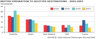
The image depicts a bar graph illustrating British emigration to selected destinations between 2004-2007, with thousands on the y-axis and destination countries on the x-axis. Each country has four bars representing the years, with blue for 2004, red for 2005, green for 2006, and yellow for 2007. Australia had the highest emigration numbers, starting around 50,000 in 2004, decreasing steadily each year to just over 30,000 in 2007. Spain's numbers ranged from just over 40,000 in 2004 to around 35,000 in 2007. New Zealand saw a consistent decrease from just over 20,000 in 2004 to around 10,000 in 2007. The USA had an increase from 20,000 in 2004 to nearly 30,000 in 2006 before dropping to around 20,000 in 2007. France's numbers remained relatively stable, starting at just over 10,000 in 2004, peaking at around 15,000 in 2005, and settling at just under 10,000 in 2007. The data source is the International Passenger Survey/ONS.
Given the complexity of the image, the above description may not be entirely accurate.
Note: Both the topic and the answer were created by one of our users.

The bar chats illustrates number of British masses are emigration from five different nations between 2004 to 2007.

After analyzing the bar ghaph, In 2004 and 2005, there was negligible difference by people to Australia.Moreover, the noticably different by 7000 individuals are emigration to first country.furthermore,the second major nation is Spain with almost identical percent in first two years,while, 32000 and 28000 people are emigration to same nation by 2006 and 2007 respectfully.

further, the total number of masses are emigration in new Zealand is 41000 collecting with given years, otherwise,the rammaning years 22000 population are emigration in 2006 ,as well as, in 2007 almost 21000. Over 20000 visitors are USA to compared France is falling down in 2004, then France is double then USA in 2005.2006 two countries are approximately sme level, at the final years,also there was 20000 in USA and France is 18000.

Overall,the maximum amount of population is Australia in over period and otherwise, the minimum is new Zealand.

Word Count: 163

Answers On The Same Topic:

The chart shows British Emigration to selected destinations between 2004 and 2007.

The provided bar graph illustrates the patterns of British emigration to various selected countries over a four-year period from 2004 to 2007. Overall, it is evident that while Australia consistently led in the number of emigrants, most other destinations experienced varying trends, either declining or remaining stable throughout the timeframe. Specifically, Australia saw the highest […]

The chart shows British Emigration to selected destinations between 2004 and 2007.

The bar chart shows the number of British people who emigrated to five destinations over the period 2004 to 2007. It is evident from the chart that throughout the period, the most popular place to move to was Australia. Emigration to Australia stood at just over 40,000 people in 2004, which was approximately 6,000 higher […]

The chart shows British Emigration to selected destinations between 2004 and 2007.

The bar chats illustrates number of British masses are emigration from five different nations between 2004 to 2007. After analyzing the bar ghaph, In 2004 and 2005, there was negligible difference by people to Australia.Moreover, the noticably different by 7000 individuals are emigration to first country.furthermore,the second major nation is Spain with almost identical percent […]

See All

Other Topics:

The diagram below shows the number of landline telephones per 1000 people in different countries over a five-year period

The provided diagram illustrates the evolution of landline telephone ownership per 1,000 individuals across several countries over a five-year timeframe. In summary, the data reveals considerable disparities in landline telephone ownership among the surveyed nations, with higher ownership rates often stabilizing or declining, while countries with initially lower ownership demonstrated a notable increase over the […]

the graph shows female unemployment in each Gandhi of the university Kingdom in 2013 and 2014

The table below represents the proportion of women unemployment figures in each land of the UK throughout 2013 and 2014. In essence, the graph notably projects and delineates that by the second investigated period, each country of the study had similar patterns of worthmentioning decreases. Additionally, it is effortless to notice that the fields of […]

the graph shows female unemployment in each Gandhi of the university Kingdom in 2013 and 2014

The table below represents the proportion of women unemployment figures in each land of the UK throughout 2013 and 2014. In essence, the graph notably projects and delineats that by the second investigated period, each country of the study had similar patterns of worthmentioning decreases. Additionally, it is effortless to notice that the fields of […]

The chart below shows information about the crop yields of three nations in 2011.

The bar chart compares the yields of four types of crops, namely wheat, oilseed, rice and other grains, in India, China and the USA in 2011, measured in million kilograms. Overall, the USA and China produced much higher crop yields than India. In all three countries, rice was the highest-yielding crop, while wheat was generally […]

the chart below show the percentage of people in a city in the UK using the internet for different activities in 2007 and 2009.

The bar chart gives information about people who used the Internet for different activities in a particular UK city in 2007 and 2009. Overall, in both years, the main purpose of the Internet usage was shopping. The least percentage in 2007 was for learning, whereas in 2009 for TV usage. Notably, the level of gaming […]

The graph shows the percentage of people who recycle their rubbish, in five countries, over 12 years

The chart illustrates the proportion of people recycling their waste in five countries over a period of 12 years. Overall, it can be seen that Uk was remained the highest percentage while Germany lowest. To begin with, United Kingdom over the 12 years the largest proportion started from 27 finished to 32%. In addition UK […]

See All
We have detected unusual activity on your device.
Please verify your identity to continue.
Note: This verification step won't sign you in. If you have a premium account, please log in to access the service as usual.
Google/Gmail Verification
Or verify using Email/Code
We've sent a verification code to:
youremail@gmail.com (Not your email?)
Enter it below to complete the verification process.
Ensure your email address is correct, your inbox is not full, and you check your spam folder. If no email arrives, consider using an alternative email.
You will need a Premium plan to perform your action!
Note: If you already have a premium account, please log in to access our services as usual.

Plans & Pricing

Our mission is to make quality education accessible and free for everyone.
However, to keep our hardworking team running and this service alive, we genuinely need your support!
By opting for a premium plan, not only do you sustain us in achieving the mission, but you also unlock advanced features to enrich your learning experience.

Free

For learners who aren't pressed for time

What's included on Free
1000+ IELTS Tests & Samples
Instant IELTS Writing Task 1 & 2 Evaluation (2 times/month)
Instant IELTS Speaking Part 1, 2, & 3 Evaluation (5 times/month)
Instant IELTS Writing Task 1 & 2 Essay Generator (2 times/month)
500+ Dictation & Shadowing Exercises
100+ Pronunciation Exercises
Flashcards
Other Advanced Tools

Premium

For those serious about advancing their English proficiency, and for IELTS candidates aspiring to boost their band score by 1-2 points (especially in writing & speaking) in just 30 days or less

What's included on Premium
Save Your IELTS Test Progress
Unlock All Courses & Content
Unlimited AI Conversations
Unlimited AI Writing Enhancement Exercises
Unlimited IELTS Writing Task 1 & 2 Evaluation
Unlimited IELTS Speaking Part 1, 2, & 3 Evaluation
Checked Answers Will Not Be Published
Unlimited IELTS Writing Task 1 & 2 Essay Generator
Unlimited IELTS Speaking Part 1, 2, & 3 Sample Generator
Unlimited Usage Of Advanced Tools

Due to the nature of our service and the provided free trials, payments are non-refundable.
Nếu bạn là người Việt Nam và không có hoặc không muốn trả bằng credit/debit cards, bạn có thể thanh toán bằng phương thức chuyển khoản:


Chọn gói:
279,000₫ 157,000 ₫ cho gói 1 tháng (chỉ 5,233₫/ngày)
819,000₫ 397,000 ₫ cho gói 3 tháng (chỉ 4,411₫/ngày)
1,649,000₫ 667,000 ₫ cho gói 6 tháng (chỉ 3,706₫/ngày)
3,299,000₫ 857,000 ₫ cho gói 12 tháng (chỉ 2,381₫/ngày)


Sau khi chuyển khoản, vui lòng đợi trình duyệt tự động điều hướng bạn trở lại Engnovate và bạn sẽ ngay lập tức nhận được mã kích hoạt tài khoản premium.
Nếu có lỗi xảy ra, bạn có thể liên hệ với team thông qua một trong các phương thức: email đến helloengnovate@gmail.com hoặc nhắn tin qua facebook.com/engnovate.
Vì toàn bộ công cụ trên website đều có thể sử dụng thử miễn phí, Engnovate không hỗ trợ hoàn tiền.