🔥 Today Only: Save 30% on Premium — Offer Ends Soon! - Upgrade Now!
Multiple Graphs

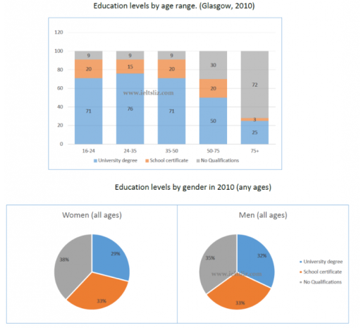
Band 4+: The charts below give information about levels of education in Glasgow, a city in Scotland, in 2010

Image for topic: The charts below give information about levels of education in Glasgow, a city in Scotland, in 2010
Our system will evaluate the answer based on this AI-generated description.
The image shows two graphs about education levels in Glasgow in 2010: a bar chart displaying education levels by age range and a pie chart showing education levels by gender. In the bar chart, for the 16-24 age range, 9% have a university degree, 71% have a school certificate, and 20% have no qualifications; for 24-35, 15% have a degree, 76% have a certificate, and 9% have no qualifications; for 35-50, 20% have a degree, 71% have a certificate, and 9% have no qualifications; for 50-75, 20% have a degree, 50% have a certificate, and 30% have no qualifications; for 75+, 3% have a degree, 25% have a certificate, and 72% have no qualifications. In the pie chart, for women, 38% have a degree, 29% have a certificate, and 33% have no qualifications, while for men, 35% have a degree, 32% have a certificate, and 33% have no qualifications.
Given the complexity of the image, the above description may not be entirely accurate.
Note: Both the topic and the answer were created by one of our users.

The given illustration includes one pie chart and one bar chart , each of which represents different information about education level in Glasgow in 2010: the bar chart illustrates the education level by age range contribution, while the pie chart illustrates levels by gender in 2010.

Overall, it’s clear that university degree it’s a foundation of a strong education and people from all ages groups had done it, despite the 75 years group. In terms of gender, women’s have more no qualification neither than men’s.

Members whose age ranged from 16-24,35-50 ages and 50-75 ages were responsible for the same levels – 20, while 75+ age group had only third level, which is less than more than half of previously mentioned figure. First three ages groups had the same no qualification level – 9, whereas the oldest age group had – 72.

Individuals from all ages and all genders where responsible for 33% school certificate degree. Women’s 29% university degree, while men’s had 3% more; 35% of males have no qualificated, comparing with this women’s have – 38%.

Word Count: 178

Answers On The Same Topic:

The charts below give information about levels of education in Glasgow, a city in Scotland, in 2010

The provided bar chart and pie chart illustrate the percentage of people in Glasgow having three levels of education (university, school and those with no qualifications) in 2010, segmented by age groups and gender. Overall, the majority of citizens with university education were in younger age groups, while in the oldest age group most people […]

The charts below give information about levels of education in Glasgow, a city in Scotland, in 2010

The charts illustrate the educational attainment of people in different age groups in Glasgow, Scotland, in 2010, while the pie charts show the distribution of educational qualifications among men and women during the same year. Overall, younger residents were far more likely to possess a university degree, whereas the proportion of people with no qualifications […]

The charts below give information about levels of education in Glasgow, a city in Scotland, in 2010

The charts illustrate levels of educational attainment in Glasgow, a city in Scotland, in 2010, categorised by age group and gender. Overall, younger age groups had a much higher proportion of university graduates, while older groups showed significantly lower levels of education. In contrast, differences between males and females were relatively small. Looking first at […]

The charts below give information about levels of education in Glasgow, a city in Scotland, in 2010

The two charts show different levels of education in 5age groups and two genders, in city, Scotland,in 2010. Overall, in table, most of the people over age 75 accounted for no qualification,on the contrary, people are young adults and middle age got almost the same percentage in university degree. Except 75+ all the ages had […]

See All

Other Topics:

Global water use by sector and water consumption in two different countries

The given line graph illustrates changes in the consumption of water worldwide between 1900 and 2000, while the table compares population, irrigated land and per-capita water consumption in Brazil and the Democratic Republic of Congo in 2000. It is obvious that total worldwide water use increased significantly over the period, with agriculture consistently being the […]

WRITING TASK 1 You should spend about 20 minutes on this task. The two line graphs below show New Zealand import figures from Australia and Japan in the years 1994 - 2004. Summarise the information by selecting and reporting the main features, and make comparisons where relevant. You should write at least 150 words.

The two line graphs illustrate the value of imports to New Zealand from Japan and Australia between 1994 and 2004, measured in NZ$ million. Overall, imports from Australia demonstrated a consistent upward trend despite some fluctuations, whereas imports from Japan initially increased but experienced a pronounced decline after 2000. Throughout the period, Australia remained New […]

the chart and table below give information about online shopping by Australia and New Zealand customers in 2012

The images below provide data on online shopping by consumers from Australia and New Zealand in 2012. Overall, the vast majority of customers in both Australia and New Zealand prefer to combine local and international websites for shopping, and only a small percentage of individuals buy exclusively from foreign resources. The prime reason for buying […]

Chart A below shows the rate of oil consumption (in millions of barrels) in a small country from 1950 to 2010. Chart B shows the number of people employed in the oil industry in that country, and also the rate of unemployment throughout the country over the same time.

The two given charts illustrates the annual consuption millionbarrels and oil employee and the percentage of national unemployment from the year 1950 to 2010.Generally the annual consumption has shot up though it remained constant at the start of the certain year but has mantained the trend despite the number of employee and unemployed reducing over […]

The bar charts give information about the salaries and university fees of students from three universities in two spheres - Law and Business. Summarize information by selecting and reporting the main features and make comparisons where relevant

The charts demonstrate three different universities in two categories: Law and Business; in addition, it shows the amount of money paid by students to tuition fees and their monthly revenue. In detail, University A is the only university where students receive and pay the same amount of money in the sphere of Law ($40,000). Nevertheless, […]

The percentage of persons arrested in the five years ending 1994 and the most recent reasons for arrest.

The charts depict the percentage of people arrested and the reasons of being restrained from 1990 to 1994. Generally speaking, men were arrested much more frequently than women. Besides, the percentage of males committing various crimes was mostly higher as well. Starting with the ratio, there were 32% of men accused of being guilty, while […]

See All
We have detected unusual activity on your device.
Please verify your identity to continue.
Note: This verification step won't sign you in. If you have a premium account, please log in to access the service as usual.
Google/Gmail Verification
Or verify using Email/Code
We've sent a verification code to:
youremail@gmail.com (Not your email?)
Enter it below to complete the verification process.
Ensure your email address is correct, your inbox is not full, and you check your spam folder. If no email arrives, consider using an alternative email.
You will need a Premium plan to perform your action!
Note: If you already have a premium account, please log in to access our services as usual.

Plans & Pricing

Our mission is to make quality education accessible for everyone.
However, to keep our hardworking team running and this service alive, we genuinely need your support!
By opting for a premium plan, not only do you sustain us in achieving the mission, but you also unlock advanced features to enrich your learning experience.

Free

For learners who aren't pressed for time

What's included on Free
100+ Cambridge IELTS Tests
Instant IELTS Writing Task 1 & 2 Evaluation (2 times/month)
Instant IELTS Speaking Part 1, 2, & 3 Evaluation (2 times/month)
Instant IELTS Writing Task 1 & 2 Essay Generator (2 times/month)
500+ Dictation & Shadowing Exercises
100+ Pronunciation Exercises
Flashcards
Other Advanced Tools

Premium

For those serious about advancing their English proficiency, and for IELTS candidates aspiring to boost their band score by 1-2 points (especially in writing & speaking) in just 30 days or less

What's included on Premium
Save Your IELTS Test Progress & Analyze Mistakes By Question Type
Save Your Own Flashcard Sets & Use Them On Any Device
Unlock All Courses, IELTS Tests, Section & Part Practice
Unlimited AI Conversations
Unlimited AI Writing Enhancement Exercises
Unlimited IELTS Writing Task 1 & 2 Evaluation
Unlimited IELTS Speaking Part 1, 2, & 3 Evaluation
Checked Answers Will Not Be Published
Unlimited IELTS Writing Task 1 & 2 Essay Generator
Unlimited IELTS Speaking Part 1, 2, & 3 Sample Generator
Unlimited Usage Of Advanced Tools & AI Features
Priority Support within 24h (12-month plan only)

Due to the nature of our service and the provided free trials, payments are non-refundable.