🔥 Today Only: Save 30% on Premium — Offer Ends Soon! - Upgrade Now!
Multiple Graphs

Band 5+: THE CHARTS BELOW GIVE INFORMATION ABOUT WEEKLY RENT FOR HOUSES AND APARTMENTS IN 4 AUSTRALIAN CITIES IN 2016 AND 2017.

Image for topic: THE CHARTS BELOW GIVE INFORMATION ABOUT WEEKLY RENT FOR HOUSES AND APARTMENTS IN 4 AUSTRALIAN CITIES IN 2016 AND 2017.
Our system will evaluate the answer based on this AI-generated description.
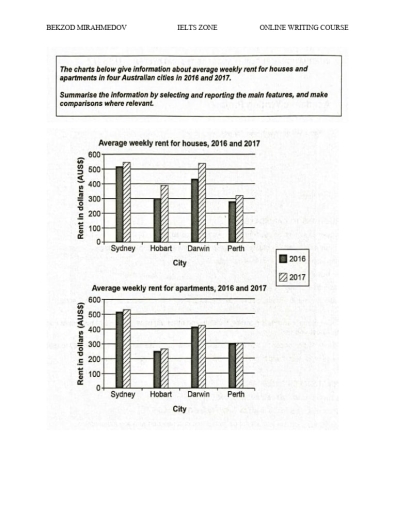
The image contains two bar charts displaying average weekly rent for houses and apartments in four cities (Sydney, Hobart, Darwin, Perth) for the years 2016 and 2017. The first chart shows that in 2016, Sydney had the highest average weekly rent for houses at just under AUD 600, followed by Darwin at around AUD 550, Perth at just over AUD 450, and Hobart at just under AUD 300. In 2017, Sydney's average weekly rent for houses increased slightly above AUD 600, Darwin's decreased to around AUD 500, Perth's remained unchanged, and Hobart's increased to just under AUD 400. The second chart indicates that in 2016, Sydney had the highest average weekly rent for apartments at just over AUD 500, Darwin at just under AUD 450, Perth at around AUD 350, and Hobart at just under AUD 300. In 2017, Sydney's average weekly rent for apartments rose to just under AUD 550, Darwin's decreased to around AUD 400, Perth's remained unchanged, and Hobart's increased to just over AUD 300.
Given the complexity of the image, the above description may not be entirely accurate.
Note: Both the topic and the answer were created by one of our users.

The given bar charts display data about weekly housing and apartment cost in 4 Australian cities (Sydnay,Hobart,Darwin,Perth) between 2016 and 2017.Units are measured in australian dollars sterling.

Overall,the most spent of money for both accommadation rent was in Sydnay,whereas the least amount of money were in Hobart and Perth,at the start.Furthemore,in 2017 Sydnay and Darwin were in the lead among other cities and spent more money for renting of house and apartment.

In terms of housing and apartment cost,people in the Sydnay spent nearly $500 weekly, on this as opposed to Hobart’s rent for accommodations were approximately $300 and $250 in 2016.Meanwhile,weekly cost for house and apartment were similarly in Perth ($300) in the period given.

On the other hand,Darwin and Sydnay spent slightly more money compared to 2016 and expend about $550 for living quarters.And Perth’s rent changed only for houses to just over $300.Finally,Hobart’s weekly rent for houses increased to $400,and price for apartments slightly increased to about $260.

Word Count: 161

Answers On The Same Topic:

THE CHARTS BELOW GIVE INFORMATION ABOUT WEEKLY RENT FOR HOUSES AND APARTMENTS IN 4 AUSTRALIAN CITIES IN 2016 AND 2017.

The charts illustrate the average weekly rental costs for houses and apartments in four major cities in Australia, namely Sydney, Hobart, Darwin and Perth, in 2016 and 2017. Overall, Sydney had the highest rental prices in both types of accommodation across the two years, while Hobart consistently recorded the lowest figures. In addition, rents generally […]

THE CHARTS BELOW GIVE INFORMATION ABOUT WEEKLY RENT FOR HOUSES AND APARTMENTS IN 4 AUSTRALIAN CITIES IN 2016 AND 2017.

The given bar charts show the standard cost of weekly renting a house and apartment in 4 cities of Australia in the years 2016 and 2017. Overall, it can be seen that the price for renting a house and an apartment increased in 2017 in all countries. It is also clear that renting a house […]

THE CHARTS BELOW GIVE INFORMATION ABOUT WEEKLY RENT FOR HOUSES AND APARTMENTS IN 4 AUSTRALIAN CITIES IN 2016 AND 2017.

The given bar charts show the standard cost of weekly renting a house and apartment in 4 cities of Australia in the years 2016 and 2017. Overall, it can be seen that the price for renting a house and an apartment increased in 2017 in all countries. It is also clear that renting a house […]

See All

Other Topics:

Task 1: The table and the chart below provide a breakdown of the total expenditure and the average amount of money spent by students per week while studying abroad in 4 countries. Summarize the information by selecting and reporting the main features, and make comparisons where relevant.

The table and bar chart show the total expenditure and average weekly spending of students studying abroad in four countries. Overall, country A is the most expensive destination for studying abroad, while, country D is the chepest. Living costs are the largest expence in countries A, B and C, whereas tuition fees are the highest […]

The diagrams below give information on transport and car use in Edmonton

The given charts illustrate transportation and vehicle usage in Edmonton. From an overall perspective, cars are the most prevalent form of transport. Moreover, citizens most often use their cars to go to work. Regarding the pie chart, the number of car commuters is the highest, standing at 45%, surpassing the figure for the LRT by […]

The graph below provides information on the avearge cost of three kinds of cereals in England and Wales over an eight-month period in 2014, while the table shows the quantity of cereals sold during the same period. Summarise the information by selecting and reporting the main features, and make comparisons where relevant.

The graphs illustrate the average price per tonne and the average quantities of cereals sold in England and Wales from January to August. Overall, a similar pattern was observed in the prices of wheat and barley, with both rising, before gradually decline falling. Wheat remained the most expensive cereal for most of the period, while […]

The charts show the proportion of different modes of transportation used by city residents in 2010 and 2020. Summarise the information by selecting and reporting the main features, and make comparisons where relevant.

The two pie charts illustrate the percentage distribution of different transport methods used by urban citizens in 2010 and 2020. Overall, cars were the main mode of transportation in both years, although their popularity declined over time. The figures -> proportions for public transport and bicycle use increased significantly during the decade. In 2010, half […]

Task 1: The table and the chart below provide a breakdown of the total expenditure and the average amount of money spent by students per week while studying abroad in 4 countries. Summarize the information by selecting and reporting the main features, and make comparisons where relevant.

The table and pie chart show total expense and average amount of money spent per week when studying abroad in 4 different countries. Overall, country A is the most expensive place to study. While, country D is the chepest one. In all three categories living cost is the biggest expence, only in county D the […]

The line graph and the bar chart give the information and forecast about the vehicle numbers and CO2 emission in England and Wales between 2000 and 2020. Summarize the information by selecting and reporting the main features and make comparisons where relevant.

The line graph and bar chart illustrate information about the number of vehicles and CO₂ emissions in England and Wales from 2000 to 2020, including future predictions. Overall, the most striking feature of the figures is that the number of vehicles increased over the period. It is also noticeable that cars were responsible for a […]

See All
We have detected unusual activity on your device.
Please verify your identity to continue.
Note: This verification step won't sign you in. If you have a premium account, please log in to access the service as usual.
Google/Gmail Verification
Or verify using Email/Code
We've sent a verification code to:
youremail@gmail.com (Not your email?)
Enter it below to complete the verification process.
Ensure your email address is correct, your inbox is not full, and you check your spam folder. If no email arrives, consider using an alternative email.
You will need a Premium plan to perform your action!
Note: If you already have a premium account, please log in to access our services as usual.

Plans & Pricing

Our mission is to make quality education accessible for everyone.
However, to keep our hardworking team running and this service alive, we genuinely need your support!
By opting for a premium plan, not only do you sustain us in achieving the mission, but you also unlock advanced features to enrich your learning experience.

Free

For learners who aren't pressed for time

What's included on Free
100+ Cambridge IELTS Tests
Instant IELTS Writing Task 1 & 2 Evaluation (2 times/month)
Instant IELTS Speaking Part 1, 2, & 3 Evaluation (2 times/month)
Instant IELTS Writing Task 1 & 2 Essay Generator (2 times/month)
500+ Dictation & Shadowing Exercises
100+ Pronunciation Exercises
Flashcards
Other Advanced Tools

Premium

For those serious about advancing their English proficiency, and for IELTS candidates aspiring to boost their band score by 1-2 points (especially in writing & speaking) in just 30 days or less

What's included on Premium
Save Your IELTS Test Progress & Analyze Mistakes By Question Type
Save Your Own Flashcard Sets & Use Them On Any Device
Unlock All Courses, IELTS Tests, Section & Part Practice
Unlimited AI Conversations
Unlimited AI Writing Enhancement Exercises
Unlimited IELTS Writing Task 1 & 2 Evaluation
Unlimited IELTS Speaking Part 1, 2, & 3 Evaluation
Checked Answers Will Not Be Published
Unlimited IELTS Writing Task 1 & 2 Essay Generator
Unlimited IELTS Speaking Part 1, 2, & 3 Sample Generator
Unlimited Usage Of Advanced Tools & AI Features
Priority Support within 24h (12-month plan only)

Due to the nature of our service and the provided free trials, payments are non-refundable.