Our system will evaluate the answer based on this AI-generated description.
The image contains two bar charts displaying average weekly rent for houses and apartments in four cities (Sydney, Hobart, Darwin, Perth) for the years 2016 and 2017. The first chart shows that in 2016, Sydney had the highest average weekly rent for houses at just under AUD 600, followed by Darwin at around AUD 550, Perth at just over AUD 450, and Hobart at just under AUD 300. In 2017, Sydney's average weekly rent for houses increased slightly above AUD 600, Darwin's decreased to around AUD 500, Perth's remained unchanged, and Hobart's increased to just under AUD 400. The second chart indicates that in 2016, Sydney had the highest average weekly rent for apartments at just over AUD 500, Darwin at just under AUD 450, Perth at around AUD 350, and Hobart at just under AUD 300. In 2017, Sydney's average weekly rent for apartments rose to just under AUD 550, Darwin's decreased to around AUD 400, Perth's remained unchanged, and Hobart's increased to just over AUD 300.
Given the complexity of the image, the above description may not be entirely accurate.
Skyrocket your IELTS band score by 1-2 points in under a month with our premium plan!
Note: Both the topic and the answer were created by one of our users.
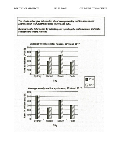
The given bar charts show the standard cost of weekly renting a house and apartment in 4 cities of Australia in the years 2016 and 2017. Overall, it can be seen that the price for renting a house and an apartment increased in 2017 in all countries. It is also clear that renting a house and an apartment in Sydney was always higher than in other cities.
Focusing on the weekly rent for houses, in Sydney it was around 500$, which was 100$ less than that of Darwin. This figure increased by 10$, while it increased to 510$ in Darwin in 2017. Renting a house in Hobart and Perth was around 300$ in 2016 before witnessing an escalation by 100$ and 20$, respectively.
Regarding the price of renting apartments, in Sydney, it was the same as the cost of renting a house. In Hobart and Darwin, it was 250$ and 400$ before increasing slightly by 10$ in 2017, respectively. Subsequently, in Perth, the normal spending on an apartment for renting was 300$, and it stabilized in the next year.
Word Count: 179