🔥 Today Only: Save 30% on Premium — Offer Ends Soon! - Upgrade Now!
Bar Chart

Band 5+: The given bar chart illustrates the population of Jakarta, Shanghai and Sao Paulo in 1990, as well as the estimated and actual figures of the populations in 2000

Image for topic: The given bar chart illustrates the population of Jakarta, Shanghai and Sao Paulo in 1990, as well as the estimated and actual figures of the populations in 2000
Our system will evaluate the answer based on this AI-generated description.
The image shows a bar graph titled 'Population size (1990 - 2000)' depicting the populations of Jakarta, Shanghai, and Sao Paulo between 1990 and 2000 in 5 million increment scale, measured in millions. For Jakarta, the 1990 population bar almost reaches the 10 million mark, the 2000 prediction bar surpasses the 15 million mark by a small margin, and the 2000 actual figures bar reaches almost the 20 million mark. Shanghai's 1990 population bar is slightly shorter than Jakarta's 1990 bar, its 2000 prediction bar is approximately half a million shorter than Jakarta's 2000 prediction, while its 2000 actual figures bar is almost identical in length to Jakarta's 2000 prediction bar. Sao Paulo's 1990 population bar is the longest, surpassing the 15 million mark, its 2000 prediction bar reaches the 20 million mark and its 2000 actual figures bar is the shortest of the 2000 actual figures but still surpasses the 15 million mark.
Given the complexity of the image, the above description may not be entirely accurate.
Note: Both the topic and the answer were created by one of our users.

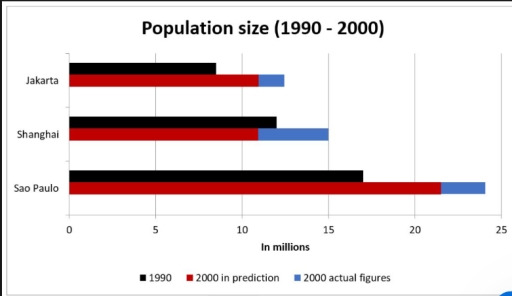
The given bar chart depicts the populations in estimated and actual of three cities namely Jakarta, Sao Paulo, and Shanghai in 10 years, starting from 1990. It is obvious that the actual sizes of population in all positions were bigger than the estimated ones. Moreover, only the number of people in Shanghai was smaller than it in the previous 10 years.

At first glance, both Jakarta and Sao Paulo had the same trend in population size occurring. Sao Paulo had the largest size of population, while Jakarta’s population size was the smallest at over 15 and nearly 10 million respectively in 1990. The number of residents was predicted at above 20 in Sao Paulo, followed by over 10 million estimated people in Jakarta. In reality, the sizes of people in two states were almost 3 and 2 million larger than estimated, and even approximately 10 and 7 million more than them in 1990 respectively.

Shanghai had the second largest size of population in 1990 at nearly 15 million. It was predicted that the number of residents there would decrease by about 2 million people in 2000. However, there was over 4 million people more than the estimated one, made Shanghai the second city had the most significant number of people given by the chart.

Word Count: 214

Answers On The Same Topic:

The given bar chart illustrates the population of Jakarta, Shanghai and Sao Paulo in 1990, as well as the estimated and actual figures of the populations in 2000

The bar chat delineates the actual and expected figures of residents of three cities, Jakarta, Sao Paulo, and Shanghai. Overall, the data reveals significant nation disparaties in the population size for different periods, with Sao Paulo generally include more population size in all periods, while Jakarta and Shanghai has lower level than Sao Paulo A […]

The given bar chart illustrates the population of Jakarta, Shanghai and Sao Paulo in 1990, as well as the estimated and actual figures of the populations in 2000

The chart illustrates the population sizes of three cities, namely Jakarta, Shanghai, and Sao Paolo, in 1990 and 2000, including both predicted and actual figures. Overall, all cities experienced growth over the period, with Sao Paulo being the largest and Jakarta the smallest. Forecasts underestimated the actual figures, and remarkably, Shanghai was predicted to decline, […]

The given bar chart illustrates the population of Jakarta, Shanghai and Sao Paulo in 1990, as well as the estimated and actual figures of the populations in 2000

The bar chart provides data on the actual and forecasted population size in three cities, namely: Jakarta, Shanghai, and Sao Paulo, in 1990 and 2000. Overall, while all three cities experienced an increase in citizen size, the actual figure in 2000 was slightly different from the predicted figure. Sao Paulo had the highest population compared […]

The given bar chart illustrates the population of Jakarta, Shanghai and Sao Paulo in 1990, as well as the estimated and actual figures of the populations in 2000

The bar chart gives information about the population sizes of three cities, namely Jakarta, Shanghai, and Sao Paulo, in 1990 and the projections for 2000, alongside the actual figures for the latter year. Overall, for each city, the real numbers in 2000 surpassed the forecasted ones, with Shanghai having been the only citu expected to […]

The given bar chart illustrates the population of Jakarta, Shanghai and Sao Paulo in 1990, as well as the estimated and actual figures of the populations in 2000

The bar chart compares the actual and projected population volumes among three distinct conurbations, Jakarta, Shanghai and Sao Paulo, in 1990 and 2000. Overall, readily discernible in the chart is that three cities experienced an upward trend in population sizes from 1990 to 2000, with Sao Paulo remaining its supremity throughout 10 years. The actual […]

See All

Other Topics:

The bar chart shows the prices of apples and oranges from 2010 to 2014.

The given bar chart showcases the comparison between the cost of apples and oranges in the years between 2010 and 2014. Overall, the data reveals general upward trend in the prices of both fruits. The prices of apple stayed fairly stable, while orange was increasing gradually over the period. During the first half of the […]

The bar chart shows the prices of apples and oranges from 2010 to 2014.

The bar chart compares the cost of apples and cranges þver a 5 year period between 2010 and 2014. Overall, the data reveals prices of the fruits over the 5 years. Notably, both fruits price increased steadily. Initially the cost of the apple was higher than that if the oranges, however the cost of an […]

The bar chart shows the prices of apples and oranges from 2010 to 2014.

The given chart depicts the shifts in costs of apples and oranges per pound between the years 2010 and 2014. Overall, the data reveals a general upward trend in prices of both fruits, with apples initially costing higher than oranges were supassed in the later years. When examining the given information, a significant difference in […]

You should spend about 20 minutes on this task The chart below shows the number of passengers who used public transport in Somewhere town from 2012 to 2015. Summarize the information by selecting and reporting the main features and make comparisons where relevant. Write at least 150 words.

The bar graph delineates the number of passengers who used different modes of public transportation: train, bus, and tram between 2012 and 2015. Overall, it is evident that at first, the train was used dominantly by public. However, there was lesser used of the tram in 2012. By 2015, passengers accelerated significantly in the tram […]

The bar chart shows the prices of apples and oranges from 2010 to 2014.

The given bar chart illustrates the prices of both apples and oranges between 2010 and 2014. Overall, the data revealed generall upward trend, with the prices of both fruits experienced a gradual increase for over 5 years. At the beginning of the period, the price of apples was consistently priced, while oranges grew steadily, reaching […]

The bar chart shows the prices of apples and oranges from 2010 to 2014.

The bar chart provides information on the costs of apples and oranges between 2010 and 2014. Overall, the datas reveal general upward in the both prices of apple and orange over the periods. The prices of apple was nearly more popular than orange, however, there was a slight decline in middle of the year. In […]

See All
We have detected unusual activity on your device.
Please verify your identity to continue.
Note: This verification step won't sign you in. If you have a premium account, please log in to access the service as usual.
Google/Gmail Verification
Or verify using Email/Code
We've sent a verification code to:
youremail@gmail.com (Not your email?)
Enter it below to complete the verification process.
Ensure your email address is correct, your inbox is not full, and you check your spam folder. If no email arrives, consider using an alternative email.
You will need a Premium plan to perform your action!
Note: If you already have a premium account, please log in to access our services as usual.

Plans & Pricing

Our mission is to make quality education accessible for everyone.
However, to keep our hardworking team running and this service alive, we genuinely need your support!
By opting for a premium plan, not only do you sustain us in achieving the mission, but you also unlock advanced features to enrich your learning experience.

Free

For learners who aren't pressed for time

What's included on Free
100+ Cambridge IELTS Tests
Instant IELTS Writing Task 1 & 2 Evaluation (2 times/month)
Instant IELTS Speaking Part 1, 2, & 3 Evaluation (5 times/month)
Instant IELTS Writing Task 1 & 2 Essay Generator (2 times/month)
500+ Dictation & Shadowing Exercises
100+ Pronunciation Exercises
Flashcards
Other Advanced Tools

Premium

For those serious about advancing their English proficiency, and for IELTS candidates aspiring to boost their band score by 1-2 points (especially in writing & speaking) in just 30 days or less

What's included on Premium
Save Your IELTS Test Progress
Unlock All Courses & IELTS Tests
Unlimited AI Conversations
Unlimited AI Writing Enhancement Exercises
Unlimited IELTS Writing Task 1 & 2 Evaluation
Unlimited IELTS Speaking Part 1, 2, & 3 Evaluation
Checked Answers Will Not Be Published
Unlimited IELTS Writing Task 1 & 2 Essay Generator
Unlimited IELTS Speaking Part 1, 2, & 3 Sample Generator
Unlimited Usage Of Advanced Tools
Priority Support within 24h (12-month plan only)

Due to the nature of our service and the provided free trials, payments are non-refundable.
Nếu bạn là người Việt Nam và không có hoặc không muốn trả bằng credit/debit cards, bạn có thể thanh toán bằng phương thức chuyển khoản:


Chọn gói:
419,000₫ 277,000 ₫ cho gói 1 tháng (chỉ 9,233₫/ngày)
1,239,000₫ 597,000 ₫ cho gói 3 tháng (chỉ 6,633₫/ngày)
2,469,000₫ 1,027,000 ₫ cho gói 6 tháng (chỉ 5,706₫/ngày)
4,929,000₫ 1,417,000 ₫ cho gói 12 tháng (chỉ 3,936₫/ngày)


Sau khi chuyển khoản, vui lòng đợi trình duyệt tự động điều hướng bạn trở lại Engnovate và bạn sẽ ngay lập tức nhận được mã kích hoạt tài khoản premium.
Nếu có lỗi xảy ra, bạn có thể liên hệ với team thông qua một trong các phương thức: email đến helloengnovate@gmail.com hoặc nhắn tin qua facebook.com/engnovate.
Vì toàn bộ công cụ trên website đều có thể sử dụng thử miễn phí, Engnovate không hỗ trợ hoàn tiền.