🔥 Today Only: Save 30% on Premium — Offer Ends Soon! - Upgrade Now!
Line Graph

Band 6+: The graph below compares the number of visits to two new music sites on the web. Summarise the information by selecting and reporting the main features, and make comparisons where relevant.

Image for topic: The graph below compares the number of visits to two new music sites on the web. Summarise the information by selecting and reporting the main features, and make comparisons where relevant.
Our system will evaluate the answer based on this AI-generated description.
The image is a line graph titled "Visits to two new music sites on the web," with the x-axis labeled "Days" marking a time range from 1 to 15 and the y-axis labeled "'000s" reporting visits in thousands from 0 to 180. Two lines track visits to "Music Choice" and "Pop Parade" across the 15 days. Music Choice starts at around 120,000 visits on Day 1, fluctuates between approximately 40,000 and 80,000 visits from Day 2 to Day 9, spikes to about 140,000 on Day 10, drops to around 100,000 on Day 11, jumps to nearly 160,000 on Day 12, then declines to roughly 60,000 on Day 13 before recovering to 120,000 on Day 14 and finishing at just under 140,000 by Day 15. Pop Parade begins close to 80,000 visits on Day 1, experiences ups and downs reaching a low near 20,000 on Day 5 and highs around 100,000 on Days 7 and 10, sharply increases to above 160,000 visits on Day 11, plummets to approximately 80,000 on Day 12, climbs again past 160,000 by Day 13, and concludes the period with a decline to about 140,000 visits on Day 15.
Given the complexity of the image, the above description may not be entirely accurate.
Note: Both the topic and the answer were created by one of our users.

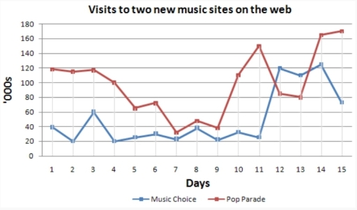
The given line chart demonstrates the information about visits to two new music sites such as “Music Choice” and “Pop Parade” on the web. Overall, Pop Parade has a better trend because, on all days except 12 and 13, Pop Parade has more visitors than Music Choice.

In the first three days, visitors to Pop Parade remain constantly. Then its trend decreases substantially until the 7th day. After that, the quantity of visitors increases significantly on the 11th day. Later, it rapidly declines again between the 11th and 12th days and remains constant for one day. Next, the trend dramatically grows on the 15th day.

In the first four days, the trend of visitors to Music Choice is changeable, it falls, rises, and goes down again. Then, it remains permanent until the 11th day. Later, the trend abruptly goes up on the 14th day and has a better trend than the Pop Parade. However, on the last day, it sharply drops

Word Count: 161

Answers On The Same Topic:

The graph below compares the number of visits to two new music sites on the web. Summarise the information by selecting and reporting the main features, and make comparisons where relevant.

The line graph illustrates the number of visits, measured in thousands, to two newly-launched music websites, namely Pop Parade and Music Choice, over a fifteen-day period. Overall, Pop Parade consistently attracted a larger audience at the beginning and end of the period, whereas Music Choice experienced lower figures initially but showed a notable surge towards […]

The graph below compares the number of visits to two new music sites on the web. Summarise the information by selecting and reporting the main features, and make comparisons where relevant.

The line graph provides us with information about amount of people which visit two music sites on the website on the internet(Music Choice and Pop Parade) over of 15 days period.Units are presented on thousands number of people. Overall,the both sites are fluctuated all time,but then they are grown of visits.Moreover Music Choice was higher […]

The graph below compares the number of visits to two new music sites on the web. Summarise the information by selecting and reporting the main features, and make comparisons where relevant.

The graph shows the number of visitors to two recently launched music sites on the internet: Music Choice and Pop Parade. Overall, both sites experienced noticeable fluctuations in visitor numbers during the whole period. While the Pop Parade saw ups and downs in visits, Music Choice remained stable at first and then saw a surge […]

The graph below compares the number of visits to two new music sites on the web. Summarise the information by selecting and reporting the main features, and make comparisons where relevant.

The line graph illustrates the rate of visits of two new music in both Music Choice and Pop Parade over 15 days from the first day to the fifteenth day. It can been seen that a downward trend and an upward trend were observed for Music Choice and Pop Parade respectively. Also, it was obvious […]

The graph below compares the number of visits to two new music sites on the web. Summarise the information by selecting and reporting the main features, and make comparisons where relevant.

The diagram compares the attendance of two new music sites on the web. Overall, the Pop Parade figures showed an upward trend and dominance above Music Choice, although there were two times when Music Choice outstripped Pop Parade. Firstly, Pop Parade visit numbers started at 120 on day one; between days 1 and 5, there […]

See All

Other Topics:

The graph shows the percentage of UK adolescents following a vegetarian diet. Summarise the information by selecting and reporting the main features.

The chart demonstrates the proportion of teenagers restraining themselves from eating meat in the United Kingdom between the years 1960 and 2020. Overall, there is a noticeable increase, with the most noteworthy points being the fall off in the mid-eighties and some fluctuations going forward in the 1990s. To start off, in the first twenty […]

The graph below shows average carbon dioxide emissions per person in the United Kingdom, Sweden, Italy and Portugal between 1967 and 2007.

This graph shows avarege carbon dioxide emmisions for one person in the United Kingdom, Sweeden, Italy and Portugal from 1967 to 2007. Firstly, United Kingdom has started in the highest point in the chart. Then in 1997 it started to decrease and the emissions had a drop to 9. Sweeden had an increase to 10 […]

The graph below shows the number of shops that closed and the number of shops that opened in one country between 2011 and 2018.

The provided graph compares the proportion of shops which are not running and the ratio of shops that stopped in a particuler nation in the time period of 2011 to 2018. Overall, it is clear that there was a fluctuation in the amount of shop closures and openings from 2011 to 2018. In 2011,the ratio […]

The graph below shows the average trip length (in miles) among U.S. children aged 5 to 15 years old. Summarise the information by selecting and reporting the main features, and make comparisons when relevant.

The line graph illustrates the number of journeys made by U.S. schoolchildren using six different transportations such as walking, cycling, bus, taxi, car, and train between 1970 and 2020. Overall, the data shows a clear shift towards motorised transport, particularly cars, taxis and trains. While walking showed some fluctuations, bus and cycling showed a steady […]

The chart below gives information about computer ownership in the US from 1997 to 2012.

The line graph shows information about computer ownership in the US from 1997 to 2012. Overall, the number of people without a computer went down, while the number of people with computers went up. One computer became the highest group by the end of the period. In 1997, about 65% of people did not have […]

See All
We have detected unusual activity on your device.
Please verify your identity to continue.
Note: This verification step won't sign you in. If you have a premium account, please log in to access the service as usual.
Google/Gmail Verification
Or verify using Email/Code
We've sent a verification code to:
youremail@gmail.com (Not your email?)
Enter it below to complete the verification process.
Ensure your email address is correct, your inbox is not full, and you check your spam folder. If no email arrives, consider using an alternative email.
You will need a Premium plan to perform your action!
Note: If you already have a premium account, please log in to access our services as usual.

Plans & Pricing

Our mission is to make quality education accessible for everyone.
However, to keep our hardworking team running and this service alive, we genuinely need your support!
By opting for a premium plan, not only do you sustain us in achieving the mission, but you also unlock advanced features to enrich your learning experience.

Free

For learners who aren't pressed for time

What's included on Free
100+ Cambridge IELTS Tests
Instant IELTS Writing Task 1 & 2 Evaluation (2 times/month)
Instant IELTS Speaking Part 1, 2, & 3 Evaluation (5 times/month)
Instant IELTS Writing Task 1 & 2 Essay Generator (2 times/month)
500+ Dictation & Shadowing Exercises
100+ Pronunciation Exercises
Flashcards
Other Advanced Tools

Premium

For those serious about advancing their English proficiency, and for IELTS candidates aspiring to boost their band score by 1-2 points (especially in writing & speaking) in just 30 days or less

What's included on Premium
Save Your IELTS Test Progress
Unlock All Courses & IELTS Tests
Unlimited AI Conversations
Unlimited AI Writing Enhancement Exercises
Unlimited IELTS Writing Task 1 & 2 Evaluation
Unlimited IELTS Speaking Part 1, 2, & 3 Evaluation
Checked Answers Will Not Be Published
Unlimited IELTS Writing Task 1 & 2 Essay Generator
Unlimited IELTS Speaking Part 1, 2, & 3 Sample Generator
Unlimited Usage Of Advanced Tools
Priority Support within 24h (12-month plan only)

Due to the nature of our service and the provided free trials, payments are non-refundable.
Nếu bạn là người Việt Nam và không có hoặc không muốn trả bằng credit/debit cards, bạn có thể thanh toán bằng phương thức chuyển khoản:


Chọn gói:
419,000₫ 277,000 ₫ cho gói 1 tháng (chỉ 9,233₫/ngày)
1,239,000₫ 597,000 ₫ cho gói 3 tháng (chỉ 6,633₫/ngày)
2,469,000₫ 1,027,000 ₫ cho gói 6 tháng (chỉ 5,706₫/ngày)
4,929,000₫ 1,417,000 ₫ cho gói 12 tháng (chỉ 3,936₫/ngày)


Sau khi chuyển khoản, vui lòng đợi trình duyệt tự động điều hướng bạn trở lại Engnovate và bạn sẽ ngay lập tức nhận được mã kích hoạt tài khoản premium.
Nếu có lỗi xảy ra, bạn có thể liên hệ với team thông qua một trong các phương thức: email đến helloengnovate@gmail.com hoặc nhắn tin qua facebook.com/engnovate.
Vì toàn bộ công cụ trên website đều có thể sử dụng thử miễn phí, Engnovate không hỗ trợ hoàn tiền.