🔥 Today Only: Save 30% on Premium — Offer Ends Soon! - Upgrade Now!
Line Graph

Band 5+: The graph Below gives information about U.S government spending on research Between 1980 and 2008

Image for topic: The graph Below gives information about U.S government spending on research Between 1980 and 2008
Our system will evaluate the answer based on this AI-generated description.
The image contains a line graph detailing U.S. government spending on research from 1980 to 2008 across five categories: Health, Space, Energy, General Science, and Other. The y-axis represents expenditure in US dollars (billions), ranging from 0 to 25, and the x-axis symbolizes years, progressing from 1980 to 2008 in 4-year intervals. Health spending shows a stable increase from approximately 5 billion in 1980 to just under 10 billion in 1992, then a sharp rise to nearly 25 billion in 2004, before slightly declining in 2008. Space expenditure remains constant around 15 billion from 1980 until a peak at just over 15 billion in 1996, followed by a decline to approximately 5 billion in 2008. Energy spending starts close to 10 billion in 1980, declining to just under 5 billion in 1984, then fluctuates between 3 to 5 billion until 2008. General Science expenditure begins around 2 billion in 1980, gradually increasing to approximately 7 billion in 2008. The Other category shows a steady incline from around 2 billion in 1980 to 7 billion in 2008, with slight fluctuations.
Given the complexity of the image, the above description may not be entirely accurate.
Note: Both the topic and the answer were created by one of our users.

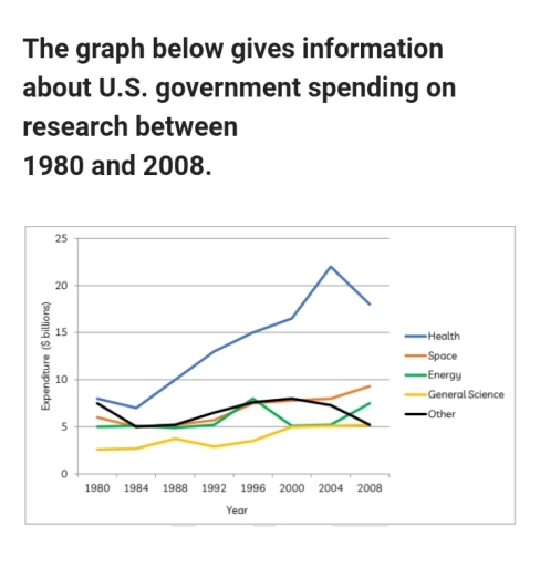
The line graph provides information on the US governments’ expenditure on research in five fields (Health, Space energy. General science and others) over the period from 1980 to 2008. Overall, it can be clearly seen that the US government spent the largest amount of money in research into Health, while the least amount of money was spent on researching general science.

Starting to around $8 billion in 1980, the government expenditure on research into Health slightly declined over the next four years before continuously raising to the peak of nearly $22 billion in 2004. Despite declining back down to approximately $18 billion in 2008, expenditure on Health research was by far the highest. However the amount of money spent on researching general science was the lowest of all research gategories beginning at $2.5 billion in 1980 and rising to just over $5 billion by 2008.

Meanwhile, there was also an increase in the money that was spent in research into Energy and Space, feom approximately $5 billion and $6 billion in 1980 to around $7.5 billion and $9 billion in 2008, respectively. In contrast, the only field that experienced decrease in expenditure was that research into other areas, which fell from approximately $7.5 billion to about $5 billion by 2008.

Word Count: 210

Answers On The Same Topic:

The graph Below gives information about U.S government spending on research Between 1980 and 2008

The line graph illustrates how much money the US government spent on research over a 28-year period (1980-2008). Overall, the graph indicates that government expenditure on research in nearly all given domains grew, with the most notable rise being observed in the health sector. Additionally, it is worth noting that general science received the least […]

The graph Below gives information about U.S government spending on research Between 1980 and 2008

The line graph illustrates the U.S. government funding on five distinct research fields over the period from 1980 to 2008. Overall, while the money spent on four of the five kinds of research underwent overall growth, Other research experienced a downward trend with fluctuation. Throughout the period, Health and General Science were the highest and […]

The graph Below gives information about U.S government spending on research Between 1980 and 2008

The line graph compares U.S. government spending on research across five sectors – health, space, energy, general science, and other fields – between 1980 and 2008. Overall, funding for health research was significantly higher than for the other sectors and increased markedly over time, despite a slight decline at the end of the period. By […]

The graph Below gives information about U.S government spending on research Between 1980 and 2008

The line graph shows U.S. government spending on five areas—health, space, energy, general science and “other”—between 1980 and 2008. Overall, health received by far the most money and rose to a peak in the mid-2000s. Space increased steadily, energy fluctuated with a sharp fall around 2000, “other” rose then fell, while general science settled at […]

The graph Below gives information about U.S government spending on research Between 1980 and 2008

The line graph illustrates how much money U.S government spend on various areas between 1980 and 2008 In 1980, U.S. government allocated nearly 18 billion dollars. It was decreased to approximately 7 billion dollars in 1984. Nevertheless, it shows a significant growth from 1984 to 2004.Below 20 billion dollars budgeted for health in 2008. Space […]

See All

Other Topics:

The chart below shows the average cost of monthly contract for four different mobile phone providers in a European country from January to September 2002, measured in euro.

The line chart illustrates the average price of a mobile phone contract per month from four phone providers in a particular country in Europe throughout the period of January to September 2002. The units are measured in euros. Overall, the prices of monthly contracts increased over the given period, except for Sim TX, which was […]

The graph below shows the population figures of different types of wild birds in the United Kingdom between 1970 and 2004.

Overall , It is evidence that there is an upward trend in the number of coastal species during the period, while the figure for farmland birds shows a contrast pattern. All four species started at 100 in1970 .The coastal species’s population climbed sharply from 100 to 135 in 1986 before peaking at roughly 140 in […]

The graph gives information about the visitors to Cardiff and Dublin from 2010 to 2020. Summarise the information by selecting and reporting the main features and make comparisons where relevant. Write a minimum of 150 words

The line graph illustrates the information about the visitors to Cardiff and Dublin over a decade from 2010 to 2020. Overall, Dublin peaked at approximately 4 million visitors in the year 2011. However, it declined dramatically over the following years, reaching a record low of under 2 million visitors by the year 2020. Cardiff started […]

The line graph shows the percentage of Australians who were employed between 1976 and 2011 in four groups.

The line graph gives information about the percentage of Australians who were employed from 1976 to 2011 in groups of Men and Women. Overall, it is also clear that percentage of women always tried to rise while men dropped from the hugest figure to low. On the one hand, women’s employed percentege started the lowest […]

The graph below shows the changes in production (millions)of three products in agarment factory from 1990 to 2010. Summarize the information by selecting andreporting the main features, and make comparisons where relevant.Write at least 150 words.

The line graph illustrates the changes that occurred in the manufacture of suit, dress and coat in a garment factory between 1990 and 2010. Units are measured in millions. Overall, the production of coats experienced an upward trend across the period while suit and dress faced significant flactuations. In detail, from 1990 to 2000, the […]

The chart below shows the percentage distribution of energy sources used in a country from 1990 to 2020.

The line graph presents information about the proportion of energy generated from four main sources (coal, natural gas, nuclear power, and renewables) in one particular country over a period of three decades. Overall, coal dominated over all four main sources, while renewables was the lowest source which least generated energy before surpassing nuclear energy. Despite […]

See All
We have detected unusual activity on your device.
Please verify your identity to continue.
Note: This verification step won't sign you in. If you have a premium account, please log in to access the service as usual.
Google/Gmail Verification
Or verify using Email/Code
We've sent a verification code to:
youremail@gmail.com (Not your email?)
Enter it below to complete the verification process.
Ensure your email address is correct, your inbox is not full, and you check your spam folder. If no email arrives, consider using an alternative email.
You will need a Premium plan to perform your action!
Note: If you already have a premium account, please log in to access our services as usual.

Plans & Pricing

Our mission is to make quality education accessible for everyone.
However, to keep our hardworking team running and this service alive, we genuinely need your support!
By opting for a premium plan, not only do you sustain us in achieving the mission, but you also unlock advanced features to enrich your learning experience.

Free

For learners who aren't pressed for time

What's included on Free
100+ Cambridge IELTS Tests
Instant IELTS Writing Task 1 & 2 Evaluation (2 times/month)
Instant IELTS Speaking Part 1, 2, & 3 Evaluation (5 times/month)
Instant IELTS Writing Task 1 & 2 Essay Generator (2 times/month)
500+ Dictation & Shadowing Exercises
100+ Pronunciation Exercises
Flashcards
Other Advanced Tools

Premium

For those serious about advancing their English proficiency, and for IELTS candidates aspiring to boost their band score by 1-2 points (especially in writing & speaking) in just 30 days or less

What's included on Premium
Save Your IELTS Test Progress
Unlock All Courses & IELTS Tests
Unlimited AI Conversations
Unlimited AI Writing Enhancement Exercises
Unlimited IELTS Writing Task 1 & 2 Evaluation
Unlimited IELTS Speaking Part 1, 2, & 3 Evaluation
Checked Answers Will Not Be Published
Unlimited IELTS Writing Task 1 & 2 Essay Generator
Unlimited IELTS Speaking Part 1, 2, & 3 Sample Generator
Unlimited Usage Of Advanced Tools
Priority Support within 24h (12-month plan only)

Due to the nature of our service and the provided free trials, payments are non-refundable.
Nếu bạn là người Việt Nam và không có hoặc không muốn trả bằng credit/debit cards, bạn có thể thanh toán bằng phương thức chuyển khoản:


Chọn gói:
419,000₫ 277,000 ₫ cho gói 1 tháng (chỉ 9,233₫/ngày)
1,239,000₫ 597,000 ₫ cho gói 3 tháng (chỉ 6,633₫/ngày)
2,469,000₫ 1,027,000 ₫ cho gói 6 tháng (chỉ 5,706₫/ngày)
4,929,000₫ 1,417,000 ₫ cho gói 12 tháng (chỉ 3,936₫/ngày)


Sau khi chuyển khoản, vui lòng đợi trình duyệt tự động điều hướng bạn trở lại Engnovate và bạn sẽ ngay lập tức nhận được mã kích hoạt tài khoản premium.
Nếu có lỗi xảy ra, bạn có thể liên hệ với team thông qua một trong các phương thức: email đến helloengnovate@gmail.com hoặc nhắn tin qua facebook.com/engnovate.
Vì toàn bộ công cụ trên website đều có thể sử dụng thử miễn phí, Engnovate không hỗ trợ hoàn tiền.