🔥 Today Only: Save 30% on Premium — Offer Ends Soon! - Upgrade Now!
Line Graph

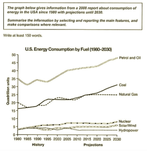
Band 7+: The graph below gives information from a 2008 report about consumption of energy in the USA since 1980 with projections until 2030. Summarise the information by selecting and reporting the main features, and make comparisons where relevant.

Image for topic: The graph below gives information from a 2008 report about consumption of energy in the USA since 1980 with projections until 2030. Summarise the information by selecting and reporting the main features, and make comparisons where relevant.
Our system will evaluate the answer based on this AI-generated description.
The image shows a line graph titled "U.S. Energy Consumption by Fuel (1980-2030)" with data from 1980 to 2007 as history and projected data from 2010 to 2030. The graph displays energy consumption in quadrillion units on the y-axis and time in years on the x-axis. Petrol and Oil consumption starts at approximately 35 quadrillion units in 1980, reaching nearly 45 quadrillion units in 2007 and projected to reach over 50 quadrillion units by 2030. Coal consumption begins at just over 15 quadrillion units, increasing to almost 25 quadrillion units in 2007 and projected at 30 quadrillion units in 2030. Natural Gas consumption starts at around 15 quadrillion units, with a steady increase to 25 quadrillion units in 2007 and projected to continue to about 30 quadrillion units in 2030. Nuclear, Solar/Wind, and Hydropower have significantly lower consumption levels, all starting below 5 quadrillion units in 1980. Nuclear energy shows a gradual increase to approximately 8 quadrillion units by 2007, with a projection of nearly 10 quadrillion units by 2030. Solar/Wind energy sees the most significant projected increase, starting at nearly 0 quadrillion units in 1980, with a slight increase to almost 3 quadrillion units in 2007 and an anticipated surge to 10 quadrillion units by 2030. Hydropower consumption remains relatively stable, starting at just over 2 quadrillion units, with little change by 2007 and a small projected increase to about 4 quadrillion units by 2030.
Given the complexity of the image, the above description may not be entirely accurate.
Note: Both the topic and the answer were created by one of our users.

The line graph presents information sourced from a 2008 report on the energy use in the USA since 1980 with predictions until 2030.

Low and stable energy consumption sources include nuclear, solar/wind power, and hydropower. On the other hand, petrol and coal have seen significantly increasing trends in usage.

The least popular energy source is hydropower, which has remained around 5 quadrillion units for past five centuries. It is the lowest predicted energy consumption. Nuclear power reached its peak at about 7 units in 2005. The number has remained stable since then. Like nuclear power, after reaching its peak in 2010, there were no more changes.

Coal’s energy consumption has nearly doubled by 2030. Starting at 16 quadrillion units, it started to see a steady increase around year 2005. Petrol and oil has a similar line of development, except its steady increase began in 1995. It is predicted to reach around 50 quadrillion units in 2030.

Word Count: 156

Answers On The Same Topic:

The graph below gives information from a 2008 report about consumption of energy in the USA since 1980 with projections until 2030. Summarise the information by selecting and reporting the main features, and make comparisons where relevant.

The graph illustrates data of U.S energy consumption from 1980 to present time along projecting estimate till 2030. Graph measures data in quadrillion unit of six distinct fuel sources. Petrol and oil was leading energy source in 1980 at 35 quadrillion units.Despite some minor fluctuations in late 1980’s.It’s consumption climbed steadily to 50 quadrillion in […]

The graph below gives information from a 2008 report about consumption of energy in the USA since 1980 with projections until 2030. Summarise the information by selecting and reporting the main features, and make comparisons where relevant.

The line graph compares energy consumption in the USA from 1980 to 2005, with projections up to 2030, for six different fuel sources. Overall, petrol and oil remain by far the most widely used fuels throughout the period, and their consumption is expected to continue rising. Coal and natural gas are also projected to increase, […]

The graph below gives information from a 2008 report about consumption of energy in the USA since 1980 with projections until 2030. Summarise the information by selecting and reporting the main features, and make comparisons where relevant.

The graph shows the consumption of energy in USA years between 1980 to 2008, with the forecast until 2030. Overall, the consumption of petrol and oil were at the peak, the coal and natural gas were trying climb one another. The rest of the energies had a unstable growth. Firstly, the petrol and oil had […]

The graph below gives information from a 2008 report about consumption of energy in the USA since 1980 with projections until 2030. Summarise the information by selecting and reporting the main features, and make comparisons where relevant.

The line graph compares historical data and future projections for energy consumption by different fuel sources in the USA from 1980 to 2030, according to a report published in 2008. All figures are measured in quadrillion units. Overall, petrol and oil dominate energy consumption throughout the period and are forecast to continue rising. By contrast, […]

The graph below gives information from a 2008 report about consumption of energy in the USA since 1980 with projections until 2030. Summarise the information by selecting and reporting the main features, and make comparisons where relevant.

The line graph shows how energy consumption by fuel in the USA changed from 1980, with predictions for 2030. It is clear from the graph that despite a slight drop in the first five years, energy consumption from petrol and oil increased dramatically from 35 quadrillion units in 1980 to about 40 quadrillion in 2008, […]

See All

Other Topics:

The line graph shows the number of books that were borrowed in four different months.

The graph gives information about the figure of books that had borrowed in June, July, August and September in 2014 from four libraries: West Eaton, Ryeslip, Sutton Wood and Church Mount. Looking at the graph from an overall perspective, it’s completely clear that all figures trend are upward except in term of the Ryeslip Library. […]

The line graph shows the number of books that were borrowed in four different months.

The graph gives information about thefigure of books that had borrowed in June, July, August and September in 2014 from four libraries: West Eaton, Ryeslip, Sutton Wood and Church Mount. Looking at the graph from an overall perspective,it’s completely clear that all figures trend are upward except in term of the Ryeslip Library. Noticeably that […]

The line graph below shows the main reasons people gave for moving away from particular capital city to the countryside. Summarise the information by selecting and reporting the main features, and make comparions where relevant

The line graph compares the numbers of people who relocated from a capital city to the countryside for three different reasons between 1990 and 2010. Overall, the rising cost of living remained the leading reason for recolation, although its figure peaked in 2000 before declining slightly. By contrast, traffic and lifestyle concerns showed sustained growth, […]

The line graph below shows the number of visitors to a museum between 2005 and 2015.

The line chart provides key information about the museum visitors number from 2005 to 2015. The figures are measured in thousands. Overall, it is clear from the graph that the number of visitors to a museum increased significantly throughout the period. In addition, in 2006, the visitors number recorded the lowest, whereas in 2015, represented […]

The line graph below shows the main reasons people gave for moving away from particular capital city to the countryside. Summarise the information by selecting and reporting the main features, and make comparions where relevant

The given line graph displays the reasons for moving away from a capital city to the suburban areas over the period of 20-years from 1990 to 2010. Overall, it can be seen that all figures followed an upward trajectory throughout the period. In addition, the risingcost of living recorded a higher figure rather than the […]

The graph below gives information about the percantage of money spent on advertising in five types of media in one country from 2010 and predicted spending to 2040.

The supplied line graph depicts how money was spent on advertising across five types of media in a particular country in 2010 and anticipation for 2040. Overall, while most types of advertisement programmes experienced and are more likely to see a decrease, only internet saw an overall increase over the period. Although TV had a […]

See All
We have detected unusual activity on your device.
Please verify your identity to continue.
Note: This verification step won't sign you in. If you have a premium account, please log in to access the service as usual.
Google/Gmail Verification
Or verify using Email/Code
We've sent a verification code to:
youremail@gmail.com (Not your email?)
Enter it below to complete the verification process.
Ensure your email address is correct, your inbox is not full, and you check your spam folder. If no email arrives, consider using an alternative email.
You will need a Premium plan to perform your action!
Note: If you already have a premium account, please log in to access our services as usual.

Plans & Pricing

Our mission is to make quality education accessible for everyone.
However, to keep our hardworking team running and this service alive, we genuinely need your support!
By opting for a premium plan, not only do you sustain us in achieving the mission, but you also unlock advanced features to enrich your learning experience.

Free

For learners who aren't pressed for time

What's included on Free
100+ Cambridge IELTS Tests
Instant IELTS Writing Task 1 & 2 Evaluation (2 times/month)
Instant IELTS Speaking Part 1, 2, & 3 Evaluation (2 times/month)
Instant IELTS Writing Task 1 & 2 Essay Generator (2 times/month)
500+ Dictation & Shadowing Exercises
100+ Pronunciation Exercises
Flashcards
Other Advanced Tools

Premium

For those serious about advancing their English proficiency, and for IELTS candidates aspiring to boost their band score by 1-2 points (especially in writing & speaking) in just 30 days or less

What's included on Premium
Save Your IELTS Test Progress & Analyze Mistakes By Question Type
Save Your Own Flashcard Sets & Use Them On Any Device
Unlock All Courses, IELTS Tests, Section & Part Practice
Unlimited AI Conversations
Unlimited AI Writing Enhancement Exercises
Unlimited IELTS Writing Task 1 & 2 Evaluation
Unlimited IELTS Speaking Part 1, 2, & 3 Evaluation
Checked Answers Will Not Be Published
Unlimited IELTS Writing Task 1 & 2 Essay Generator
Unlimited IELTS Speaking Part 1, 2, & 3 Sample Generator
Unlimited Usage Of Advanced Tools & AI Features
Priority Support within 24h (12-month plan only)

Due to the nature of our service and the provided free trials, payments are non-refundable.