🔥 Today Only: Save 30% on Premium — Offer Ends Soon! - Upgrade Now!
Line Graph

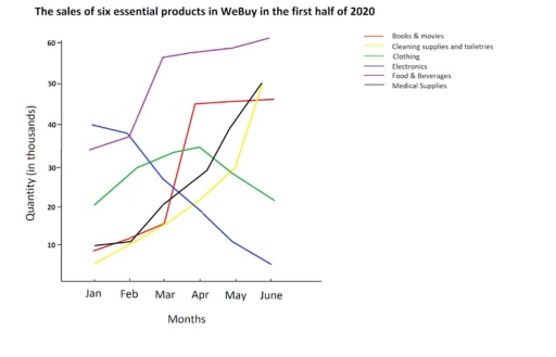
Band 5+: The graph below gives information on the sales of six essential products in WeBuy in the first half of 2020. Summarise the information by selecting and reporting the main features, and make comparisons where relevant.

Image for topic: The graph below gives information on the sales of six essential products in WeBuy in the first half of 2020. Summarise the information by selecting and reporting the main features, and make comparisons where relevant.
Our system will evaluate the answer based on this AI-generated description.
The image shows a line graph titled "The sales of six essential products in WeBuy in the first half of 2020" with quantities in thousands on the y-axis ranging from 0 to 60 and months from January to June on the x-axis. There are six lines representing different products: Books & movies start at 10 in January, peak at 20 in February, drop to 10 in March, rise slightly to 15 in April and May, and drop to 5 in June; Cleaning supplies and toiletries begin at 15 in January, jump to 50 in February, fall to 30 in March, 20 in April, 25 in May, and 10 in June; Clothing starts at 30 in January, drops to 25 in February, rises sharply to 60 in March, then plummets to 20 in April, 10 in May, and 5 in June; Electronics starts at 5 in January, rises to 10 in February and March, surges to 55 in April, falls to 40 in May, and plunges to 5 in June; Food & Beverages starts at 15 in January, rises to 35 in February, peaks at 40 in March, drops to 10 in April, soars to 45 in May, and falls to 25 in June; Medical Supplies start at 15 in January, rapidly ascend to 60 in February, remain at 60 in March, fall to 35 in April, 25 in May, and 10 in June.
Given the complexity of the image, the above description may not be entirely accurate.
Note: Both the topic and the answer were created by one of our users.

The line graph compares the quantity of products that were sold via WeBuy in the first half of 2020 dividing into 6 categories.

It is clear that, overall sales increased over the period given and food was by far the most demanded category of all.

In january, electronics were the main marketable products in WeBuy, accounted for 40 thousands which was 2 times greater than clothing. Figures for books and movies, cleaning supplies, medical supplies were just under 10 thousand. Around 34 thousand of food and beverages were sold in WeBuy. Over the first quarter, all figures rose remarkably apart from electronics. The sales of this category fell considerably to only 5 thousand at the end of the period.

In the following quarter, sales in food, medicine and cleaning supplies reached their peak of 60,50 and 50 respectively. By contrast, the figure for clothing dropped again to 20 thousand in June.

Word Count: 151

Answers On The Same Topic:

The graph below gives information on the sales of six essential products in WeBuy in the first half of 2020. Summarise the information by selecting and reporting the main features, and make comparisons where relevant.

The line graph compares the sales of 6 essential items in WeBuy within the first six months of 2020. Overall, there was a rise in the sales of all products in question, with the exception of electronics and clothing. The sales of clothing, in particular, were relatively volatile. In detail, the sales of food and […]

The graph below gives information on the sales of six essential products in WeBuy in the first half of 2020. Summarise the information by selecting and reporting the main features, and make comparisons where relevant.

The information concerning the data about six indispensable products were sold in WEBUY in the first six months of 2020.It has been manifested that, the sales of clothing witnessed fluctuation trend throughout the given period of time. To commence with,33000 food and beverages being sold in the January month in the 2020.Moreover, the sales of […]

The graph below gives information on the sales of six essential products in WeBuy in the first half of 2020. Summarise the information by selecting and reporting the main features, and make comparisons where relevant.

The line graph shows the sales of six essential products in WeBuy from January to June 2020, measured in thousands. Overall, electronics saw the most significant growth, while clothing experienced a notable decline. Sales of other products, such as food and beverages, cleaning supplies, medical supplies, and books & movies, varied over the six months. […]

The graph below gives information on the sales of six essential products in WeBuy in the first half of 2020. Summarise the information by selecting and reporting the main features, and make comparisons where relevant.

The line graph gives information about the sales of six various essential products in WeBuy in the first half of 2020. Overall, what can be immediately surmised from the data is that there was an upward trend in the number of books & movies, cleaning supplies and toiletries, food & beverage, and medical supplies. While […]

The graph below gives information on the sales of six essential products in WeBuy in the first half of 2020. Summarise the information by selecting and reporting the main features, and make comparisons where relevant.

The line graph illustrates the sales quantities of six essential products at WeBuy in the first half of 2020, measured in thousands. Overall, sales of “food and beverages” showed the largest increase, while “electronics” experienced the steepest decline. “Medical supplies” and “cleaning supplies and toiletries” saw considerable growth, whereas “clothing” remained relatively stable throughout this […]

See All

Other Topics:

The graph below shows home heating fuel choice according to the year the house was built.

The line graph illustrates the figure for using heating fuel of the house from before 1950 to 2010. Overall, the percentage of natural gas used was the highest in the first period, while the percentage of the electricity was lowest in the same time. According to the graph, the figure for natural gas choices peaked […]

The line graph below shows how often Mauritian teenagers consumed three types of fast food between 1985 and 2015. Summarise the information by selecting and reporting the main features, and make comparisons where relevant.

The linegraph illustrates the frequency of fast food consumption per year of Mauritian teenagers between 1985 and 2015. Overall, the consumption of pizza had a downward trend, while that of hamburgers and fried chicken saw the opposite pattern. Strikingly, pizza was the most popular fast food in 1985, but after 3 decades, hamburgers had the […]

The graph shows the number of shops that closed and the number of new shops that opened in 2018 in one country between 2011 and 2018.

The graph beneath illustrates comparison between number of shop closuers and openings in one country 2011 and 2018. Overall, the graph shows the stright lines or dot lines the number of closures and openings of shop, the highest rate of opening in 2011, and the highest rate of closing in 2013. First of all, the […]

The graph below shows the number of passengers using four types of public transport in a European city between 2000 and 2025. Summarise the information by selecting and reporting the main features, and make comparisons where relevant.

The line graph illustrates the changes in passenger numbers for four modes of public transportation in a European city from 2000 to 2025. Overall,the metro experienced a steady upward trend, eventually becoming the most popular form of transport.Conversely, bus usage saw a gradual decline over the period, while both tram and bicycle-sharing services recorded significant […]

The data illustrates how the costs of copper, nikkel and zinc altered monthly throughout 2014.

The line graph provides proportion of mean monthly changes in the prices of three metals (Cooper, Nickel, Zinc) during 2014. Overall, it is evident that, Nickel was the highest beginning of the year, dropped to the lowest level and increased slightly, whereas Cooper and Zinc showed erratic trend over the year, in the last months […]

The graph below gives information about the number of jobs in four sectors of the economy in the US between 1960 and 2020. Summarise the information by selecting and reporting the main features, and make comparisons where relevant.

The diagram ilusstrates details of amount offers between Manufacturing, Retail, Agriculture, and Healthcare economics in US from the period 1960 to 2020. Overall, Healthcare with Retail had increased at the end of a period, However Mnufacturing and Agricalture had decreased. Firstly in 1960 Manufacturing was the highest economy than others, it had 15 millions. At […]

See All
We have detected unusual activity on your device.
Please verify your identity to continue.
Note: This verification step won't sign you in. If you have a premium account, please log in to access the service as usual.
Google/Gmail Verification
Or verify using Email/Code
We've sent a verification code to:
youremail@gmail.com (Not your email?)
Enter it below to complete the verification process.
Ensure your email address is correct, your inbox is not full, and you check your spam folder. If no email arrives, consider using an alternative email.
You will need a Premium plan to perform your action!
Note: If you already have a premium account, please log in to access our services as usual.

Plans & Pricing

Our mission is to make quality education accessible for everyone.
However, to keep our hardworking team running and this service alive, we genuinely need your support!
By opting for a premium plan, not only do you sustain us in achieving the mission, but you also unlock advanced features to enrich your learning experience.

Free

For learners who aren't pressed for time

What's included on Free
100+ Cambridge IELTS Tests
Instant IELTS Writing Task 1 & 2 Evaluation (2 times/month)
Instant IELTS Speaking Part 1, 2, & 3 Evaluation (2 times/month)
Instant IELTS Writing Task 1 & 2 Essay Generator (2 times/month)
500+ Dictation & Shadowing Exercises
100+ Pronunciation Exercises
Flashcards
Other Advanced Tools

Premium

For those serious about advancing their English proficiency, and for IELTS candidates aspiring to boost their band score by 1-2 points (especially in writing & speaking) in just 30 days or less

What's included on Premium
Save Your IELTS Test Progress & Analyze Mistakes By Question Type
Save Your Own Flashcard Sets & Use Them On Any Device
Unlock All Courses, IELTS Tests, Section & Part Practice
Unlimited AI Conversations
Unlimited AI Writing Enhancement Exercises
Unlimited IELTS Writing Task 1 & 2 Evaluation
Unlimited IELTS Speaking Part 1, 2, & 3 Evaluation
Checked Answers Will Not Be Published
Unlimited IELTS Writing Task 1 & 2 Essay Generator
Unlimited IELTS Speaking Part 1, 2, & 3 Sample Generator
Unlimited Usage Of Advanced Tools & AI Features
Priority Support within 24h (12-month plan only)

Due to the nature of our service and the provided free trials, payments are non-refundable.