🔥 Today Only: Save 30% on Premium — Offer Ends Soon! - Upgrade Now!
Line Graph

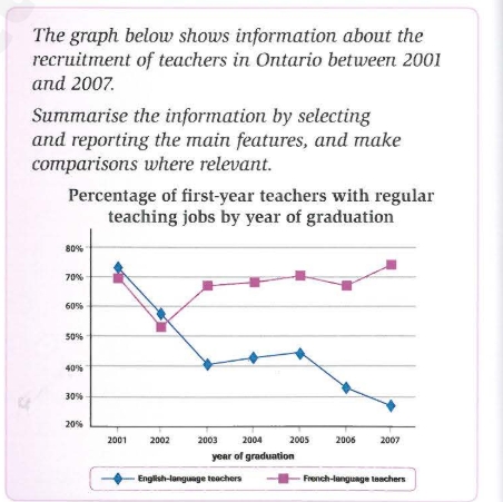
Band 7+: the graph below shows information about the recruitment of teachers in Ontario in 2001 and 2007

Image for topic: the graph below shows information about the recruitment of teachers in Ontario in 2001 and 2007
Our system will evaluate the answer based on this AI-generated description.
The image presents a line graph with two series depicting the "Percentage of first-year teachers with regular teaching jobs by year of graduation," specifically for English-language teachers and French-language teachers. The x-axis lists the years of graduation from 2001 to 2007, and the y-axis represents the percentage scale from 30% to 80% in increments of 10%. English-language teachers' data points are as follows: 2001 - 70%, 2002 - 68%, 2003 - 54%, 2004 - 42%, 2005 - 38%, 2006 - 40%, and 2007 - 38%. French-language teachers' data points are: 2001 - 76%, 2002 - 74%, 2003 - 70%, 2004 - 60%, 2005 - 48%, 2006 - 50%, and 2007 - 52%. The graph shows an overall decline in the percentage of first-year teachers with regular teaching jobs for both English-language and French-language teachers over the seven-year span, with French-language teachers consistently having a higher percentage compared to English-language teachers each year.
Given the complexity of the image, the above description may not be entirely accurate.
Note: Both the topic and the answer were created by one of our users.

The chart gives information about the proportion of first-year teachers with regular teaching jobs by year of graduation who were recruited to teach French and English language in Ontario from 2001 to 2007.

Overall, what stands out is that a sharp contrast can be seen between French and English teachers, while the proportion of French language teachers climbed gradually, the percentage of English teachers dropped significantly.

In 2001, the proportion of French language teachers was approximately 70%. Within a year, this figure saw a downward trend reaching a low of 50%. In the following years, this percentage experienced a moderate increase, peaking at nearly 75% in late 2006.

In contrast, the proportion of English language teachers showed a significant decrease from over 70% in 2001 to 40% by the mid 2002. Then this trend rose slightly till the middle of 2004 and continued falling dramatically thereafter, reaching a low point at under 30% by late 2006.

Word Count: 156

Answers On The Same Topic:

the graph below shows information about the recruitment of teachers in Ontario in 2001 and 2007

Given is a line graph illustrating the data about the hiring teachers who learn English and French languages in Ontario between 2001 and 2007. Overall,it is clear that French-language teachers’ percentage were higher, whereas English-language teachers’ percenatge were lower. In 2001, the propotion of French-language teachers was approximately 70%. Within a year, the figure sa […]

the graph below shows information about the recruitment of teachers in Ontario in 2001 and 2007

The supplied line graph demonstrates the data about recruitment of instructors in Ontario from 2001 to 2007. Looking from an overall perspective, it can be seen that both language teachers commenced from the highest percentage. However, french language masters grew significantly over the period, whereas english language teachers reduced dramatically. According to the line graph, […]

the graph below shows information about the recruitment of teachers in Ontario in 2001 and 2007

The line graph gives information about the recruitment of teachers in Ontario between 2001 and 2007 . According to the data , the English- language teachers has went down in popularity during this time . But the trend of the French- language teachers is the opposite. From 2001 to 2000 , to the teachers of […]

the graph below shows information about the recruitment of teachers in Ontario in 2001 and 2007

The chart shows the data about how many English-language teachers and French-language teachers were recruited by the year of graduation in Ontario over a seven-year period between 2001 and 2007. Overall, it can be seen that more French-language teachers were hired compared to English-language teachers over the period in question. According to the data, there […]

the graph below shows information about the recruitment of teachers in Ontario in 2001 and 2007

The chart shows the data about how many English-language teachers and French-language teachers were recruited by the year of graduation in Ontario over a seven-year period between 2001 and 2007. Overall, it can be seen that more French-language teachers were hired compared to English-language teachers over the period in question. According to the data, there […]

See All

Other Topics:

Look at the graph showing changes in the use of the internet for different activities in the future.

The line graph delineates anticipated changes in the extent to which the internet is employed for four distinct purposes – downloading films, sending emails, shopping and studying online courses – over the fifteen-year period from 2015 to 2030. Overall, the projections point to a pronounced divergence between the four purposes. While shopping and studying online […]

The graph below shows the four leading types of farming produce in Mitchford city between 1970-2000. Summarise the information by selecting and reporting the main features, and make comparisons where relevant.

THE line graph illustrate the production of four main agrucultural products , namely cotton, corn, wheat and sugar, in Mitchford between 1970and 2000 , measured in thousands of dollars . Owerall, cotton production experienced the most dramatic change , rising sharply to a peak of about $90,000 in 1990 before falling back to approximately $20,000 […]

The graph below shows the changes in UK birth rate of women in 6 different age group from 1973 to 2008.

The given line chart illustrates how female birth rates divided into six age groups in the United Kingdom changed from 1973 to 2008. Overall, there is a considerable decrease in the birth rates of women under 25 and over 40, while an opposite trend can be seen in that of the 30-to-39 age bracket. In […]

The graph illustrates the price in Euros of 800 grams of four types of bread in one European country from 2001 to 2006.

The line graph compares the cost of four distinct 800-gram breads in one European country between 2001 and 2005. Overall, the prices of all types of bread were the same except for wholegrain in the initial year. While all figures exhibited an upward trend in general throughout the period, the price of wholegrain experienced a […]

The graph shows how much money was spent on foreign investment in real estate for four Asian countries from 2014 to 2024.

The presented line graph depicts the amount of currency in real estate for China, Singapore , Korea and Japan was being spent on foreign investment. Time between 2014 and 2024 A glance at the graph reveals that Japan reached its highest peak on investigation in foreign real estate in 2024, while China dropped to its […]

The line graph below shows the percentage of households in Singapore owned in four different consumer items (computer, car, air conditioning, washing machine) between 1973 and 2008.

The line graph demonstrates the proportion of households with electronic devices( air conditioning, washing machine, car, computer) in Singapore, from 1973 to 2008. Overall, it is apparent that all four devices experienced an increase throughout the period. In addition, the washing machine and car recorded the highest percentage, whereas the air conditioning depicted a moderate […]

See All
We have detected unusual activity on your device.
Please verify your identity to continue.
Note: This verification step won't sign you in. If you have a premium account, please log in to access the service as usual.
Google/Gmail Verification
Or verify using Email/Code
We've sent a verification code to:
youremail@gmail.com (Not your email?)
Enter it below to complete the verification process.
Ensure your email address is correct, your inbox is not full, and you check your spam folder. If no email arrives, consider using an alternative email.
You will need a Premium plan to perform your action!
Note: If you already have a premium account, please log in to access our services as usual.

Plans & Pricing

Our mission is to make quality education accessible for everyone.
However, to keep our hardworking team running and this service alive, we genuinely need your support!
By opting for a premium plan, not only do you sustain us in achieving the mission, but you also unlock advanced features to enrich your learning experience.

Free

For learners who aren't pressed for time

What's included on Free
100+ Cambridge IELTS Tests
Instant IELTS Writing Task 1 & 2 Evaluation (2 times/month)
Instant IELTS Speaking Part 1, 2, & 3 Evaluation (2 times/month)
Instant IELTS Writing Task 1 & 2 Essay Generator (2 times/month)
500+ Dictation & Shadowing Exercises
100+ Pronunciation Exercises
Flashcards
Other Advanced Tools

Premium

For those serious about advancing their English proficiency, and for IELTS candidates aspiring to boost their band score by 1-2 points (especially in writing & speaking) in just 30 days or less

What's included on Premium
Save Your IELTS Test Progress & Analyze Mistakes By Question Type
Save Your Own Flashcard Sets & Use Them On Any Device
Unlock All Courses, IELTS Tests, Section & Part Practice
Unlimited AI Conversations
Unlimited AI Writing Enhancement Exercises
Unlimited IELTS Writing Task 1 & 2 Evaluation
Unlimited IELTS Speaking Part 1, 2, & 3 Evaluation
Checked Answers Will Not Be Published
Unlimited IELTS Writing Task 1 & 2 Essay Generator
Unlimited IELTS Speaking Part 1, 2, & 3 Sample Generator
Unlimited Usage Of Advanced Tools & AI Features
Priority Support within 24h (12-month plan only)

Due to the nature of our service and the provided free trials, payments are non-refundable.