🔥 Today Only: Save 30% on Premium — Offer Ends Soon! - Upgrade Now!
Line Graph

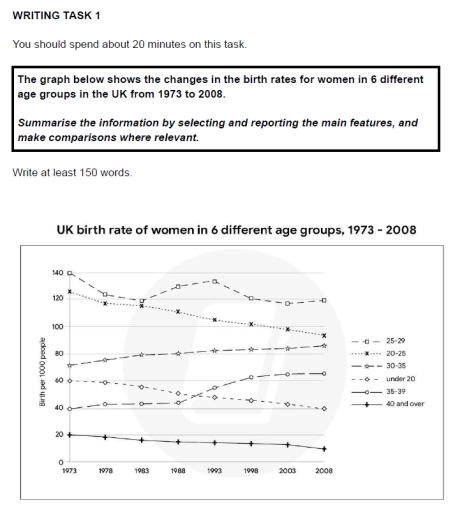
Band 6+: the graph below shows the changes in the birth rates for women in 6 different age groups in the UK from 1973 to 2008. summarise the information by selecting and reporting the main features and make comparisons where relevant.

Image for topic: the graph below shows the changes in the birth rates for women in 6 different age groups in the UK from 1973 to 2008. summarise the information by selecting and reporting the main features and make comparisons where relevant.
Our system will evaluate the answer based on this AI-generated description.
The image depicts UK women's birth rates from 1973 to 2008 in age groups: 25-29, 20-24, 30-35, under 20, 35-39, and 40 and over. In 1973, 25-29 had 140, 20-24 had 130, 30-35 had around 65, under 20 had 50, 35-39 had 25, and 40 and over had about 5. In 1978, 25-29 was 125, 20-24 was 100, 30-35 was 57, under 20 was 45, 35-39 was 25, 40 and over was about 5. By 1983, 25-29 was 110, 20-24 was 90, 30-35 was 60, under 20 was about 45, 35-39 was 25, 40 and over was around 5. In 1988, 25-29 was 115, 20-24 was 85, 30-35 was 60, under 20 was about 45, 35-39 was 25, 40 and over was around 6. By 1993, 25-29 was 112, 20-24 was 65, 30-35 was about 57, under 20 was 42, 35-39 was 25, 40 and over was around 8. In 1998, 25-29 was 100, 20-24 was 55, 30-35 was about 55, under 20 was 42, 35-39 was 30, and 40 and over was 10. By 2003, 25-29 was 102, 20-24 was about 55, 30-35 was 66, under 20 was 41, 35-39 was 40, 40 and over was about 12. In 2008, 25-29 was 98, 20-24 was 52, 30-35 was 95, under 20 was 40, 35-39 was 45, 40 and over was 16.
Given the complexity of the image, the above description may not be entirely accurate.
Note: Both the topic and the answer were created by one of our users.

The line graph illustrates the birth rate of females between 1973 and 2020 in the United Kingdom. Overall, is appreciated that giving birth has suffered a decrease over the last half-century.

Firstly, is seen that 20 teenagers per each 1000 had babies in that period, slightly falling to 18 in 2001. Secondly, youth, between 20 and 25 years old, which were the ones with the highest rate, plummeted from 120 to 20 per thousand in 50 years, reaching the third position in the ranking. On the contrary, those aged between 28 and 34, were the only group that increased, becoming the principal, doubling in less than 10 years and hitting the peak in 2020 at 80 births per thousand. Lastly, women older than 40 years old, gradually fell from 10 to 5 per 1000 in that period, being the group that gives birth the least.

To summarize, the figure shows a general decreasing trend during the past 50 years, indicating that nowadays are not the youngest females who have more babies.

Word Count: 171

Answers On The Same Topic:

the graph below shows the changes in the birth rates for women in 6 different age groups in the UK from 1973 to 2008. summarise the information by selecting and reporting the main features and make comparisons where relevant.

The given line chart illustrates the transformation in the ratio of birth for females in 6 different age groups in the UK between 1973 and 2008. Overall, it is evident that women in the 30-34 age group experienced an upward trend over time while the opposite can be seen for those in from under 20 […]

the graph below shows the changes in the birth rates for women in 6 different age groups in the UK from 1973 to 2008. summarise the information by selecting and reporting the main features and make comparisons where relevant.

The line graph shows changes in birth rates for women in six different age groups in the UK between 1973 and 2008. Overall, women aged 25-29 had the highest birth rate during the whole period, while women aged 40 and over had the lowest. In general, birth rates went down for younger women but went […]

the graph below shows the changes in the birth rates for women in 6 different age groups in the UK from 1973 to 2008. summarise the information by selecting and reporting the main features and make comparisons where relevant.

The graph represents how much the share of birth per 1000 people for women changed in a variety of age groups in the UK between 1973 and 2008. Overall, it can be seen that the birth rate in most age groups witnessed a downward trend throughout the period of time. Meanwhile, age groups like 30-35and […]

the graph below shows the changes in the birth rates for women in 6 different age groups in the UK from 1973 to 2008. summarise the information by selecting and reporting the main features and make comparisons where relevant.

The graph below provide information about the changes in the birth rates for women in 6 age groups in the UK from 1973 to 2008. Overall, the only age group that increase over this period is “30-35” and “35-39” years, the lowest result among women is by “40 and over” persons, moreover we can see […]

the graph below shows the changes in the birth rates for women in 6 different age groups in the UK from 1973 to 2008. summarise the information by selecting and reporting the main features and make comparisons where relevant.

The line graph shows data on the natality rate among adult females in England between 1973 and 2020. It is measured in births per hundred women. Overall, it can be seen that the aged under 20 and aged 40 plus followed a similar pattern and aged 28- 34 has the highest number of births per […]

See All

Other Topics:

The graph below shows the percentage of people in a European country, by age group, who believed that wearing traditional attire was an important part of their cultural identity between 1990 and 2020.

The line graph illustrates the percentage of people lived in Europe, by five age groups who had a belief that wearing traditional attire had a significant meaning of their cultural identification between 1990 and 2020. Overall, age grops that are older showed higher percentage but gradually declined decade by decade. As for the younger generation […]

The chart below shows the changes in car ownership in Great Britain between 1961 and 2001.

The line graph illustrates the changes in the proportion of households owning cars in Great Britain over a 40-year period from 1961 to 2001. Overall, it is clear that car ownership in Great Britain increased significantly over the period. The percentage of households without a car experienced a sharp decline, while the figures for families […]

The diagram below gives information about the number of parcels delivered by two major mail services companies from 1920 to 2000. Summarise the information by selecting and reporting the main features, and make comparisons where relevant.

The diagram illustrates data about the number of parcels delivered by two major mail service companies between 1920 and 2000. Overall, while Federal Express (FedEx) underwent a period of volatility, TNT mail services experienced an upward trend throughout the period. In addition, the highest number of parcels delivered by both FedEx and TNT was observed […]

The line graph below gives information on cinema attendance in the UK. Summarize the information by selecting and reporting the main features, and make comparisons where relevant. Write at least 150 words.

The provided line chart illustrates the great Britain reports for percentage of people are attending cinema age-by- age Between 1984 to 2003 . Following all Data are increasingly significant over the time . From 1984 to 1988 age fifteen to twenty – four are 18% grown at that time and after that Between 2000 to […]

The chart below shows the percentage of households with different kinds of technology in the UK from 1997 to 2001. Summarise the information by selecting and reporting the main features, and make comparisons where relevant.

The graph compares the percentage of UK households that had access to various types of technology, namely CD player, telephone, computer, and internet as well as DVD player over the period from 1997 to 2001. Overall, it can be seen that all types of compared technology experienced an overall increase. CD player dominated over the […]

The chart below shows the percentage of households with different kinds of technology in the UK from 1997 to 2001. Summarise the information by selecting and reporting the main features, and make comparisons where relevant.

The graph below details the increases of the usage of house item from 1998 to 2001 in the UK. Overall, all the figures showed increases, especially the telephone which had been on of the least preferred and became one of the most useful in the end. While CD represented the highest figures throughout the period, […]

See All
We have detected unusual activity on your device.
Please verify your identity to continue.
Note: This verification step won't sign you in. If you have a premium account, please log in to access the service as usual.
Google/Gmail Verification
Or verify using Email/Code
We've sent a verification code to:
youremail@gmail.com (Not your email?)
Enter it below to complete the verification process.
Ensure your email address is correct, your inbox is not full, and you check your spam folder. If no email arrives, consider using an alternative email.
You will need a Premium plan to perform your action!
Note: If you already have a premium account, please log in to access our services as usual.

Plans & Pricing

Our mission is to make quality education accessible for everyone.
However, to keep our hardworking team running and this service alive, we genuinely need your support!
By opting for a premium plan, not only do you sustain us in achieving the mission, but you also unlock advanced features to enrich your learning experience.

Free

For learners who aren't pressed for time

What's included on Free
100+ Cambridge IELTS Tests
Instant IELTS Writing Task 1 & 2 Evaluation (2 times/month)
Instant IELTS Speaking Part 1, 2, & 3 Evaluation (2 times/month)
Instant IELTS Writing Task 1 & 2 Essay Generator (2 times/month)
500+ Dictation & Shadowing Exercises
100+ Pronunciation Exercises
Flashcards
Other Advanced Tools

Premium

For those serious about advancing their English proficiency, and for IELTS candidates aspiring to boost their band score by 1-2 points (especially in writing & speaking) in just 30 days or less

What's included on Premium
Save Your IELTS Test Progress & Analyze Mistakes By Question Type
Save Your Own Flashcard Sets & Use Them On Any Device
Unlock All Courses, IELTS Tests, Section & Part Practice
Unlimited AI Conversations
Unlimited AI Writing Enhancement Exercises
Unlimited IELTS Writing Task 1 & 2 Evaluation
Unlimited IELTS Speaking Part 1, 2, & 3 Evaluation
Checked Answers Will Not Be Published
Unlimited IELTS Writing Task 1 & 2 Essay Generator
Unlimited IELTS Speaking Part 1, 2, & 3 Sample Generator
Unlimited Usage Of Advanced Tools & AI Features
Priority Support within 24h (12-month plan only)

Due to the nature of our service and the provided free trials, payments are non-refundable.